Feb 12

Not all users know that an interaction design element can _have_ disabled state.
I’ve seen users clicking and clicking, and just not understanding why a button or other element won’t work. You may not have seen this behaviour, but that doesn’t mean it doesn’t exist. These users are typically less experienced at navigating technology and the web. Please don’t make their lives even harder by giving them a thing that’s frustrating and which they can’t figure out.
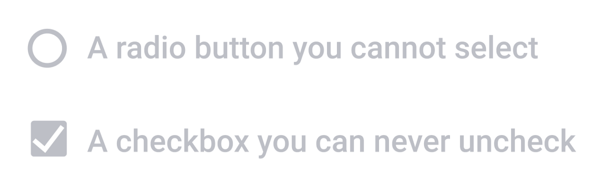
It has become an implicit design convention that deactivated elements have poor contrast.
Why is it okay for only some users to be able to read a disabled interaction element? All users deserve the same amount of information. This means making all visual elements equally legible for everyone, and that means ensuring adequate contrast and legibility.
Disabled options only communicate implicitly. At best they are ambiguous; at worst, impenetrable.
If you show an element but don’t allow people to interact with it, they then have to interpret why they can’t. Not everyone will be able to do this, for a host of reasons from simple tiredness to lifelong cognitive issues to just plain not knowing how your system works. And even those who can infer that something is being signalled by a disabled element may interpret this lack of clickability in different ways.
If your disabled element can’t have focus, screenreader users get less information (plus keyboard navigation gets a little weird).
You probably don’t want to create a deactivated element than can have focus, because what’s that about, an element that can get focus but can’t be changed. So you deactivate the element, and don’t allow it to have focus. But if users of screenreader technology can’t focus on that element, they won’t know it’s there. Which means they can’t infer, the way sighted users can, that the option exists, but is not available. Why should this group receive any less information?
Meanwhile, for other keyboard users (a group that extends far beyond those with screenreaders), if the element does meet contrast requirements, then there’s a moderate chance it doesn’t look different — so it’s not obvious why navigation would just hop right over it.
We should solve these problems with better content design, not by using disabled elements
Reframe the problem. Why are you using a deactivated element? What are some different ways of framing the issue that might be clearer for users, and easier to recover from? Below are some situations, and suggested alternatives that don’t involve disabled elements. There are probably others. Let me know!
Disabled element indicating that the user’s situation (as understood by the system) renders this particular interaction invalid
If it’s not valid, then don’t show it. It’s often that simple. But if not showing the option means users might get confused, and wonder why it isn’t available, you may need to explain. So use words to describe this dependency:
Because you have told us that you are travelling alone, you cannot select another passenger.
You might want to give the user a chance to recover, in case they didn’t mean to enter that they were travelling alone. This might involve being able to navigate backwards in the flow. If many users struggle with this issue, you might even provide a direct call to action to edit the bit about travelling alone:
If you want to add another passenger, you can [add or edit passengers here](LINK).
But a much better option might be to put this stuff on the same screen as the thing about passengers — maybe even immediately after it. This way the user gets immediate feedback about how their choices affects the range of subsequent options. Maybe you even need to write a little microtext at that point, where you explain how selecting that option might limit subsequent choices (though in this particular case I hope it would be obvious).
Disabled element indicating that an option is not currently available, though may be available later
Expecting users to understand that this is why an element is disabled is a pretty tall order. So say it with text instead. Do this in a way that makes sense for your flow, so users get the information at the right time. Do they need to know that an option is unavailable before they read the available ones?
When do you want your class to visit the museum?
Note: Evening opening will begin again from March 4.
Sometimes, like the above example, it might be okay to add the extra information afterwards. Users who want mornings or afternoons will go on their merry way, but users who don’t find what they want will start to sniff around a bit, and discover the message about evenings. Though for the sake of screenreader users, and the very linear order their information comes in, the following might be even clearer:
When do you want your class to visit the museum? Note: Evening opening will begin again from March 4.
Disabled element indicating that some part of the system is not currently functioning
Unavailability of a system component seems like a thing that all users should know about. Say it with text:
The appointments booking system is currently unavailable. Please try again later. If you like, you can choose to [save and continue your application until later](LINK)
Here, as with many other situations where user choice is for some reason constrained, it’s nice to present a helpful or temporary alternative.
I have never seen a deactivated UI component that could not be removed by rethinking the interaction design.
And I have never seen a disabled element that could not be more clearly and universally explained with text. Text on the web, whether it’s plain text or link text or headings or subheadings, is by and large accessible out of the box. It’s also explicit rather than implicit, which means it should be understandable and readable by everyone. If you write clearly and concisely 😉.
So please, lose the deactivated interaction elements, because they’re not helping anyone. And please don’t make disabled elements a part of your design system. If they don’t exist, they’re much harder to use, and designers will have get creative about other ways to solve the problem.