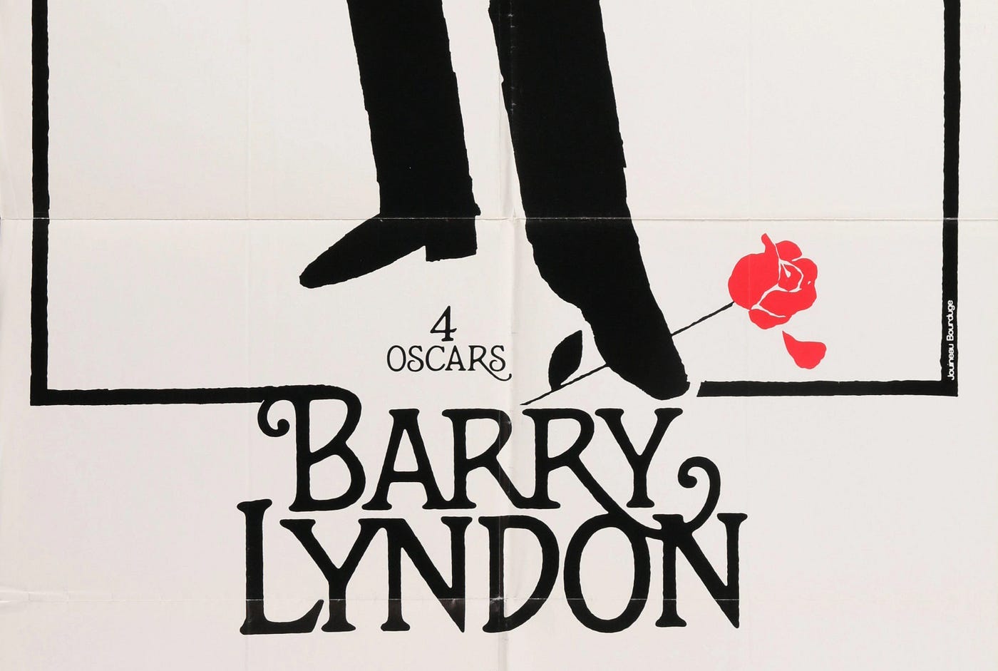
The very mention of Barry Lyndon will either elicit a groan you get from an over stimulated teenager forced to trudge through economics class or silent reverence in a middle-aged man who bought the Criterion Collection edition, and delicately wipes it down every month. It is Kubrick’s overlooked masterpiece, sandwiched between the higher profile A Clockwork Orange and The Shining, receiving a mixed reaction (which Kubrick film didn’t) on its release in 1975.
I have indeed caught myself wiping and sometimes sponging down the surface of my own copy from time to time. It is in my top films of all time for good reason. There are so many artistic highlights throughout the film, from the stately art direction, sumptuous detailed costumes, to the painterly cinematography and immersive sound design. The soundtrack is wonderfully eclectic and beautifully underscores the internal struggles of our titular character. Yet it is a sluggish film compared to any of his other works.
I have this image of an exhausted-looking designer bursting in to tears as Stanley brandishes his measuring tape for the hundredth time.
Kubrick worked over every inch of the film in obsessive detail, and the marketing of the film was one aspect he kept a pathologically rigorous eye on. It was total filming, and he saw posters, branding and promotional materials as a tool to present a consistent story, establishing his vision early in the design process, reviewing everything through to release. I have this image of an exhausted-looking designer bursting in to tears as Stanley brandishes his measuring tape for the hundredth time.
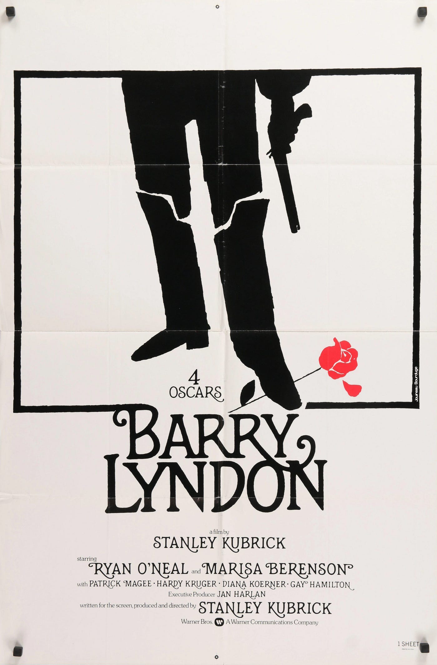
The poster for all its style was not in fact designed by Saul Bass. We have such a soft spot for Bass that we think he designed every iconic thing from the 60s and 70s. The poster has all the classic hallmarks of a Bass production; flat, limited palette, rough silk screen quality and a big honking metaphor. I made this mistake at first, promptly typing out ‘by S Bass’ when posting about it online. I have seen this incorrect attribution on many sites and even the Criterion Collection edition of Barry Lyndon wrongly attributes the artwork to Bass.
I had been aware that airbrush artist and poster designer Philip Castle, a Kubrick regular, was originally commissioned to create the poster, and whose first drafts Kubrick thought were ‘too funny’. Those I would love to see. I eventually noticed, much to my irritation, the exotic French name of Jouineau Bourduge printed vertically on the poster. As I researched deeper, I found that Jouineau Bourduge was, in fact, a shortened combination of French design team Guy Jouineau and Guy Bourduge. During their hay-day, they created posters for classics like Sleeper, Paths of Glory, The Bird with the Crystal Plumage, Week-End and Network. They have been inseparable ever since meeting at the School of Graphic Arts in Paris in the late 1940s.
As with much of Kubrick’s life and work, it is difficult to untangle myth from fact, and one of his major themes was the shifting nature of truth and identity.
The inaccuracies of attribution are interesting, especially for such an iconic poster. We might find the Saul Bass attribution understandable, as Bass designed Kubrick’s next film, The Shining, where the poor man had to submit an eye watering amount of ideas and drafts. Since the style looks very Bassish and The Shining was such a big event, nobody checked too closely. Interestingly, The Shining poster isn’t representative of Bass’ style at all.
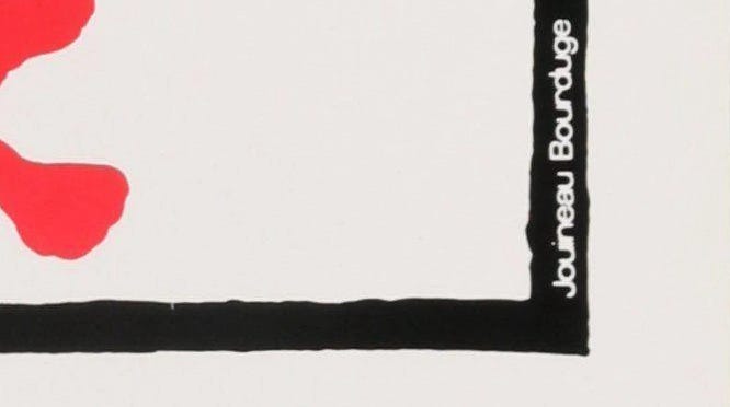
With Jouineau and Bourduge being one entity, it’s understandable since their byline appeared in their work. Jouineau and Bourduge are relatively unknown in the US compared to poster luminaries like Bob Peak, Richard Amsel, Robert McGinnis, and so we lazily duplicate these errors across the infobahn unchecked. As with much of Kubrick’s life and work, it is difficult to untangle myth from fact. A major theme of his was the shifting nature of truth and identity. Fitting, really.
As for the aesthetics of the poster, it is a masterpiece of graphic economy. The blackness of the figure and lettering is striking. The red of the rose, a wonderful bit of symbolism that relates to the many themes that run through the film. To add more layers to the origin story, the typography is hand lettered not by Jouineau and Bourduge but by celebrated illustrator Bill Gold, who created the custom typeface which is also used in the opening credits and chapter titles.
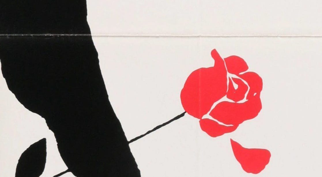
The contrast in styles between the image of the primitive flintlock pistol and pirate boots, and the more knowing, stylish typography, creates a powerful tension. This gives the poster its distinctive flavour and quality, elevating it. The boot stamping on the rose stem is a powerful metaphor, of a failure to commit, loves deception, love gone awry, the petal falling away, love lost. The rose also doubles as a bloodstain, referencing the last absurd dual scene. I love how Kubrick’s credits become more sweeping with ‘written for the screen, produced and directed by Stanley Kubrick’.
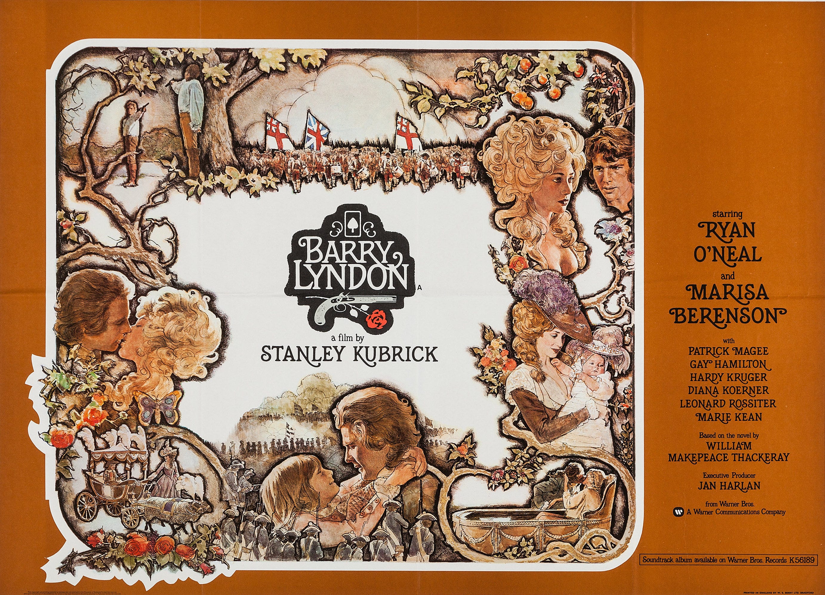
American artist and illustrator Charles Gehm created a more detailed poster, incorporating Gold’s lettering, which is a monumental work of intricacy. It is certainly beautiful, but of its time, and lacks the direct simplicity of the Jouineau and Bourduge poster, which rightfully takes its place beside Vertigo in well-appointed rooms and dorms of teenage cinephiles everywhere.