In UX design, usability is the ease of use of an interface, or how easily a person can learn and use the product. How can we evaluate the usability of a product objectively? From 1990–94, Jakob Nielsen developed broad rules of thumb known as heuristics that should be considered when objectively evaluating interaction design. These usability heuristics are:
1. Visibility of system status
2. Match between system and the real world
3. User control and freedom
4. Consistency and standards
5. Error prevention
6. Recognition rather than recall
7. Flexibility and efficiency of use
8. Aesthetic and minimalist design
9. Help users recognize, diagnose, and recover from errors
10. Help and documentation
We are going to take a closer look at how these heuristics apply in evaluating the usability of meditation app, Headspace. Launched in 2012, the subscription-based app helps users practice mindfulness by offering guided meditations in audio format with some supplemental video animations. The gamified series of meditation require users to complete certain “levels” of meditation before advancing on to other content that reflects the user’s progress. The app also features series and standalone “singles” for a variety of specific topics from “Sport” to “Fear of Flying”. Let’s take a brief look at the app from the lens of Nielsen’s usability heuristics.
Visibility of system status
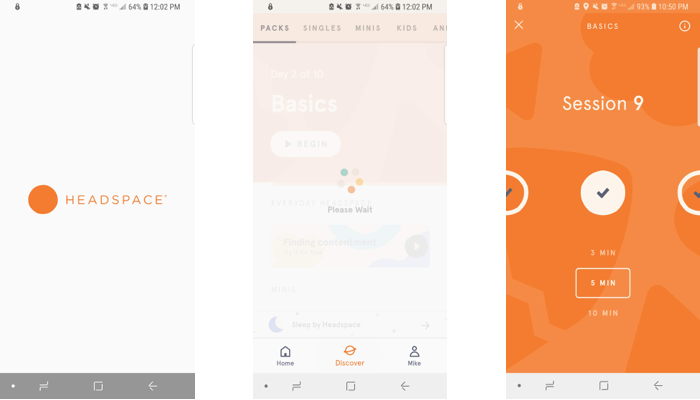
When pages or videos are briefly loading, a ring of rotating circles spins above “Buffering” or “Please Wait”, immediately indicating to the user that content is loading.
Match between system and the real world
For an English-speaking audience, Headspace is approachable in that the language is simple to understand, and even seemingly abstruse concepts around meditation are broken down into digestible explanations. The explanations are usually supplemented with adorable animation videos to provide a visual tool to further solidify understanding.
User control and freedom
Beyond the intuitive swiping navigation tabs and sub-tabs that allow the user to swiftly change pages, more specific pages consistently have a white X in the top-left corner of the orange screen that allows users to exit.
Consistency and standards
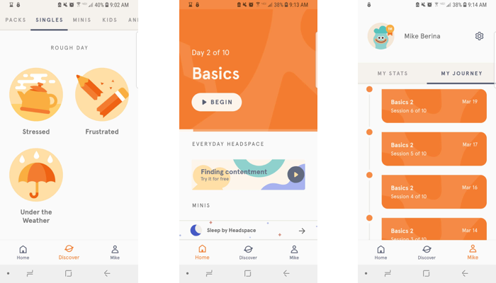
The app clearly communicates the type of content the user will engage in with very little room for confusion. Some examples of content include “Finding Focus” and “Managing Anxiety”. An exception that might not be so clear to everyone is a meditation called “Under the Weather”. For native English-speakers who are familiar with the idiom, it makes sense that it would be appropriately used for when spirits are low. However, for non-native English-speakers who may not have come across the phrase before, they might think it’s a meditation for a rainy day with its accompanying umbrella illustration.
Error prevention
The app design leaves very little room for user-input errors to occur with the user only selecting between options on most of the app that can easily be undone, and there don’t seem to be any extensive processes or urgent actions that might require a confirmation.
Recognition rather than recall
Each meditation can stand alone and doesn’t necessarily require knowledge from prior content to still add value to the user experience. Upon opening the app, the home screen picks up right where the user left off with the next meditation in the series so they don’t have to scroll into the series and guess which meditation they finished last. The app also indicates which meditations the user has completed with check marks, as well as laying out the chronology of every meditation the user has completed on their “Journey”.
Flexibility and efficiency of use
While reaching the content the user is looking for is fairly straightforward as is, accelerators for more expert users are available by allowing users to save “packs” to their homepage to find a meditation series without having to navigate through the main catalog and a skip feature to bypass introductory pages and videos.
Aesthetic and minimalist design
Text is very concise and simple, and there isn’t any excessive or irrelevant information competing for attention.
Help users recognize, diagnose, and recover from errors
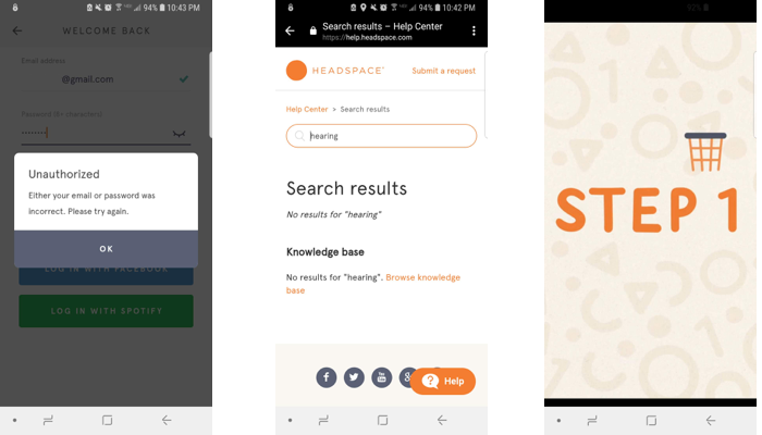
In the log-in / sign-up area, an error message prompts that either the username or password is incorrect. On the Support page, a keyword that is not found is prompted by a link to the Knowledge Base for further information and an optional chat icon.
Help and documentation
The “Support” area isn’t readily available from all pages on the app. The user has to go to their account page, and then click on a gear icon, which must be assumed to represent “Settings”. In this Settings menu is a Support button that links you to the Headspace Support page that features a prominent search bar, a list of common topics, and a means of contacting Headspace for additional support. The troubleshooting instructions list concrete steps and a prompt to contact Headspace if the problem persists.
Headspace does an excellent job in satisfying most of the usability heuristics outlined by Nielsen, but there is always rooms for improvement. Bringing more attention to the language used and considering the languages offered could improve the usability of the app.

Accessibility shortfall
While Headspace touts spreading meditation and mindfulness to the masses with Andy Puddicombe’s soothing British accent, it seems to be lacking for those who face auditory challenges. Can the audio guided meditations help someone who is deaf? Headspace supplements its widely categorized audio meditations with stunning animation videos that teach important lessons for approaching meditation. While some of these animations have some text peppered in here and there, the visual information doesn’t quite convey the information that is spoken. With no options of subtitles or transcripts, Headspace doesn’t quite offer the same experience for people with auditory disabilities.
Summary
Overall, the usability of Headspace is excellent in most areas, but there lies opportunity for improvement, especially with its accessibility. The meditation app satisfies most of Nielsen’s usability heuristics with some exceptions. The consistency and standards could be more clear with its use of language for its entire audience, and expanding its language offerings could improve its match between the system and the real-world. For the visually impaired, Headspace could play to their strengths with animated videos and offer visual guided meditations that could be just as helpful for those with 20/20 vision.