Posted on: 9 January 2024
A sketch on the back of a napkin, a few lines on the whiteboard, a fully interactive digital mockup – prototypes are anything that makes your ideas more tangible. Ranging from conceptual to concrete, they are excellent tools for communicating, testing, and even marketing ideas throughout a design project.
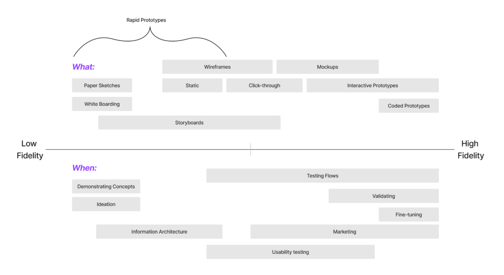
While most stakeholders understand the value of prototyping, many can be unclear about what purpose they serve and how to create the best prototype for the project’s current stage. The level of detail a prototype achieves will vary depending on how far along the project is, what kind of questions it hopes to answer, and the time and resources available. The sections below describe three broad categories of prototypes (Low, Medium, and High Fidelity) and give an idea of when, where, why, and how to use them.
Low Fidelity Prototypes
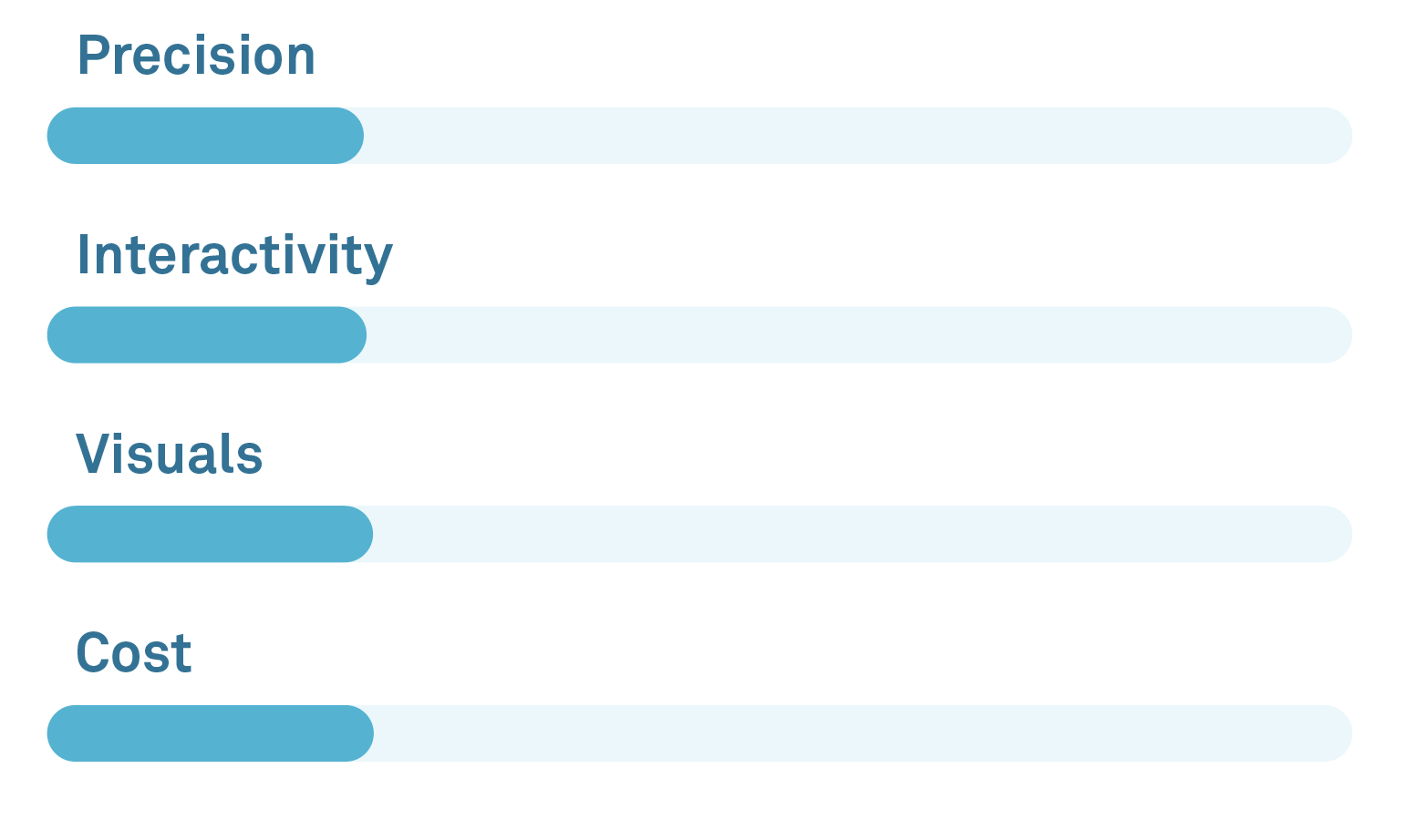
In the early stages of a design project, the concepts can be abstract and details fuzzy. Creating low-fidelity prototypes is an excellent way to facilitate early discussions with stakeholders and converge on a design direction. These prototypes place emphasis on demonstrating concepts while leaving aside detailed visuals, interactivity, and precision. They are simple, cheap, and easy to create, making them the ideal tool at stages where the design direction is in flux.
“Fail early, fail often, but always fail forwards”
John C Maxwell
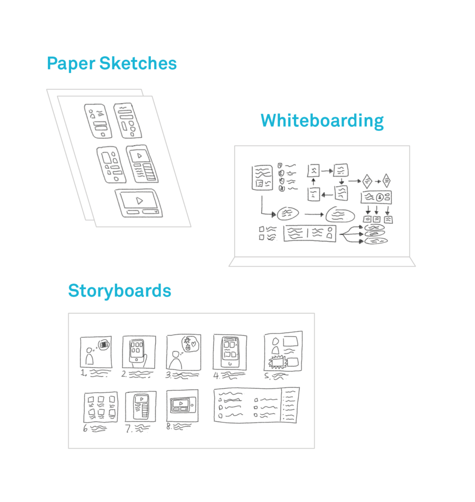
Examples of Low Fidelity Prototyping
- Paper sketches
- Whiteboarding
- Storyboards
When to use low fidelity prototypes?
- During early ideation and visualization
- Testing basic layout and high-level flows
- Gauging user understanding of IA, labels
- Demonstrating core functionality
Pros
- Cheap and easy to produce
- Quick to create, easy to iterate
- Low investment makes it easier for users to suggest (and designers to implement) significant changes
Cons
- Low precision
- Lacks interactions
- Do not capture the look and feel of a product
Creating Medium Fidelity Prototypes
The medium fidelity stage is where prototypes take on an increasing level of detail and accuracy. Medium-fidelity prototypes begin to represent the look and feel of a product, making them more suitable for user testing and feedback. They allow designers to ask more sophisticated questions and can lead to more meaningful insights.
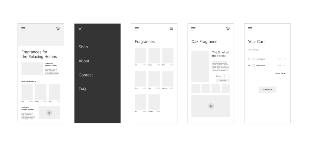
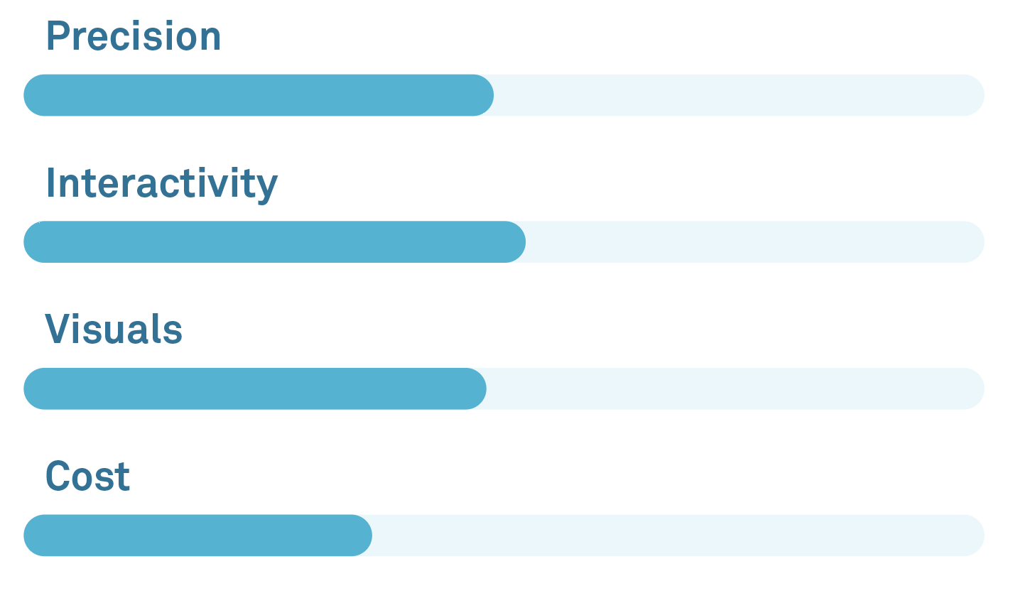
Often, stakeholders hear the word “prototype” and expect something approaching a final product, minus a few bells and whistles. At the medium-fidelity stage, too much detail can feed into this expectation and give stakeholders the impression that design decisions are more final than they really are. Designers should ensure that the level of detail a prototype achieves is appropriate for the stage of the project and the questions being asked. In other words, don’t add flames and a spoiler when you’re still deciding what kind of car to build.
Examples of Medium Fidelity Prototyping:
- Wireframes
- Click-through prototypes (linked static screens)
When to use them?
- When product requirements and initial design direction are established
- Testing basic workflows
- Testing the organization of information and general layout (content classification & hierarchy)
Pros
- Better represents the look/feel of the product
- Suitable for more thorough product testing than low-fi prototypes
Cons
- It is more time-consuming than low-fi but still leaves gaps in the user experience
- If not communicated properly, can cause confusion with stakeholders expecting a fully functional prototype
High Fidelity Prototypes
High-fidelity prototypes are increasingly sophisticated representations of a product that are useful in the later stages of a project when the final design begins to take shape. When major design decisions have been settled, questions arise about finer details like interactivity, visuals, and specific use cases.
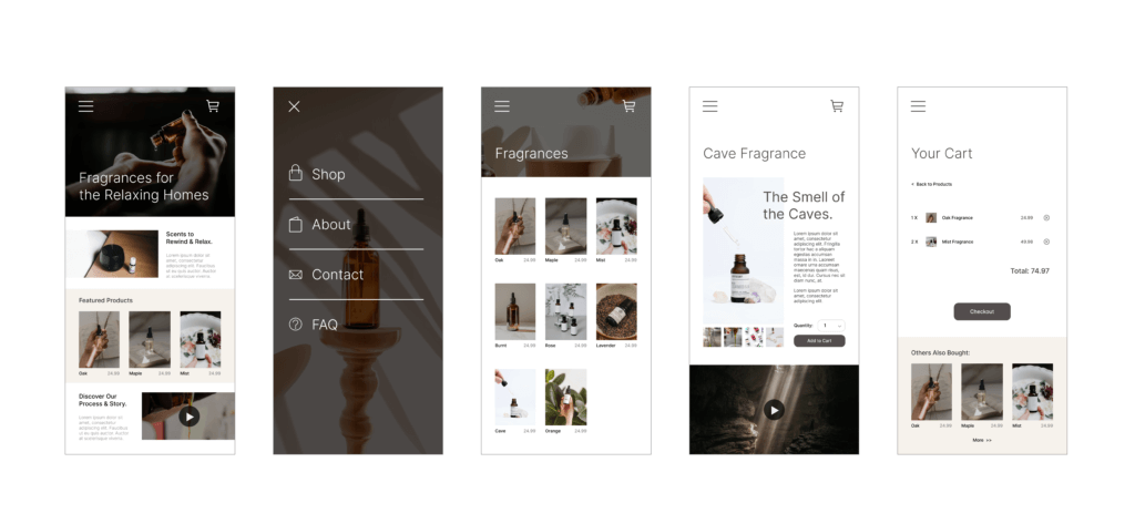
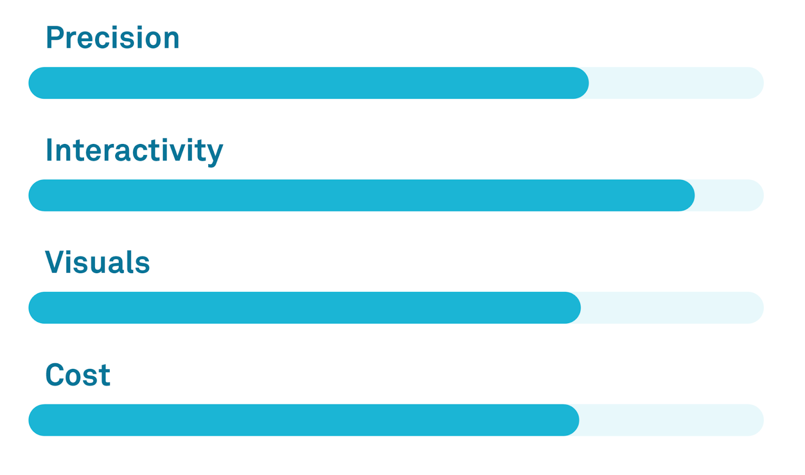
High-fidelity prototypes take more effort to create (and are often harder to change) but reward us with much richer insight into how our users experience the product.
Examples of High Fidelity Prototyping:
- Mockups / Interactive prototypes
- Front-end code (HTML, CSS)
When to use them?
- When the team has a firm understanding of how the final product should operate
- UX Testing
- Interaction Design
- Fine-tuning / Validation
Pros
- Looks close to the final product; feedback will be very accurate in comparison to future customer response
- Testers can provide feedback on more than just flow, such as overall ‘feel’ (with animations, transitions, etc.)
Cons
- It takes the longest to develop
- If there is a major issue detected during UX testing, then it will be a high cost in time and finances to go back and fix
Final Thoughts
The broad brush with which we apply the label “prototype” can seem confusing, but keeping in mind a few basic things can help us get the most out of these valuable tools:
- Know what question you’re asking
- Prototyping should be done with a goal in mind. The more specific the question you are trying to answer, the more effective your prototype will be.
- Avoid misconceptions, manage expectations
- Many stakeholders think of a prototype as an early version of the final product. Communicate clearly what the prototype is and why you are prototyping to avoid confusion and garner more helpful feedback
- Prototyping doesn’t have to follow a linear progression
- It’s okay to go back to low or medium-fidelity prototypes at later stages of a design if that will help answer important questions. Similarly, not all projects need to start with low-fidelity prototypes.
- Feedback is the goal
- A successful prototype is one that allows you to learn more about your users
Happy prototyping!


