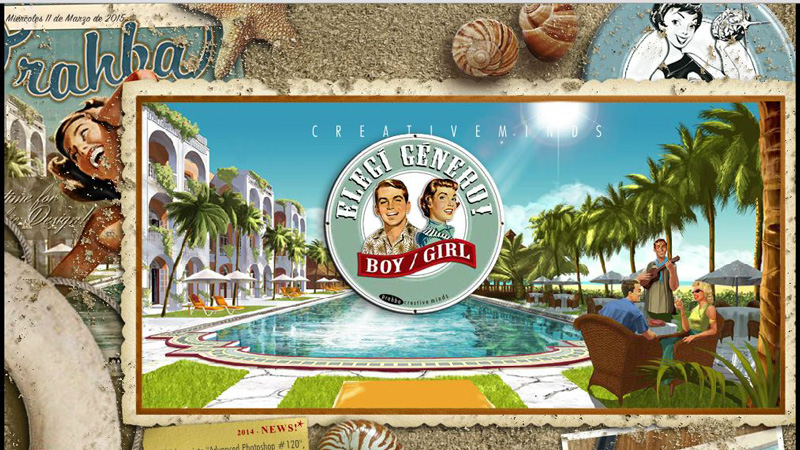
Fashion for retro and vintage style has gradually moved from podiums and fashion shows to website design. It has been actively used in a variety of contexts: in advertising, corporate design, blog design, etc. Moreover, nowadays you can even find webdesign studios that specialize in vintage designing only.
Retro Website Design
There are several old-fashioned graphic elements that are used in design to recreate a retro atmosphere:
- Texture: torn paper, ink texture, old printing paper
- Text: old-style typography, script fonts and handwriting
- Illustrations: images from old posters, old photos, pin-up girls images
- Images of old objects: radio and TV devices, cars
This article presents a collection of 10 best websites designed in vintage and retro styles. Perhaps the following examples will inspire you to create new, exciting projects on the Internet.
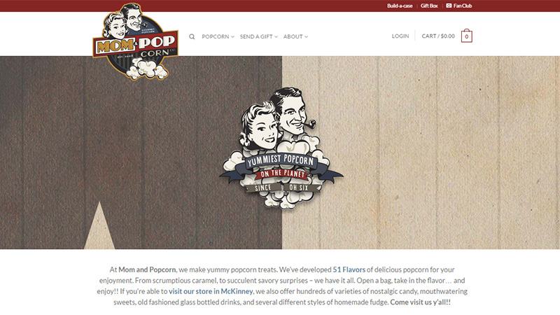
Mom & Popcorn
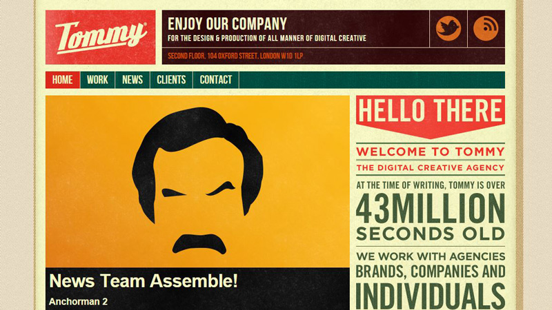
Tommy
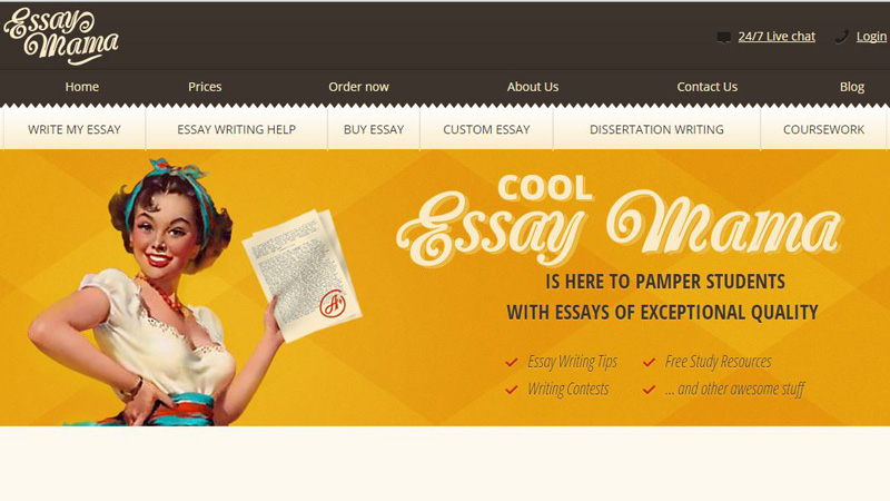
Essaymama
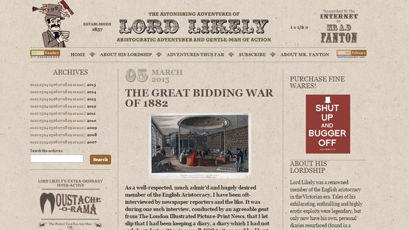
Lord Likely
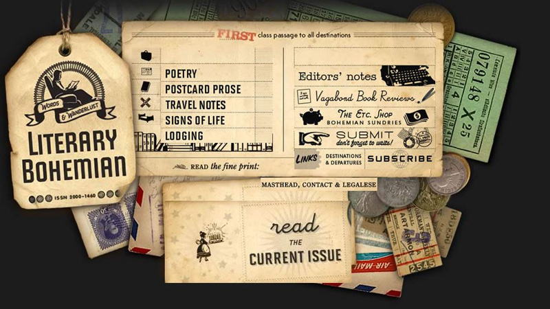
Literary Bohemian
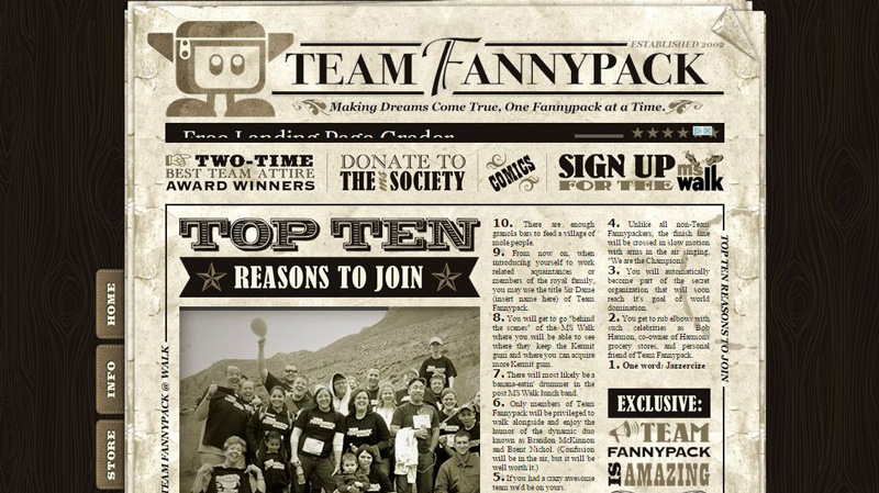
Team Fannypack
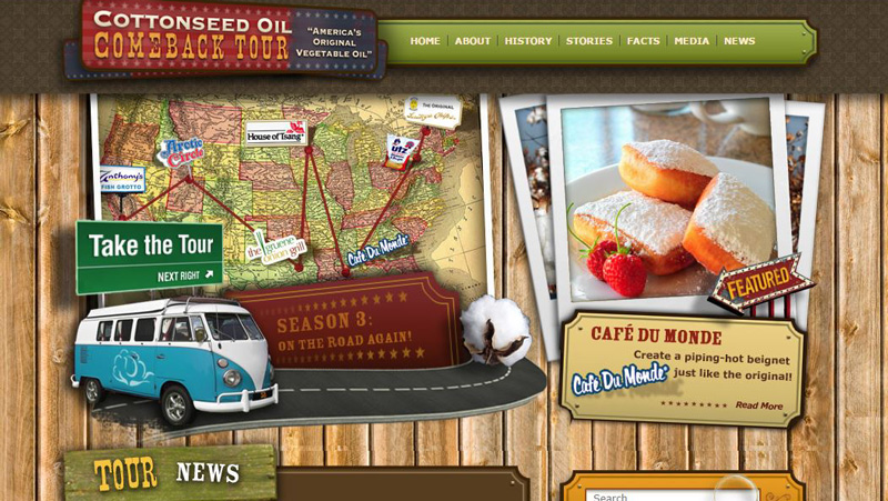
Cottonseed Oil Tour
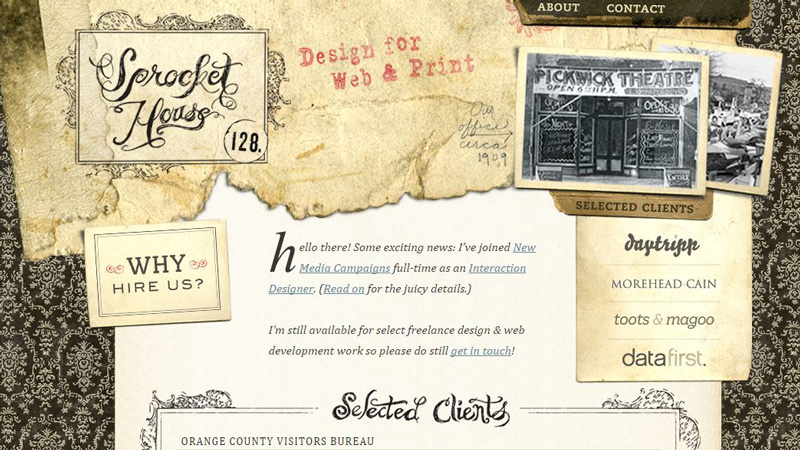
Sprocket House
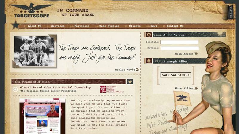
Targetscope
Prahba
Conclusion
Clients may think that retro web design can be used only for corporate styles of popular and stylish old time places like retro cafes, restaurants, barbershops or cinemas. However the collection above has just proved the opposite as vintage website design can be suitable for a variety of companies from different industries.
Obviously retro style can never get outdated as it doesn’t only evoke nostalgia, but is proven to be exceptionally moderate, laconic and attractive.
So what do you think, have designers succeeded in reviving the past on the modern web?
u

