With the current, huge trend of flat design, we don’t see so many 3D elements used in web design these days. Perhaps you can take the creativity out of design, but it is difficult to take the creativity out of the designer, and flat design doesn’t offer many opportunities for amazing creativity, so we are starting to see some mixing and matching of styles, where landing pages may have some amazingly creative effects and the rest of the site is in the flat design style.
It was not so long ago that 3D elements were trending, especially with the advent of HTML5 and CSS3, and we brought you a round-up of Inspirational HTML5 Websites with 3D Flavor Added. That was in December of 2011, and some of those site still have the same design and still look great. So 3D elements are still effective in web design, and here we have selected a round-up of examples of 3D elements in use today.
3D Elements in Web Design
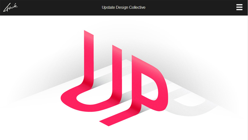
Upstate Design Collective
The development of this site is on hold at the moment – whether it will ever be fully up and running is unsure, however, the landing page currently has a beautiful 3D text effect element.
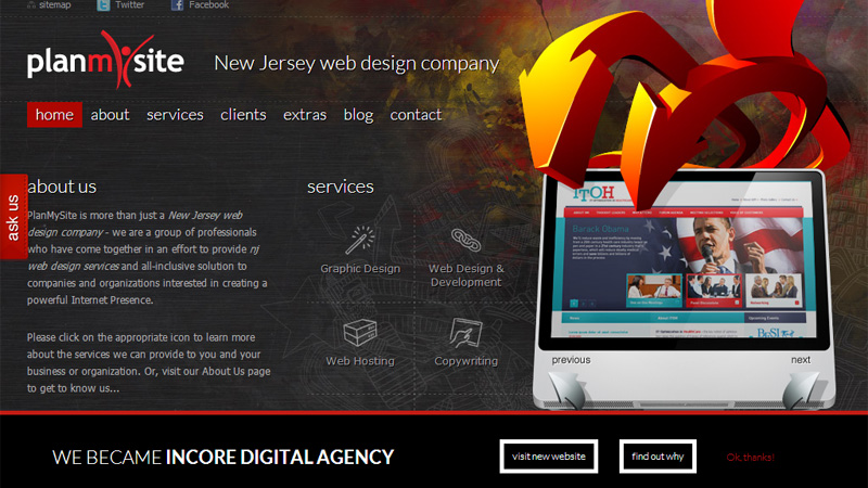
Plan My Site
The 3D image with a computer monitor and arrows is quite garish on this otherwise flat site.
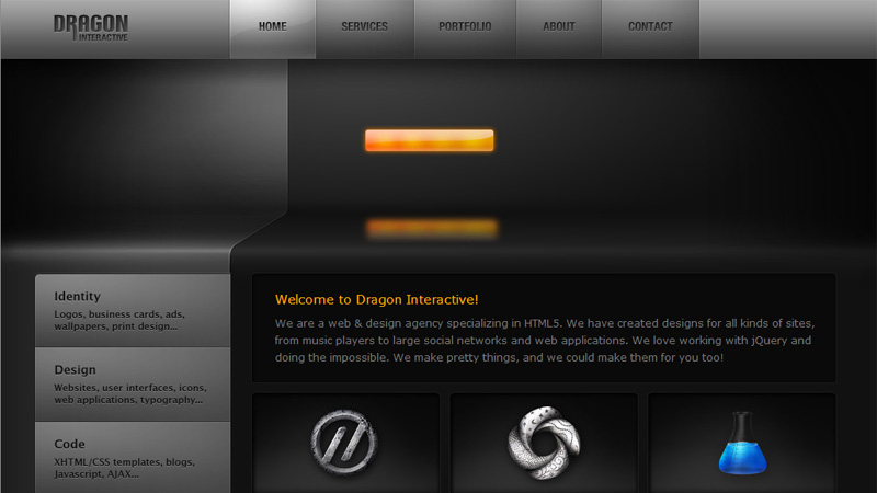
Dragon Interactive
Almost every element on this site is 3D. The site has a metallic appearance and the navigation buttons light up in different colors when you hover over them.
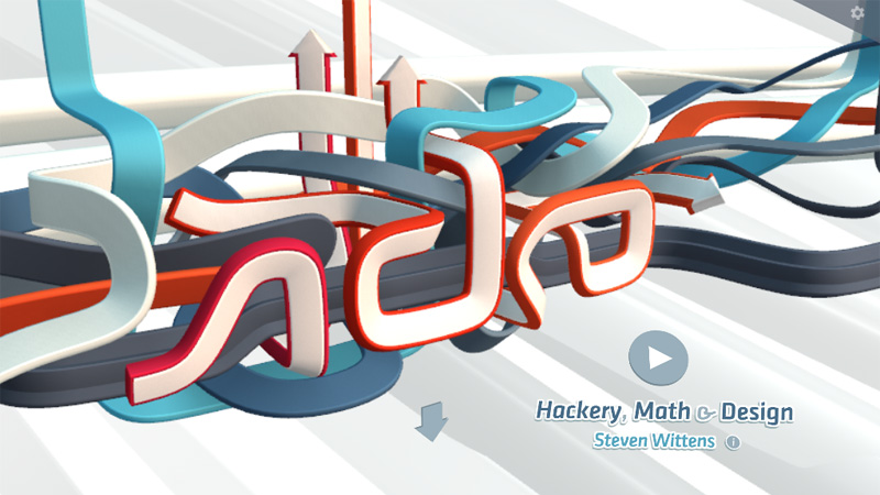
Hackery, Math & Design
The 3D network of arrows builds up as you land on this page. The rest of the site is in the flat design style.
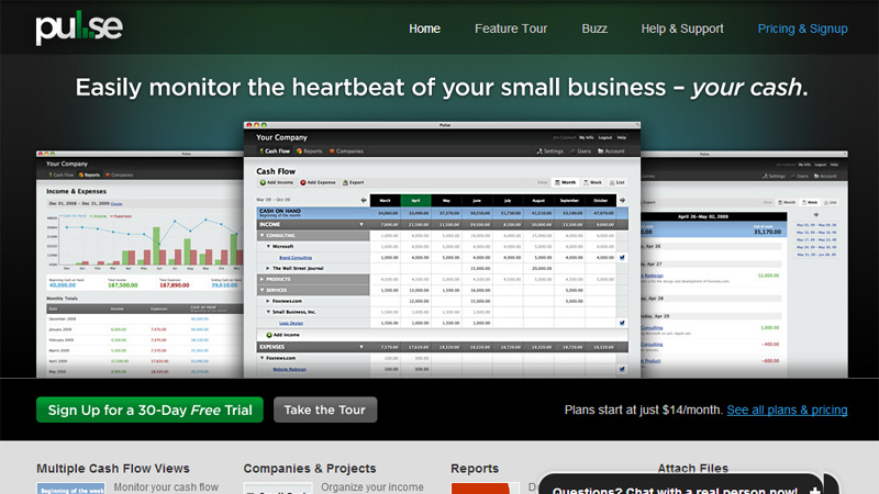
Pulse
Nice 3D effects to show different screenshots on this clean and business-like site design.
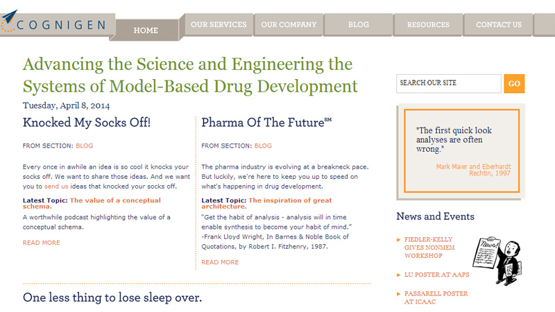
Cognigen
The top navigation bar is fairly ribbon-like and the depth of each section changes on mouseover.
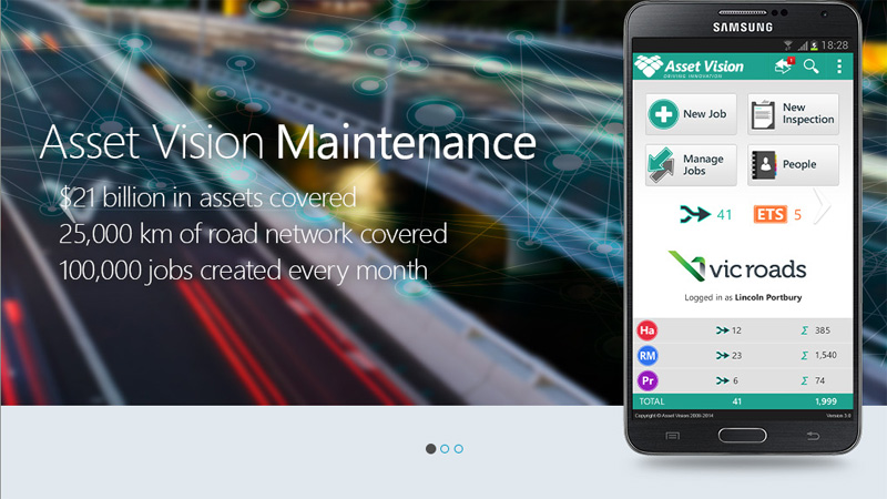
Asset Vision
The three images on the slideshow on the landing page of this site all have part of the image outside the frame with an added shadow to give a 3D effect. The rest of the site is completely flat in design.
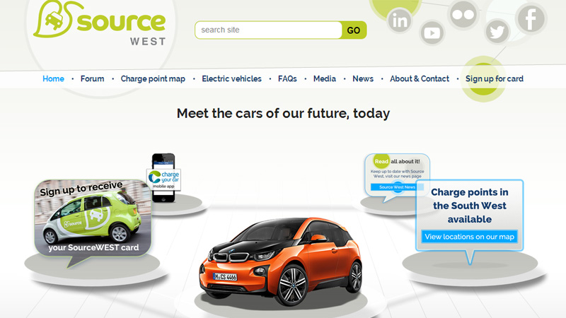
Source West
The discs that hold images with links to pages have shadows under them making them appear to be floating. Size and blurring give a great illusion of depth on this landing page.
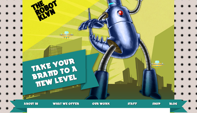
The Robot Klan
This Australian brand and marketing company have a really garish site with a lot of 3D elements – it is very different among sites using the current trends.
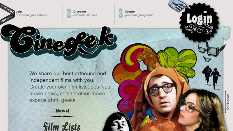
Cinegeek
This site mixes 3D elements with a grungy design – now that really is a blast from the past!
Webalys
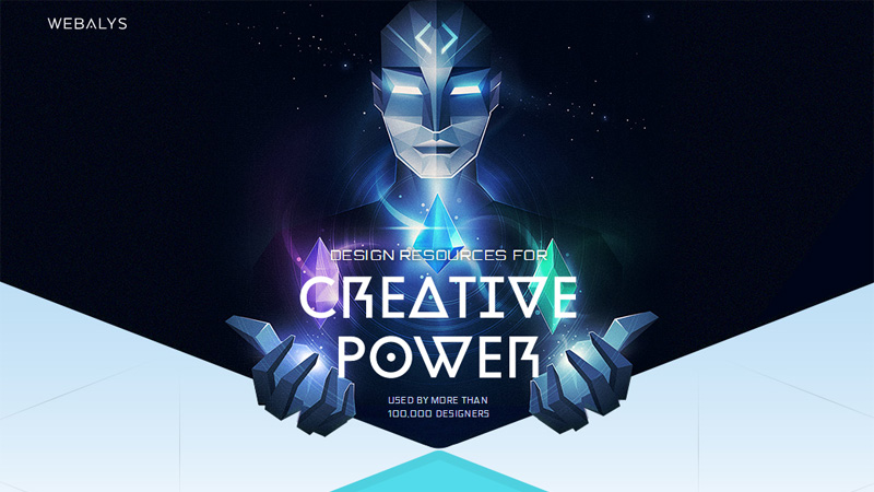
The robot-type guy on the landing page is the only 3D element on this site – the rest of the site is completely flat design.
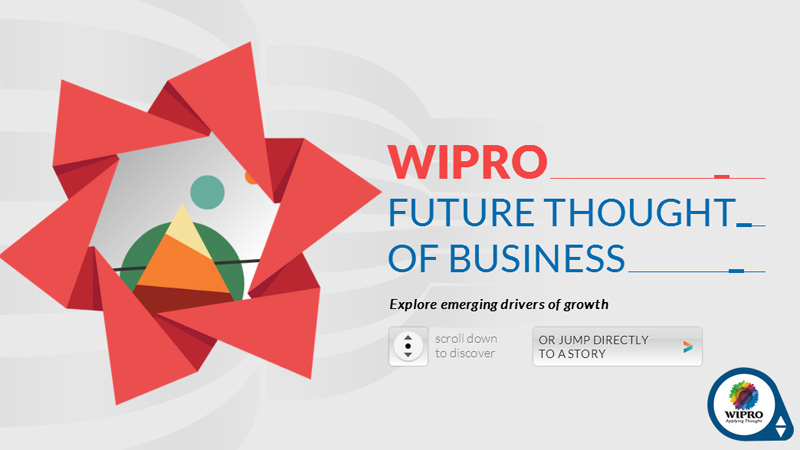
WIPRO
The touches of 3D effects on the landing page are the only deviations from an otherwise flat design.
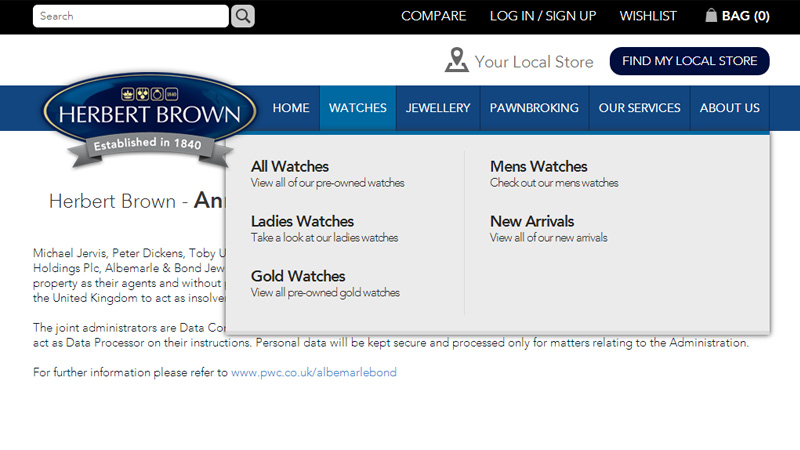
Herbert Brown
The ribbon under the logo and the drop-down menus are nice 3D effects on this site.
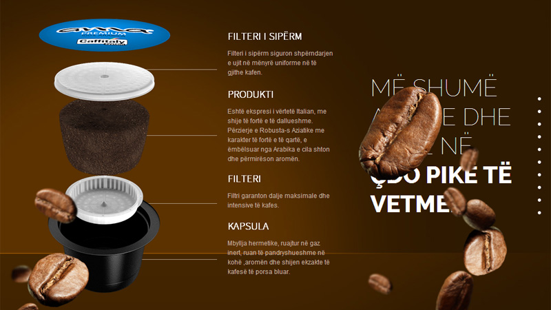
Ama Capsule
There are a lot of 3D elements on this site that has some good scrolling animations.
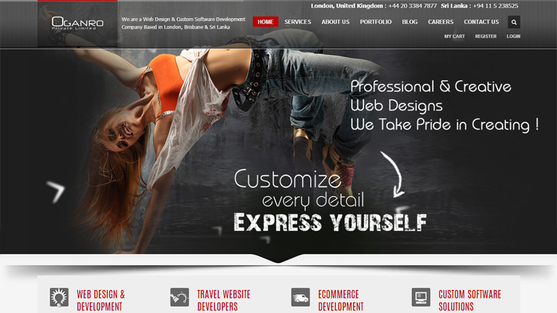
Oganro
The shadows under the bottom of the slideshow make it appear somewhat like a photograph laying on the page. The small amount of grungy text also adds to the design.
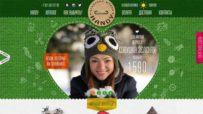
Handy Hat
This Russian site sells novelty knitted hats, and has quite a few 3D elements in their design, many of which resemble clothing tags, like the red tag on the right, which is the ‘Contact Us’ call-to-action.
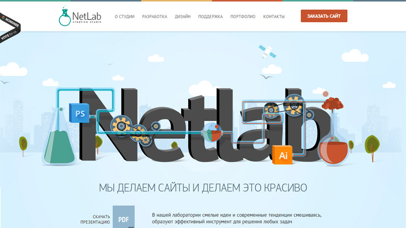
NetLab
Another Russian site – this one uses 3D text and Adobe product cubes, mixed with a flat illustration. The rest of the site is in the flat style.
Stodge Podge 2014
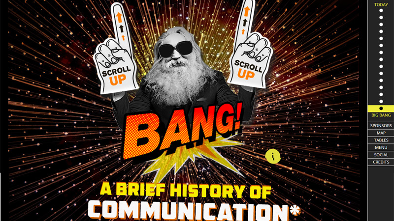
This site has a lot of 3D effects, as well as some good scrolling animations and scrolling effects.
My/Static/Self
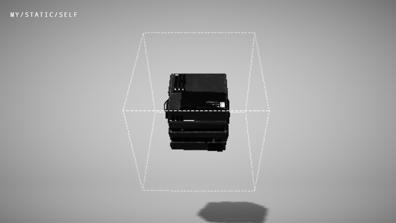
This is the site of software developer John Iacoviello. The 3D machine in the center of the screen is slightly animated, and hovering the cursor over it brings up the page links.
Special T
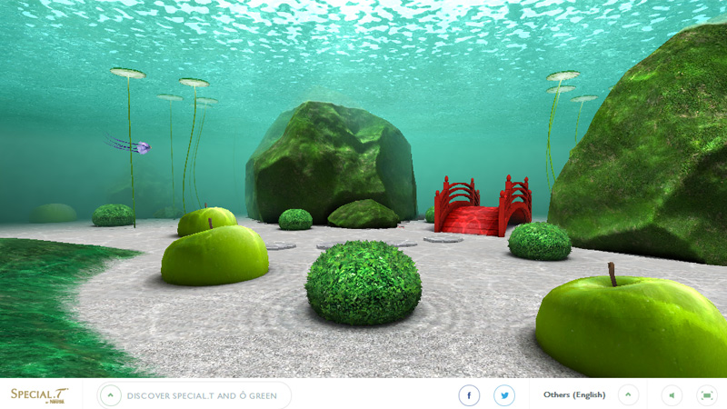
And finally… this is an amazing, totally 3D experience. Moving your mouse guides you around this under water fantasy world… all to promote a green tea! Maybe not a 3D element, but definitely worth a visit!
Conclusion
With so many users viewing sites on mobile devices these days, it has been difficult to see how trends are going to progress from flat design without creating extra work for developers, but perhaps mixing and matching styles is going to be the way forward.
What is your opinion of adopting more than one style in a design? Do you still use 3D in any of your designs, and does it depend entirely on the company you are designing for? Please share your links and opinions with us in the comments section below.

