Designing ecommerce websites are a whole world onto itself due to how they’re used compared to other sites on the web. First of all, ecommerce is a service that customers use for purchasing goods, so the usability of an ecommerce website is a serious topic. For anyone out there with a business, you know how important it is for customers to be able to get what they want, whether it’s off a shelf or on a website.
This all comes together into what’s called user experience, or UX for short. It has become a whole new field onto itself, and ecommerce takes a lot from good UX design. A big part of that design is a well-made product detail page that shows just about everything you need to know about a product without being too boring or too complicated. The customer must be able to understand the major details of a product with a quick scan of the page, then be able to access additional details when desired.
As you most likely can tell by now, it’s not as easy as it looks. Designing a proper product page is an endeavor onto its own, requiring a good bit of thought and consideration to come up with a good one. For those who want to dive deeper into the user experience of a product page, here are the some crucial UX elements you need to look closely at in order to make an ecommerce website that people would actually want to buy from.
Product Name
The name must be readable at first sight. It’s pretty much the first thing the customer should see, along with the product image. The standard format of the product name should contain the brand name, model number, the kind of product it is, and any other designation it may have, and not much else.
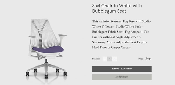
Source: Sayl Chair in White with Bubblegum Seat – Living Edge.
That’s pretty much what they have to go on when they browse or search for whatever they’re looking for, so they have to be descriptive while being brief enough at the same time.
Product Image
Simple and up front, the product image should feature the product in the clearest and highest quality possible. If you can have its picture taken against a neutral background, that’s even better. The disadvantage of shopping online is that you don’t get to view the product physically up close when browsing, so the next best thing is to see detailed image of it that gives you a good idea of what it looks like.

Source: Snapback Caps – Unique Apparel Clothing.
Also make sure that the image shows off the product’s most defining features as that can be a factor in making people understand what the product is and even make them want to buy it.
Gallery / Further Photos
Having a gallery of images that show it in front, side, and rear view, as well as other accessories if that applies, is pretty much the standard these days. Many people would think that one photo isn’t enough anymore since you’d like to see what it looks like from other angles. Therefore, if you really want to provide a good user experience with your ecommerce website, then you’d put in the extra effort and have a gallery for product images so they can see it as thoroughly as possible. If you’re able to show its scale, that would be great as well.
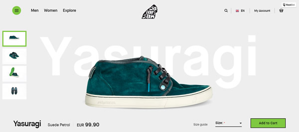
Source: Suede Petrol – Satorisan Shoes.
Specification
This is the most detailed part of the product page as it contains most of the in-depth information about the product.
There are many ways to go about it, like having the details in table form as the best way to go about it, as well as a paragraph or two about the product. Details like model number, dimensions, weight, color, and other physical and technical details should be listed clearly in table form for best effect.
Examples of Well Detailed Specification Element for Your Product Page:
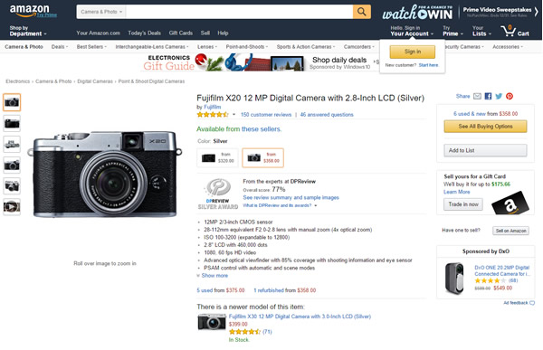
Source: Amazon – Fuji Camera.
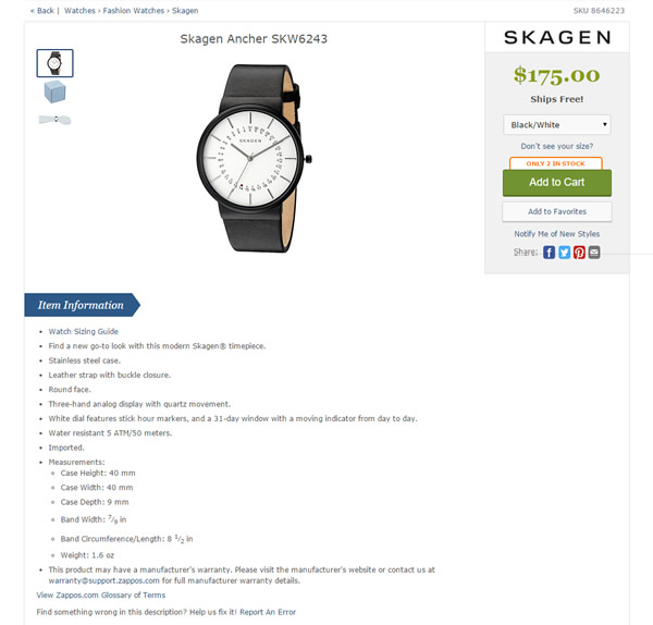
Source: Zappos – Skagen Watch.
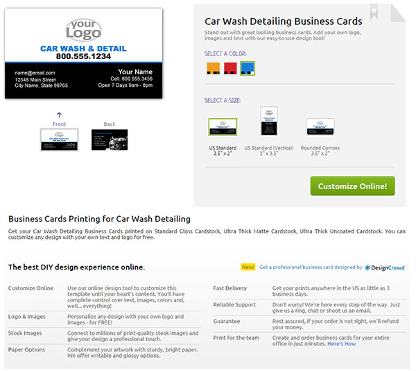
Source: YouPrint – Business Card.
Price
This is a very important part of the product page since the customer needs to know how much the product is. The selling price has to be highlighted and easily visible, so it should be sufficiently enlarged and put somewhere near the product name and image.
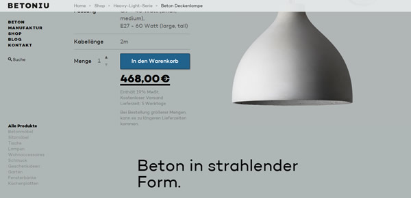
Source: Beton Deckenlampe Kaufen.
For ecommerce websites that ship internationally, you’d want to give the option of showing the price in different currencies, as well as have a system that calculates shipping and handling costs. If there are promos or discounts included, the price must indicate it in order to inform customers of it.
Buy / Add to Cart or Basket Button
Of course, this is the one thing you can never make a mistake with in an ecommerce website. The button should be clearly visible and in a place where it doesn’t get in the way of the other elements. The customer need only click it when he/she is sure about buying, or at least putting it in the cart. Also make sure that the button does what it’s supposed to do and put the desired item in the cart since there’s nothing worse for user experience than things that don’t work.
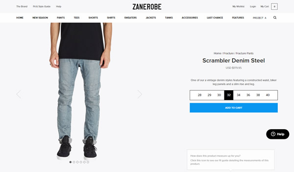
Source: Scrambler Denim Steel – Zanerobe.
Conclusion
The most important thing here is how all these small, yet critical elements work together to help customers buy whatever they want to buy. Building and maintaining an ecommerce website is hard work, and it’s even harder work to have customers buying your stuff by making the website as usable and approachable as possible.
When you have it all together, then you’ll definitely have an ecommerce website that will get good business. All that’s left after that is selling products that people actually want and having people know that you exist in the first place.
