Grid frameworks are the flexible way to make more responsive and cross browser compatible websites. With the huge impact of smartphones, there is a need to get your website compatible with mobile devices as well as classic PC browsers. Here comes the need of these grid frameworks and tools. Web designers are working tremendously well on website design evolution, now there are more visitor engaging websites rather than filthy web designs. People like to serf more websites and spend more time due to these responsive websites, most of the credit goes with grid frameworks & tools.
These fluid grid frameworks set the resolution of your website as per the device screen resolution it is being served on. Following 15 grid frameworks & tools are so helpful for web designers and keep them engage in design process of responsive websites. These are free grid frameworks and will help you to get your responsive website easily and effectively.
320 and Up

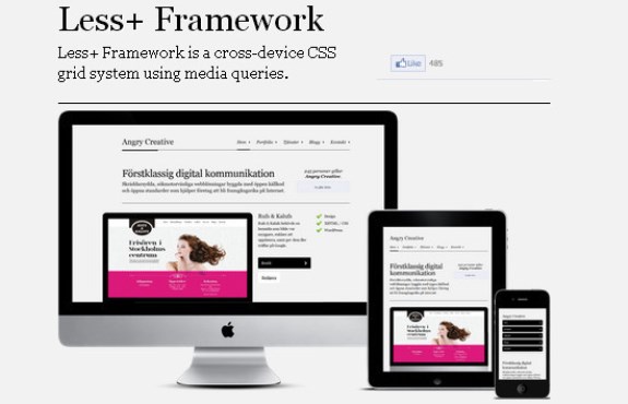
Less+ Framework
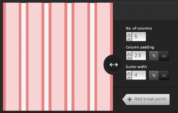
Responsive Calculator

Gumby

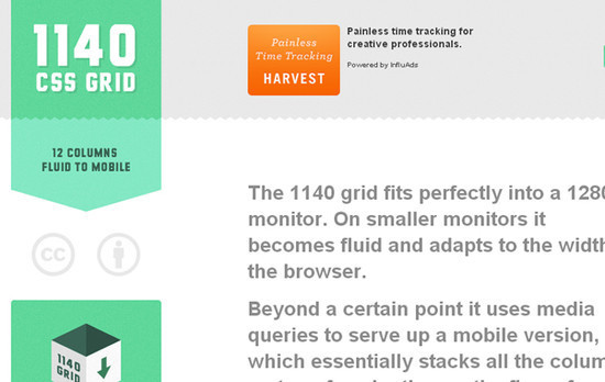
1140PX CSS Grid
Responsive Grid System

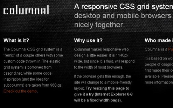
Columnal CSS Grid System
Titan Framework

Semantic Grid System

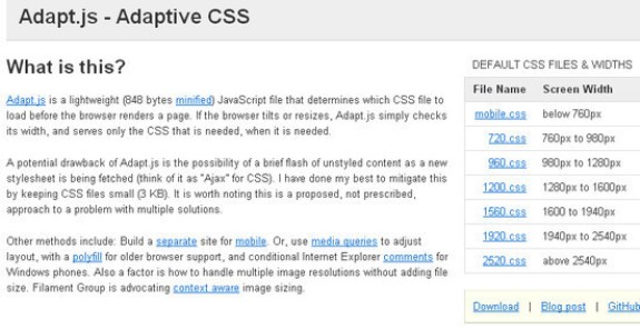
Adaptive CSS
Golden Grid System
Gridless

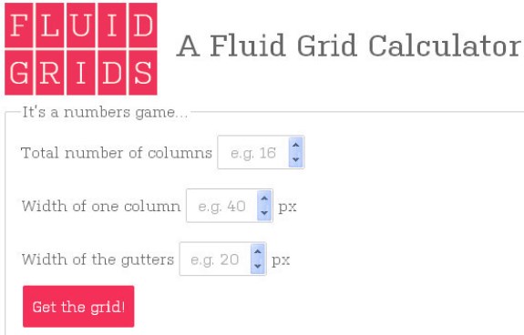
Fluid Grids
The Grid
Gridpak