In web design nowadays we’re quick to assign an “ism” to any passing trend. But no matter how arbitrary or fleeting they are, these isms can be important to understand.
“Isms” in the art and design world come from artistic movements; styles and philosophies practiced by a group of artists and designers, usually with a particular objective, often during a specific period in time.
The “Bauhaus Movement” from the early 20th century is one you’ll likely have heard of. Born of a small design school in Germany (The Bauhaus), its principles and practitioners pushed modernism and minimalism in design and the idea that “form follows function”.
Isms for the Modern Web Designer
Not all the isms you’ll have heard in art history class have their obvious web design equivalents but let’s have a look at 13 web design isms, what characterizes them, their origins, where you might have seen them, and how they can influence your work as designer.
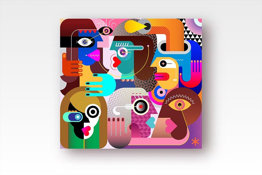
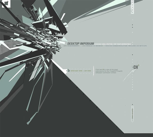
1. Cubism
Cubism is an example of an art movement which is often used as an influence in web design, rather than being a web design movement itself. It’s argued to be the first style of abstract art which came to light at the beginning of the 20th century. Pablo Picasso and Georges Braque were its main advocates at the time.
Cubism’s primary characteristics are:
- Art with multiple viewpoints simultaneously.
- Fragmented and angular.
- Information presented in non-linear fashion.
- Geometric shapes.
- Monochromatic color palette.
So where might we have seen cubism in web design? Despite the style being more than 100 years old, it’s certainly still in fashion.
You can still see cubism-inspired web design in patterns and graphics, like the below. Adding bright, contrasting colors modernizes the style and brings it very much into the 21st century.


Not to forget the strong use of geometry within cubism, which is used regularly across modern web design, like the below.
Can the geometry we’re so used to seeing within modern web design be linked back to Picasso and pals? I’ll leave that to you to debate!
2. Abstractionism
Again, abstractionism isn’t so much an artistic movement or a web design philosophy, but abstraction is certainly something which is used in web design. Abstract art uses geometry, form and color to communicate, rejecting traditional depictions of familiar objects. Cubism certainly had its roots in these principles.
“Abstraction is the modification of representational forms. We reduce a shape to a more simple shape, but still maintain connection to the actual thing.” — Alvalyn Lundgren
There are plenty of examples of abstract web design—look out for it during your next scroll of the internet and you’ll no doubt find it!
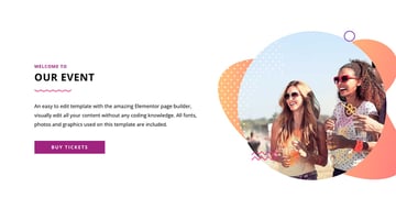
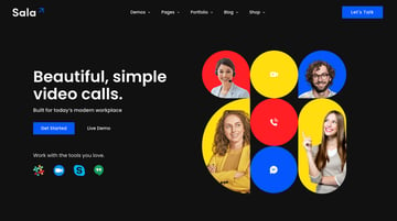
Take a look at the bold shapes and patterns used within this modern web design example.


The artist Wassily Kandinsky is widely regarded as the pioneer of the abstract art back in 1911—can modernism in web design take its roots from the movement? What do you think?
3. Biomorphic Abstractionism
I’ve done it again, this term isn’t really ever used in reference to web design. But I’ll bet if I describe organic shapes, reminiscent of natural elements, you’ll instantly think of websites like this:


Although strongly linked to classic abstractionism, the biomorphic element describes the use of rounded, abstract forms based on those found in nature. The design is more closely linked to living forms such as plants or the human body.
This is why this design trends works so perfectly with animation—add movement to the abstract and the designs come to life.
“Art should melt into and even merge with nature itself. This is obviously contrary to painting and sculpture based on nature.” — Jean Arp
As well as within art, biomorphism can also be spotted within architecture. Check out the 2008 Olympic Stadium in Beijing, China, for a classic example.
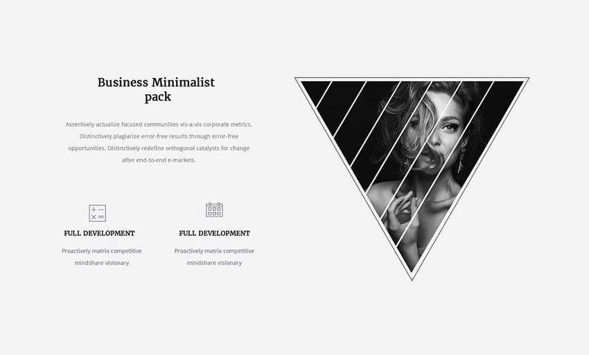
4. Minimalism
In the world of fine art and architecture minimalism is characterized by extreme abstraction, simplified shapes, geometry, clean lines and colors.
Flat design arguably has its roots in minimalism.
In terms of web design it’s regularly misunderstood, often interpreted as being design devoid of color and any detail whatsoever.
It’s not just a visual strategy, however. And by swinging the design axe, cutting and hiding as much as possible from a design, you might actually be increasing complexity and going against the core idea of minimalism.
Instead, minimalist design should prioritize the essential, showing only what’s needed to help the user achieve their goal. If part of that process means having the global navigation visible at all times, so be it!
“Ensure that the visual elements of the interface support the user’s primary goals.” — Jacob Nielsen

5. Maximalism
An aesthetic of excess. “More is more”, in contrast to the “less is more” philosophy of minimalist design. Think Flash intros and gratuitous animations.
Technology plays a huge part in web design trends, and in the early 2000’s while Macromedia/Adobe Flash was a prominent tool for creating web experiences it seemed every website needed an animated welcome/loading screen.

The more extravagant the design, the more immersive and spectacular the experience, the better a website was perceived as being. Designers flexed their multimedia muscles to absurd degrees, but at least it encouraged creativity.
6. Modernism
Modernism can be thought of as the rejection of everything that came before it. It heavily impacted art, architecture, design, and literature and probably remains one of the most well-known ‘isms’ to this day.
Particularly prominent between the World Wars, it was largely based on the idea that the world had to be rethought.
Characteristics of modernism include:
- Experimentation with form (shapes, colors, and lines).
- Rejection of history and conservative values.
- A rejection of realism.
- Simplicity.
- Beauty in functionality.
- Embracing minimalism over ornament.
One of the most influential architects of the 20th century, Mies van der Rohe, was famous for strictly following the “less is more” philosophy when it came to design. His designs strip back the detail and are effortlessly beautiful in their simplicity. Check out some of his designs which decades later still look modern and remember just how much of a break with the norm they would have been at the time.
The idea of rejecting what’s come before in favor of simplicity can be seen again and again in modern web design.
Think about search engines, for example. In the mid 1990s, sites such as HotBot and BackRub graced our screens. Bright and colorful with plenty going on on the screens, in comes a simpler Google with a plain white background and limited info. The design has become simpler and simpler to leave us with the solitary search bar we have today.
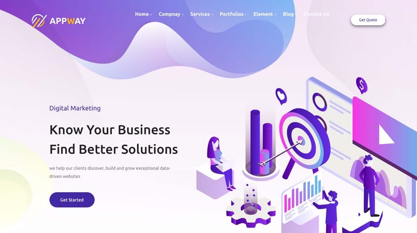
Look out for minimal web design and see what you discover! Take a look at this example to see how modernist design can influence modern web design.


7. Post-Modernism
Are you ready for another “ism”? The next up is post-modernism! Spanning an era of roughly 40 years between the 1920s and 1960s, post-modernists rejected the modernist dedication to the new.
This led to a ‘collage approach’ where modern elements merged with more classical nods to the past.
Characteristics of post-modernism:
- Anti-establishment.
- Refusal to follow one single style.
- Dissolving the distinction between high culture and mass or popular culture.
- The recycling of past styles and themes in a modern-day context.
So, what would be an example of post-modernist web design? Think about ways you could reject the norm, i.e. when designing a business website, picking a typography that’s unexpected in the context. Or you could follow web design convention, but then poke fun at the fact you’ve done so.
It’s a fun ‘ism’ with plenty of opportunities to stand out!
8. Vintage Modernism
Enter the next ‘ism’—if you’re new to vintage modernism, this trend is pretty much spelled out in its name! The vintage modernist style is heavily influenced by the 20th century. Think Sherlock Holmes, industrial print presses, wax seals, and ribbons all merged with a hint of Art Deco.
Although vintage modernism has its roots firmly in the past, the ‘modernist’ style element is its mix with clean layout and strong typography. A limited color palette is also at the heart of this style, with sepias giving us another nod to times of yesteryear.
9. Skeuomorphism
Something which is skeuomorphic uses visual cues to represent its original (usually “real world”) counterpart. This realism gives design “affordance”, perceived behavior which suggests how the user should interact with it.
When we think of skeuomorphism we tend to think back to the earlier days of iOS and the icons and interfaces of mobile apps. We weren’t so accustomed to touch screens and digital interfaces in those days, so the familiarity which came from textures, tangible dials, and 3D buttons helped us along perfectly.
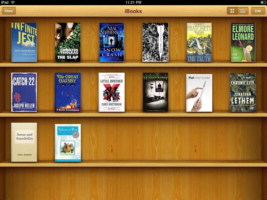
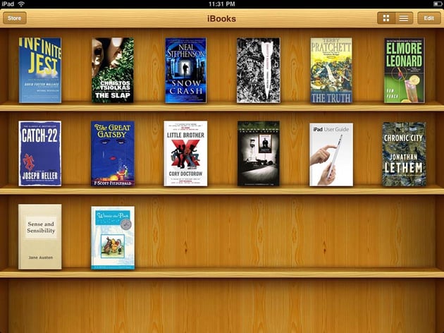
The original UI for Apple’s iBooks on the iPad is a common example. The eBooks sat on wooden shelves, and when opened used paper textures, with a spine, and page-turning interaction. You might say users were somewhat spoon-fed.

Another classic example of skeuomorphism is the case of the original Instagram icons, designed by co-founder Kevin Systrom and Cole Rise respectively.
No doubt was left for the user: this was a photography app! The newer (and by now ubiquitous) logo was introduced by Ian Spalter back in 2016 while Flat design was enjoying success and is much more conceptual, relying on some interpretation and familiarity from the user:
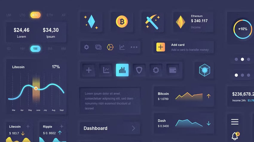
10. Glassmorphism
And next we naturally move to glassmorphism, which was the natural progression from skeuomorphism.
With the technique only earning its name in 2020, glassmorphism is a technique that enables designers to give their work depth and texture. It’s when you combine a blur effect with transparency, meaning the pixels look slightly opaque—almost like glass.
Glassmorphism is different to skeuomorphism in that the style isn’t supposed to look exactly like glass, but instead is supposed to evoke a feeling of it.
This design style has become such a big part of modern web design that you’d be forgiven for almost forgetting it’s there. Think about the folders used to categorize iPhone apps—classic example of glassmorphism right there.
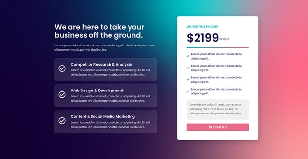
Glassmorphism is a handy tool to have up your sleeve, partly to draw attention to useful UI elements while maintaining minimal web design. Think buttons, navigational options, sliders, and other UI elements—all can benefit from a touch of glass!
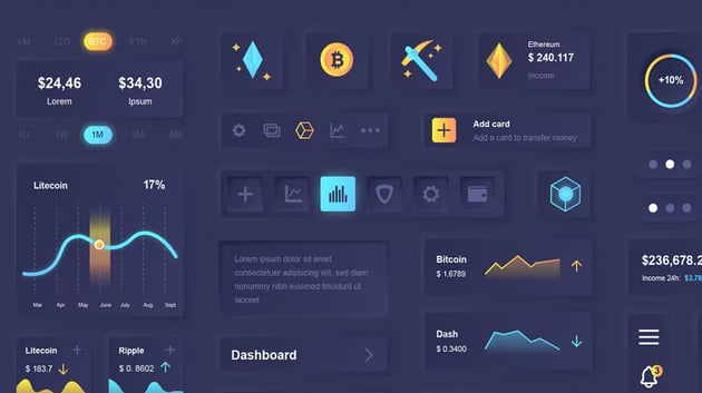
It’s also commonly used to highlight essential calls to action or other key text sections. Check out how it’s used below, for example, with the technique helping to draw the eye to pricing features.


11. Neumorphism
Soft, glassy, misty, and certainly with depth. Neumorphism was a response to the flatness of UI design since skeuomorphism waved goodbye.
So, what actually is neumorphic design? Let me explain. Rather than focusing on the contrast between real and digital worlds, neumorphism is centered around the color palette of the entire screen. It’s a desire to create an entirely unique experience for users.
If you’re following a neumorphic design aesthetic, you’d create an entire iOS or Android interface for an app, for example, and place UI elements behind the background. This differs to placing UI elements on top of a design and gives the feeling that buttons or cards are actually inside the background.
The minimal web design trend opts to remove any unnecessary elements, instead letting the function guide the form! Texture is at the heart of this style.
12. Brutalism
Brutalist websites, like their architectural cousins, are an antidote to the more popular, softer web.
Brutalism has been part of architectural lingo for over half a century, referring to a raw form of architecture with characteristics such as rough unfinished surfaces, unusual shapes, solid materials (like concrete), massive forms, and contrasting small features.
During a time when web design is obsessed about offering users empathy and understanding and products intentionally entice customers in the friendliest, easiest ways possible, brutalist web design is a rebelling against it.
Looking at brutalist websites, adjectives such as these spring to mind:
- Harsh
- Rough
- Rugged
- Uncomfortable
- Raw
- Confrontational
- Cynical
So how does brutalism reveal itself in modern web design? It goes beyond purely aesthetics to the nuts and bolts of the website—its code. Brutalist websites will tend to have crude, simple markup, inline styles, a lack of optimization, but also nothing complex to weigh things down.
Color-wise, it probably won’t surprise you to hear the palette is more limited than it is in more typical website design you commonly see today. It favors traditional colors that were available in the early manifestations of web design—a gray, a blue, a red, for example. A simpler time! Did you have a MySpace profile back in the day? I’ll guess it was a perfect example of brutalist web design.
Imagery also typically removes the editing that we’ve all grown so accustomed to seeing online. Forget flattering Instagram filters, enter raw imperfect photography. Think the sort of pictures you’d get after taking your digital cameras on a night out back in the mid 2000s. Need I say more.
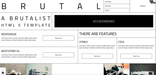
Feeling this vibe? Check out this unapologetically brutalist web design template.

13. Neubrutalism
Flat hasn’t gone anywhere, as the website for every web designer’s favorite tool (Figma) will tell you.
Neubrutalism is the offspring, if you like, of brutalism. It retains the edge of brutalism, but combines it with more modern animation, illustration, and text standards.
What are the common traits of neubrutalism?
- Ugly (ish)
- Clashing colors
- No gradients
- Modern typography
- Animations
This is one of those web design trends that is unapologetic about breaking the status quo. Colors can clash to the point that it’s almost difficult to look, which in turn cleverly captures the user’s attention.
The style abandons gradients used so frequently across the web, preferring clunkier styles. However, the use of beautiful animation or other modern design techniques firmly place the style in modern web design—techniques like this almost there as a reminder that the more retro or even ‘ugly’ design elements are a choice rather than an inability to follow web trends.
Check out a few classic neubrutalist examples below.


As you can see, there are plenty of different ‘isms’ to inspire your next design project! Design influences can come from anywhere—either from centuries-old movements or nods to material objects. What links each one is either a rebellion from a past movement or a desire to add a personal stamp on it.
The biggest question is, what will the next ‘ism’ be?