As our lives become more hectic, so does our eating. We aren’t necessarily eating more, but eating faster. The way that we live our lives today results in us wanting either fast food or food on-the-go as we simply don’t have time for homecooked meals these days!
Many fast food chains aren’t just well-known for their food and beverage offerings, but their logo as well. In fact, most well-established food brands have rarely changed their logos since they first launched many years ago. Logos such as Coca-Cola and McDonald’s are easily recognisable simply by looking at their logo; this is a sign of great branding and establishment of their company.
If you look at the design aspect of well-known fast food logos, you may notice a few similarities; the majority of brands use primary colours red, blue and yellow. Not only does this create a strong presence against other companies, but the primary colours also plant deeper into our brains, allowing us to remember the logo a lot easier than we would have done had the company used purple, white and pink, for example.
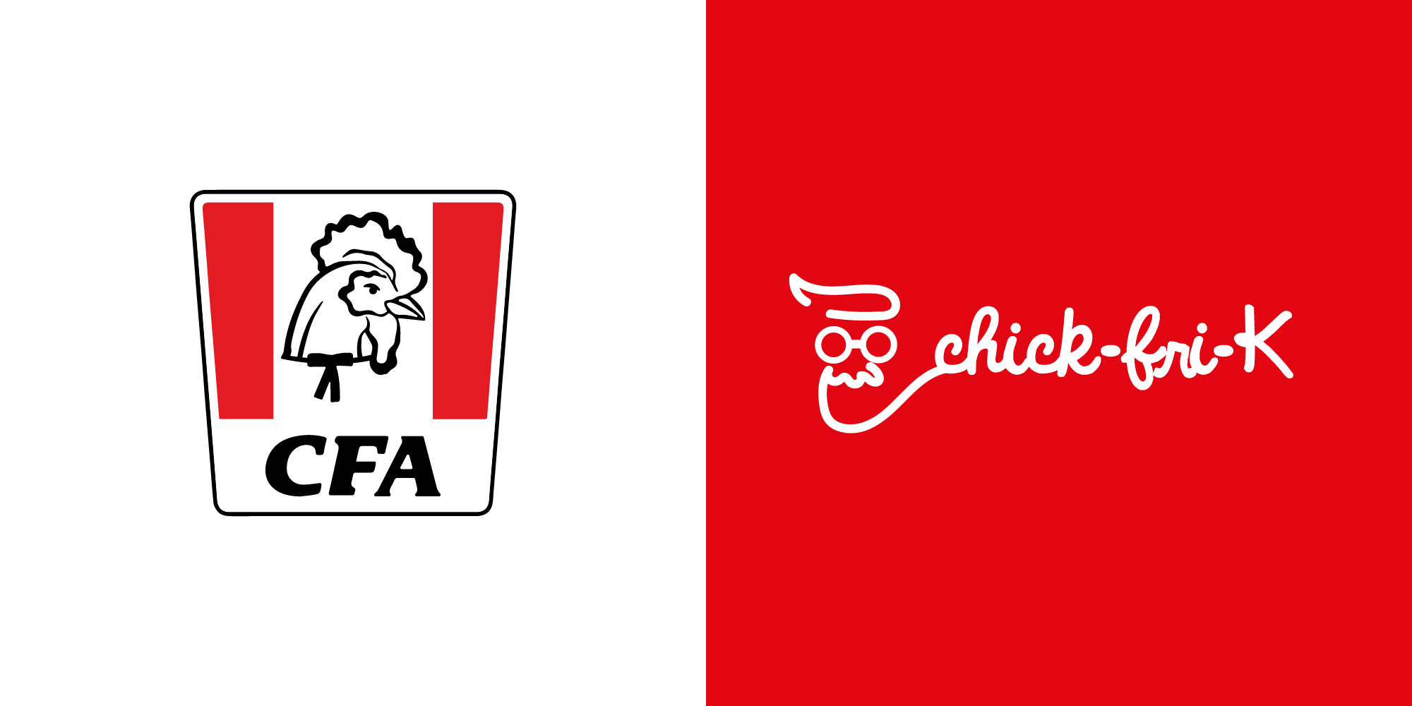
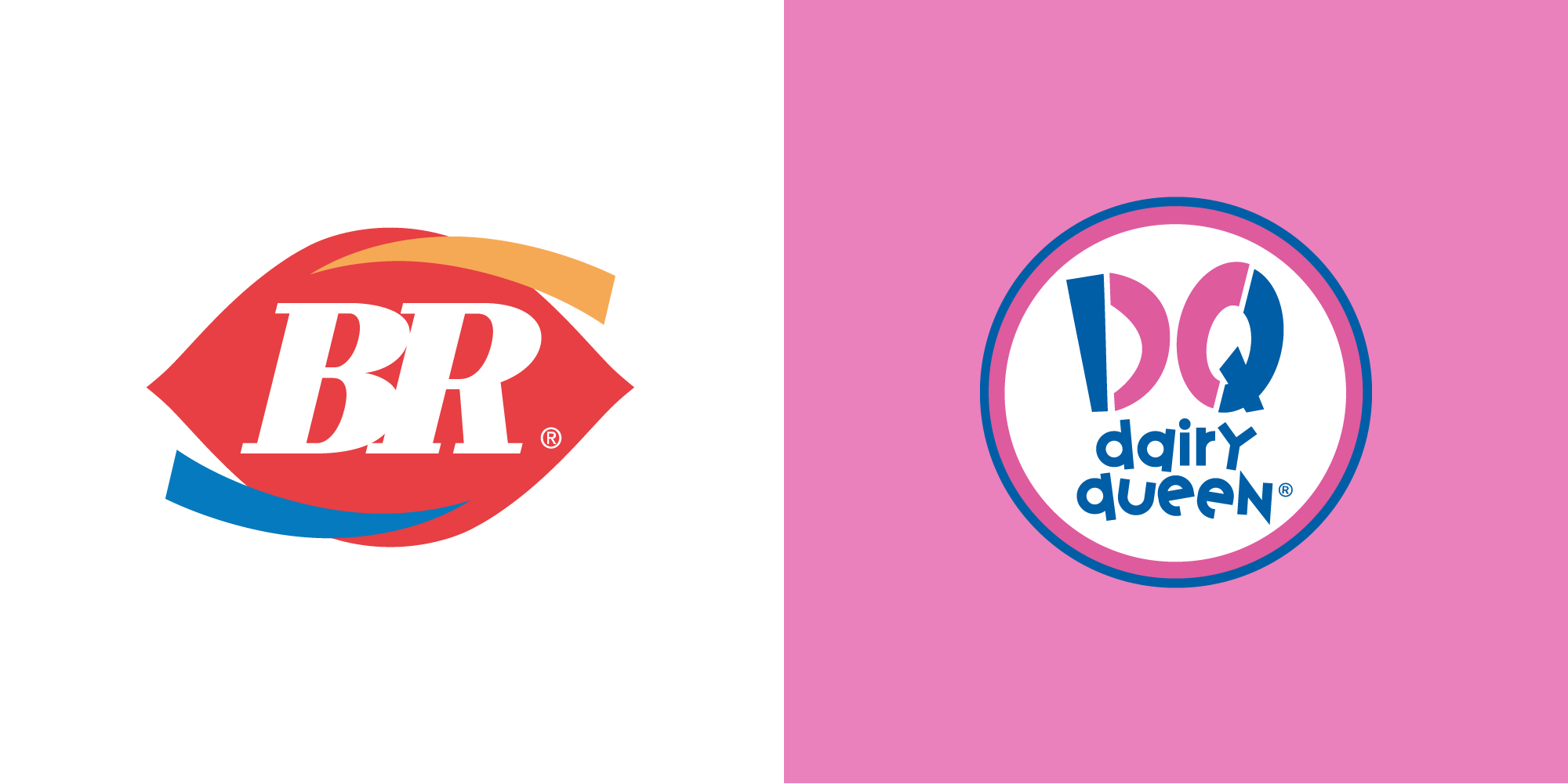
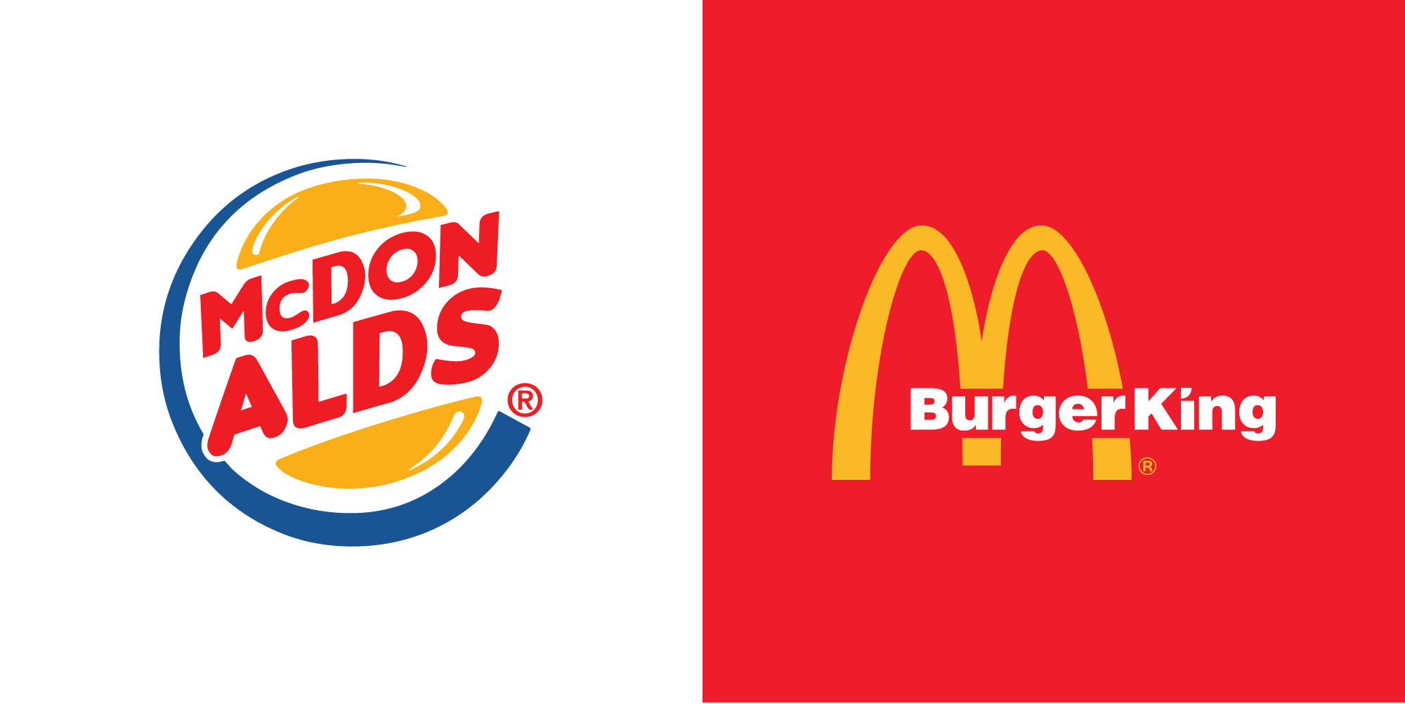
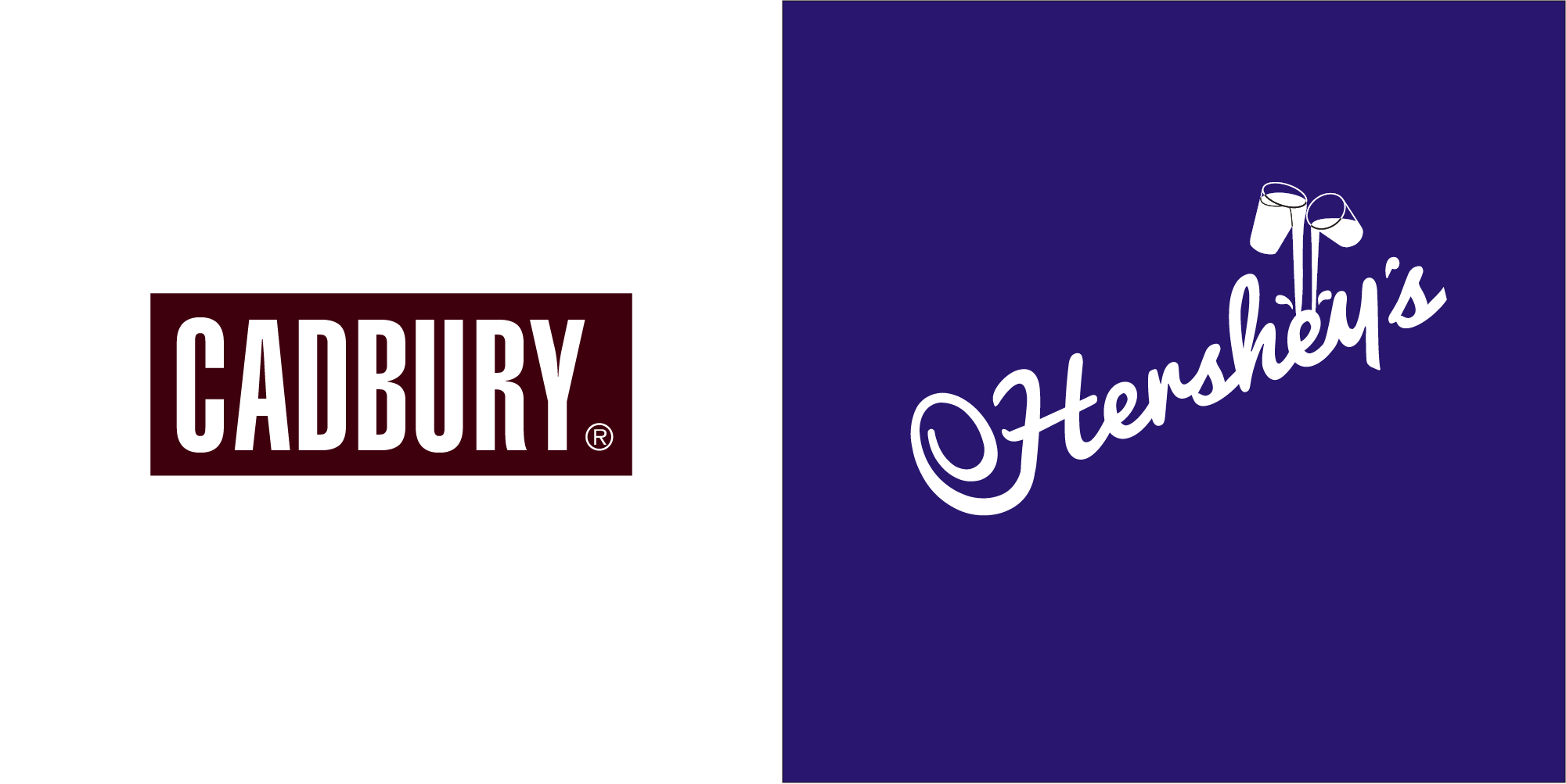
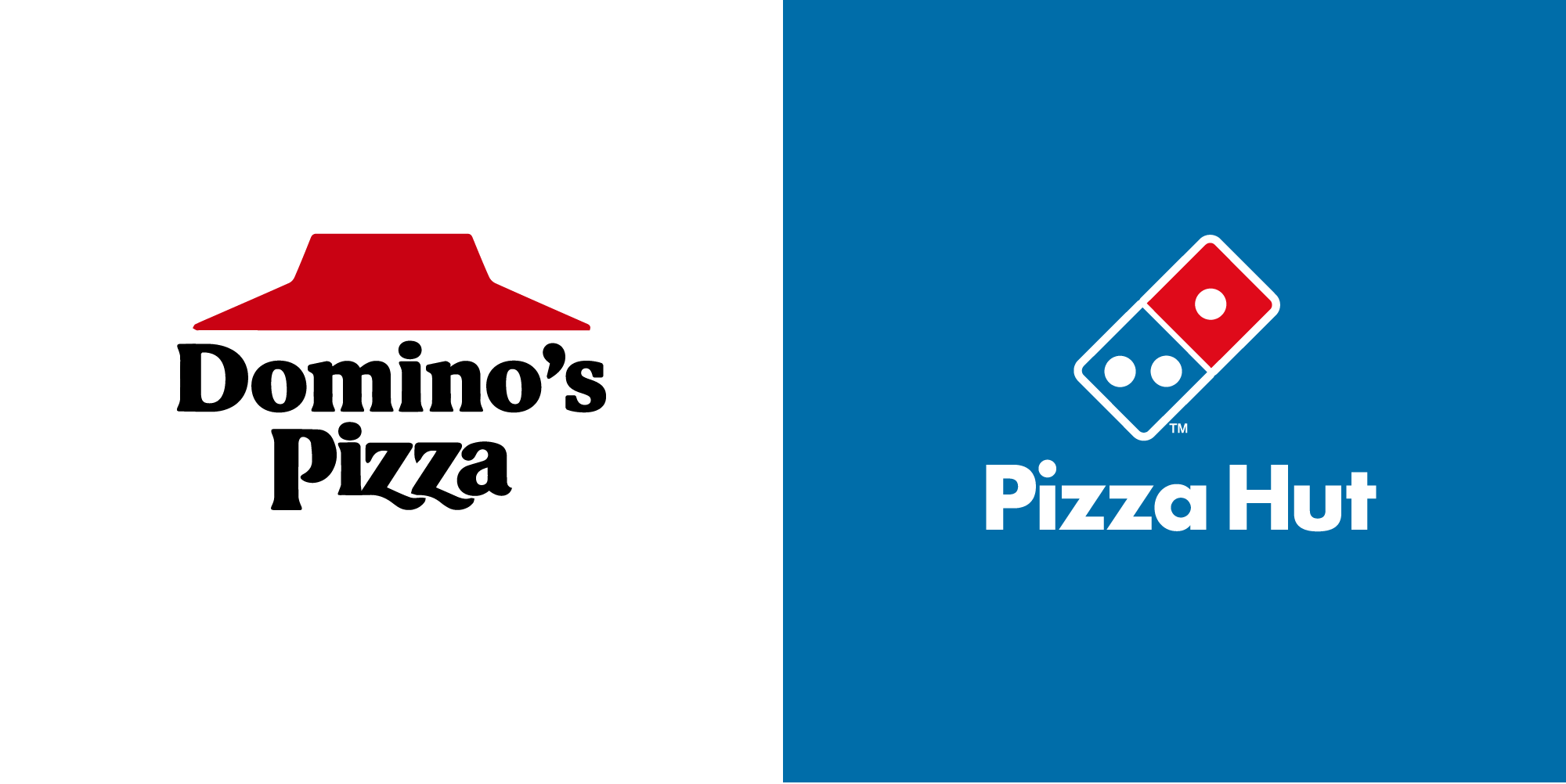
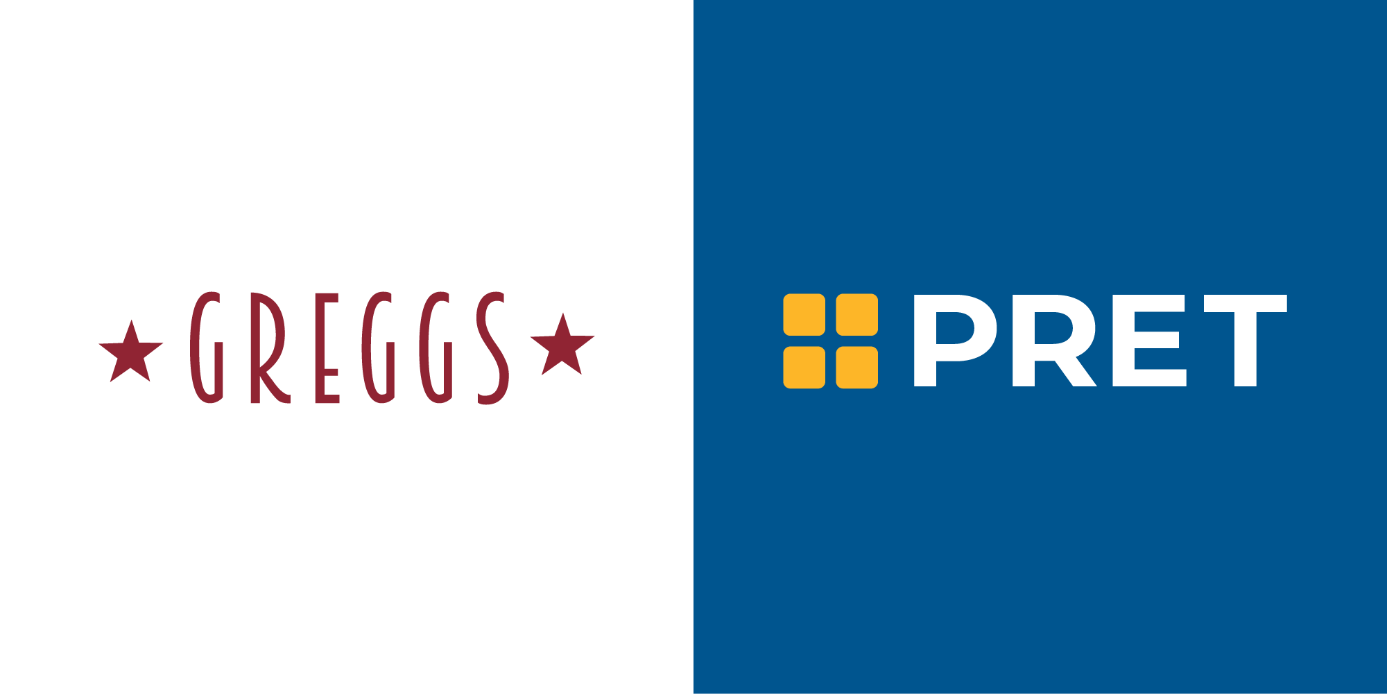
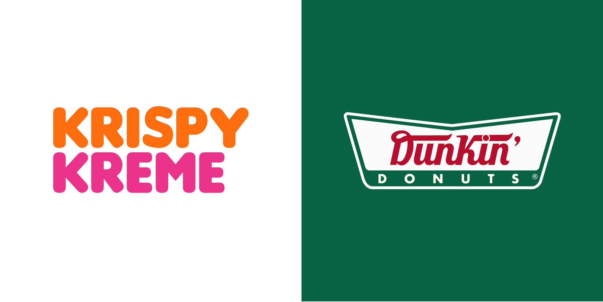
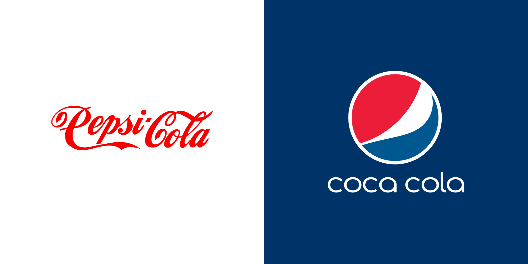
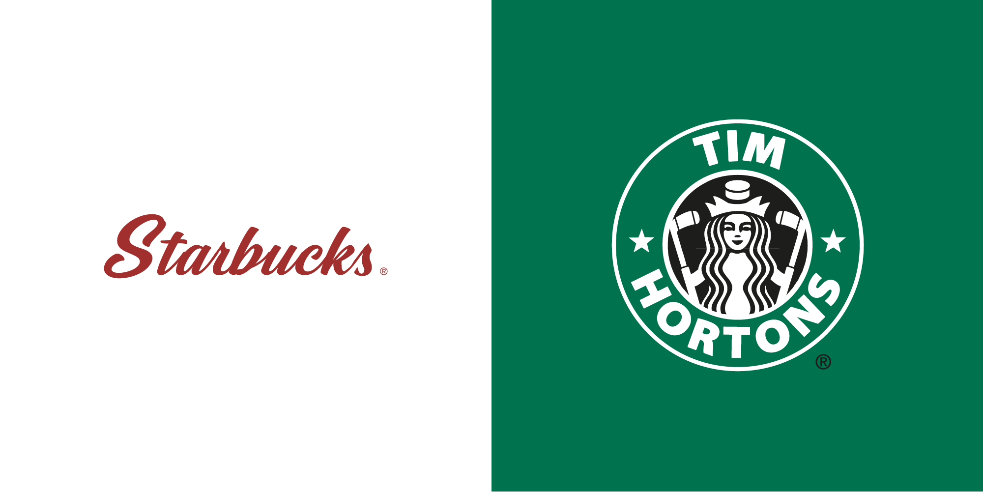
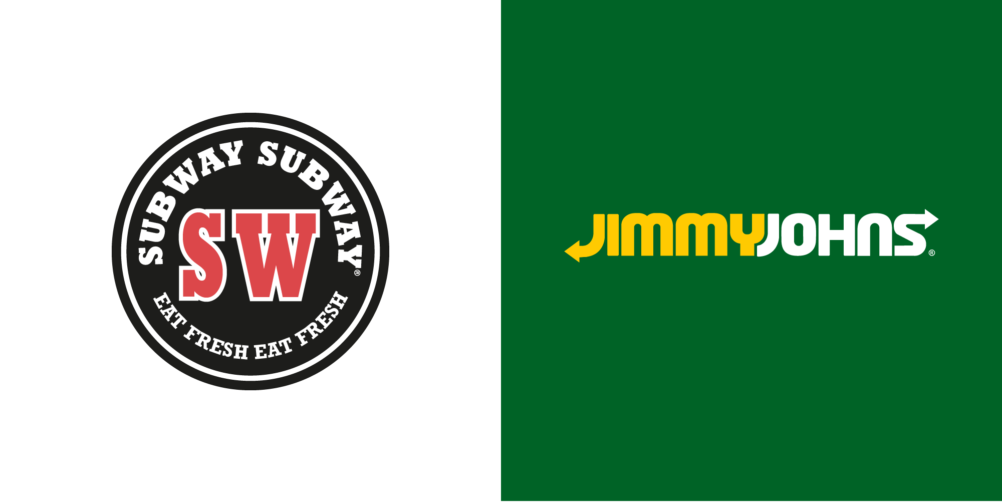
For many, fast food is their go-to choice, resulting in many fast food franchises stepping up their game, whether that’s with rivalry between other well established fast food chains or simply by switching up their offering to supply to the vast that want something different whilst also wanting it from the same chain. In fact, rivalry is at its most in the food industry and, although we’ve been teased of it in the past (Pizza Hut and KFC) collabs between food brands are likely to never exist.
The guys at CDA decided to delve into the possibility that their favourite fast food chains might one day join forces and had a little fun creating a “mash-up” of fast food brand logos.
Author: Spyre Studios