
Alignment is one of those things that comes hand-in-hand when working with grid systems. The subject of alignment isn’t simply a matter of choosing whether or not you want to align text or images to the left or right of a design (though those decisions obviously still matter), instead, we employ alignment to improve our designs. Proper alignment in your designs will make them visually more appealing and will also make it easier for users to scan over a page, sub-consciously also offering a calmer reading experience.
All of the elements in your design will have to be aligned in some way, whether this is just plain text on your page, images mixed within the text (or even header or hero images), videos, buttons and call-to-actions, links (within the text or in modules such as a navigation section) or any other elements you might have.
Grids will go some way to helping you solve alignment issues or decisions in your design, but what we need to focus on here is how the different elements, groups of elements or particular modules in your design work together. I’ve emphasised from the beginning the importance of a cohesive user experience, and getting alignment right is one of those really important things that can help to enhance an experience for the user.
Alignment also allows us to make conscious decisions about where elements are placed and how they interact with each other. Creating good alignment bridges the visual gap between every element in your design, helping us to create relationships between the elements that we have. Otherwise, we’d have a design that has blocks of text and images all over the place, making little sense with no sense of structure.
Should Every Element Align?
As explained in the previous grid articles, it seems that many people dislike grids because they find them restricting; that they often crush any chances of creativity within a design.
This is totally understandable. Grids are a bunch of columns and rows which essentially help us create blocks; CSS generally lays element out in a box arrangement. However, recognising an appropriate time to break from our grid can be difficult.
Mixing Alignments in Your Designs
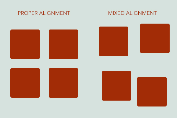
Not everything on your website design has to align. Sometimes, depending on your design or the way that you work, this really can stifle creativity. Instead, think about how you can mix your alignments. This way, you’re still ensuring that there is a pattern to every element or module on your website, but by mixing the alignments you’re ensuring that you’re still creating something of visual interest that will keep your users exploring the website.
Mixing alignments also means that you can play with layouts and grids a little more – instead of using one 6-column grid, why not also introduce another grid that you can overlay with – such as a 4-column grid.
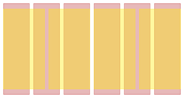
While you’re then not strictly breaking from your grid completely, you’re instead introducing a new grid that you can work from, offering even more alignment and layout options in your designs.
Mixing alignments doesn’t just mean that you introduce new grids, columns or extras to your structure. Instead, use your current grid to mix which elements align to which columns. For example, you may have your header elements aligned to the edges of the first and last columns – but you may then decide to align your main body text to the first and second-to-last columns. The great thing is that a grid offers you an almost endless amount of alignment options, even with something as small as a 4-6 column grid.
Mixing alignments is a way to keep your users interested and alert while browsing a website. Instead of keeping elements similar, it introduces another level of focus to the elements of your design, however sub-consciously that may be.
Aligning Main Design Elements
Text
The main alignment options you have for your text are very similar to the options available in CSS: left, right, centred or justified. Quite self-explanatory really; if you left-align your text then it will drift to the left, if you right-align your text it will gravitate to the right.
Instead, what you want to think about is how suitable these alignments are for your text and how they sit in your design. For example, small amounts of text can work well in a centred alignment, though this will be more confusing and difficult to read on larger chunks of text. Similarly, with headings it might work well in your design to align them centrally, though this depends on the size of the text and where it is being placed. For example, a centrally-aligned heading may not work well when it has a large chunk of text that is left-aligned immediately below.
You also need to think about the cultures that may be exposed to your design and website. In some cultures, you read from right-to-left, though in the Western cultures it is from left-to-right and top-to-bottom.
.content { direction:rtl; text-align: right; }
Because of the Western culture of reading from left-to-right, it will likely be difficult to have a large amount of text right-aligned. Instead, use those alignments that may be more difficult to read in very small amounts, in more of a design feature such as in a footer for address or contact info, or in a header with a list of navigation links.
Images
Aligning images can be difficult, because the alignment that you should use for each image is relative to the size of the image. Smaller images are naturally easier to place in your content in a way that doesn’t disrupt the content, whereas larger images tend to disrupt the reading flow more and are therefore harder to place within your content.
You have two options; either place your images outside of the content flow (for example, between paragraphs or at the beginning or end of your content), or you can work out a way to slot your images into your grid.
The first option is quite easy to implement. Without disrupting the flow of text, you can place images at either full-width or a custom width and centre within the area the text normally is in. This is simple enough and still looks good, whilst working well when we scale down a website if it’s responsive.
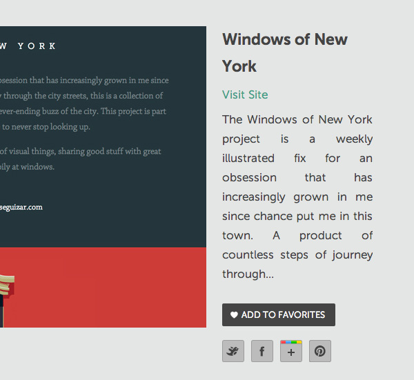
The second option can get a little more complicated, depending on how you decide to place the images within your content. You have several options. You can first have the images aligning perfectly (on the left or right) with your text, or you can have the images appearing to jut out slightly past the edge of the content.
This way, your images could be placed one full column width into the content, with the content flowing around the image. This doesn’t disrupt the reading flow as much as if the image was placed fully inside the content area, but it also adds interest to your design – for you are creating another area of alignment for your elements that will keep your design visually fresher and more engaging.
Background Images
Aligning background images is one of those little toughies-and again, it’s all relative to your design and subject, as well as the size of the background image itself.
As with the text alignments, the alignment of your background images can very much match your CSS rules; fixed, absolute, to the top or to the bottom, to the left or to the right? Really, this depends on your design and how the background image fits in with that. If your design has a pattern, think about how that pattern aligns with your elements – you want to make sure that it aligns nicely with your elements or else it could throw the whole design off completely.
Also think about how it looks if you have a large focal background image and how that fits in with your design. If they are large and quite a big focus, maybe think about how your other elements and modules may fit in with that design. For example, could your main body text align with the edges of the design? It’s all about questioning how your images work with the other parts of your design and how you can work with them to make your design more polished and work together much better.
Element Groups
When I describe an element group, I think of it as very different to what I would describe as a module.
When thinking in terms of modules—in both designing and when developing the website design—I think of them as being a group of elements, related to one another, which are in very close proximity to each other. Examples of modules to me are a group of links, a hero image and overlaying text or header; anything that can be grouped, is a repeatable pattern or standalone module.
However, an element group is a group of elements in your design, which don’t necessarily have to be close to one another. For example, an element group could be both your header items (logo and navigation links, for example) as well as your footer items (perhaps another set of links, alongside a copyright notice). These are element groups and you can then align these element groups together in your design. Although the header and the footer may not be visible on the same screen space as one another, these subtle uses of alignment will make for a stronger, more visually appealing and much more consistent design.
Other examples of element groups are simply both the text and the images of your main copy on a page, or can even be as simple as one set of navigation links or elements. For example, in a more complex navigation you may have the main text links, but also a smaller “sub-heading” to the link. On top of this, you might have an icon above or below the link text. While these are all individual bits and those three bits make up one link, all of these individual links can make up a complex navigation module, but can also be put together as an element group, which you can then align with other groups in the design.
Assignments
Now you know all about alignment in your designs (and with your grids) I want you to start looking at your designs and looking at how all of the elements align. Try grouping different elements, element groups and look at aligning the text and images in your designs.
See what you can do to create a better design through properly aligning every element in your design. Using the grid system from your last assignment, work to align all of the elements in your design using the tips given in today’s post.