Photoshop layer styles are a popular way to add effects, such as drop shadows and strokes, to layers in a non-destructive way.
In this tutorial, I’m going to explain all the different settings that you’ll need to know about when adding an inner shadow in Photoshop.
So, if you want to learn how to add an inner shadow in Photoshop, then continue reading to find out how easy the entire process really is.
Follow along with us over on our Envato Tuts+ YouTube channel:
The Uses for an Inner Shadow
The traditional use for an inner shadow is to simulate 3D depth in a 2D image. This is done by creating an offset shadow within a shape to make it look as if it is cut out and casting a shadow on the object beneath it.
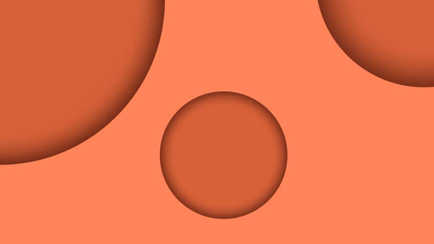
Below, you will see an example of how an inner shadow can indicate how big the light source is and where it is coming from, as well as how far away an object is from the background. By changing only the settings of the inner shadow, you can dramatically change the look of an image.
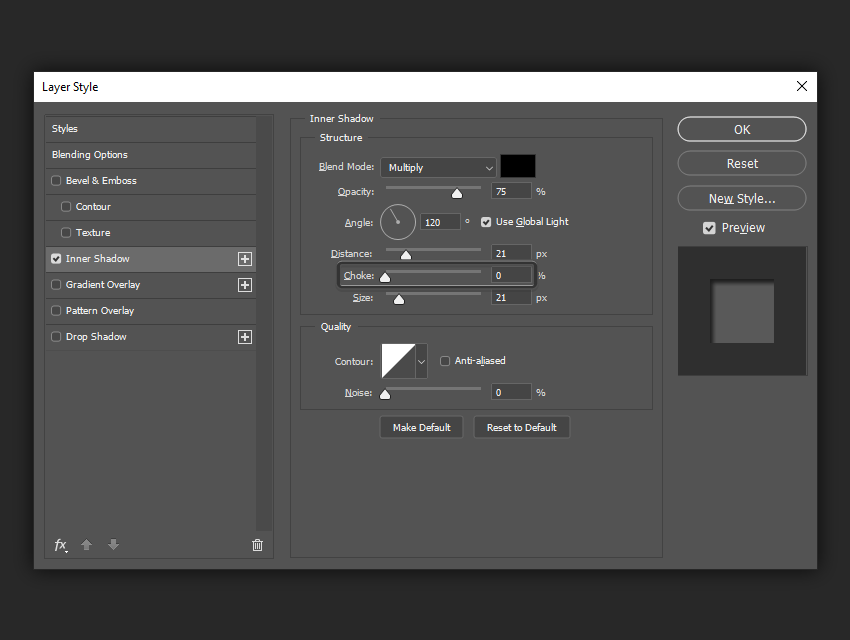
The Layer Styles Inner Shadow Dialog Box
The Inner Shadow dialog box is shown below. The settings are nearly identical to the Drop Shadow dialog box—the only difference is that, instead of the shadow showing up behind the shape, it shows up within the shape.

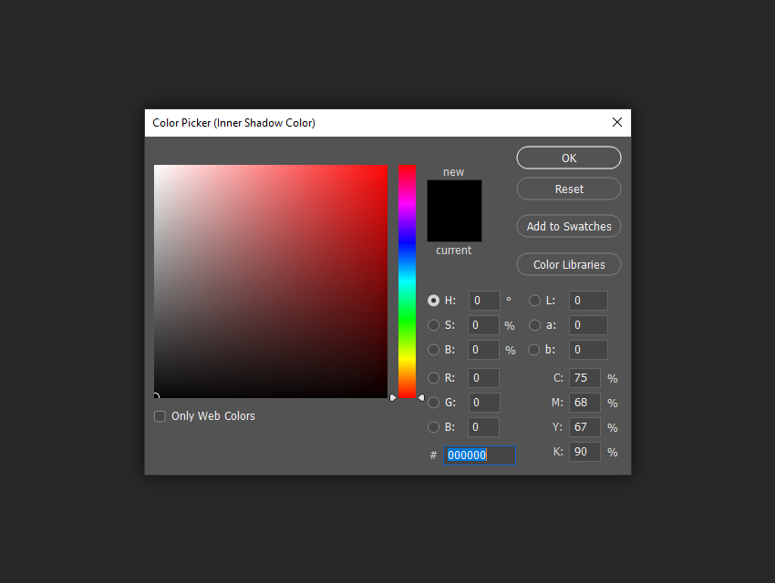
Blend Mode
The Blend Mode allows you to set the blending mode for your shadow. Typically you will want this to be Multiply or Linear Burn, so that your shadow darkens the layer that is behind it.
If you are unfamiliar with how all the different Blending Modes work, I highly recommend checking out the Blending Is Fun Basix tutorial.

This is also where you set the color of your shadow by clicking the color block next to the Blend Mode dropdown menu. By default, the shadow color will be black, but you can add a tint of color or even try something outrageous to get special effects.
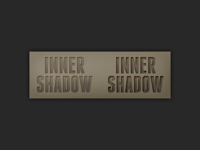
In the following example, you can see that the color of the shadow on the left is black with a Blend Mode of Multiply, while the color of the shadow on the right is a dark purple color with a Blend Mode of Normal. This creates the result you see below.

Opacity
The Opacity slider allows you to specify how transparent your shadow will be. A setting of 0% is completely see-through, while 100% is completely opaque.

In the following example, you can see that the shadow on the left adds a subtle hint of depth to the text, while the shadow on the right is more visible and adds even more depth.

Angle
The Angle spinner and corresponding box allow you to change the apparent angle that the light source comes from. By turning the Use Global Light checkbox on, any changes you make to the angle of the Inner Shadow will also change the angle of the light sources used in other effects like Bevel & Emboss and Drop Shadow. By leaving it unchecked, you can change the light angle for the Inner Shadow independently of other effects.
The recommended setting is “checked” for most cases, because we want to have a uniform light source for the most cohesive-looking effect.

In the following example, changing the angle of the light source changes the way in which the shadow falls, and since Use Global Light is checked, it also changes the light angle for the Drop Shadow and Bevel and Emboss effects as well.

Distance
The Distance slider changes the apparent distance between the subject and the background. The effect is achieved by altering the offset between the subject and the Inner Shadow itself.

In the following example, increasing the distance gives the effect that the text on the left is simply indented in the cardboard, while the text on the right is a completely separate piece hovering above the background.

Choke
The Choke slider changes the falloff of the shadow in a linear fashion, or in other words, how gradually it fades out at the edges.
For a typical Inner Shadow, you will normally want to leave this at 0%, but for harder shadows you should increase it, and for shadows with hard edges or even inner strokes and faux highlights, you can set it all the way to 100%.
Adjusting the choke is almost the same as changing the size to 0 px and then altering the distance. It basically achieves the same effect in a different way.
In the following example, increasing the choke percentage to 100% changes the falloff of the shadow so that it has a hard edge.

Size
The Size slider changes the apparent size of the light source by softening the edges of the shadow. When it is set to 0 px, the shadow is exactly the same size as the shape of the object. As you increase the size, the shadow grows in 1 px increments.
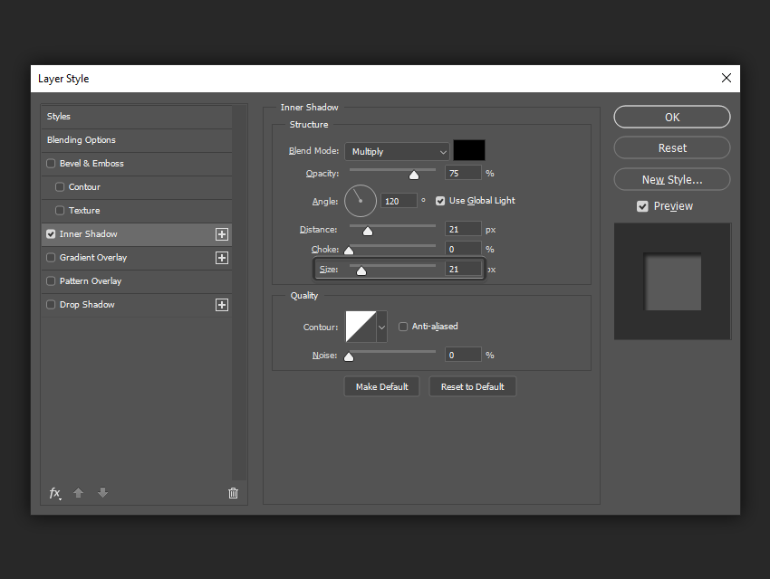
In the following example, increasing the size of the shadow gives us flexibility over controlling not only the overall size of the shadow, but the softness of it as well.

Contour
The Contour shapes allow you to change the falloff of the shadow in a non-linear fashion. By choosing different curve profiles, you can get the shadow to fade out in different ways.
The only time this is really useful is when you are trying to achieve special glow or abstract effects.
In addition, the Anti-aliased checkbox allows you to improve the quality of the shadow with a very slight drop in performance. The performance hit is negligible, so I recommend always keeping the box checked.
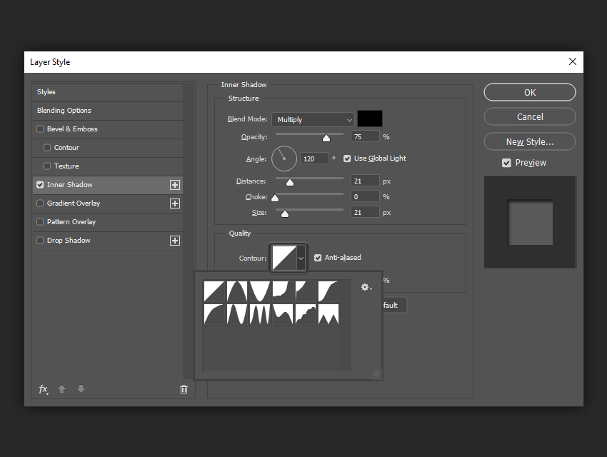
In the following example, changing the Contour shape to an inverted “U” results in a shadow with a tiny gap between the edge of the shape and where the shadow starts. This is typically not a desirable effect.

Noise
The Noise slider is a useful tool to give your shadow a gritty feel. If you are creating a style that is going to resemble dirt or concrete, adding some noise can help the overall effect. For a totally smooth shadow, leave it at 0%.

In the following example, setting the noise to 30% gives us just a little grit in the shadow. A good range to use is 0% to 30%, as going higher than 30% can often result in a very unnatural look.

Saving and Loading Default Settings
You can save and load default settings for each effect in the Layer Styles dialog box. When you click Make Default, Photoshop will store whatever settings are currently active as the new default settings for that effect.
If you click Reset to Default, Photoshop will then load whatever settings were last saved. This allows you to experiment and simply reload the default settings if you want to start over.

Expand Your Photoshop Layer Styles Library
Want to build an extended Photoshop layer styles library, but don’t know exactly where to start? Well, don’t worry, since GraphicRiver has you covered, giving you a great selection of layer styles such as these ones.
Chalk Layer Styles
Give your text a unique look using this amazing Photoshop layer style, which will do all the work for you using just a couple of clicks.

3D Cinematic Layer Styles
Turn your work into a cinematic masterpiece using these professional-looking Photoshop layer styles that are easy to use.

Halloween Layer Styles
Whether it’s Halloween or not, this one should definitely be part of your layer style library, since it gives you that spooky vibe in a matter of seconds using just a couple of simple clicks.

Christmas Layer Styles
Turn your text into a work of art using one of 15 included layer styles that will help you bring the spirit and joy of Christmas into the heart of every beholder.

Rust Layer Styles
Whether you’re working on a video-game cover or just want to turn a boring old font into something different, this pack of industrial-looking layer styles should have you covered.

Advance Your Photoshop Skills
Just started out using Adobe Photoshop and feel like learning more about it? Well, today’s your lucky day since I’ve put together a little list of tutorials that should keep you going for the following days!
-
![]()
Adobe Photoshop CC (and versions before it) is filled with tools, panels, and effects meant to give users as much control as possible over their…
-
![]()
The drop shadow layer style is one of the most basic elements of Adobe Photoshop that can help accentuate your design. In this tutorial, we break down the…
-
![]()
Learn an easy way to create a Stranger Things series inspired text effect, using only layer styles and some simple adjustments.
-
![]()
In this quick tip tutorial, we will learn what a layer mask is, what it does, and how to create a mask in Photoshop!
-
![]()
Short on time? Use Photoshop actions and Photoshop templates for impressive photo effects! Check out the latest Photoshop actions from Envato Market and…
-
![]()
Step back in time with an extraordinary vintage photo effect! Today we bring you 20 amazing vintage and retro-inspired Photoshop actions from Envato Market…
-
![]()
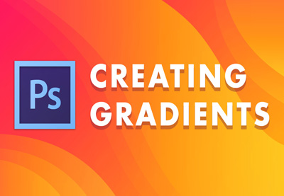
Learn how to create a gradient in Photoshop, as well as how to load and save preset gradients in Photoshop.
-
![]()
Have you ever wanted to remove a person’s face? Maybe throw some worms in it? Then I have the perfect Photoshop effect for you! Because today, we will be…
-
![]()
Use a texture, a couple of filters, and some drop shadow effects to create a super easy and quick stylized chalk text effect
-
![]()
Learn how to create a beautiful color photo effect using Photoshop filters with this easy tutorial.