
Many trends in general web design can also be applied to single page layouts. But there are some unique features to the lone webpage which can add more flavor into a design. Like most of the web design field, common sense and user experience always trumps inessential creative ideas.
But that doesn’t mean anybody can just understand the best techniques for creating a single page design. In this post I’d like to share a few ideas on how to create usable, tactile portfolios with content featured on a single page. Mobile users are growing rapidly so you have to be thinking about clickable and swipeable interfaces at all times.
Fixed Block Scrolling
When all the website content is fitted onto a single page you can break down each section into horizontal blocks. As the user scrolls vertically they pass by each section denoted through background colors, images, or even horizontal rule breaks. This idea can be expanded with forced scrolling sections.

The personal portfolio of Zack Batsaikhan demonstrates this effect brilliantly. Scrolling even 1 notch down will automatically animate to the next section. His website also supports navigating with the arrow keys so you can jump between sections and even go through his portfolio entries without a mouse or trackpad.
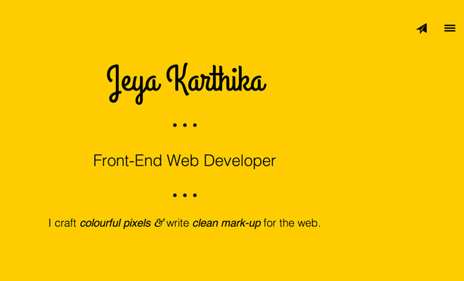
Another designer Jeya Karthika has this same effect using split background colors. It’s especially nice for mobile users who need to swipe down between sections. To create this type of portfolio you would typically use a jQuery plugin for parallax scrolling. But it’s also possible to create your own with just a bit of JavaScript.
Responsive Design
Coupled with the importance of mobile support includes naturally responsive layouts. RWD isn’t a new concept, but the implementation is still in a growth & research phase. Designers are constantly playing around with new ideas for responsive web design. Portfolios are even more important because they represent your work quality and even some tidbits about yourself.
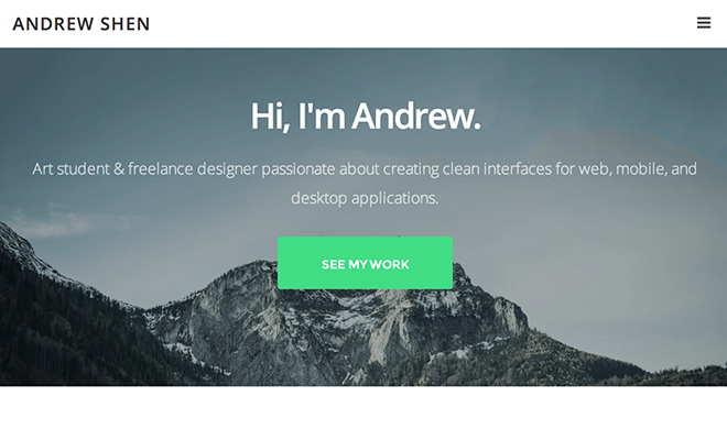
Andrew Shen has a great responsive portfolio which adjusts the content and navigation menu. The hamburger toggle icon has become a staple among UX designers to convey a clickable button for showing & hiding a menu. His website is simple and would render perfectly on any sized mobile screen.
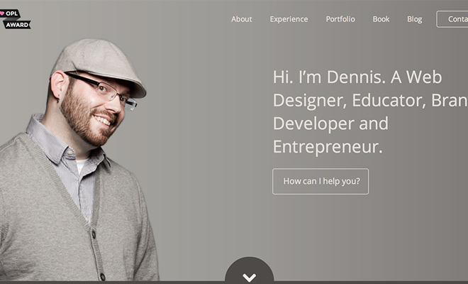
Comparing with another website by Dennis Field you’ll notice many similarities. Content is broken down into horizontal sections which then retract based on the browser width. But interestingly enough, Dennis’ portfolio hides the navigation beyond a certain point. Instead users move between page sections with arrows scrolling dynamically with jQuery. Each approach has its own benefits so think about your end result when building responsive traits.
There will always be a few responsive techniques you want to include on any site. Responsive images and collapsable thumbnail galleries will be necessary. Also think about breakpoint dimensions and when you should be resizing fonts to fit neatly on the screen.
Animations & Effects
A bit of charm in your single page portfolio will capture more attention if done correctly. There is a limit where visitors will not put up with your outrageous animations – but a neat balance will give the effect of dynamic and creative design talents.
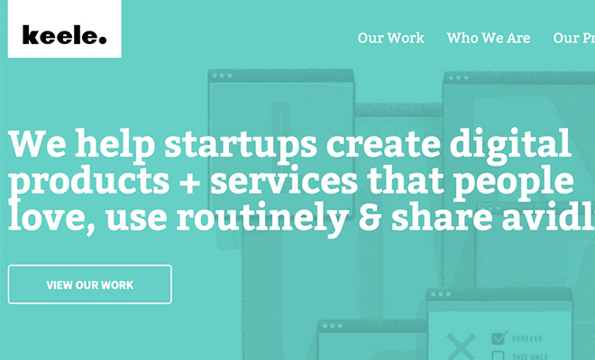
The design studio for Keele has a bunch of neat page animations. Whether you find this beyond your acceptable limit is really subjective. But even if you don’t like all of these effects there is a lot to learn from their website. Notably the navigation hover effects coupled with the expanding logo really catch your attention right off the bat.
Instead of interface animations you might try animating images or page content instead. The portfolio of Karol Krakowiak does this as you scroll throughout her work samples. If you can build the animations with jQuery everything should run smooth even on a mobile device. There is no scientific formula for making catchy page animations – just try some stuff and see what you like the most.
Hidden Sliding Navigation
The topic of navigation seems a bit confusing on a single page website. Since a one page portfolio has no inner pages(or very few), the nav links create auto-scrolling behavior. So basically users will click a link and it scrolls down to that section of the page.
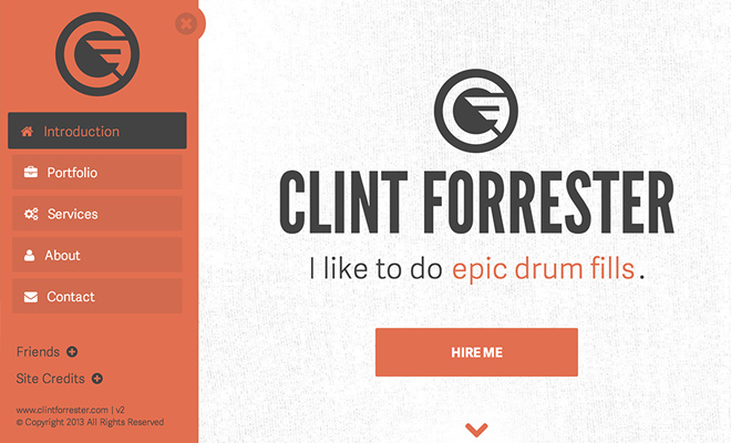
So why would you want to use hidden navigation? Well the example on Clint Forrester’s portfolio provides a good starting point. It will save you room on the screen which is very important on a 320px portrait iPhone view. Plus visitors will be able to scroll down through the site without a nav menu so it’s much less important compared to a multi-page website.
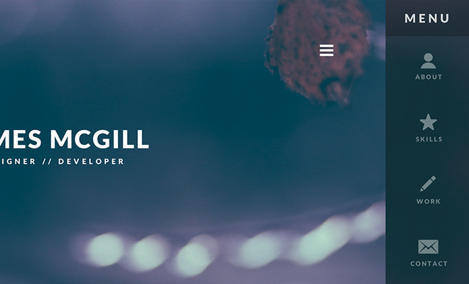
If you don’t want to use a larger menu take a look at how James McGill designed his portfolio. The menu link is always accessible yet only uses small icons and some brief text descriptions. Almost all of the content is accessible right from the page so the menu isn’t all that important. But it’s very useful if you want to include some off-site links such as your social profiles or personal blog.
Clean Minimalism
The simplest technique for creating a usable single page portfolio is clarity and minimalism. That doesn’t mean you should only stick to white colors and contrasting text. Instead just try to strip down the layout into absolute necessities. Once you’ve got a wireframe or mockup design then go back to add extra fancy icons or text effects.

I think the portfolio of Alicia Harris uses the technique of minimalism brilliantly. Her website still uses a lot of color and the top-right navigation also has some neat icons. But it also uses plenty of whitespace and clearly readable text. It’s got the bare necessities and just the simple bare necessities(cue Jungle Book soundtrack).
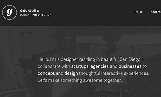
Gabe Abadilla has a portfolio which seems a bit more detailed. He uses a fixed header along with some big images. But his portfolio is really focused on simplicity, demonstrating his work and his talents. This is the most important part of any portfolio. People want to hire you because you do amazing work – everything else about you is still important but shouldn’t take a primary seat at the throne above work samples.
I’m sure there are many other tips you could apply to build a magnificent single-page website. Just keep in mind that you’re selling yourself and more importantly, your talents. One webpage should be enough to do so if you organize content conservatively. Along with the examples in this post feel free to share other single-page portfolios and your thoughts on what makes them so great.