When you’re showing your client a web design mockup, they’re going to want to see how it looks on different devices. Learn how to create a fully responsive mockup in our new course, Responsive Design in Adobe XD.
What You’ll Learn
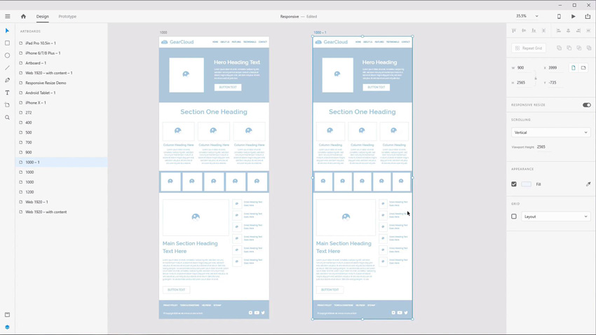
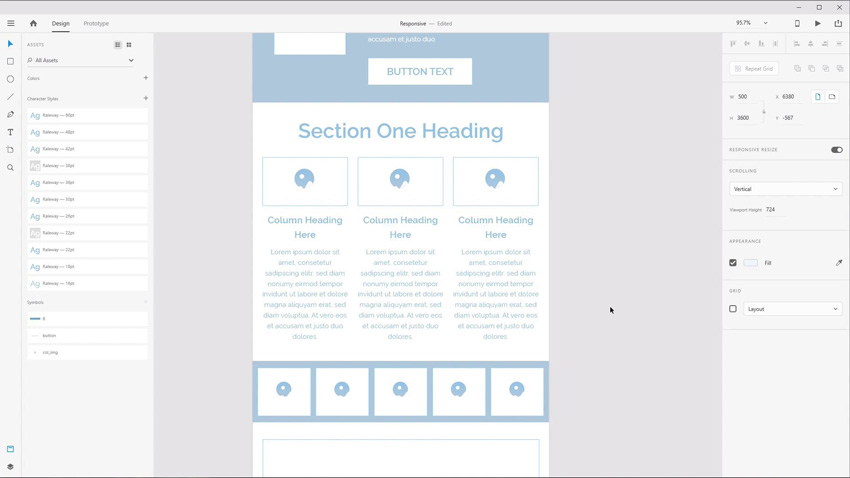
XD is Adobe’s contribution to the world of design mockup software. In Adobe XD, as with any concept design tool, it’s important to illustrate how your layouts are going to behave responsively.
In this course, Kezz Bracey will show you how to best use XD’s toolsets to efficiently create responsive design mockups.
You’ll get a quick refresher on responsive design and then dive into a look at all of Adobe XD’s best features.
Then you’ll go through the full process of creating different layouts for different breakpoints.
Watch the Introduction
Take the Course
You can take our new course straight away with a subscription to Envato Elements. For a single low monthly fee, you get access not only to this course, but also to our growing library of over 1,000 video courses and industry-leading eBooks on Envato Tuts+.
Plus you now get unlimited downloads from the huge Envato Elements library of 850,000+ creative assets. Create with unique fonts, photos, graphics and templates, and deliver better projects faster.