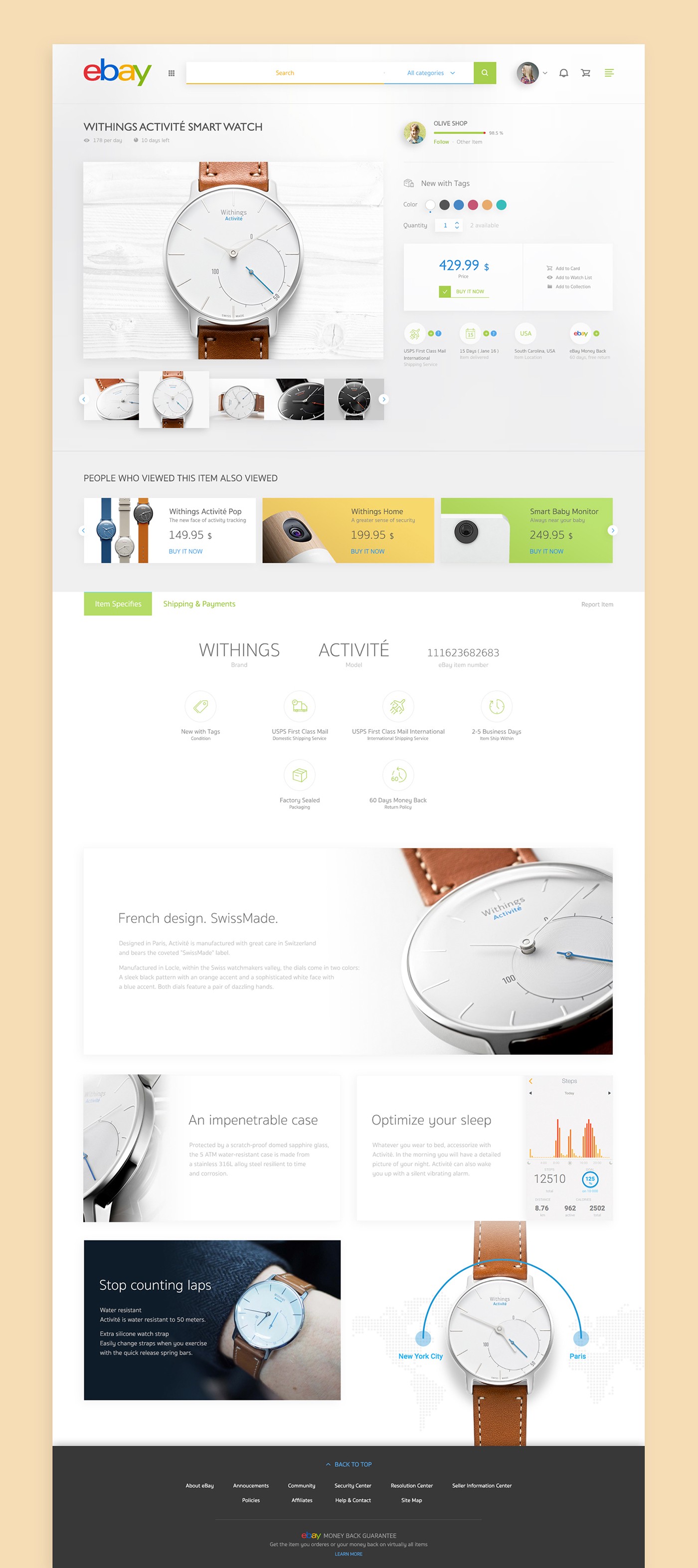
“I tried to redesign Ebay but I realised this is just make it cleaner, I expect to make it all new but I am not pro with ux. so this is quiet play safe. If you want to critic or share some idea how to redesign, don’t hesitate to comment, I will appreciate that :)”
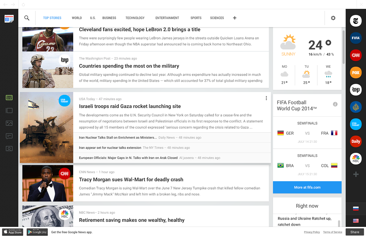
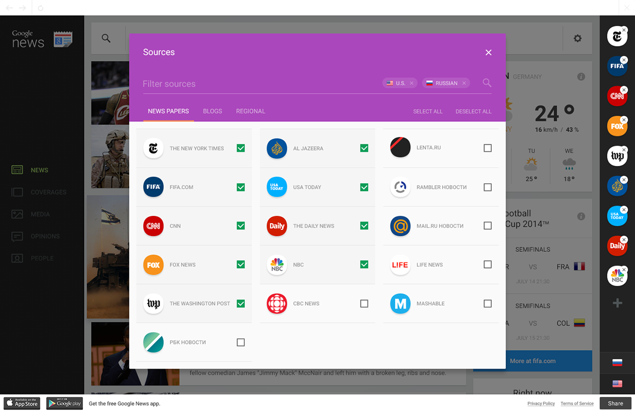
“News is a direct tool of influence on public consciousness. The goal of the news is to provide to the society objective information about a particular event or action. In reality, news is often just retelling of events, passed through the prism of an author’s own subjective judgment, beliefs and attitudes. Authorship of the news inevitably leads to inconsistencies in the coverage of the same events. Moreover, the author often deliberately covers the events from his beneficial point of view, which he thereby can use to manipulate public opinion. Today, there are a lot of news media and many of them are dependent on the government, radicalized, or critical, and so on. The problem of “point of view”, while reporting the news, is very significant. It has become very difficult to understand the flow of information. To figure out the truth, to form your own opinion about this or that, is a tremendous challenge for the modern man. These facts cause the need to create tools that allow the reader to easily handle the news information, analyze it, to screen out unnecessary biases and form their own opinion.”
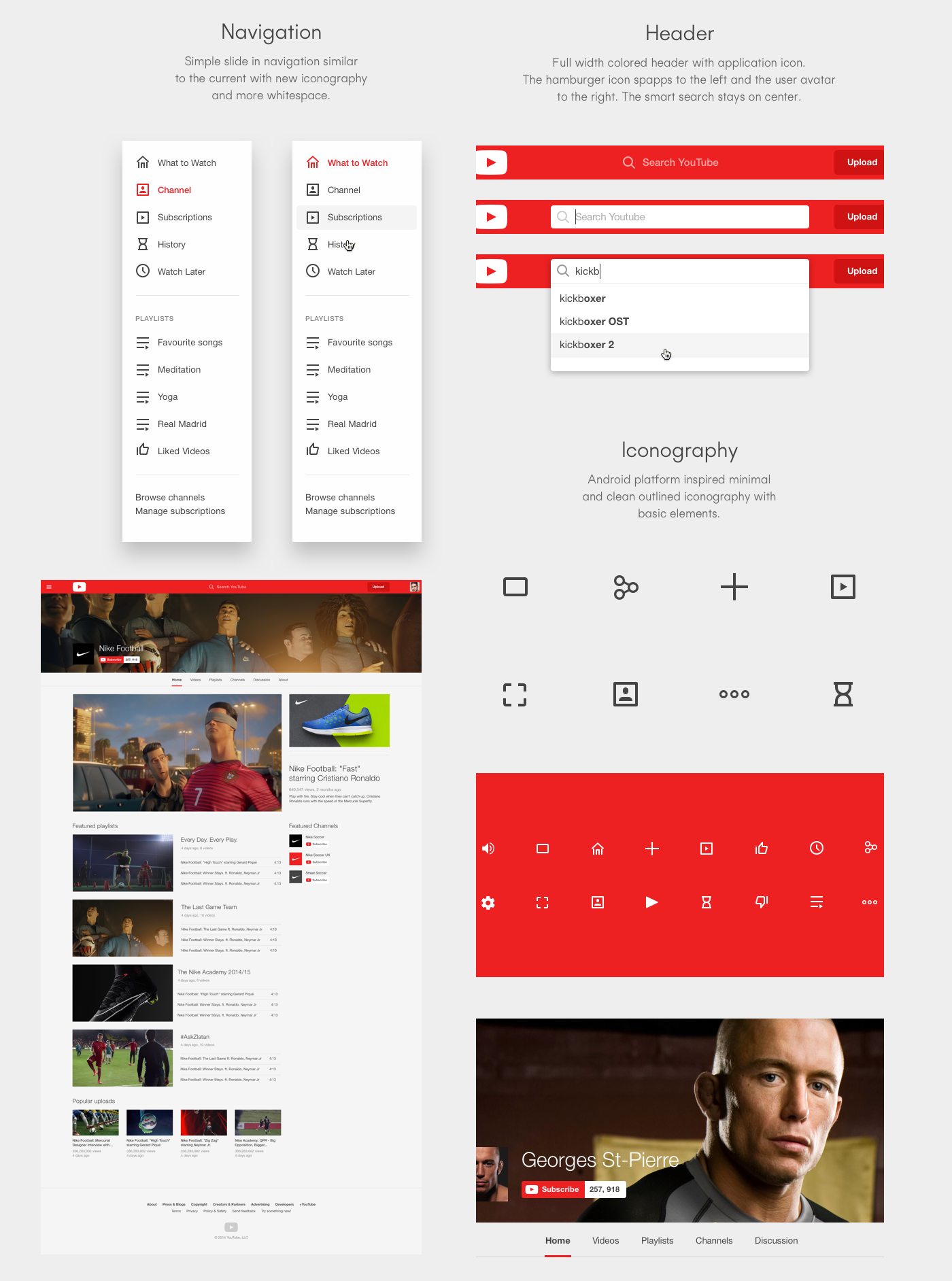
“Everybody knows YouTube and everybody loves it. I tried to create a quick but feasible facelift included the existing features and functionalities. I used the current system as a starting point and worked on the primary visual layer to create a more loveable experience.’
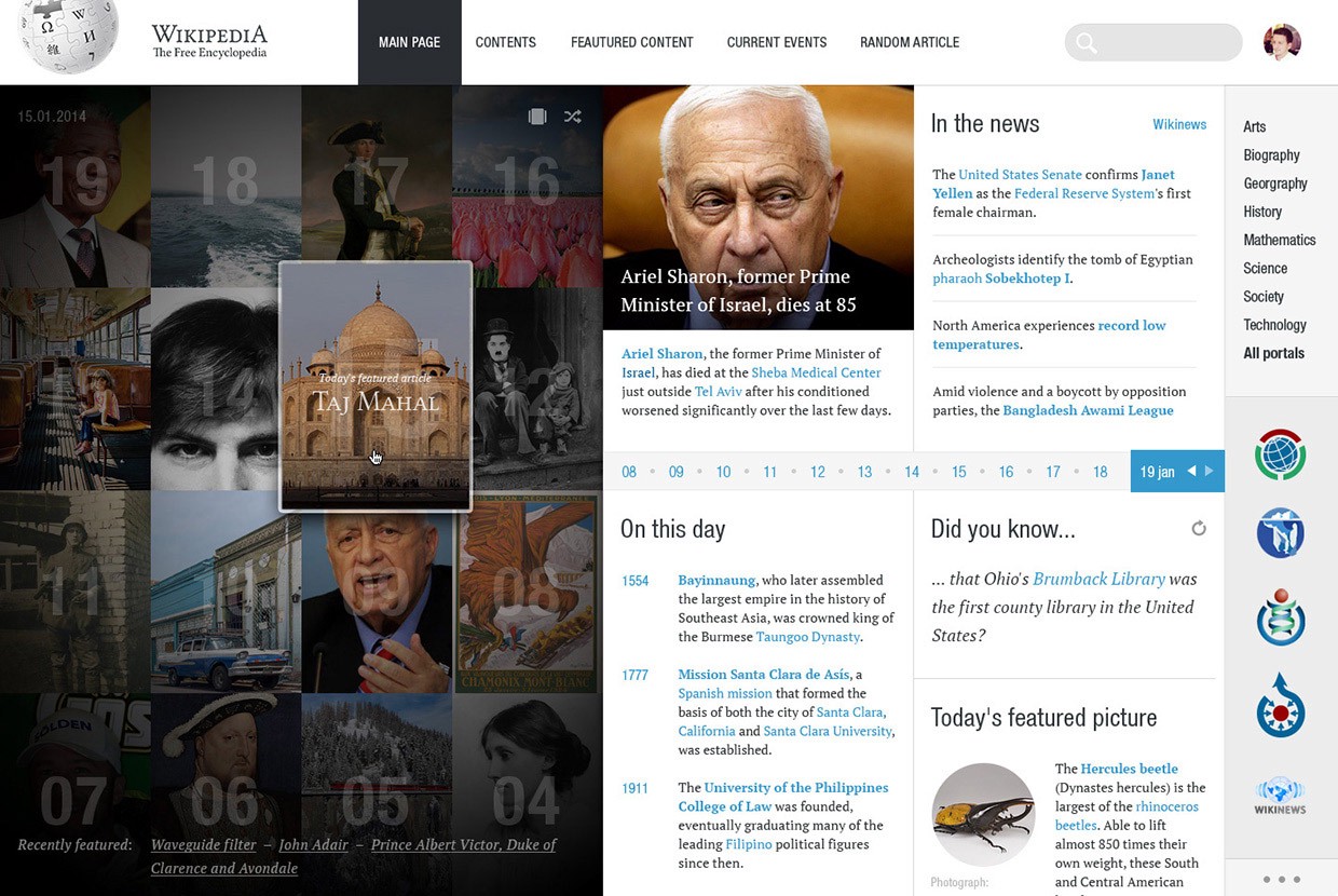
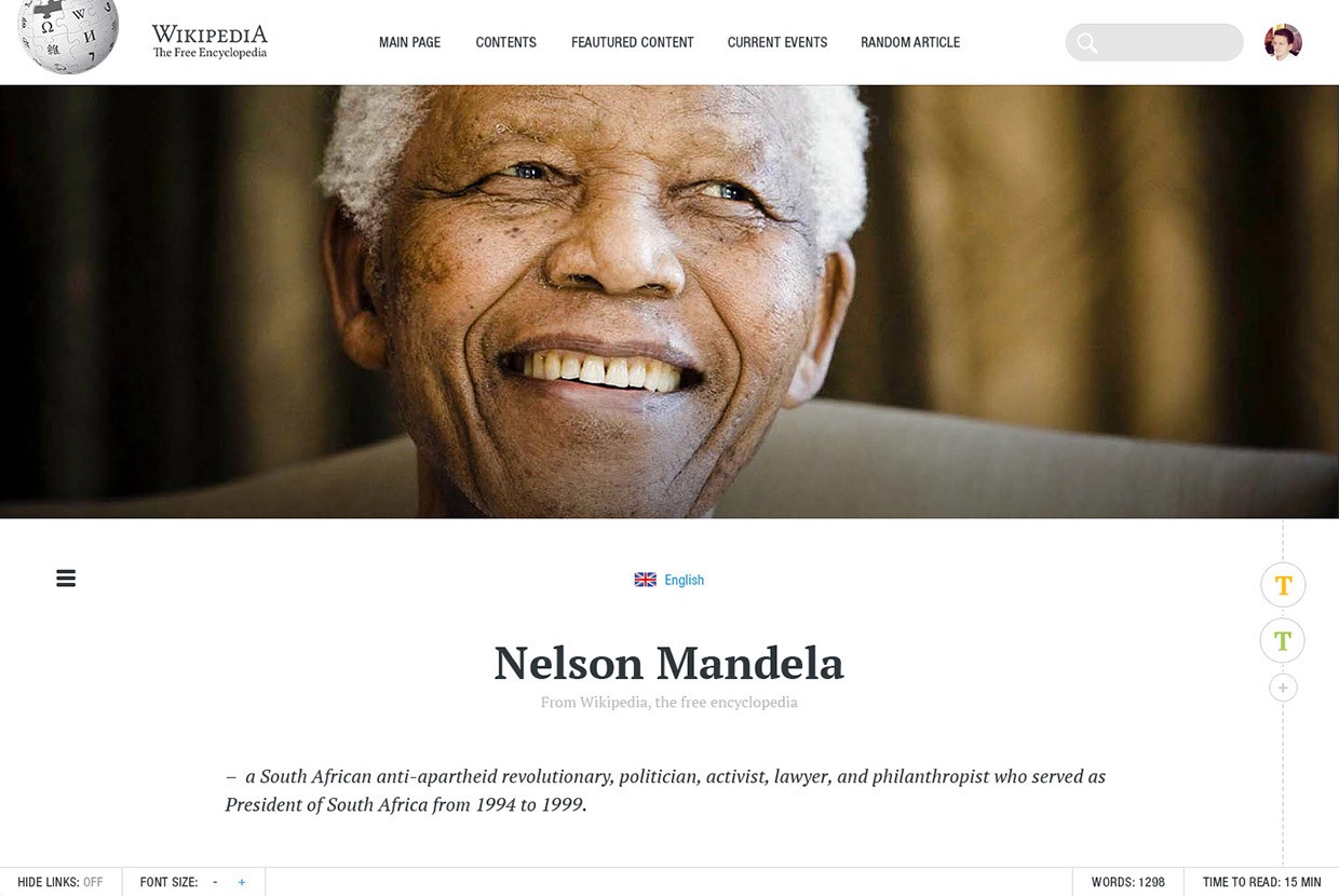
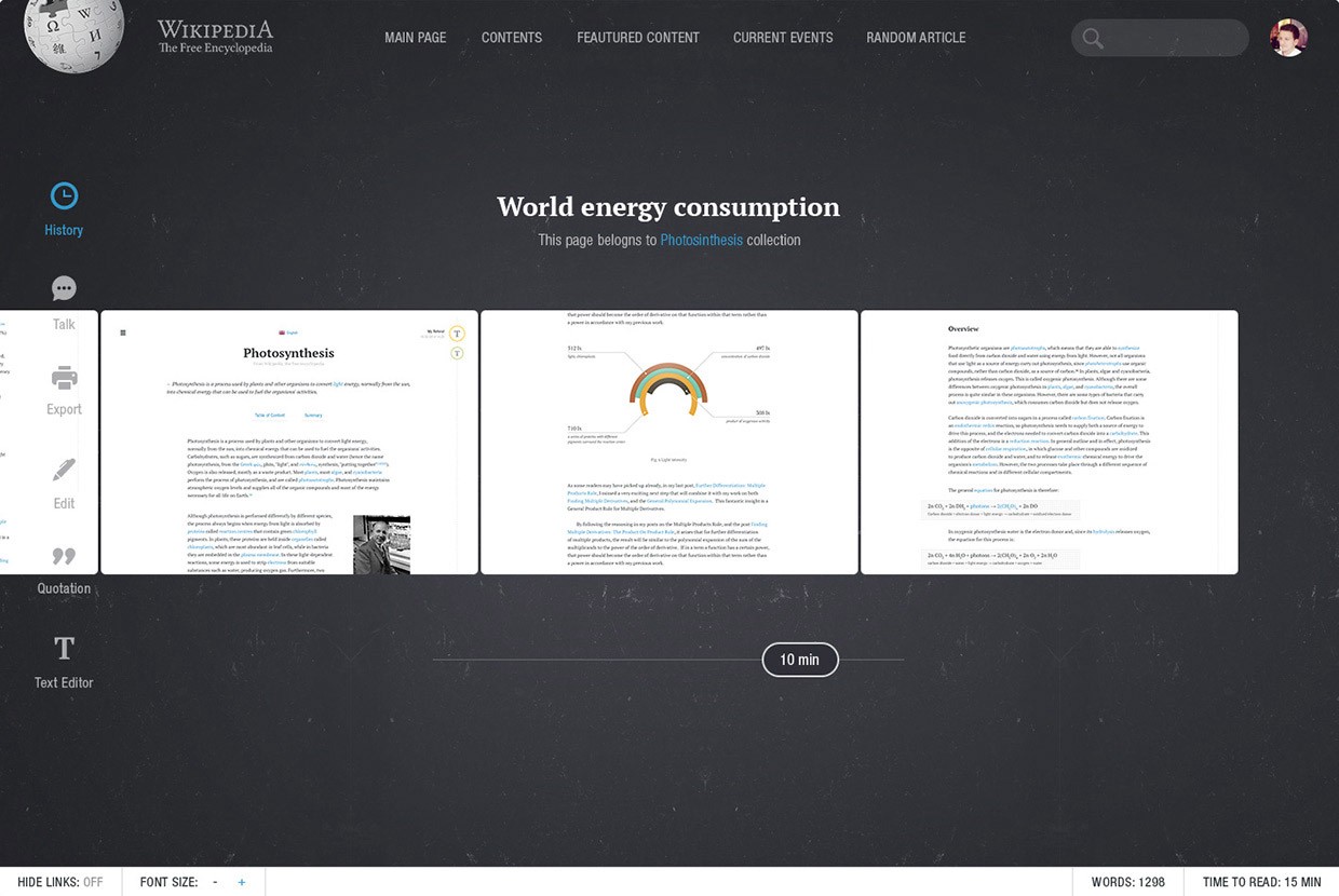
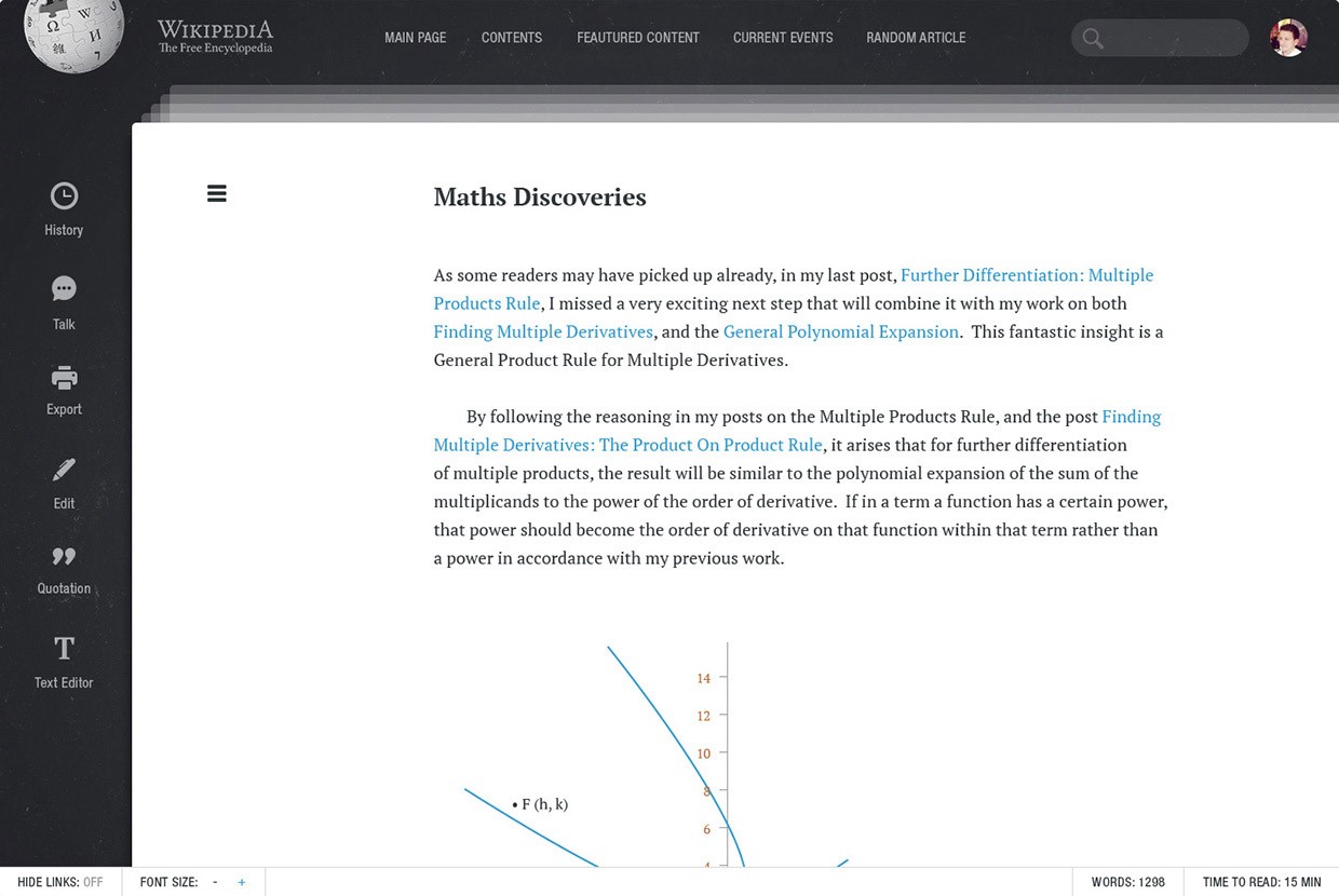
“Wikipedia is one of the most visited websites in the world. It hasn’t been changed or redefined during the last 10 years. This is a try to make Wikipedia more modern, readable, useful and personal.”
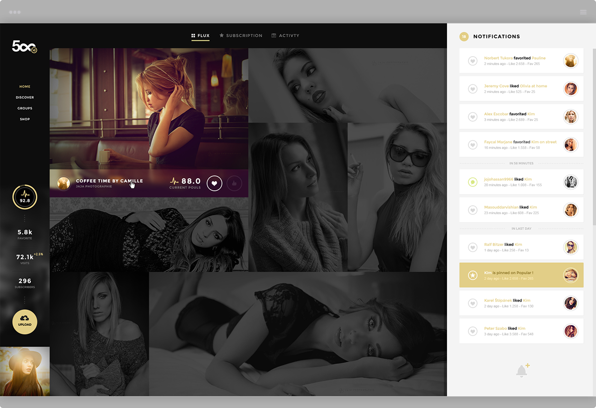
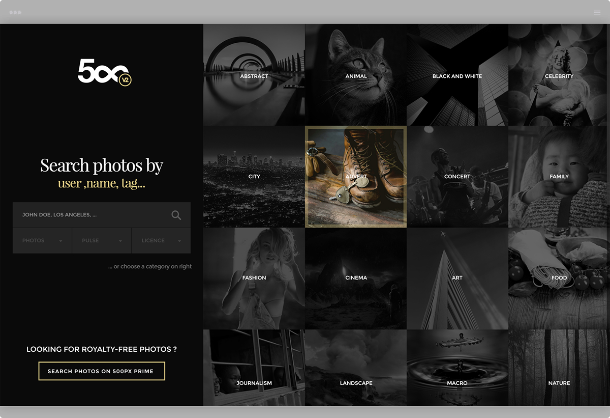
“As a designer ui / ux & photographer, here’s my vision of the site 500px.com. Hope you all enjoy it! In this experimental concept, what I wanted to highlight : — avoid empty spaces using the full screen (Based on a grid, this design will fit easily on any device) — remain in dark interface to better highlight the photography — interaction users & community between: pulses / like / rating / share … Comments, feedback, likes and follow are welcome ! Thanks for watching — have a great day and week! jaja-design.com — UI/UX Designer based in France. All right reserved”