![]()

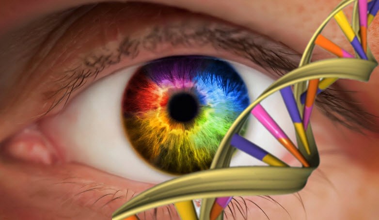
Our eyes are not only a mirror of our souls, but also the main and most important way for us to perceive the world around us. With the help of vision, we gather about 80% percent of all information concerning what is happening around us. Of course, we still hear and smell, we use our tactile senses, but sight is our main compass for daily activities. Our vision allows us to see not only the forms of things around us, but also their colors. It is precisely about color vision and its features that I want to talk about in this article, because when we create a digital product we do not make it black and white — we use many colors. When analyzing a product’s user experience, it’s crucial to understand how people perceive colors.
A little immersion in biology
In order to understand some of the features of our color vision, we need to make a small and, I hope, extremely simple excursion into neurobiology. As many of you probably know, in our eye, namely on the back of it, the retina, there are two main types of receptors: rods and cones. The rods are sensitive to the brightness of the light, and cones to colors.
What is most interesting, at the present time, is that people who live in industrialized countries practically do not use rods, because these receptors are designed to automatically orient themselves in poorly lit spaces. And, since in cities we are constantly surrounded by electric lighting, we use the rods in our eyes, at best, during a romantic candlelit dinner.
Cones, in this case, are of much more interest to us. These receptors are divided into three types:
- Low-frequency — these receptors perceive light in almost its entire frequency range, but best of all they perceive yellow and red colors.
- Mid-frequency — these receptors perceive light in the range from high frequency — blue, to lower-frequency light — orange.
- High-frequency — these receptors are aimed at the perception of blue and violet colors, which are at the very top of the pyramid of the spectrum of visible light. However, they also, although not so well, respond to green, which is in the middle range.
As you can see, all three types of cones intersect within their influences, so in order for us to see a wide range of colors, our brain, namely the neurons in the visual cortex, subtract these signals from the cones and generate three channels of color signals — red-green, yellow-blue, and black-and-white.
Contrast Above Brightness
All our immersion in neurobiology is the basis for the following conclusion about the nature of our color vision: our eyes are much more sensitive to contrast differences in colors than to the brightness of these colors.

Look at these two red circles in the middle of the squares. In fact, they have exactly the same color, but due to the fact that the right one is shown in a black square, its color seems to us more vivid and saturated. Such a system helped our ancestors to see a predator that hid in the forest in bright sunshine, and on a cloudy rainy day. And you must admit, such a system is extremely effective, otherwise humanity would have had a very hard time. This important feature of human vision should be considered when creating a user interface.
We perceive colors depending on how they are presented.
Our nervous system plays with us. Our ability to distinguish colors can be limited and even very significant. Consider three cases in which our perception may be deceived:
- Picture 1 — it is difficult for us to distinguish between pale, weakly saturated colors. The paler they are, the less we are able to see the differences.
- Picture 2 — the size of the area in which the color is depicted is significant — the smaller the size of the color spot, the more difficult it is for us to distinguish these colors.
- Picture 3 — the greater the distance between the color spots, the more difficult it is for us to distinguish between them

These key factors can play a key role in user experience. For example, let’s say that you have created a product, and need to go through several stages of authorization.
If the color of the stage where the user is located is pale and does not differ slightly from the colors of the other stages, as you can see in the picture, then the user may get confused and not understand at what specific stage he is, which can negatively affect the user’s experience.
External factors of color perception
Every UX designer knows that he cannot predict with perfect accuracy in what environmental conditions and on which particular device the user will use his product. These conditions can also affect the color perception of the user. For example, you may encounter differences in the characteristics of color displays, and in the end what is blue on one display may appear pale blue or light purple on another.
There is also an environmental factor. Excessively bright light in a room or direct sunlight can significantly change the colors that we see on a display, and I think almost every one of us has encountered this phenomenon. Of course, a designer cannot influence these factors or somehow change them, but each designer should just remember them and, if possible, take into account their impact.
So how can we use this?
And so, as you’ve read to this place, learned about some of the limitations or features of our color vision. And you are probably wondering — what next? How can we put this into practice in UX design?
Here is a shortlist of tips that you can apply to your UX design practice:
- Avoid slight color differences. If your product, for example, has the “Confirm” and “Cancel” buttons, then it will be more advantageous to color them blue and yellow or green and red, rather than pale yellow and beige, respectively.
- Use basic distinctive colors such as red, yellow, green, blue, white, and black. As you remember from our short excursion into the neurobiology of the eye receptors, the perception regions of the color ranges of our cones intersect. Using the colors listed above will help the user more easily perceive information, and will not cause the user to activate an additional number of processes of the nervous system.
- You should not rely only on the color difference of the interface elements. In addition to color, use symbols and additional notation. This will help the user more easily understand the process of using your product and build not only color, but also symbolic associations.
Output
Color is very important in user experience design. When we develop a new product, its color scheme is a business card, and the user will associate your product with the colors that you use. Yes, of course you can have your own ideas about the colors to be used, as well as your own unique vision of the product, but still I recommend that you at least pay attention to the peculiarities of color vision., It is in this way that you can avoid problems associated with human perception and create a more user-friendly product.