
It’s not easy being a Web designer. We craft works of art that adhere to a multitude of environments, and deliver our message to a globally and culturally diverse audience. Despite having tools and apps to guide our processes, increasing demands upon our time and skillset mean we occasionally forget, ignore or fail to fully embrace metrics that can impact your visitors, resulting in a non-cohesive or damaging user-experience.
To combat this problematic issue, we’ll examine the metrics that shouldn’t be ignored, and why they remain relevant and mission critical to any Web project. Forget about design trends and that shiny new framework, this article is about the meat and potatoes of the user-experience. You don’t need to be an expert to make a difference, but if you’re more focused on a hamburger menu than any of the below, you might want to rethink your priorities.
Metrics That Shouldn’t Be Ignored
Accessibility
If there were an award for the most widely accepted but ignored metric in Web design, accessibility would win hands down. While we have standards (WCAG), laws to enforce compliance (Equality Act), and statistics to back up the huge range of interaction issues that disabled people may suffer; we still have a hard time trying to comply (and convince clients to take an interest) – which is a huge issue for the millions of sufferers worldwide.
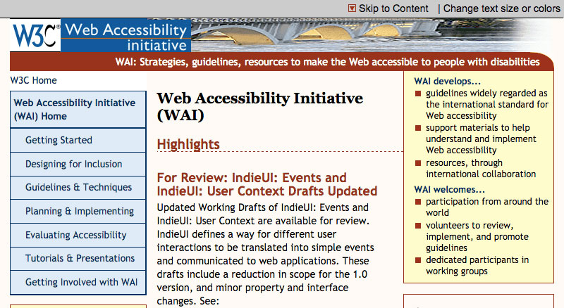
Image credit: W3C
Disability affects people from all walks of life and we should not shy away from supporting those with unique needs. After all, we’ll each (at one point in our lives) fall into the wide range of issues that accessibility encompasses, even if it’s just in our later years of life. Being accessible may require care and attention (due to the wide spectrum of possible variables), but it is achievable and enhances the user experience significantly.
Useful tools:
- WCAG 2.0 Guidelines
- Accessibility Project
- Color Blindness Checker
- Color Contrast Checker
- Free Screen Reader
Compatibility
If there is one lesson that Internet Explorer has taught us, it’s that nothing on the Web can be taken for granted. Years of being stuck with rendering quirks and ugly hacks has left us a cynical bunch who wouldn’t trust a flexbox as far as we could stretch it. Despite this, it has prepared us for the increasing range and diversity of devices that now have Internet access. After all, desktop web browsing is so last decade!
We browse the web on our phones, tablets, televisions, games consoles and watches. Because of this, rigorous testing of our work has become firmly ingrained into our best practices. We check analytics to see which rendering engines, OS’s, and devices are visiting our sites; emulating or physically testing our (responsive and mobile friendly) designs as we go. Compatibility testing remains an essential part of any designer’s workflow.
Useful tools:
- Developer Tools Tutorials
- Universal CSS Reset
- List of Device Emulators
- Internet Explorer Tester
- Responsive Design Tool
Freshness
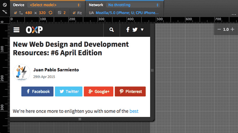
The Web is littered with relics of a bygone age. How many of us have lovingly produced articles, content or side-projects and allowed them to become stale, irrelevant or out-of-date. Keeping your content fresh and relevant is probably the most simple metric of a good website (as content is king). Despite this it’s often forgotten about, even though the pages still appear in Google search results – reflecting on your public image.

Image credit: CSS Tricks
Spending a few hours a year weeding out the dead links, updating incorrect information, redirecting moved pages and images, and improving the content quality can make a real difference to your visitors. Creating new stuff is certainly important, but showing you don’t simply abandon prior creations helps to maintain trust in your work. Even if you can’t commit to overhauling the entire site, updating a few pages at a time will help.
Useful tools:
Performance
There have been many notable evolutions in the way we craft websites; the Web standards movement, progressive enhancement, responsive design, and mobile first are among them. But with pages becoming increasingly heavy and bandwidth hungry, the year of Web performance is certainly in full swing. The principle of this metric is simple: make it load and work quickly; but how we go about achieving this can be both varied and time consuming.
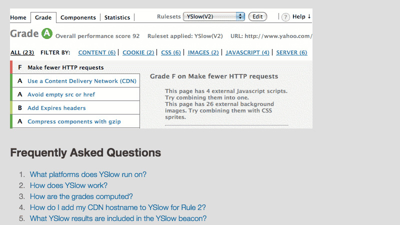
Image credit: YSlow
With people browsing the web on handheld devices (often without a good WiFi or wired connection), the need for fast and data-lean sites is obvious. And for most performance bottlenecks, solutions have been developed. From compression and minifying; to prefetching and caching, most sites can improve the speed at which users can consume their content. If you’re not already setting targets and performance budgets, it’s time to start.
Useful tools:
Usability
Understanding the needs of your visitors has always played a significant role in converting them to customers. While the field of usability is filled with best practices and research, we can easily feel overwhelmed with the subjectivity of the field. We have to stand out yet we must also feel familiar to our users, and one users “most important new feature” could be the next users “meh, I’ll pass”. What’s a designer to-do?
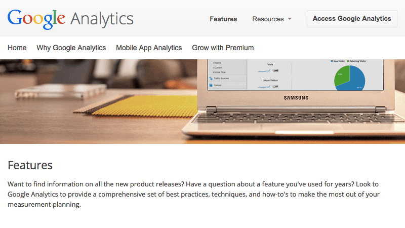
Image credit: Google Analytics
One of the biggest usability mistakes I see people make in is that they are all too taken in with the results of some survey or test performed on another site. While third party research is useful, it’s important to reach out to your audience and make changes they would find helpful. Usability testing helps us iron out bugs and issues in layouts, it also keeps users central to the design process. It’s therefore a critical metric to adopt.
Useful tools:
The Experience of Design
Design is an iterative process, and the evolution of our mark-up requires an increased awareness of best practices. After all, it’s not that people want to avoid being accessible or usable, they often don’t know how or underestimate the value that these best practices offer. Explain the benefits of such practices to your clients, appeal to your users for feedback, and allocate some of your development time to meeting these metrics head on.
The path to the perfect website is never-ending, and while time is often in short supply, it’s certainly not a challenge we should shy away from. Part of the task lies in education, and keeping up with these ever evolving requirements; the other is in research, and learning more about how our customers really use our work. After all, anyone can make a pretty layout, but few can make one that leaves a positive lasting impression – an accessible, compatible, fresh, high performing, usable experience; the holy grail of Web Designers and developers