
This article is the second in a three-part series showing the new approaches to iconography Iconic will be delivering. If you like what you see in this article, please consider backing Iconic on Kickstarter
Styling Icons With CSS
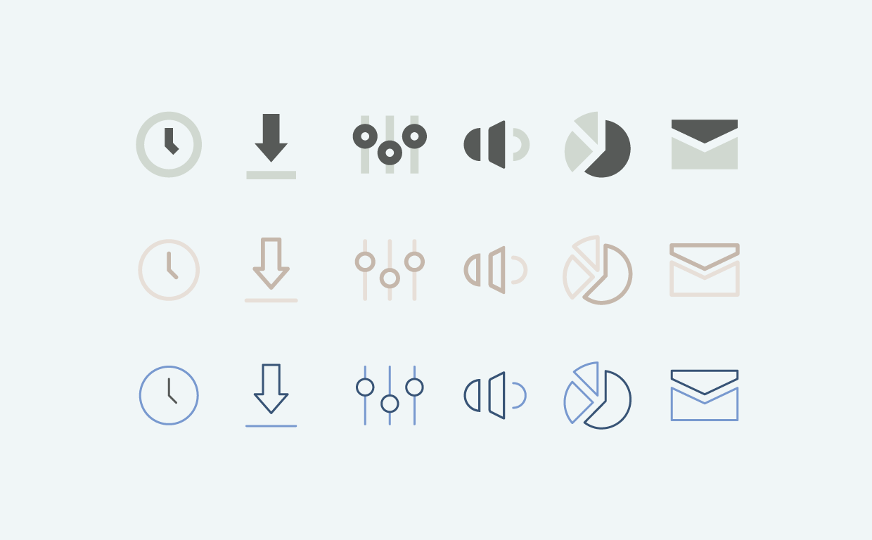
Smart icons have gotten a lot of interest, but styling may be the most useful feature on a day to day basis. Icon sets cover a wide array of different subject matter, yet are rendered in a single visual style. That is often times appropriate, if not optimal. However, there are many situations where specific icons can and should have specific styling (be it color, stroke width, or other attributes).
Styling wasn’t a possibility with static images (unless you output files for each specific aesthetic). Icon fonts got us closer by allowing simple styling, but it was not granular—meaning if you colored the icon red, the whole icon would be red. With SVG, the freedom exists to style individual elements within an icon, which opens up entirely new possibilities.
One Icon, Infinite Possibilities
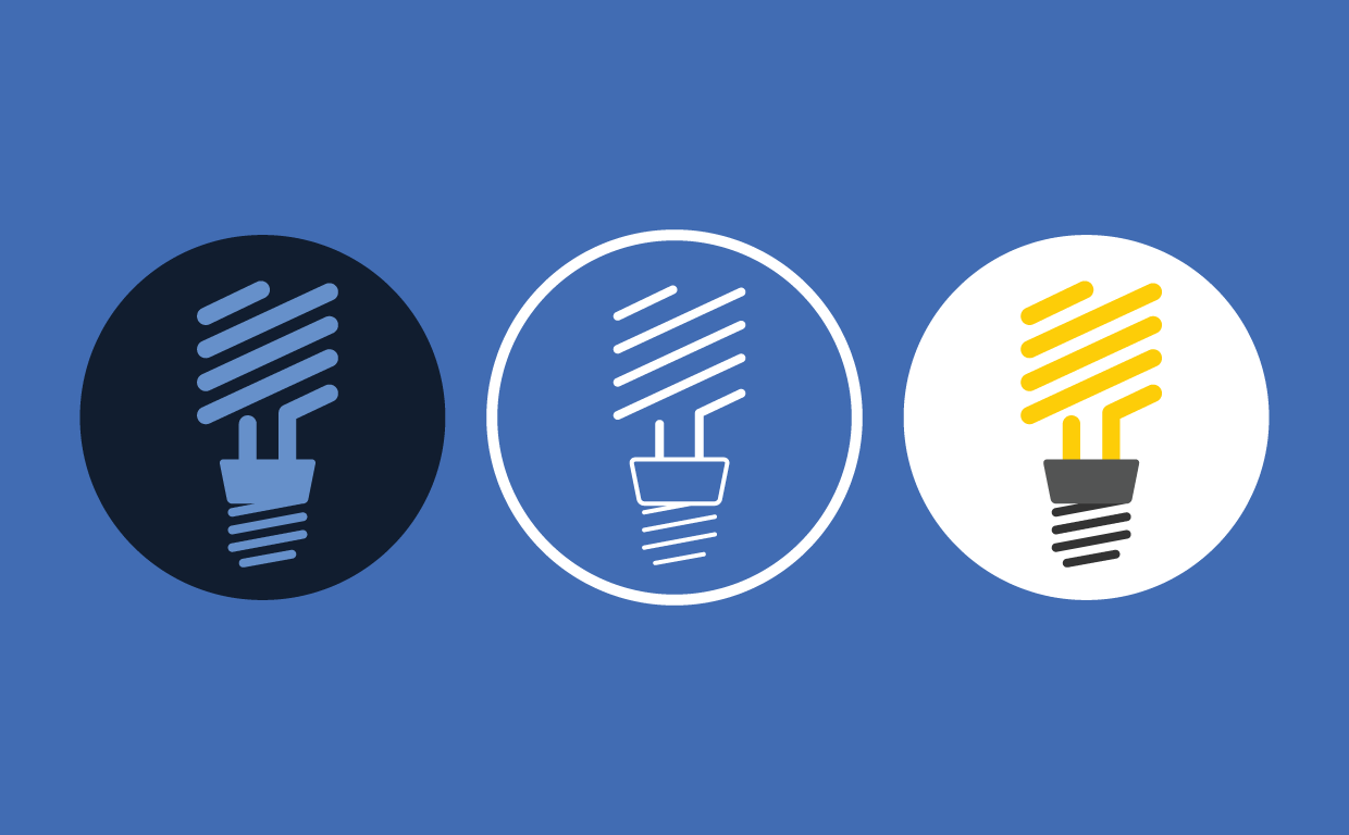
The combination of SVG and CSS is magical. Imagery can take on entirely different looks, have bespoke treatments and interesting interactive transitions. SVG markup provides access and control to all elements contained in it. This means a lightbulb icon can be “lit” with CSS, the contrast icon can be styled to reflect a specific contrast and a stoplight icon can communicate go. Being able to style at the elemental level breathes new life into icons—they can be truly unique.
Icon Themes
The next logical step of styling icons with CSS is to create set-wide themes for a consistent aesthetic. Part of our focus for Iconic is to expose and address the challenges around icon theming. Normally, styling a set of icons (beyond simply changing the color), was a laborious task which depended on having the source vector files. Don’t have them? Well, you’re out of luck.
SVG icons can solve this problem. I say “can” because consistently structuring an entire SVG icon collection is difficult. The icons need to be designed and built with theming in mind for the styles to be consistent across the set. However, when it works, it’s pretty awesome to see.
We’ve put together a demo to show icon theming in action. It shows you just how much can be done when CSS rules are applied to an entire icon set.
Play with our icon-theming demo.
Interesting Use-cases
Icon styling can go much further than just arbitrary color changes. This approach gives us the opportunity to provide another valuable layer of information.
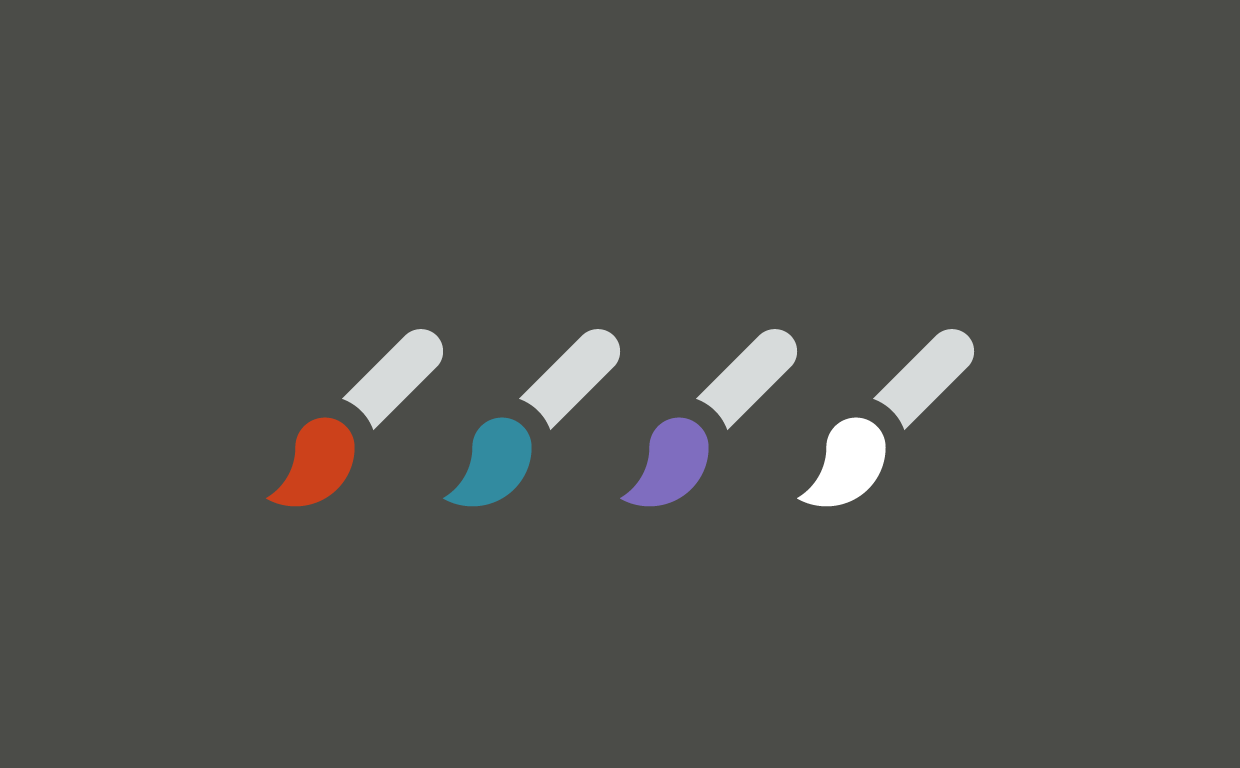
Provide simple contextual information
Think of all the icons you see in an interface which show contextual information. Just think of the paintbrush or fill icons in various applications that communicate what color you’re about to draw or fill. SVG icons that are designed to be styled can do just that.
Styling States
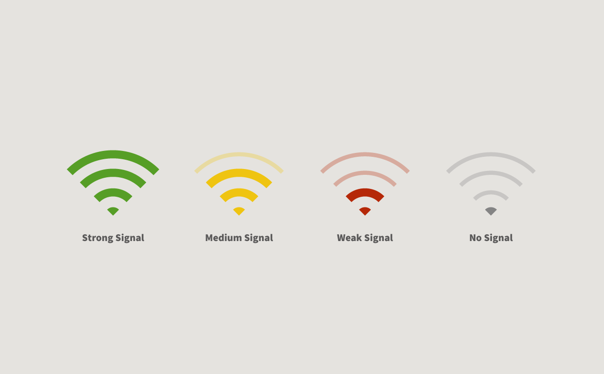
Communicating state within an icon is often times as simple as using color. This can already be achieved with icon fonts, but what if you wanted to go beyond a simple color switch? This is another perfect use-case for SVG & CSS. For example, let’s take a look at the WIFI signal icon.
How it works
Note: The example below is still a proof-of-concept prototype. None of the following code is final, let alone beta. We’re still in the R&D phase of this approach and we know there are many issues that still need to be addressed. We will be working on a more concrete direction for this method after the Kickstarter campaign is complete.
The mechanics of styling icons is quite simple. If you’ve used CSS in the past (which we’re assuming you have), there’s very little to learn. That’s part of what makes this method so great—it’s amazingly powerful using the skills and tools you already know. SVG styling has an entirely unique set of CSS rules that you’ll need to learn, but the concepts are straightforward and require minimal effort to pick up.
The real work comes from designing and constructing an icon to actually be style-able. Just like Smart Icons, this method depends on SVG to be directly injected in the DOM and that it be semantically structured for styling. This goes well beyond just adding classes to each element in your SVG icon (but that doesn’t hurt). Priming an icon for styling is still a bit of an art form. We’re pretty sure there’s a science to this and we hope to write more about the process in the future. Our goal with Iconic is to help make this process clear and repeatable so that other icon designers can make their icons style-able.
Let’s take the example of styling the WIFI signal icon to display its various states. You’ll quickly see just how approachable it is.
HTML
<img src="signal.svg" class="svg-inject" alt="signal" />
JS
$ ('.svg-inject').svgInject();
CSS
/*Strong signal*/ .iconic-signal.iconic-signal-strong .iconic-signal-base {
	fill:#569e26;
}
.iconic-signal.iconic-signal-strong .iconic-signal-wave * {
	stroke:#569e26;
}
/*Medium signal*/ .iconic-signal.iconic-signal-medium .iconic-signal-base {
	fill:#efc411;
}
.iconic-signal.iconic-signal-medium .iconic-signal-wave * {
	stroke:#efc411;
}
.iconic-signal.iconic-signal-medium .iconic-signal-wave-outer {
	opacity:.3;
	stroke-width:.5;
}
/*Weak signal*/ .iconic-signal.iconic-signal-weak .iconic-signal-base {
	fill:#b52808;
}
.iconic-signal.iconic-signal-weak .iconic-signal-wave * {
	stroke:#b52808;
}
.iconic-signal.iconic-signal-weak .iconic-signal-wave-outer,.iconic-signal.iconic-signal-weak .iconic-signal-wave-middle {
	opacity:.3;
	stroke-width:.5;
}
/*No signal*/ .iconic-signal.iconic-signal-none .iconic-signal-base {
	fill:#848484;
}
.iconic-signal.iconic-signal-none .iconic-signal-wave * {
	stroke:#848484;
	opacity:.3;
	stroke-width: .5;
}
SVG: signal.svg
<svg version="1.1" class="iconic iconic-signal" xmlns="http://www.w3.org/2000/svg" xmlns:xlink="http://www.w3.org/1999/xlink" x="0px" y="0px" width="11.26px" height="8px" viewBox="0 0 11.26 8" enable-background="new 0 0 11.26 8" xml:space="preserve">
<path class="iconic-signal-base" d="M6.337,7.247c-0.391-0.391-1.023-0.391-1.414,0l0.708,0.708L6.337,7.247z"/>
<g class="iconic-signal-wave">
<path class="iconic-signal-wave-inner" fill="none" stroke="#000000" stroke-miterlimit="10" d="M7.62,5.966c-1.098-1.098-2.88-1.098-3.977,0"/>
<path class="iconic-signal-wave-middle" fill="none" stroke="#000000" stroke-miterlimit="10" d="M9.31,4.275C7.278,2.244,3.984,2.245,1.952,4.276"/>
<path class="iconic-signal-wave-outer" fill="none" stroke="#000000" stroke-miterlimit="10" d="M10.9,2.684c-2.911-2.911-7.629-2.911-10.54,0"/>
</g>
</svg>
Not too bad, right? Once an SVG icon is properly set up to be styled, the rest is downhill!
This Can All be Better With SVG 2.0
As you can see, you can do a lot with SVG and CSS, but there are still some limitations. One of the main issues we’ve run into is stroke alignment. All strokes in SVG 1.1 are center-aligned, meaning that the stroke will be evenly divided on each side of the path. We don’t think this is optimal for icon design for various reasons including potential clipping at increased stroke weights and a more complex drawing process to accommodate center-aligned strokes.
Fortunately, this is fixed in SVG 2.0—strokes can now be center, inner and outer aligned. Unfortunately, it appears that SVG 2.0 is still a way off. Our hope is that Iconic will help drum up more interest in SVG and encourage a more expedited process.
Conclusion
Icon styling has been a little overlooked in Iconic, but we think it’s a massively powerful technique. We truly believe that it’s going to have a huge impact on the way people use and see icons in the future. The great thing about this technique is that the technology is already broadly supported—all you need are icons which can take advantage of it.
Back Iconic on Kickstarter
The goal of Iconic is to help provide new approaches to iconography. We still have a lot to share with you and look forward to sharing our next instalment.