 Imagine the public excitement when, in 1951, William Edmund Hick (“Hickey” to his friends?!) and Ray (with an “a”) Hyman published research about people’s responses to a bunch of flashing lights. I’m sure no-one could imagine how important this work would be for the information age since, of course, at that time, a bank of flashing lights was pretty much the height of technological sophistication.
More accurately known as the Hick-Hyman law, their research draws the (not really earth-shattering) conclusion that the more options you have to choose from, the longer it takes you to choose — we’re still waiting to see what they thought about the wetness of water.
Yes, alright.
There are, in fact, some really important implications of this law. It touches disciplines as diverse as Aviation, Self Defence and, of course, Web Design. Here’s how it works:
What is Hick’s Law?
In simple(ish) terms, Hick and Hyman both found that, when people are presented with more choices, the increase in their response time is logarithmic. This just means that, as the number of choices increases, the response time increases at a decreasing rate. In the end, increasing the number of choices stops making much difference.
Don’t panic, here’s a picture:
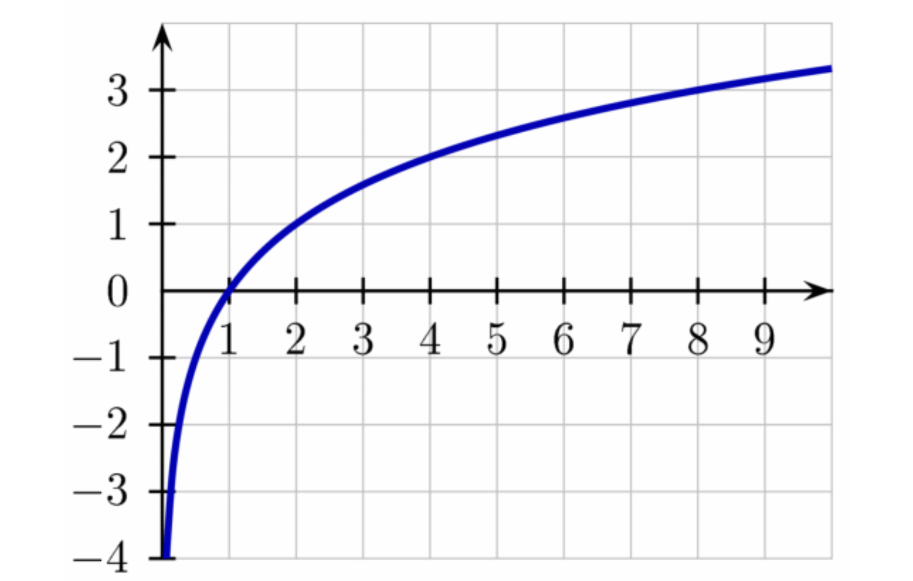
You can think of the horizontal axis as the number of items to choose from, and the vertical axis as time. Notice, that for 1 item, the choice time is 0. Adding more choices makes a big difference in the beginning, but much less towards the end.
This law really only applies for sorted lists and tends to break down as choices become more complex, as we’ll see.
It actually describes a kind of binary search. Those of you who got further in computer science than I did will recognize that this means half of the remaining items are searched at a time. The remaining half is subdivided, one half of it is searched and so on. In human terms, it’s like narrowing down the search of, say a buffet table, by deciding if you’re going to start on the right or left. Then, having chosen the right side, deciding whether to start with soup or salad.
The law applies equally to the number of stimuli (say, menu items) and the number of responses. So a menu like this:
will take more time to process than a menu like this:

If you can’t break down the choices logically (because the list is random, for example), searching in a binary fashion won’t help. This is also true in situations where you’re familiar with the interface, or guess (correctly) in advance which choices you’ll be offered. These, then are exceptions to Hick’s Law.
It doesn’t really apply, for example, when deciding “how to manage your time”…
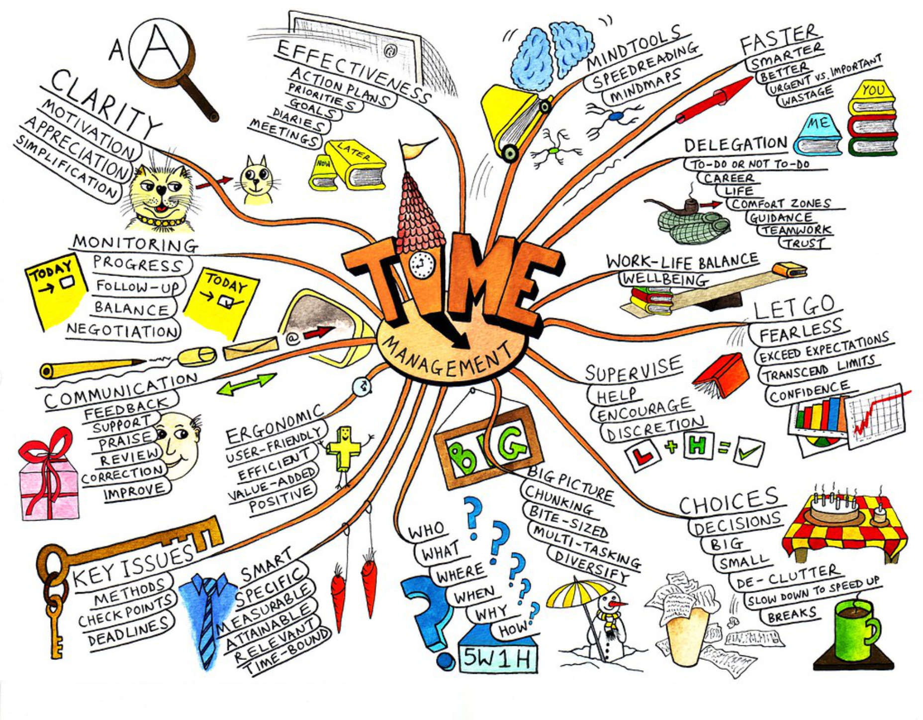
Time Management Choice by Jean-Louis Zimmerman via Flickr.
Relevance to Web Design
Here’s a simple rule: The longer it takes to make a choice, the easier it becomes to make no choice at all. Don’t be that designer! Most of the time, less is more.
There are four performance metrics that are strongly affected by Hick’s law:
- Bounce
- Engagement
- Average Time on Page
- Subjective User Experience
If you’ve got your UX head on, you’ll realize, of course, that each of these affects your traffic, search ranking, and ultimately — if it’s a money-making business — revenue. Let’s look at each in turn:
Bounce
The big problem here is information overload. If you arrive on a landing page and see something like this:
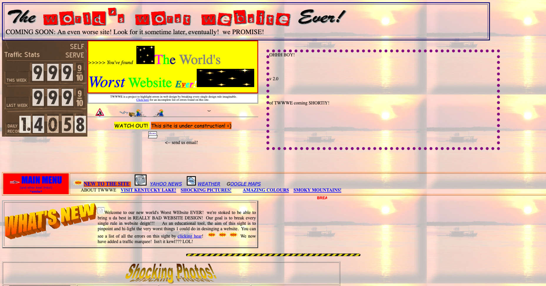
You “might” start by trying to make a decision about where to go next, but pretty soon you’re going to just, err… go. This is one good reason why less is more.
Engagement
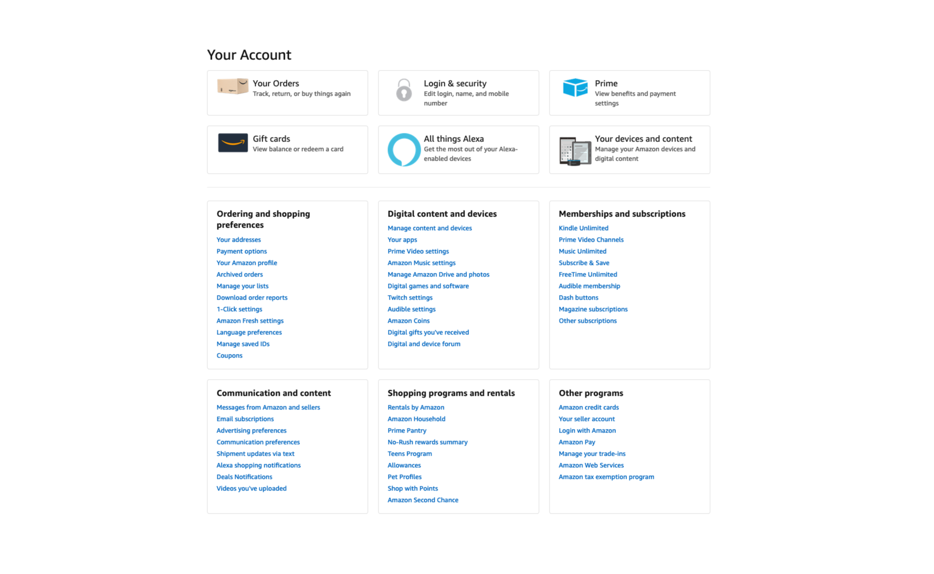
Users don’t want to be faced with tough decisions or to spend a lot of time getting through things like registration. They want to get to the content they’re looking for as fast as possible. If your sign up process looks like this:

You’d probably be better off with something like this:
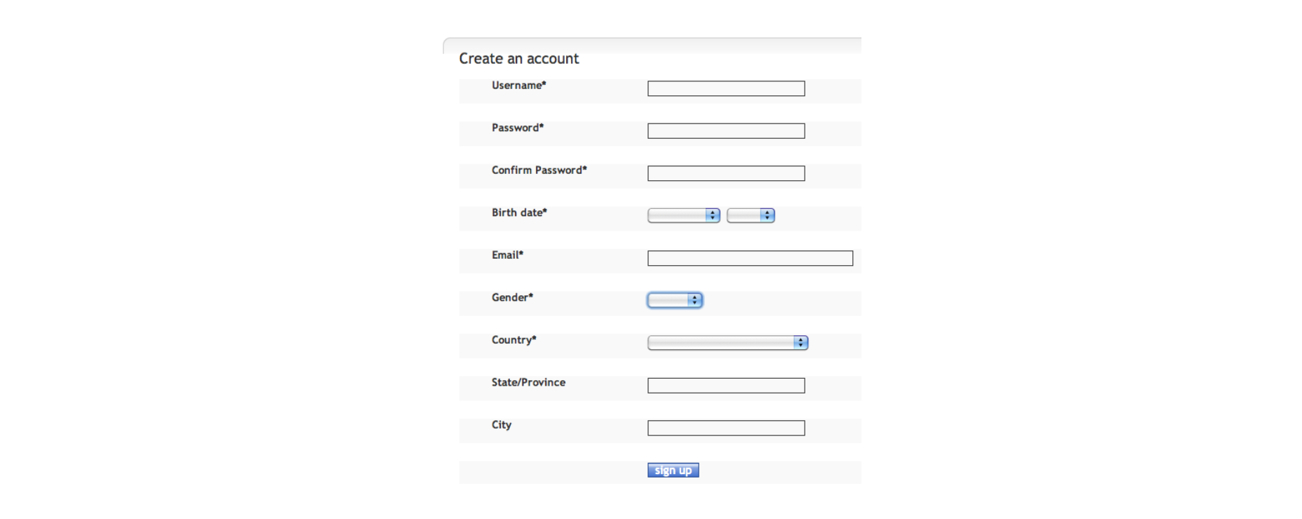
Even if you then go on to ask them more information, you can do it in small chunks. If not you risk losing people halfway through.
Average Time on Page
This is one situation where less may not be more: the more items you have on the page or in a menu — as Hick’s law tells you — the longer they’ll spend on it. The gamble is that having too many items will risk a bounce.
Subjective User Experience
In many ways, what users say or feel about their experience is more important than any hard metric. Take frustration for example. If you’ve never seen “User Inyerface” and/or never felt frustration, try it, it’s hilarious. And also not.
From a Hick’s law point of view, User Inyerface illustrates three really important things:
- If you can’t find an option, it doesn’t count as an option.
- Unless you use a consistent method for identifying potential choices (a mouse-pointer change or relevant label, for example), everything becomes a potential choice!
- Frustration is a powerful driver to abandon any activity, no matter how much you might want to complete it.
Chances are you’ll spend a couple of minutes on that site (great for AToP and Bounce) but never, ever, go back again.
Important Uses for Hick’s Law
Hick’s law is powerful but doesn’t apply in every situation. As a web designer, you can exploit both these facts to your advantage.
Group Menu Items Together
Using meaningful headings: product categories, for example, turns one massive choice into lots of smaller ones:
Decision times will be shorter, and your users will get a fast, breezy experience.
Consider Contrast
By using contrasting color, shape, size and texture, you can indicate choices more clearly. As well as a way of grouping similar or important options, this uses familiarity to decrease response times and improve user experience. A good example of this is in guiding users towards “safe” options to help them avoid negative outcomes.
Think About Goals
Remember that the decision-making process always begins with a goal. Understand the most likely goals of your users. When ordering and grouping menus, think about how users will segment their choices. WhatsApp, for example, offers 5 “Frequent Contacts” before presenting an alphabetical list.

Research and Test
Don’t leave it to chance. Find out what works for other sites, and, more importantly for your users before going live.
Exceptions to Hick’s Law
Exceptions to Hick’s law, aside from long, unordered lists (which you want to avoid at all costs), involve cases where there is familiarity, and users can guess what’s coming next.
Meet Expectations
There are clear conventions for things like buttons, links, information hierarchy and standard icons. By adhering to these conventions you’ll allow your users to break Hick’s Law and save time in their decision making, even when there are a lot of options.
Don’t Forget Your Users
You know your site or application really well so, in testing your own work, your experience will be much smoother than theirs. Get other people to test it for you before the client does.
Key Points
Hick’s Law means that the more choices you offer to your users, the longer it will take them to pick one. In a web design context, long choice times tend to mean higher bounce, lower engagement and more user frustration. That’s why, in general, less is always more.
The law is based on binary choice, so it’s important to segment the choices you present, and order them in clear, logical, user-centered ways. This will help to break large menus up into smaller “sub choices”. You can find creative ways to do this with things like color, shape and texture.
Where average time on page is concerned, there’s a balance to be struck between decreasing choice time, and holding attention. Realistically, though, UX is more important than metrics.
p img {display:inline-block; margin-right:10px;}
.alignleft {float:left;}
p.showcase {clear:both;}
body#browserfriendly p, body#podcast p, div#emailbody p{margin:0;}
![]()