 This month, the slow decline of minimalism continues, and color is everywhere. There’s some awesome type, and video-based maximalism seems to be gaining a foothold. Enjoy!
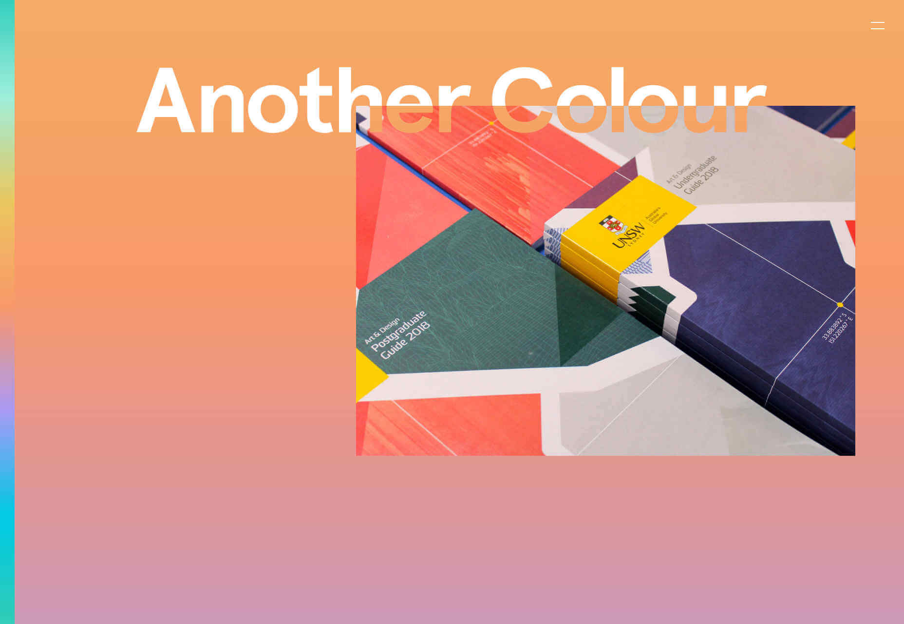
Another Colour
I adore Another Colour’s site. It takes incredible complexity to produce an effect this simple. The landing page is a looping rainbow gradient, and the gradient strip on the left takes you to the related point. Click a case study, and you’ll see tons of great UX detail. The masks being used to create contrasting type is a cool effect.
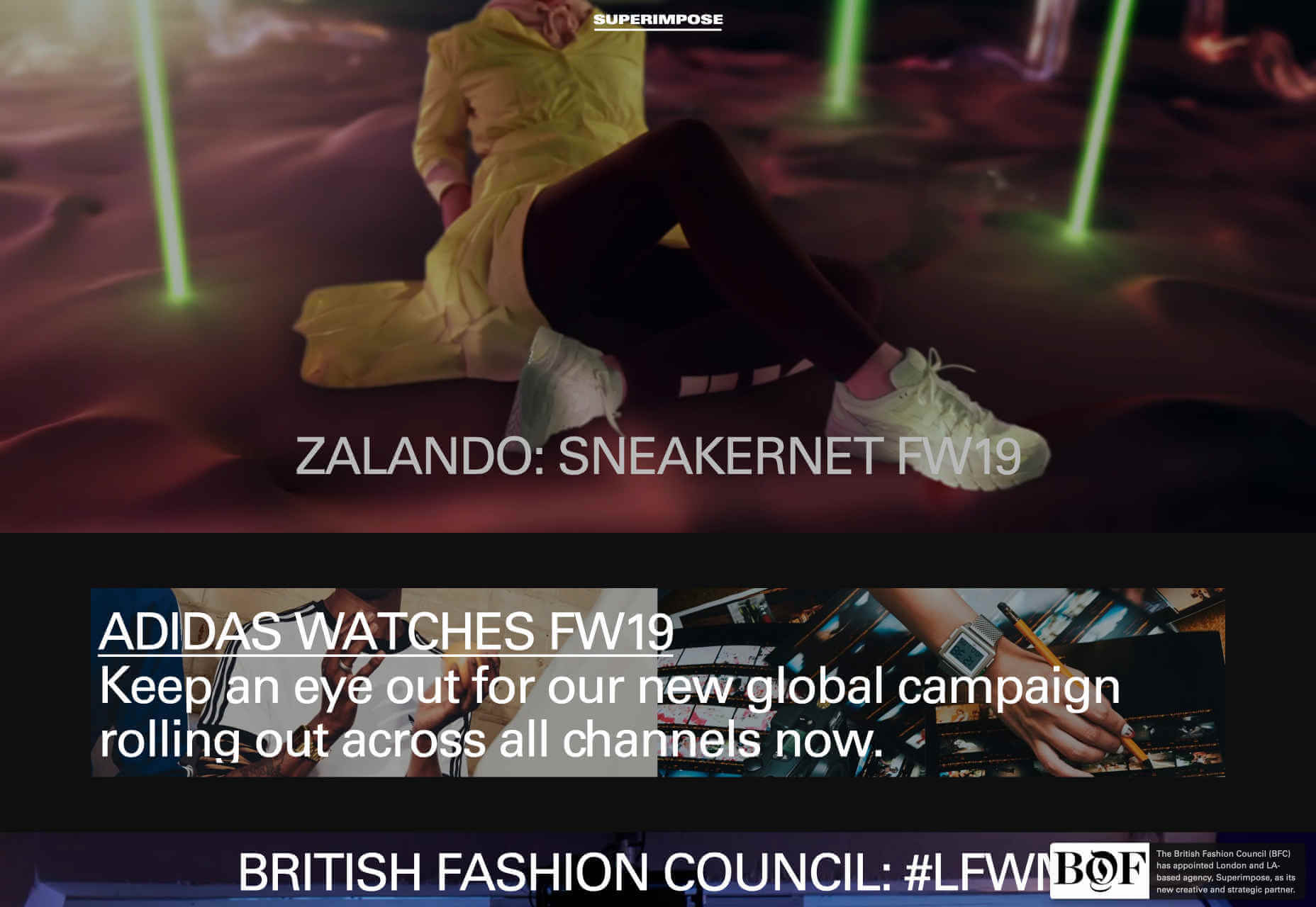
Superimpose
Superimpose goes for full visual overload. With repeat images, rapidly changing graphics, and videos in constant flux — the whole thing feels like the tour film for a French techno band. The menu is terribly hard to find, hidden behind the logo, but there’s not much there in any case, the focus of the site is the endless scroll on the landing page.
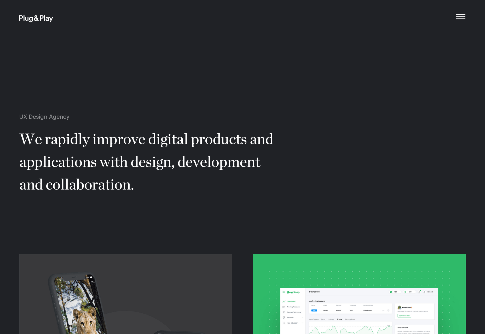
Plug & Play
Back in the realms of established user experience, the agency site for Plug & Play feels a lot less challenging. There’s the simple mission statement in large type that we’ve come to expect, and work overlapping the bottom edge encourages you to scroll. What I really like is is the way in which the site transitions from dark mode to light, as you scroll to the case studies. It’s a brilliant example of a simple transition that can be tied to a scroll.
Root
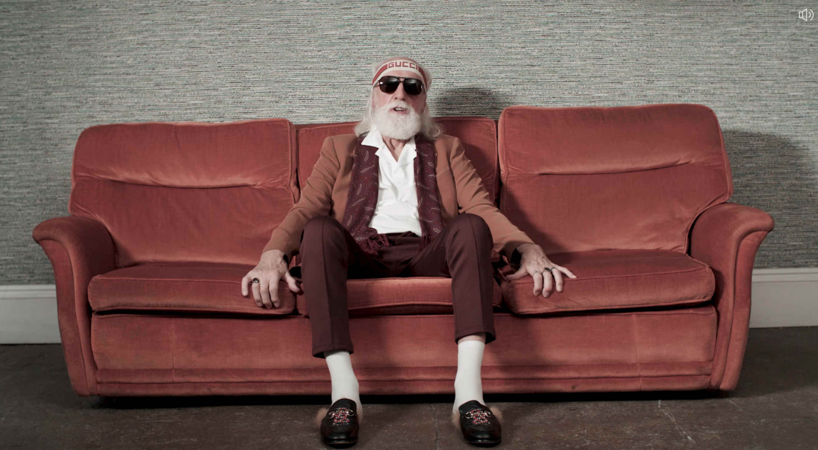
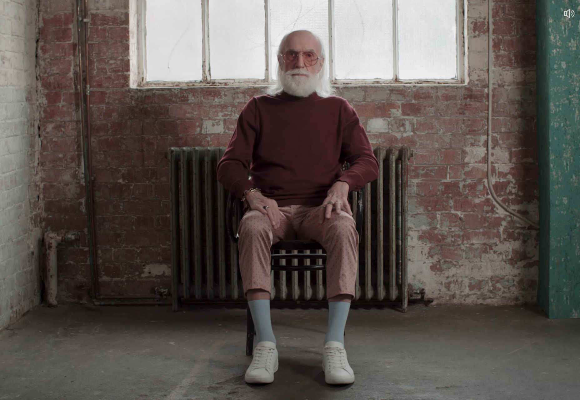
The video on the homepage of Root’s site made me snort coffee up my nose. An old British guy with a plummy accent, reads out a list of font names in a deadpan style. I don’t know if everyone would understand what the names refer to, but check out their client list and you’ll see that it’s working for them. I’m not a fan of the mobile-only approach though.
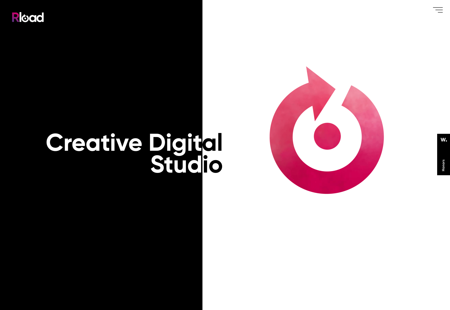
Rload
From a slightly anarchic British agency, to a highly-polished Spanish one. Rload hangs everything on its logo, with videos of smoke, and ink in water, behind a mask in order to add motion to the design. It’s a simple and effective way to present color and animation, without adding too much bloat. Their project page has embraced the brutalist trend, softened with a nice animated blob.
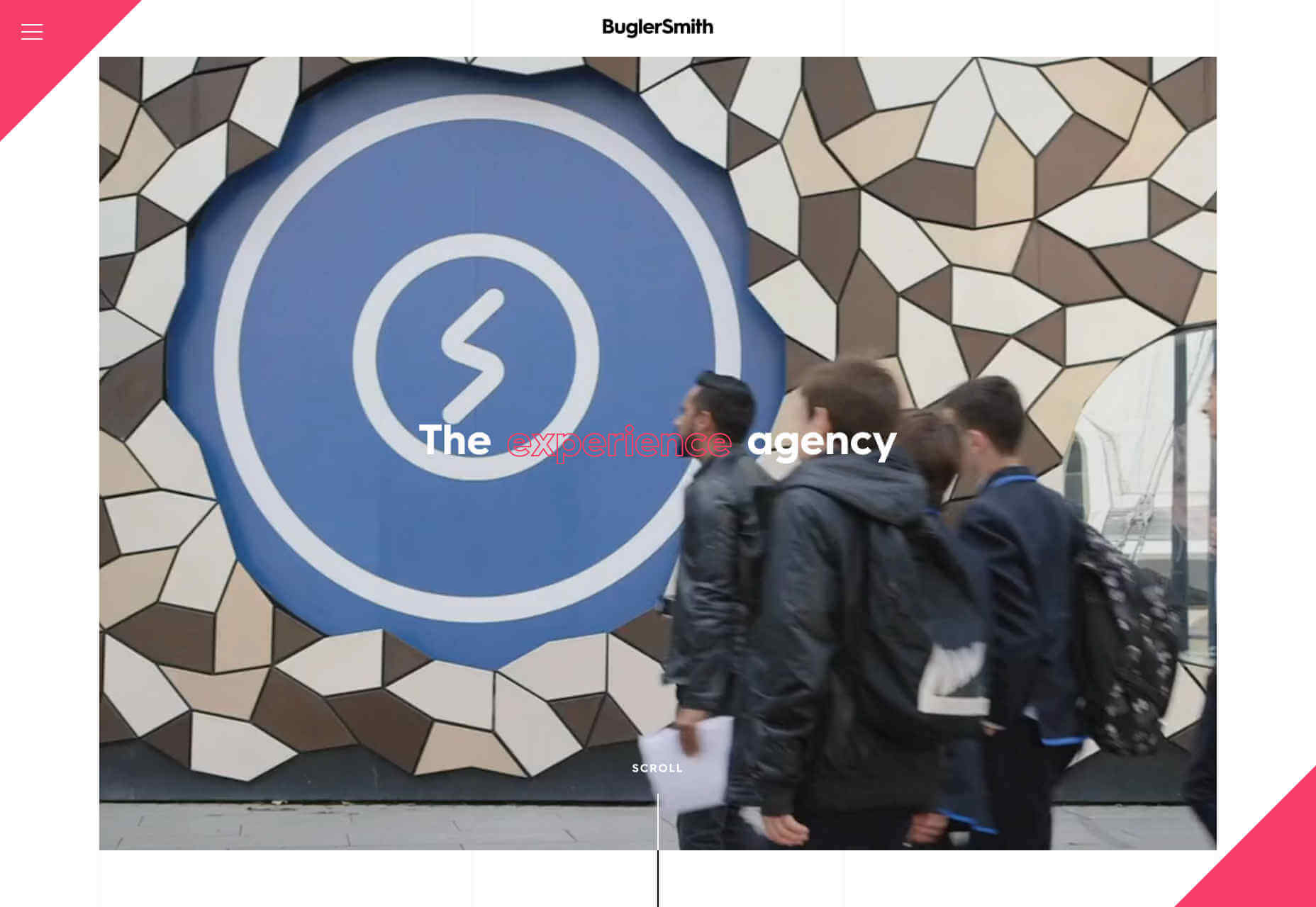
BuglerSmith
BuglerSmith is a creative agency, working on all kinds of media and interactive campaigns. Their site uses a very strong, very traditional 12-column grid to position thumbnails offset from each other, embracing the post-Brutalist trend. What really works is that some of the grid columns are highlighted with a fine line, which gives the scrolling page an incredible sense of depth. What’s more, it’s hard to dislike any agency that embraces neon pink.
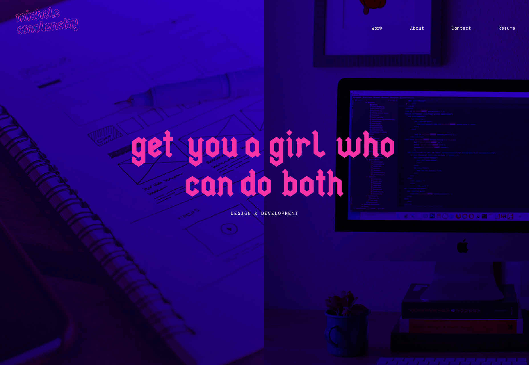
Michele Smolensky
Speaking of neon pink, what could possibly beat neon pink, other than blackletter type set in neon pink. Michele Smolensky is a freelance designer and developer, from Austin Texas. Her site is simple, but the color combination of deep blue and neon pink really pops, and you’ve got to love any site that has the confidence to embrace blackletter, possibly the world’s most underused style of typeface.
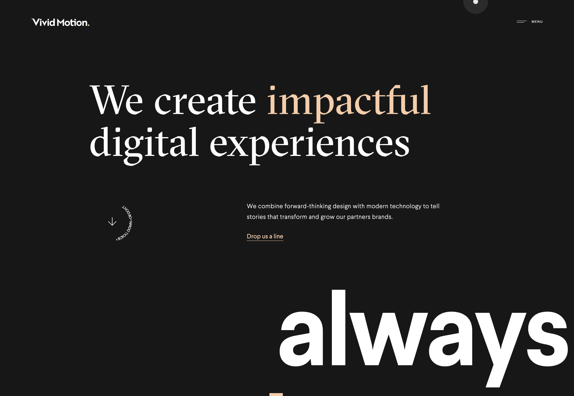
Vivid Motion
Vivid Motion is another site embracing beautiful typography. Vivid Motion relies on GT Spectra — a lovely serif font with tons of character thanks to those sharp cutaways. Scroll rapidly and the thumbnails sheer nicely to enhance the sense of motion. The dark background and simple grid feels like a lot of similar sites, but the considered typography really makes this site stand out.
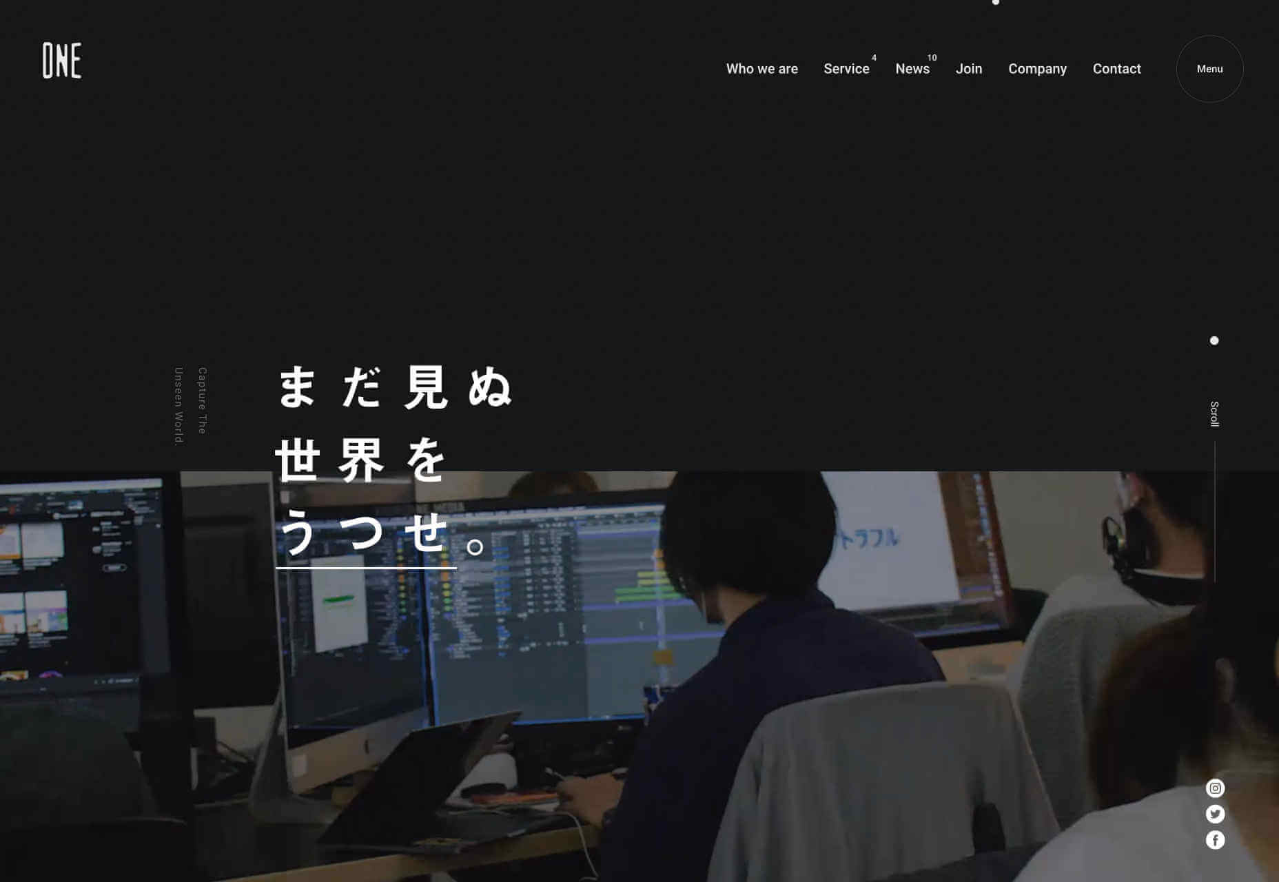
One Media
I love the energy of One Media’s site. It’s more than just the rapid-cut video, the whole layout, the overlapping elements, and the interaction of the different blocks of text all contributes. It also makes use of a big design trend: menus that rely on overlays rather than background color, in order to stand out.
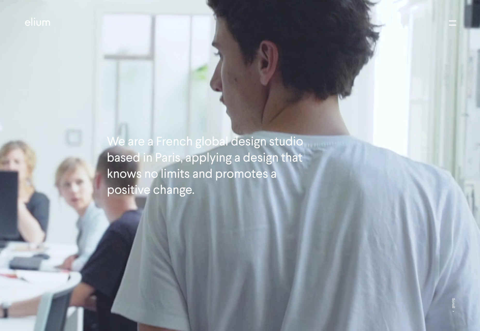
Elium
Elium is a Paris-based design studio specializing in product design. Their site features a slow-motion video that is effortlessly cool, and light-filled; precisely what I think of when I think of Paris. They’ve adopted a little of the spirit of brutalism with their offset images, but this site really longs for minimalism with the geometric sans-serif, and the subtle shifts in grey. I still can’t quite let go of this style.
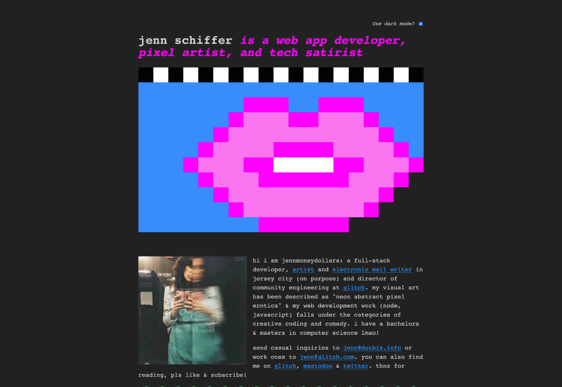
Jenn Schiffer
After a little visit to minimalism, we’re back to brutalism with a vengeance. Jenn Schiffer’s site might be my favourite this month, because it harks back to the early web, when we posted what we loved, not what had been analysed, measured, and approved. Describing herself as a web app developer, pixel artist, and tech satirist, this site is cool AF. And the fact that she’s included a dark mode option is hilariously awesome.
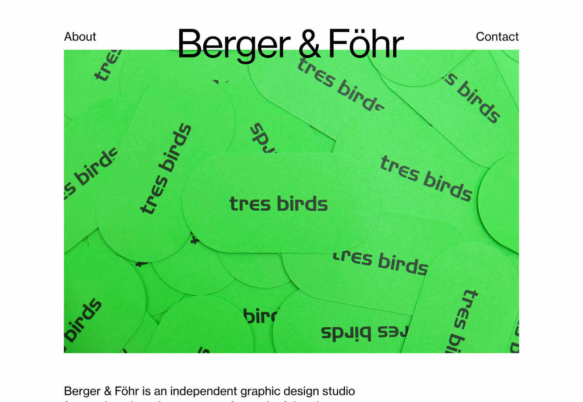
Berger & Föhr
Back to nice, sensible, orderly design. Berger & Föhr is a graphic design agency focused on brand ideas and identities. It’s a simple site that gives over all the attention to the actual portfolio. The work on show is highly accomplished, the identity for Hampton Architecture, Blackbelly, and Ello particularly stand out. If you had a healthy budget to rebrand your business, this is where you would spend it.
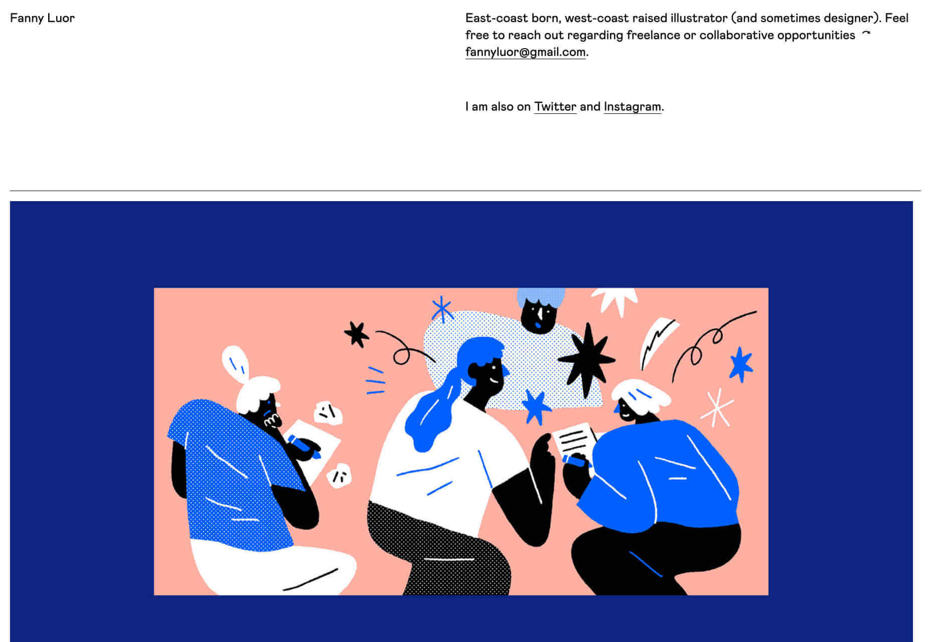
Fanny Luor
Fanny Luor is a freelance illustrator (and sometimes designer) whose site features some awesome work for clients like Dropbox and Intercom. Her very simple site is an exercise in self-restraint, which lets her work speak for itself. The illustration is both modern, and reminiscent of mid-late twentieth century illustration, with rich color blocks and simple shapes.
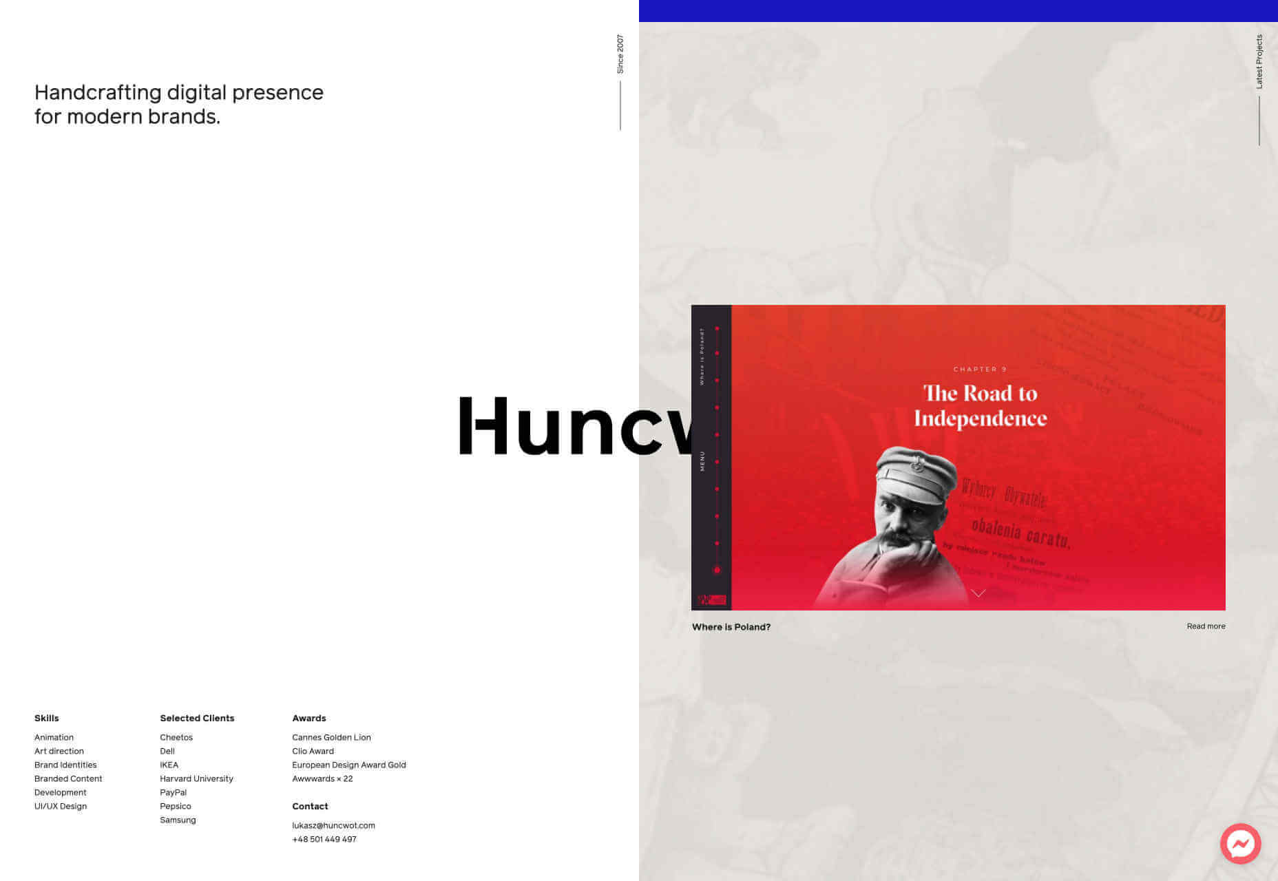
Huncwot
Huncwot’s site is a simple premise, executed brilliantly. It’s a split-screen design with company details on the left, and work on the right. As you scroll the logo, which straddles both, is overlapped by the design thumbnails to create a subtle sense of depth. There’s even some parallax scrolling (yikes!) thrown in for good measure.
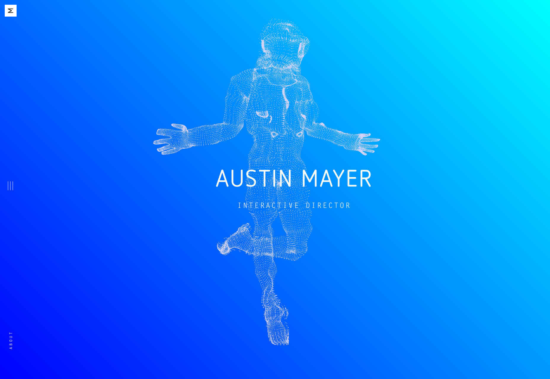
Austin Mayer
Austin Mayer describes himself as an ‘Interactive Director’ and the fun particle-explody effect on his landing page is certainly attention grabbing. What I really love is the use of the blue gradient. It feels like forever since I’ve seen blue used this well, creating a sense of space and light, without relying on darkmode to do it. Did I mention he’s done work for Beyoncé? Yup!
p img {display:inline-block; margin-right:10px;}
.alignleft {float:left;}
p.showcase {clear:both;}
body#browserfriendly p, body#podcast p, div#emailbody p{margin:0;}
![]()