The great challenge of every owner of an online store is how to transform a visitor of our website into a new client. It’s something that may sound simple, but that it really isn’t.
This essential aspect of the business must be reduced and solved in a systematic way through a process. We developed this process ourselves over the last 6 years working online and with more than 21 million clients in Latin America.
And this specific methodology is the one that I would like to share throughout this article.
Only one final goal
The first step to successfully develop a landing page is to explain to the user in less than 5 seconds: what we offer, (advantages, benefits, distinctiveness.)
If our value proposal is not interpreted by the user in less than 5 seconds, then because of not complying with this first requisite we will lose 73% of the traffic that enters our website for the first time.
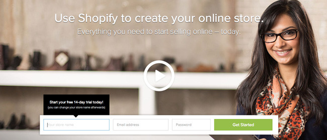
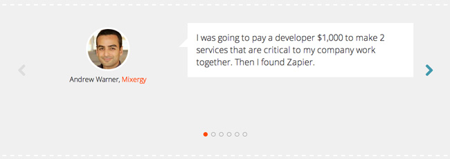
A well-developed example of this item is Shopify; in two sentences they describe what their tool offers to us and why we should use it.
But in order to compare, let’s see an example down below of what SHOULDN’T be done:
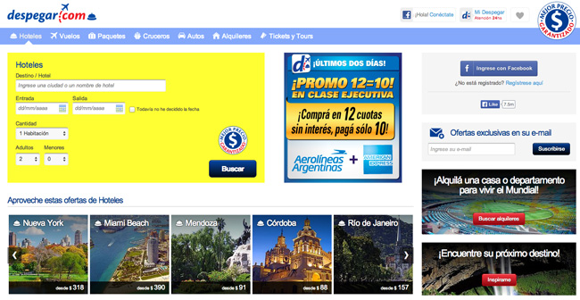
Despegar is a travel agency in Latin America. When entering for the first time, one doesn’t exactly know what to do; there are so many options (searchers for flights/hotels/cruises/car rentals, searchers for places of great tourist interest, and even options for the Football World Cup, and also special offers with credit cards (payment methods.) There’s also the option of subscribing to their newsletter.
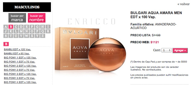
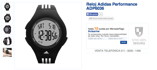
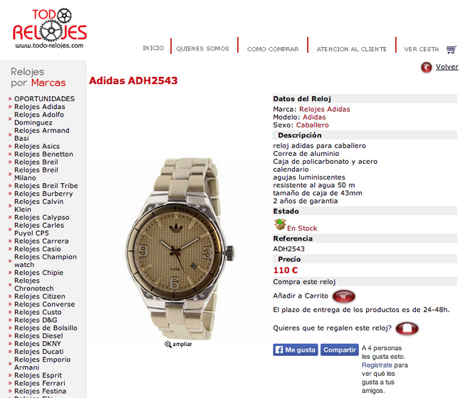
Down below we have two more examples of what SHOULDN’T be done:
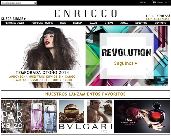
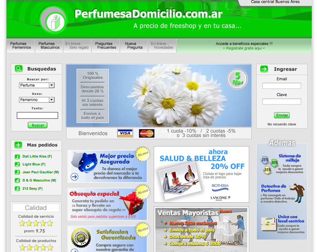
This is a clear example we shouldn’t follow. Later on, while the client starts to interact with our online store, we will always have time to offer them special offers, to offer them the possibility of subscribing to our data base with their email and to offer them additional suggestions. But we need to focus first on a single final goal and value proposal.
Opening communication channels
Based on our own experience with our startup EmpréstimosOnline, we were able to raise 34% of the sale conversions of our landing page once we understood that the client needs answers in time and manner for their last-minute queries.
All of us have, at least once, decided with one last question to the seller whether to buy a product or not, for example: “does this shoe quality resist rain?”, “is this watch water resistant?”, “is this cellphone compatible with my phone supplier company?” or “what is the warranty period and what return policies do you offer?”
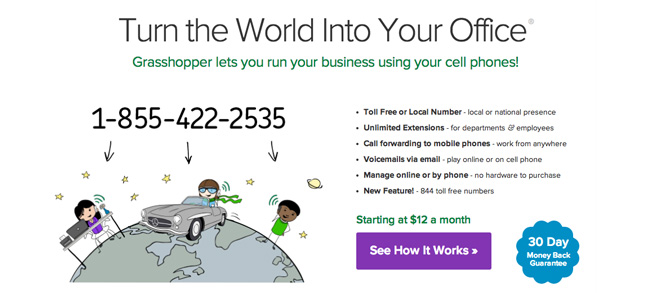
No matter how complete we may think our landing page is, let’s not ever underestimate our clients. Each one of them is a different world. In our case we offered two direct communication channels. The first one was a free of charge phone number (Grasshopeer):
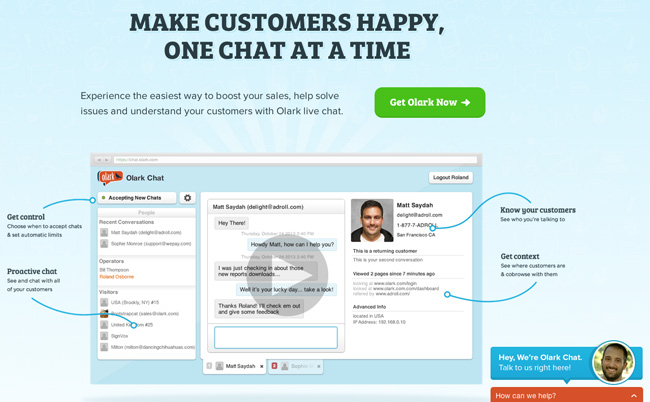
And the second option was a direct chat with our service center in real time using Olark:
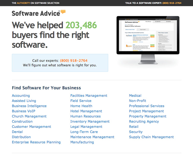
Let’s see now an example of a landing page that successfully uses its phone number on the right upper edge. But it also shows it in the middle of the website as a mechanism to avoid losing a potential client because of not answering when needed:
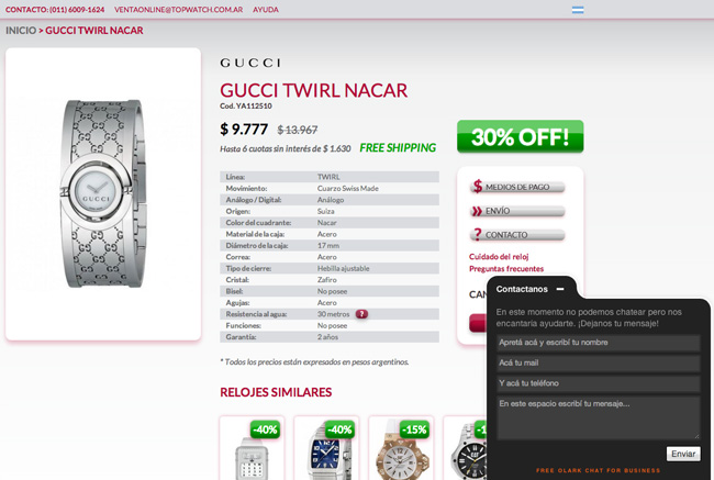
Another example, but of a landing page now, where an online chat is offered as a means of contact and as a direct customer service:
Offering reliable references
Another aspect that was significant and important for us originated from the possibility of giving transparent and reliable references towards our work. We gave those references to enterprises (suppliers) that trusted us, and to clients who had used our products and services in the past.
It’s a good idea to also add the places where our online store was published on the media (magazines, newspapers, supplements, TV, etc.)
In this way, the goal is to show through our landing page that we are a real, secure, and trust worthy website that other people would recommend and that they should trust too consuming and experience our products for the first time.
This can be achieved in our website through comments from previous users:
We can also achieve this through international enterprise logos and which enjoy greater reputation than ours:

Or even enterprises with which we usually work together to offer our services (partners):
We shouldn’t forget press logos that also transmit integrity towards our work:

Showing signs that transmit integrity
In order to support the client’s decision of finally buying our products, we must always expose our security mechanisms in our landing page such as Submarino does in its online store.

Another thing we should never forget are the payment options we offer (the more, the better):

Never underestimate the power these little details have on our landing page to close the sale of a product of our online store. Each aspect, no matter how unimportant it may seem, it’s essential.
Closing a sale
One of the biggest mistakes we made was not having a big and evident button to close the sale that would differentiate itself from the rest of the content. Although it may seem simple, this item must be clearly implemented if we don’t want to lose clients in our landing page.
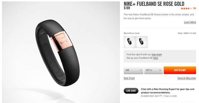
Nike is a clear example of this. The button calls the attention, it’s in another color, it has a bigger size and it’s very well placed (always on the right, where the user intuitively looks for it):
Down below there are three examples of what SHOULDN’T be done that show that this simple mistake is much more frequent than is thought of (it takes time to find the “BUY” button):
Professional design DOES matter
Lastly, a very important recommendation is to understand that the design of our online store is essential. This is the only perspective the user will take into account to rate the quality of our products.
As the client is not in an offline store (a physical store in the real world), the only existent reference is the web design of the page they have in front of them. If it’s mediocre or even standard we’ll for sure lose that sale against another online development which has a good design, done in a professional way.
For this case, let’s first see an example that should be improved:
Let’s analyze now its competence and please tell me in the comments of this article which store you would buy at:
When I say that the design is an INVESTMENT that we should make for the sake of our online store I don’t only refer to the web design, but also, and equally important: to the quality of the images, interactive videos, logos, structure (navigability and interaction), etc.
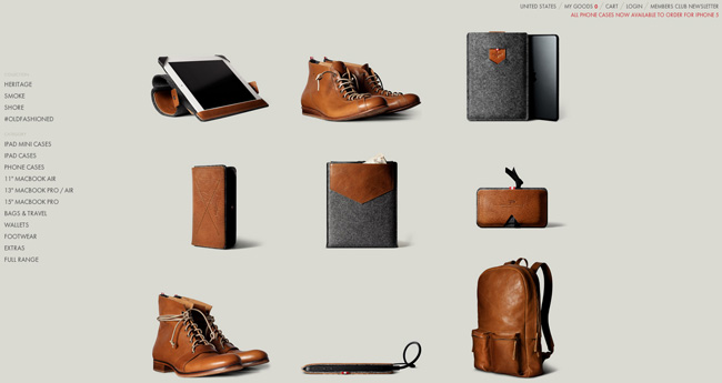
When I refer to the images, what I mean is that, for example, implementing this is definitely a mistake:
This is what should be done:
The combination of all the previous items is the key to this systematic process to successfully develop a landing page. I even invite each owner of an online store to try each one separately so as to measure the final results.
Author: Cristian and Hernán, who shared everything they have learned. They are both founders of PlazoFijo, the greatest online simulator of services in Argentina, Mexico, Colombia, and Chile; now also available in Brazil.