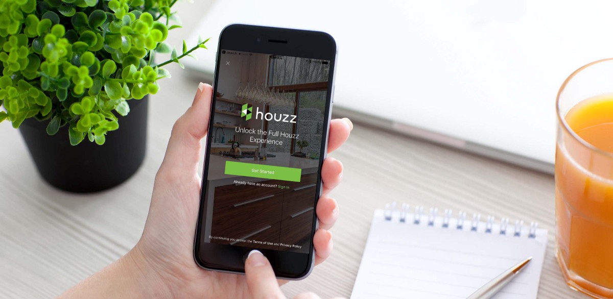

We are all looking for self-expression and inspiration. We express ourselves through fashion, music, art, and through furniture. Houzz is an interior design app that has thousands of furniture inspirations for users to express their styles.
After talking to friends and interviewing users I found that out of the people I talked to there were 3 main categories:
- New-movers furnishing a new house and looking for a wide variety of ideas and services.
- Casual-Renewers who upgrade a piece of furniture every once and a while.
- Style-lovers, They are always on the lookout for new ideas and like to shop frequently for smaller furniture pieces or decorations.
I personally fall into the last category, I use Houzz because I am passionate about interior design and I love creating spaces and matching furniture, Houzz is my very own Pinterest. However, I noticed some usability issues in the app that hinders inspiration, so I decided to track them down.
Hypothesis
- Houzz has “Ideabooks” which is a feature that allows users to save photos and ideas in boards to access them and make edits.“Ideabooks” does not have an easy access, my hypothesis is by making navigation to it easier more users will be able to find their saved ideas without frustration.
- I discovered recently “View in my room” which is an AR visualization tool allowing you to place items in your surroundings, I had no idea it existed, its indication right now is subtle and almost invisible to new users, my hypothesis is that by making this feature visible more users will be able to see this feature and use it.
The objectives of this case study:
- Back up my hypothesis with data.
- Conduct testing to uncover issues.
- Discover confusion around saving and navigation.
- Understand the discoverability issues in “view in my room ”.
- Propose design solutions and validate them.
The process:
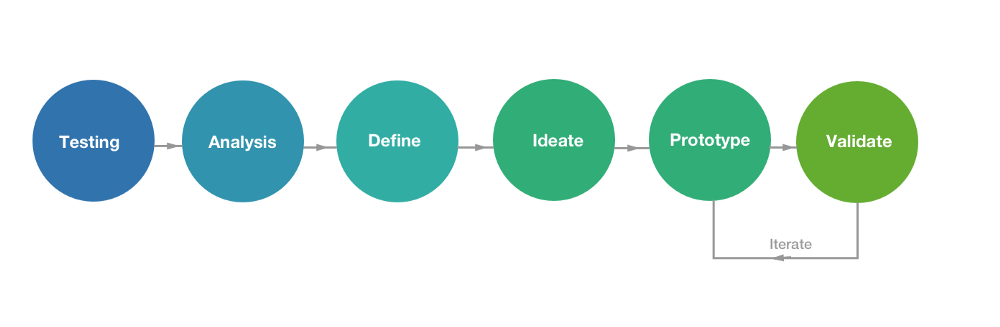
Research
Following the IDEO model for the human-centered design, I started the process with usability testing and ended with validation. This process provided me with a roadmap and a solid foundation to base my design solutions on users findings.
Persona
First I created a provisional persona for a typical user for Houzz based on online research and the base of users within my friends and family. (If this was a bigger project I would want to validate with more user interviews.)
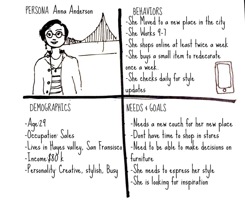
Anna is a stylish young professional
Then I created a storyboard, where our hero (Anna) is facing a problem in getting inspired and expressing her style, she can’t find the right couch for her living room, but using Houzz helped her overcome this problem. Imagining the scenario helped me empathize with the users, and I could better address the frustrations they would face.
Storyboard
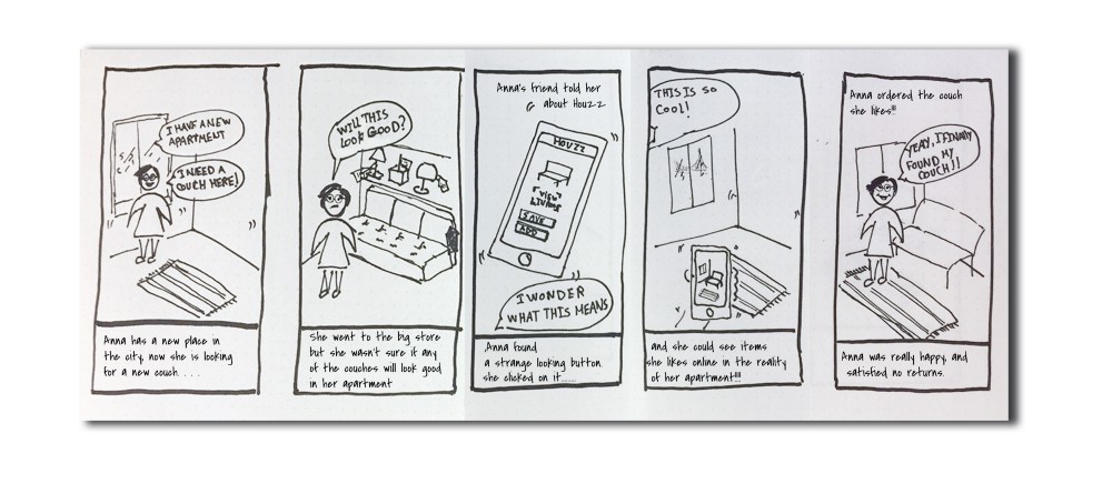
Storyboard showing our hero struggling with finding the right furniture.
Job stories
Based on Alan Klement concept of creating job stories, focusing on Motivations, situations, and outcomes, I created job stories to back up my hypothesis.
Guerilla Testing
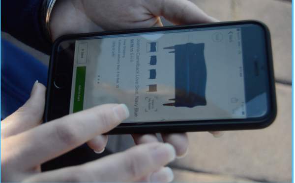
Imagine you just moved to a new place, and you are bored with your old couch, now you are looking for a new one, your friend just told you about “Houzz” an app that can help you get ideas and choose furniture. How can you use Houzz to find the couch that you want?
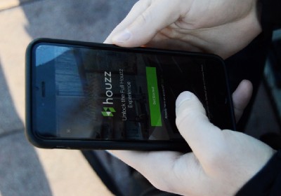
For the next phase, I went out to the streets and conducted 5 guerilla usability tests using a scenario inspired by my storyboard. I tested on users riding the Caltrain on my trip from Redwood City to SF in the morning. I was able to meet users that validated some of my persona hypotheses and I could spot some pain points that emerged through using the app.
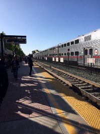
Testing People in Caltrain station
Affinity mapping:
From my notes on user testing, patterns started to appear and I started categorizing these issues by similar pains through affinity mapping.
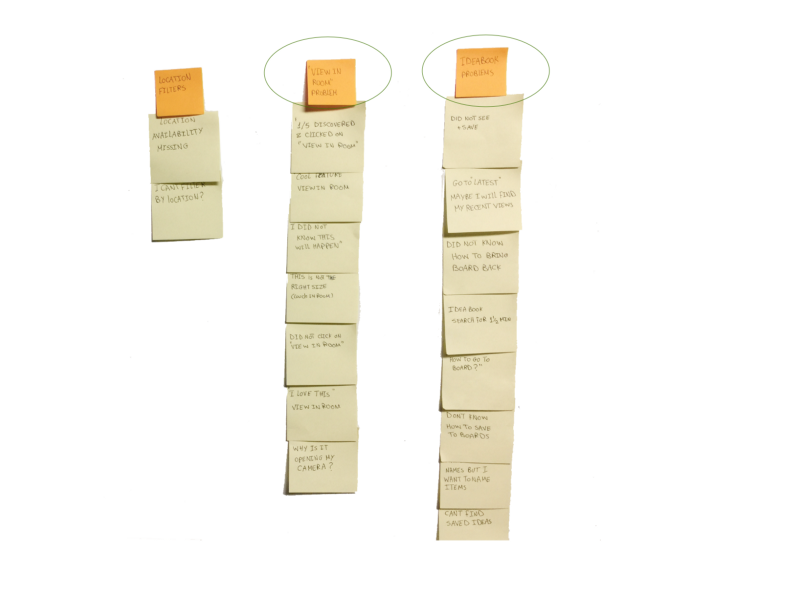
Affinity Map to discover where the users are having the most issues.
Then, I created a 2*2 to prioritize these categories by most important, to figure out what is the biggest cause for frustration.
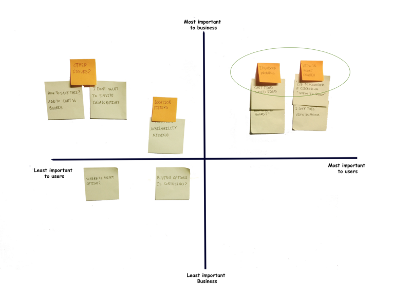
2*2 to prioritize issues by importance.
Define the problem
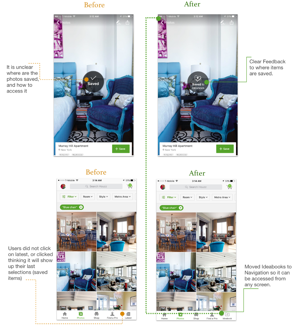
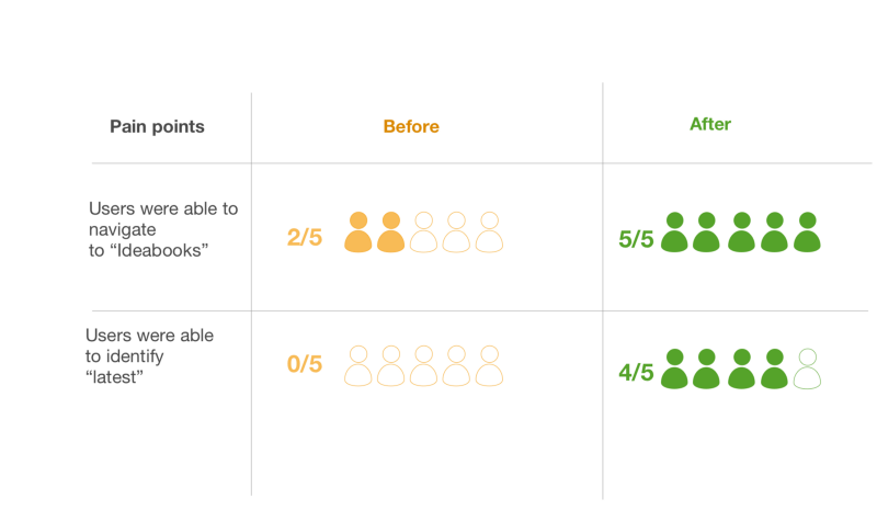
Pain point 1: “Ideabooks” navigation. Users were not able to find photos that they saved, they would save the photo and go back to the previous screen to look for where the photo might be, and get confused. It took users a while and multiple tries before finding “Ideabooks”..
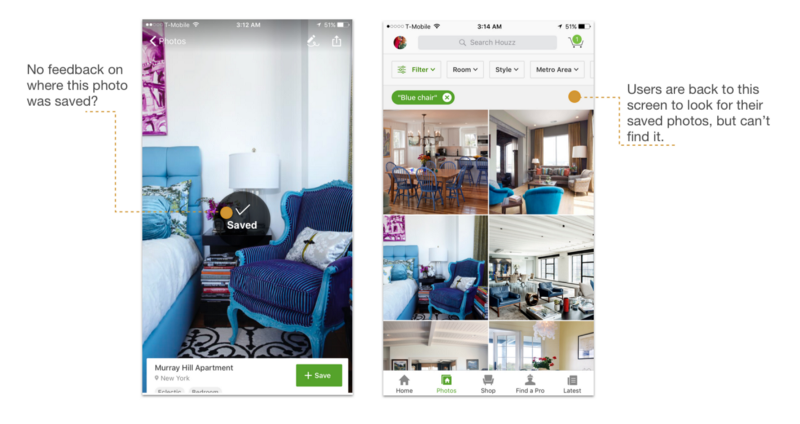
Flow problem in saving a photo
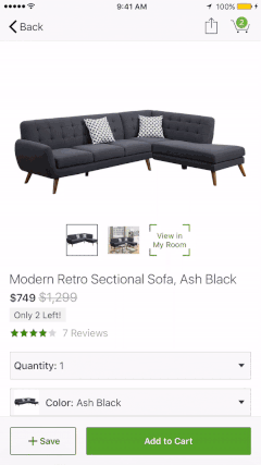
Pain point2: “View in my room” discoverability. Users did not know that “view in my room” feature exists, they were not tempted to click on the icon, and so they did not know what it does.
The current screen in the app.
** Now I will go through each pain point from ideation to validation separately to simplify things.
Pain point 1: “Ideabooks” navigation
Existing Task flows
I analyzed the existing Task flow of getting to Ideabooks to understand where the problem is. In the tested scenario, I asked users to find a photo that they like, and save it to access it later for ideas.
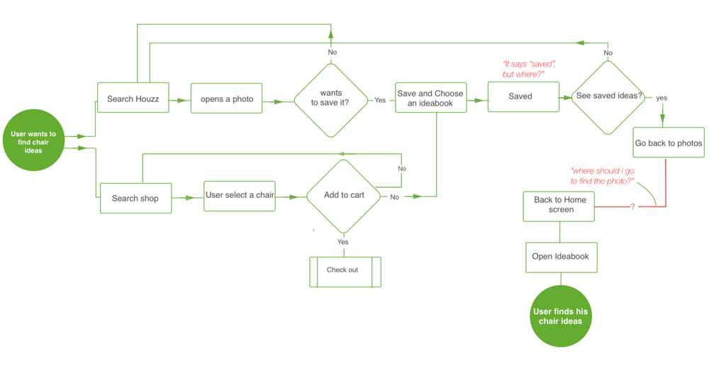
Users were confused on where the photos were saved
Ideation
Me love coffee….
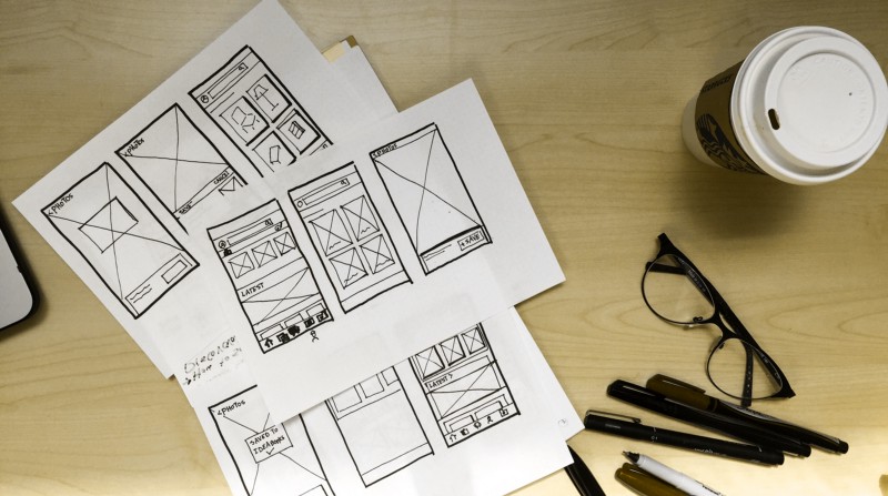
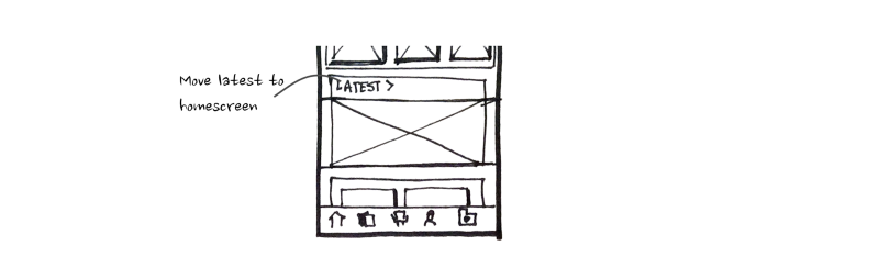
I started sketching out solutions on paper to give freedom to my flow of thought and not be constrained by details. My main objective was to create an easy flow and a clearer way to navigate to “Ideabooks”.
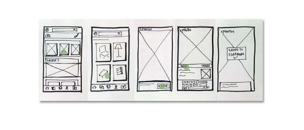
The proposed flow to create a clear navigation to Ideabooks
Design solutions
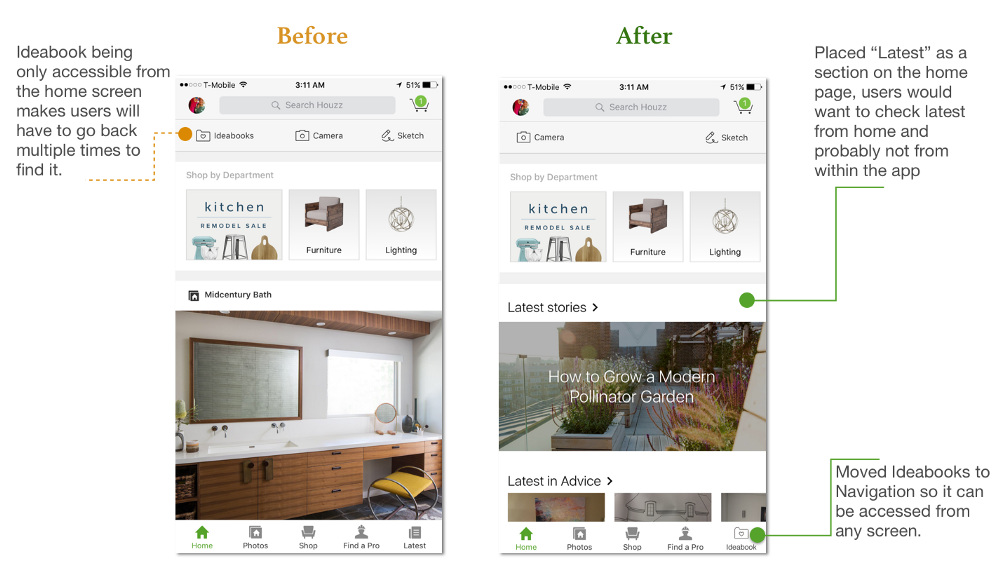
1- Make navigation easier I proposed to add the “Ideabooks” to the navigation bar at the bottom, and remove it from the tool menu at the top which only appears in the home screen. My reasoning was that Ideabooks is more of a place to go to than a tool to use, by making it available in the navigation bar users can access it from any screen.

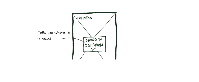
2- Giving feedback after saving. proposing a pop-up to show “Saved to Ideabooks” instead of just “Saved”, so it is clear where the item is saved, and where the user should go next to find it.
3-Moving “Latest” section to the home screen, I have noticed through running comprehension testing that “Latest” in the navigation, was either misunderstood or not used at all so I moved it to the home screen, as a section of the updates.
Prototyping
After sketching on paper I turned my ideas into high fidelity screens using Sketch, then used Marvel to create a clickable prototype to validate my solutions.
Proposed Flow
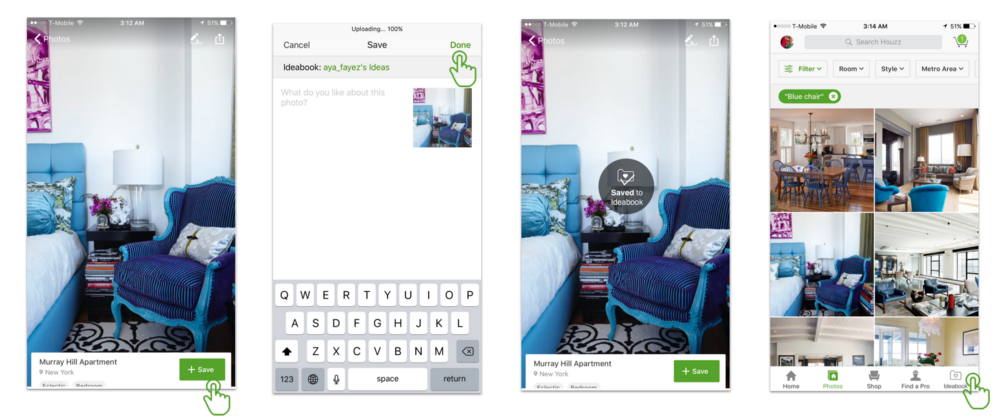
The proposed Flow to find Ideabooks
Validation
I tested the prototype with 5 new users using the same scenario used for guerilla testing to validate if the problem has been solved.
I also conducted comprehension tests on the home screen, to see if placing the “Latest” there made sense to users. Most users had no problem identifying it.
Pain point 2: Discovering “View in my room”
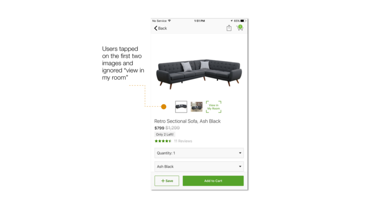
Using “View in my room” to place a couch in my own living room….
people didn’t know that “view in my room” feature exists in the app, my reasoning is :
- Having “View in my room” placed with the images carousel implies that it performs the same function which confuses users on what it does.
- Using text does not prompt the user to be interested or curious to click it, so they might skip the screen without even knowing this feature exists.

Users were surprised to see what this button does.
Word cloud:
So I started thinking about ways to increase discoverability…I conducted comprehension tests on Usability Hub , My question was what do you think (View in my room) does? to understand why people are not clicking on it.
The results showed that there was no clear understanding of what this feature does.
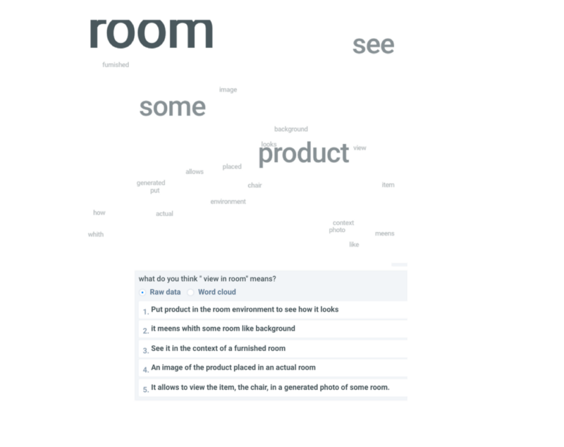
A sample of the answers I got from the comprehension test
Ideation
Thinking about discoverability:
I searched around on how to increase discoverability and came across this article at Studio by UXPin, which summarized discoverability strategies into 5 main strategies:
- Action bars
- Huge buttons
- Notifications
- Discoverable controls
- Social media log-ins
To apply what I learned in the article, I initially thought about creating an icon to replace the text in “view in my room”, I thought about changing its position on the screen, or having a tutorial to show what happens when clicked on it.
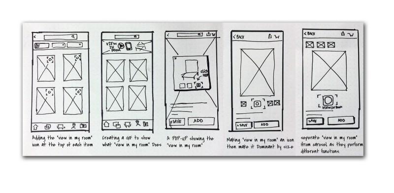
Iterations to increase discoverability for view in my room.
Prototyping
For my first high fidelity iteration, I created different Icons to represent “view in my room”, It was challenging to create a familiar icon for an AR feature.
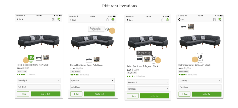
After conducting comprehension test to validate my solutions, users found the icons to be vague and confusing and the tip was not doing much good..
How do you create an Augmented Reality Icon?
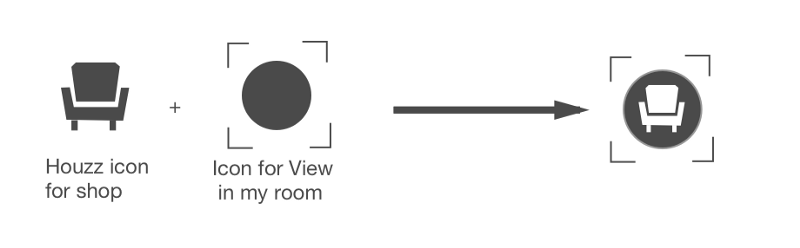
For this iteration I thought about using the icons already existing in Houzz to ensure some level of familiarity with users, I used the “Shop” icon combined with the Camera square to create a clean simple Icon that would be visible enough to catch users eyes.
Design solutions:
- Adding an Icon to make the feature more visible and clickable.
- Separate different features:
- Placing “view in my room” in the center below the item image.
- Placing the carousel of images at the top right(I would have chosen to reove it and use a dot slider, but the app already has the slider function to view different Items)
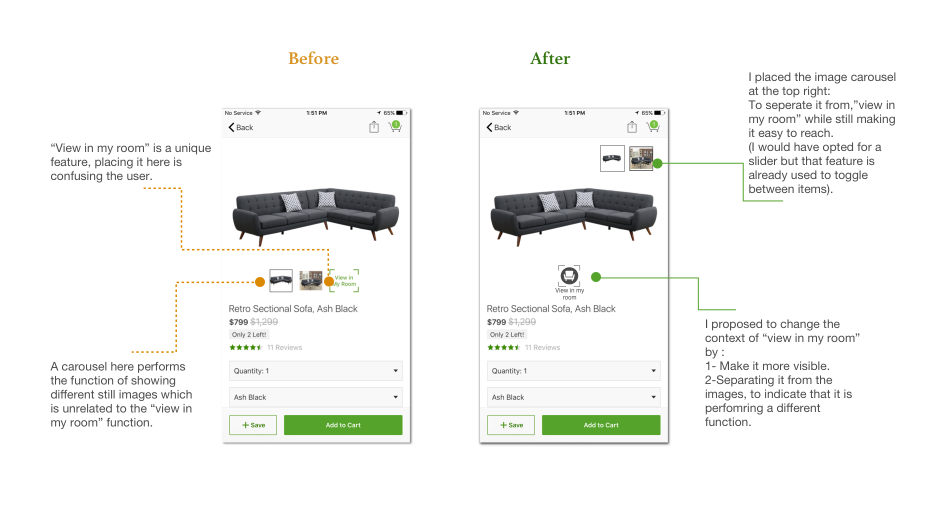
3-Tool tip screen: Highlighting the Icon using a tip screen that shows simple copy to explain that the camera will open to view the item in the room.
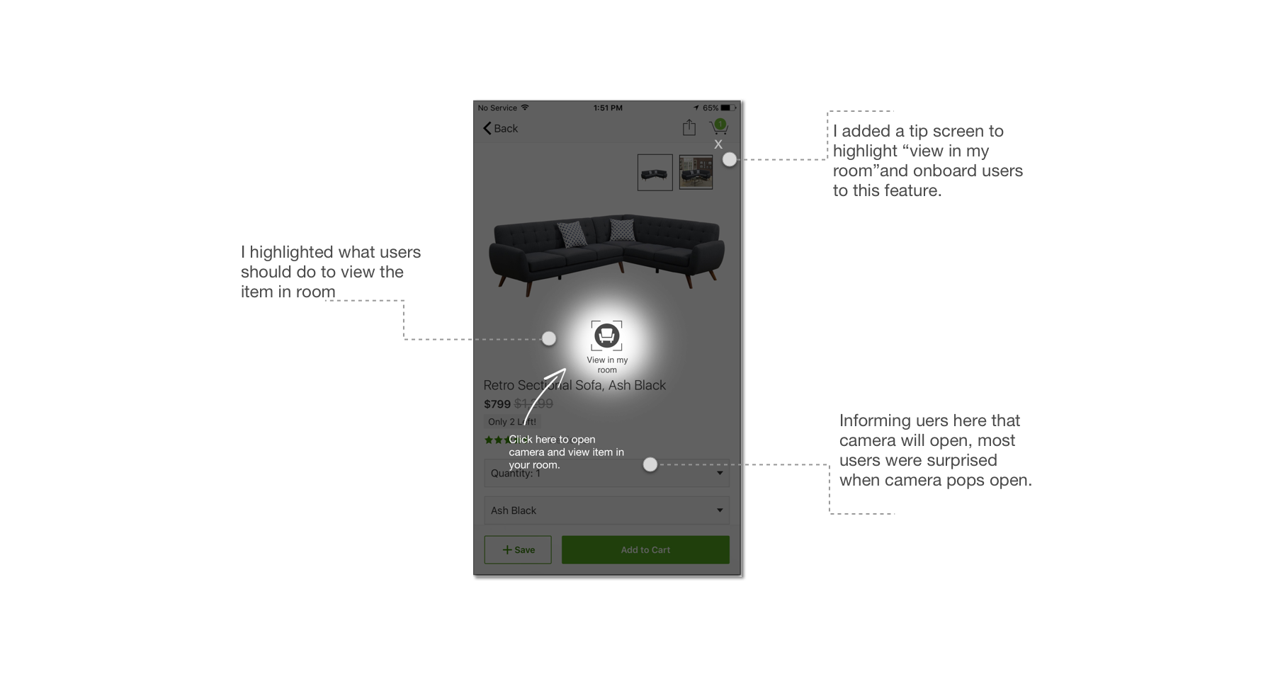
The proposed flow
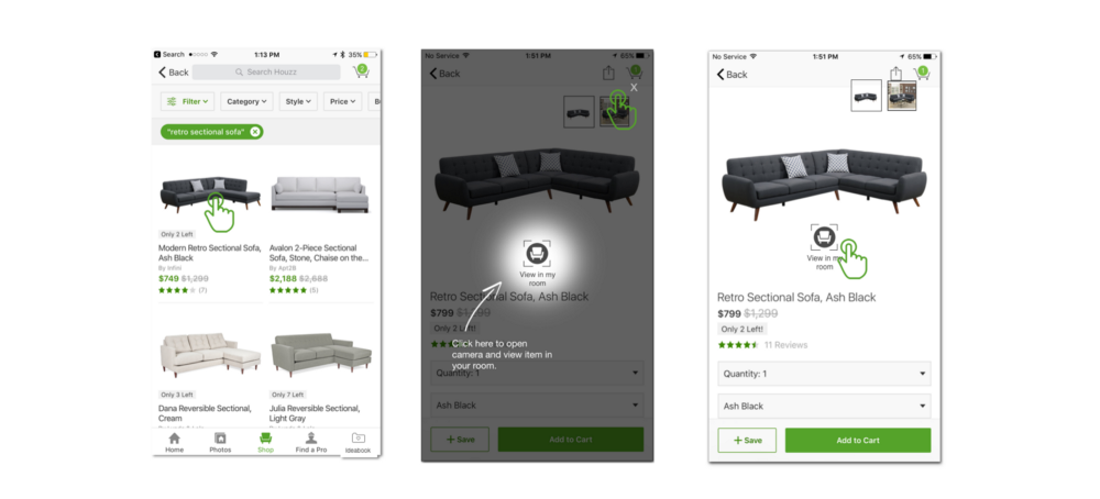
The proposed flow after adding the design edits.
Validation:
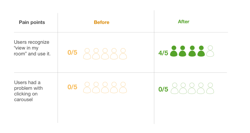
After conducting validation tests:
- Users had no difficulty using the carousel after changing its position.
- Users were able to catch words like “camera” and “furniture” without reading the whole text and were able to understand the feature, and curious to click on the icon.
Generally the results were better and more people clicked on “view in my room”
I used Marvel to create a clickable prototype for validation, you can find it here.

yeay, now you can get inspired!
TL;DR
Houzz provides home lovers with a space to express themselves through features like, saving ideas on boards and viewing furniture through the camera. “Ideabooks” is the user’s personal space on Houzz, so it made more sense to relocate it to the navigation bar to have easy access to it from any screen.
Visual users like myself love features like“view in my room”. The way it is represented in the app is subtle and almost invisible for new users, making it visible will give a chance to more people to use it and get inspired.
I hope you enjoyed the read and learned something new!