Private practice dental offices are starting to realize that people look at site design when they pick out the individual who will have the privilege of performing services for them. While this might not be the first thing that potential patients look for, it does play a fairly big role in the decision-making process according to a number of experts.
Some have opined that it’s actually the risk of frustration that influences healthcare consumers the most. Sites that frustrate their users at a time when they might be experiencing actual real life pain could cost a dentist a booking. This is precisely why so many firms have hired a Dental Marketing Guy or a web design specialist who understands the psychology of those looking for a dentist online.
Read: 50 Shades of Urban Decay – Color Inspiration Showcase
Others have decided to learn by example. While it’s never a good idea to simply copy your competition, there’s no reason that dentists shouldn’t look at what others have done for their own offices. And, if you’ve got a dental office as a client, you definitely have to look at what’s out there.
You can learn plenty by checking out some of the most well-designed dental sites online.
Barrett Family Orthodontics
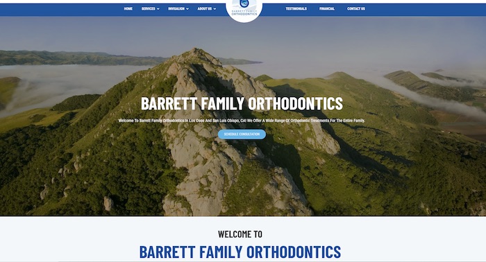
Combining good looks and usability is a challenge for even the best designers. That’s what makes the Barrett Family Orthodontics site stand out so well. It features a nice revolving series of images up top that shows the area surrounding their locations coupled with a menu that users can rely on to find the place the office they want to book an appointment at.
Each of these menus scrolls seamlessly over the top of the page, so they don’t end up obscuring the image scroll. While it might not necessarily mean much in the dental world, that really is an interesting touch from a design standpoint.
Perhaps the most notable aspect of this choice is the fact that the site responds really well to almost any kind of device. It automatically adjusts to match the resolution of the screen, which is good news for those who are bound to cellular phones.
For that matter, this is one of the few dental sites on the Internet today that looks equally nice on the large desktop computers that you’re likely to find in an actual dental office.
Timberhill Dental
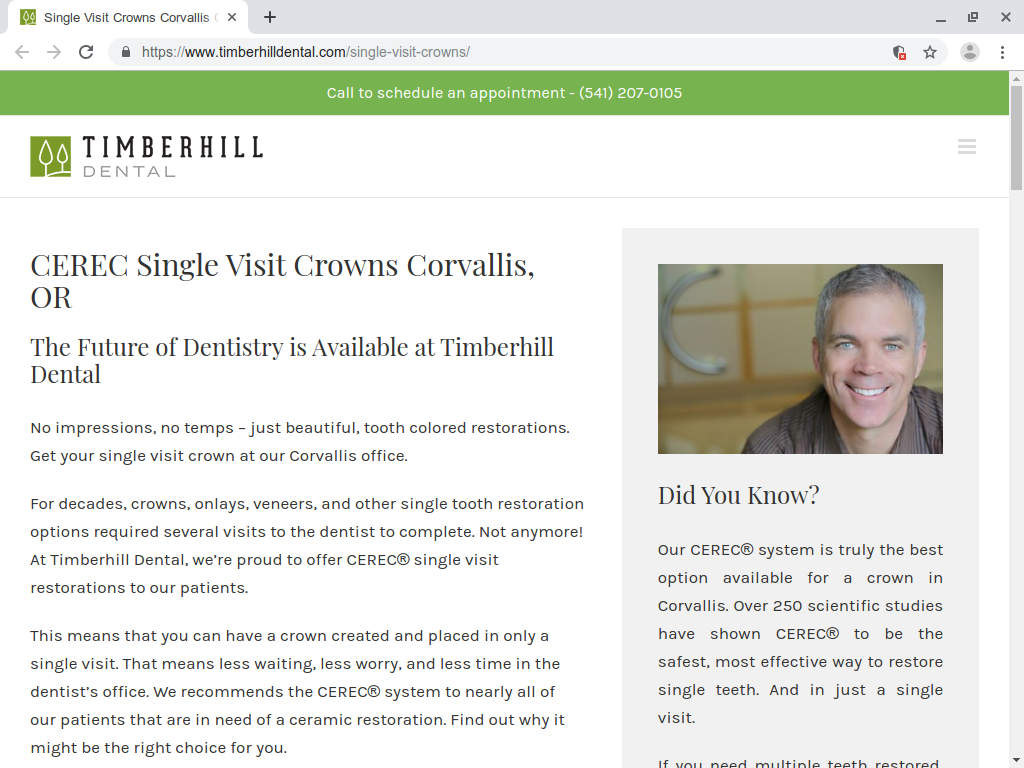
Timberhill’s practice focuses on the fact that they can position and fit crowns in a single visit. Forward-thinking web designers worked this into the site’s URL and resource address, which helps it from a search engine optimization standpoint.
The visual design, however, is what really stands out. Coders decided to work with a rather minimalist style that goes well with the name. Since the presence of timber would suggest a green color, they elected to make the landing page primarily green.
Eyeballs are quickly drawn to the phone number at the top of the page, which is set aside in its own green box. This is particularly useful, because many potential clients will continue to prefer to place a phone call when they want to book an appointment as opposed to using an online form.
Alexandra S. George DDS
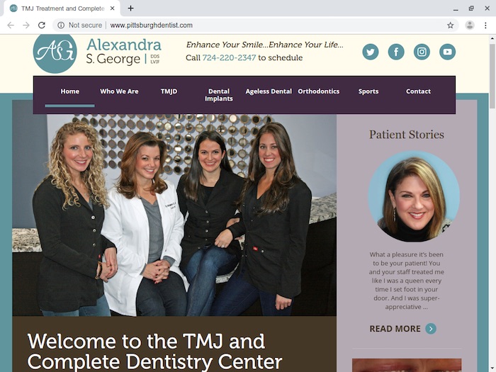
A majority of dental offices have a relatively cold color scheme and little personality. These unfortunate choices often then find their way onto the Internet. An independent dentist in Pittsburgh has decided to completely buck these trends and go with something different.
The cream and lavender tones on this page coupled with the almost cursive writing gives it a very different feel that you might expect out of a furniture store’s site. If that wasn’t eye-catching enough for you, then take a look at the patient stories box on the side. It provides potential clients with a little reassurance before they sit down in the big chair.
Cedar Village Dentistry
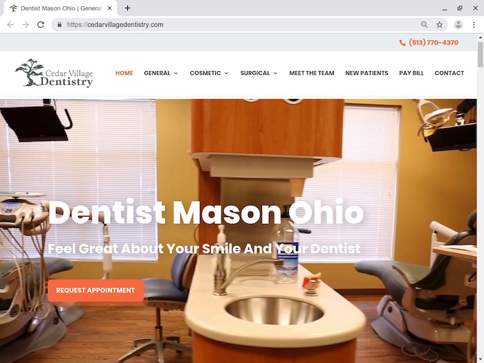
Video packages have taken heat from many commentators, many of whom view them as annoying. Cedar Village Dentistry thumbed their collective noses at these designers and used one to great success by including a looped video at the top of their page that shows off their offices.
This kind of design decision is every bit as visually attractive as it is useful. Users who are interested in learning more about the facilities only need to wait a moment to receive a full tour.
Adding a Touch of Class to Your Own Dental Site
Dentists who are currently struggling with design choices shouldn’t necessarily try to copy any of these looks. Rather, you’ll want to take a few minutes to think more about why they work. Once you’ve had a chance to find the deficiencies in your current design, you shouldn’t have any problem getting up to speed with a new design.
Author: Spyre Studios