Apr 7
At our company, we have this quarterly HackWeek, where employees from different backgrounds — developers, product managers, and UX designers alike — have the freedom to collaborate and work on self-initiated projects.
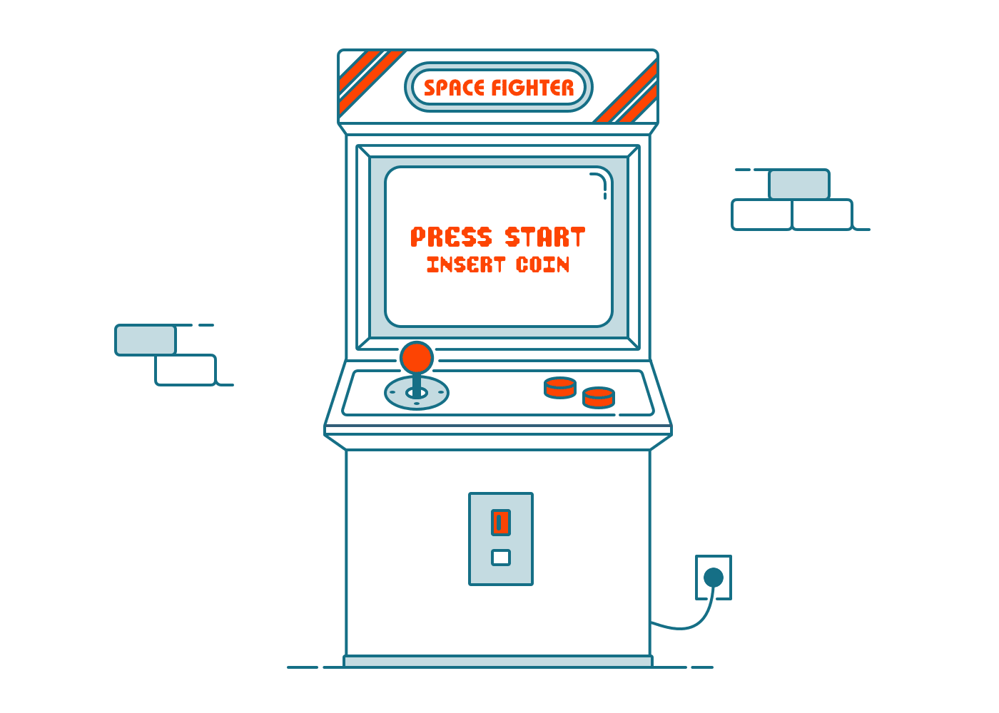
The best thing is that there are no limitations. So — you can rethink existing products, conceptualizing something completely new. Various kinds of projects are possible. You can, for example, do something for personal reasons or something that makes our lives at the company easier or more fun like building an arcade machine. Fun fact: At a previous HackWeek someone actually built an arcade machine.
You see, our HackWeek is basically the same as a hackathon — a one-week long event where people collaborate, create something and share their knowledge afterward.
As I’ve been at the company for about one year and have missed the past HackWeeks, I’ve decided to take part this time and work on something that is already in my scope for a couple of weeks. Furthermore, I think it could be cool to document and share my project progress with some kind of a diary. So let’s dive into it!
The backstory
We’ve been using Fira Sans as our corporate typeface for 4 years now. Originally created for Firefox OS in 2013 and later reissued under the SIL Open Font License, it became more broadly distributed by the various font providing platforms like Google Fonts.
It’s a pretty good typeface for different reasons. Good legibility, support for a broad variety of different languages and, from a designer’s perspective, it looks quite nice. Beyond that — Fira is not that overused like many other typefaces and feels a little bit more unseen.
Until now, everything has been great regarding this font. But — there is an annoying bug occurring under iOS. If we have some basic text, set in regular and want to emphasize some words with bold, the line height starts to increase which looks quite awful.
As we haven’t found a solution by fixing this via some code in iOS and the original creator of the font is not offering a solution to solve this problem, we’re not able to roll out Fira Sans on our official iOS app. And this is kind of bad, especially from a brand design perspective, because we have to stick with Apple’s San Francisco.
Execute a Typedesign Sprint during HackWeek
To get Fira working properly under iOS I made some investigations in advance by myself and had a look into font information. After some research, I came up with a list of needed actions points and this leads to the mentioned HackWeek project. This could also be called something like a Typedesign Sprint. Five days to completely rebuild Fira Sans from scratch and reboot it from a technical point of view.
Monday: The fundamentals
Today I start by building up the general font information like vertical metrics, alignment zones or stem widths. Also, I’ll create three masters — light, regular and bold — to have the flexibility to interpolate every font weight between those master layers.
The intense part is filling those three masters with glyphs. As I don’t want to touch the design itself, this is more or less a work of copy and paste. You can imagine this is not that much fun but, at the end of the day, it has to be done. Additionally, I’ll also add the side-bearings for each glyph. This is not that difficult but should be done precisely to get an evenly distributed white space.
To speed things up, I make use of so-called components. In general, this means that I can build composite letters like á, â, ä out of those mentioned components. So I create the base glyphs and necessary diacritics in advance and combine them afterward.
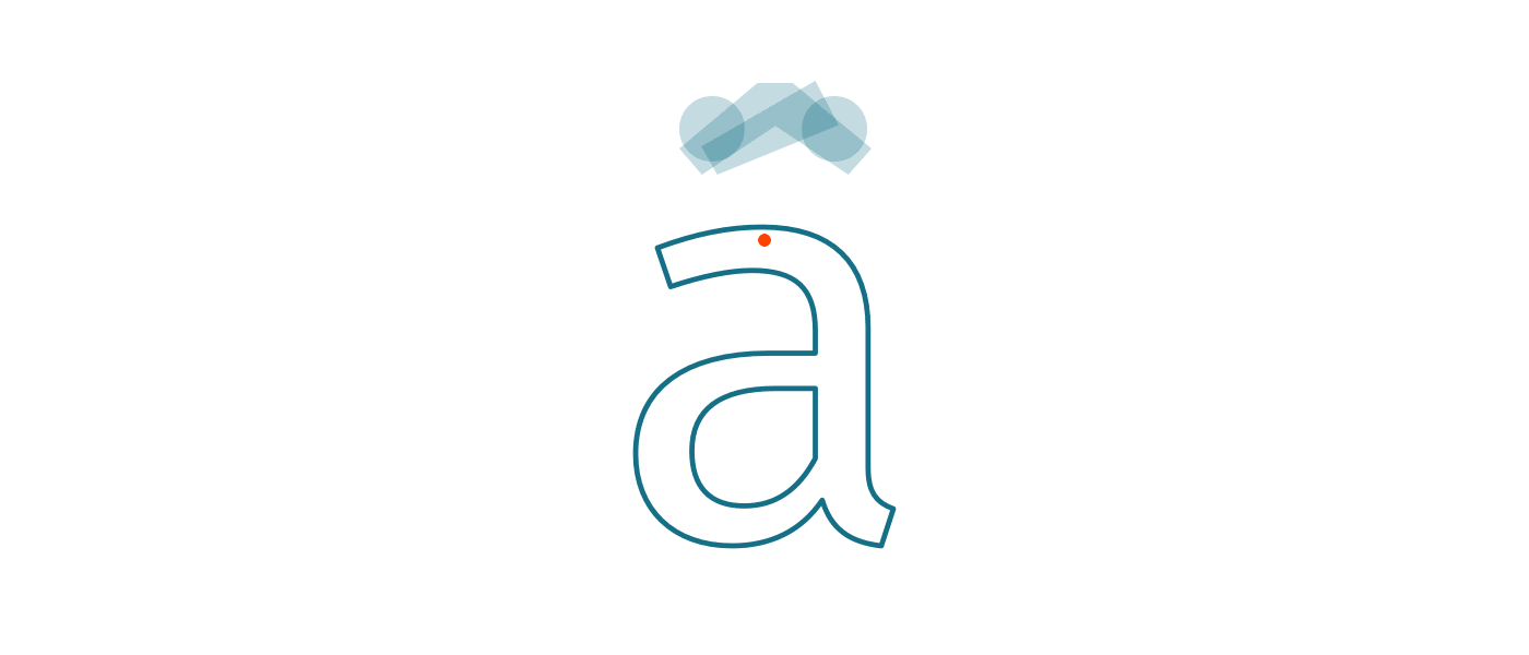
As you can see, the connection takes place via the help of the anchoring points set.
After 9 hours of intense work, my goal of the day is accomplished and all three masters are now filled with 274 glyphs each.
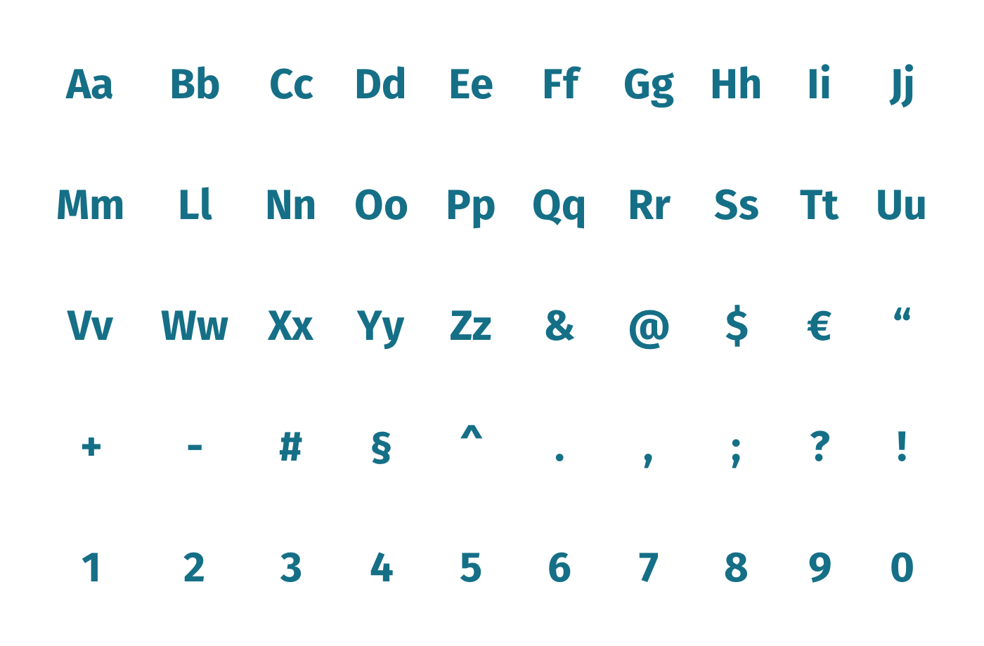
Further, the font supports now every Western European-, most Central European- and some Southern European languages. Since we are mainly a German-language platform, we don’t need more comprehensive language support at the moment. Moreover, the font now features a solid set of ligatures and case-sensitive forms for different glyphs.
Tuesday: Kerning until the cows come home
Most of you have probably already heard of kerning. For the rest of you, here is a basic explanation. In general kerning means adjusting the space between two individual letters. Extreme combinations with a lot of whitespaces like Ta or Va need to be adjusted.
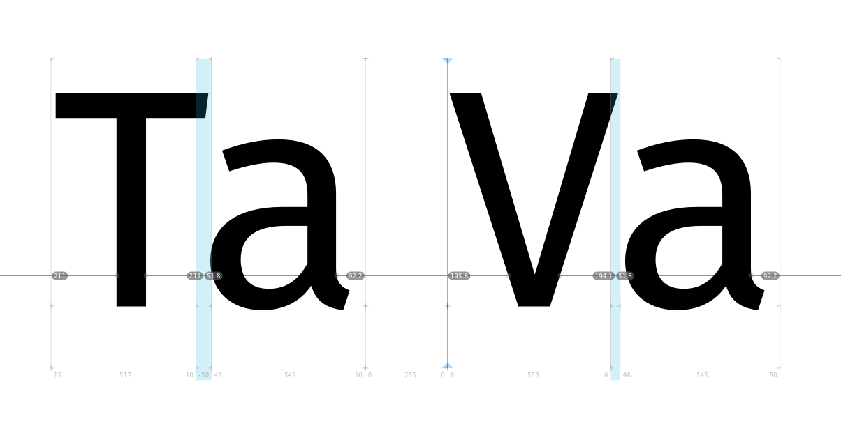
You can certainly imagine the possible combinations are almost endless. It is definitely possible to lose yourself in madness here, but there are plenty of combinations that don’t make sense. Think economical and logical at this point. Moreover, my decision for this project is to concentrate only on the most important pairs, in order to keep the effort manageable.
Kerning groups
Fortunately, there is again the possibility to accelerate the process and to fall back on so-called kerning groups. In detail, this means that you have to put letters with similar forms like c, e and o into the same group and, accordingly, you only have to change the kerning once. The values are then automatically transferred to the entire group.
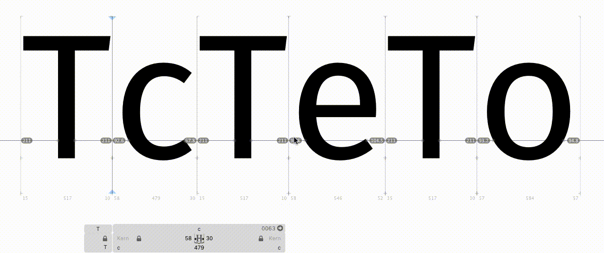
After setting up all the needed groups, I’m ready to start with the actual kerning for every master. At the end of the day, the light and the regular master includes around 300 kerning pairs each.
Wednesday: More Kerning and Documentation
As I didn’t completely finish the kerning for all masters on Tuesday, I continue with it on Wednesday. There are no kerning pairs within the bold master at this point, so there is still a way to go. Just to make it clear once again: the ability to create groups accelerates the process but does not automate it. Kerning is always a very considerable undertaking, which strongly influences the actual legibility of the typeface.
With the basic kerning for all three masters, I could then start writing this article with the help of my notes.
Thursday: Opentype niceties
After more or less basic things during the last three days, I can finally start with the really fun part — OpenType features.
Fonts don’t just consist of a sequence of different glyphs and the adjustment of the respective distances or the balancing of the white space. They can also contain a considerable amount of code that provides the font with a selection of extra features.
Normally, every professionally produced font today has built-in OpenType features. These can range between different number formats, alternative letterforms, or contextual variants. Some of them are almost standard features of a font, while others are more advanced. Even the basic ones represent an improvement since our version of the Fira Sans supported almost no OpenType features.
Standard Ligatures
Some of the more generic ones are standard ligatures. Think about writing the word Profile for example and you see that the f hits the dot of the i. A ligature containing those two letters will help to prevent this issue.
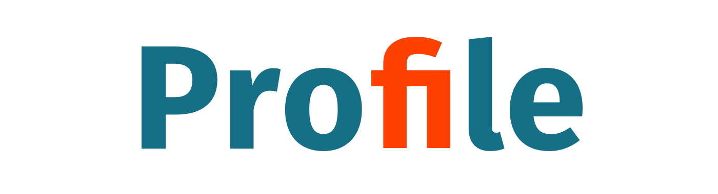
You can add a lot more standard ligatures like ff, fl or fj to name a few. The needed code is pretty simple, although.
sub f f by f_f;
sub f i by f_i;
sub f l by fl;
Contextual Variants
Up next are the contextual variants. In general, they are a great help when it comes to correct localization.
In the German alphabet, we have the lowercase letter ß which is widely used. By the way, you spell it Eszett. However, it is also often used incorrectly when a word is written entirely in capital letters.
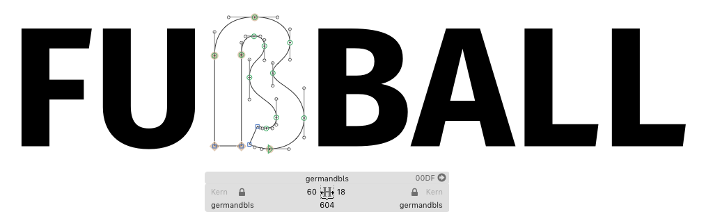
A workaround to solve this — and this makes the lives of authors and writers much easier — is to build in a contextual variant. In this case, I create an extra glyph called germandbls.calt that contains a double-S.
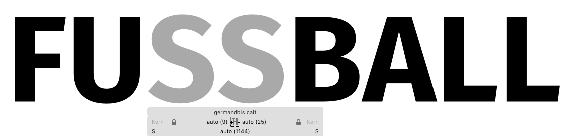
To make this thing work, I only have to add two simple lines of code.
sub @Uppercase germandbls’ @Uppercase by germandbls.calt;
sub @Uppercase @Uppercase germandbls’ by germandbls.calt;
And from now on, every lowercase ß will be replaced by a double-S when it comes to uppercase.
Friday: Wrap-up and final experiments
Friday! The HackWeek is slowly approaching its end and the fundamental steps to reboot Fira Sans are done.
I have a production file with correct metrics. A total of three master levels, which contain an extensive character set. All glyphs are perfectly spaced and, beyond that, the most important kerning pairs are created. Last but not least, it supports a lot of cool built-in OpenType features. I’m quite happy with the result and, for now, my HackWeek projects is coming to an end.
The only thing left is my presentation. In a few hours, all hackers from all over our different locations in Hamburg, Vienna, Munich, Porto, Barcelona, and Valencia will showcase their projects. Awesome.