A pocket folder is a very powerful business device when created the right way. In this tutorial, you’ll learn how to set up a dieline, create a multi-page spread with bleed to accommodate your dieline, and apply a full design to the exterior and interior of the pocket folder in Adobe InDesign. This pocket folder will highlight two popular folder styles in one: the hidden pocket and standard pocket. Finally, you’ll learn how to save your print ready file for delivery to your printer.
Tutorial Assets
The following assets were used during the production of this tutorial.
- Open Road Image
- Novecento Wide Normal (font)
- Novecento Wide DemiBold (font)
- Mission Gothic Normal (font)
1. Create Your Dieline
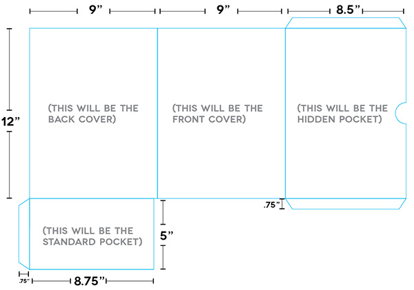
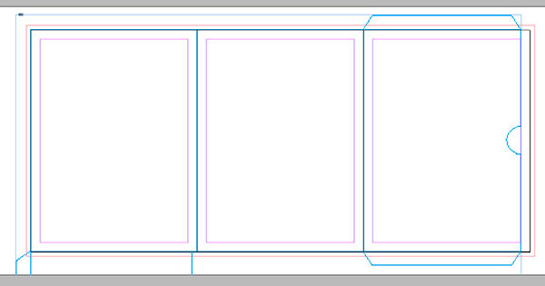
The first thing we need to do is create our dieline in Illustrator that our InDesign file will be created around. This will be a custom pocket folder with one interior ‘hidden pocket’ and one standard pocket on the other side. This folder will hold a 8.5 x 11in or A4 sheet of paper within it, so we need to make sure the height and width is greater than that. We’ll make this one 9 x 12in. It’s always helpful to make a paper dummy first of how your folder needs to fold. Once you have your measurements and your fold areas, it’s time to make your dieline.
It’s always good to print out your Illustrator dieline and fold it together to make sure you’re happy before creating your folder in InDesign. This will save many headaches later on if any measurements are off. The image below shows the dieline for this folder, along with the measurements used for each side. I’ve set the stroke to 2pt so you can see it, but 0.25pt is fine (make sure you’re only using a stroke and not a fill). Save this as an .AI or eps file.
2. Create Your Layout
Step 1
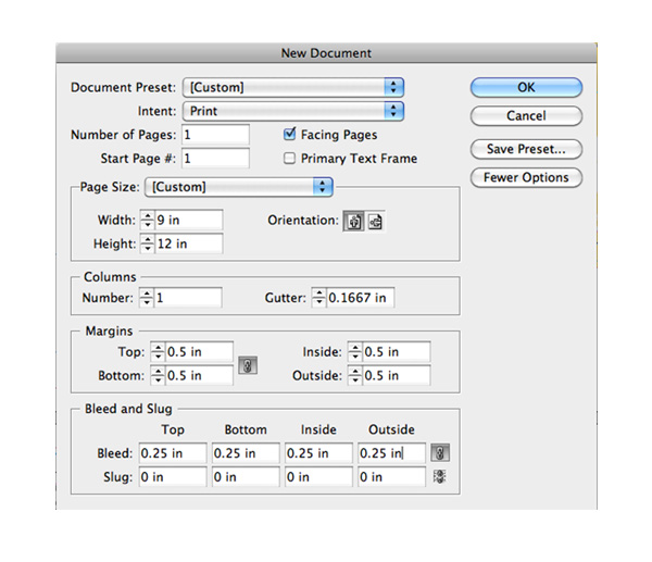
Next, open InDesign. Go to File > New > Document. Put in the measurements below, and make sure Facing Pages is checked. Our first page will be the size of our front cover, and we’ll include a 0.25in bleed on every side of our folder. If you don’t see bleed, click on More Options on the right side of the dialog box.
Step 2
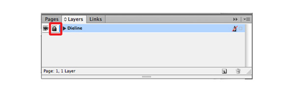
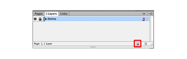
Now we need to bring in our dieline so we can create the other pages of our folder. Go to File > Place and select your dieline .AI or .EPS file. Align the middle page on top of your current page. Go to your Layers panel (Window > Layers), name your layer “Dieline”. Lock your layer by clicking in the box to the right of the eyeball.
Step 3
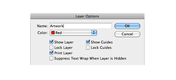
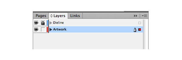
Create New Layer by clicking the icon next to the trash can in the Layers panel. Name it “Artwork”. The new “Artwork” layer will automatically be placed above your dieline layer. Since we want to still see the dieline as we being putting artwork in, we’ll want our “Artwork” layer below our “dieline” layer. Do this by clicking on the “Artwork” layer, and dragging it below the “dieline” layer.
Step 4
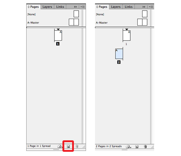
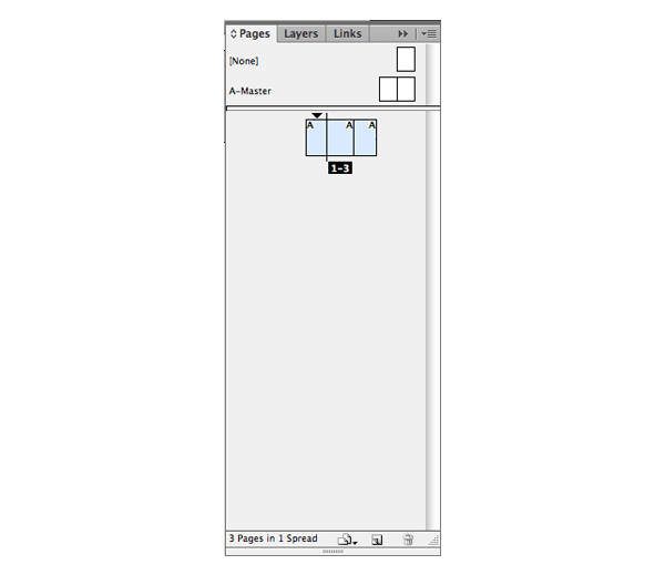
Now we need to create the other pages that make up our folder and then size them according to our dieline. Go to your Pages panel (Window > Pages) and click on the new page icon
(located to the left of the trash can at the bottom of the window). Once you do this, you’ll notice the new page is positioned below our first page, but we need it to be next to our first page.
Step 5
Click on your options fly out menu (upper right corner of the Pages panel) and click on Allow Document Pages To Shuffle. By default, it should be checked, so you’ll be unchecking it when you click on it.
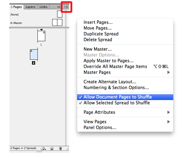
Step 6
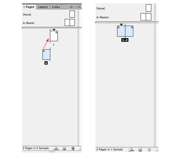
Now, with your “page 2” selected (highlighted in blue) click-drag “page 2” to the left side of “page 1”. You’ll notice a closed bracket looking icon ( [ ) when you get close. Once you see it, release your button.
Step 7
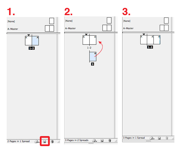
Deselect “page 1” and “2” by clicking anywhere in the empty space of the Pages panel (so they are no longer blue). Now, click on only “page 2” (so it’s once again highlighted in blue). Next, click on the new page icon to the left of the trash can at the bottom of the window. “Page 3” will automatically be positioned below “pages 1” and “2”. With “page 3” selected, click-drag to the right side of “page 3”. Release when the closed bracket looking icon ( ] ) appears.
Step 8
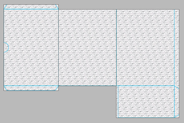
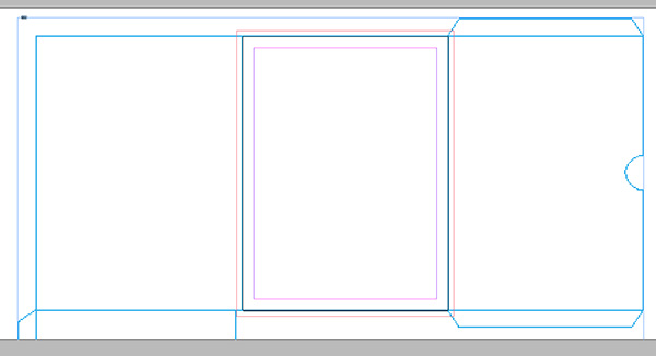
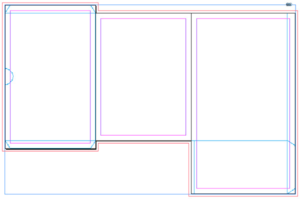
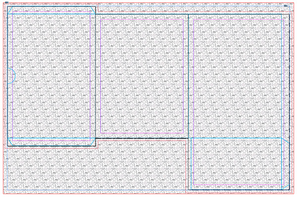
Your pages should now look like this below your dieline. Now it’s time to resize the pages to fit the dieline!
Step 9
To resize the pages, we’re going to use the Page Tool (Shift + P) located in your toolbox on the left (see below). When you click on the Page Tool and then click on your first page, you’ll notice the page’s size in the bar above your document.
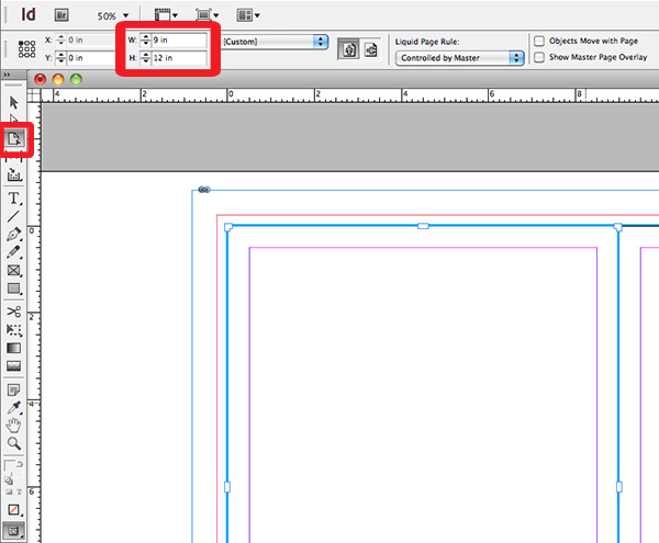
Step 10
We’ll have to refer back to our original dieline and measurements to see that if we add up the height of the left most page, including the standard pocket, we have a total height of 17in (page height of 12in, pocket height of 5in). Now we need to figure out our width.
Since we have a flap that will fold and adhere to the upper page to create our pocket, we need to account for its width in the total width of our page. So, 9in page width and 0.75in for flap width gives us 9.75in. With the left most page selected with our Page Tool, input a Height of 17in and a Width of 9.75in in the top bar.
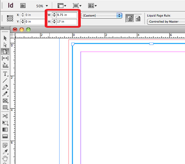
Step 11
Once you put your new measurements in, you’ll notice that while the height aligns perfectly, the extra 0.75in was added to the right side of the page instead of the left where our flap is. To fix this, we’ll have to unlock our “dieline” layer, and using the Selection Tool (V), select the dieline and move it to the right (press and hold Shift while dragging to drag in a perfectly straight line) until the dieline highlighted in red below falls exactly on top of the black page line highlighted in green below. Once your dieline is aligned, lock the “dieline” layer once again, and click on your “Artwork” layer to continue working.
Step 12
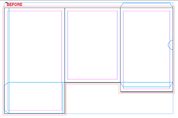
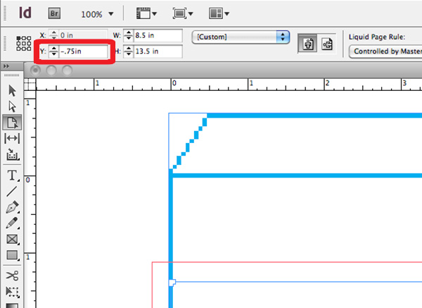
Since our center page is perfect, it’s time to resize our right most page that will end up being our hidden pocket folder. Referring back to the original dieline, you’ll see that the total height is equal to 13.5in (12in page height and two flaps that are both 0.75in in height). Our total width is 8.5in. With our Page Tool, click on the right most page, and in the measurement area on the bar above the dieline, input a Height of 13.5in and a Width of 8.5in.
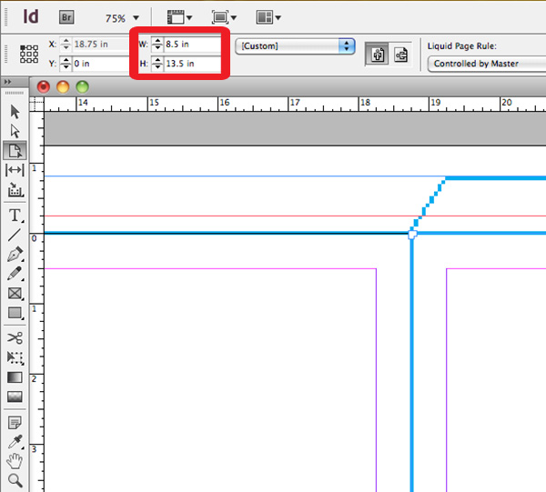
Step 13
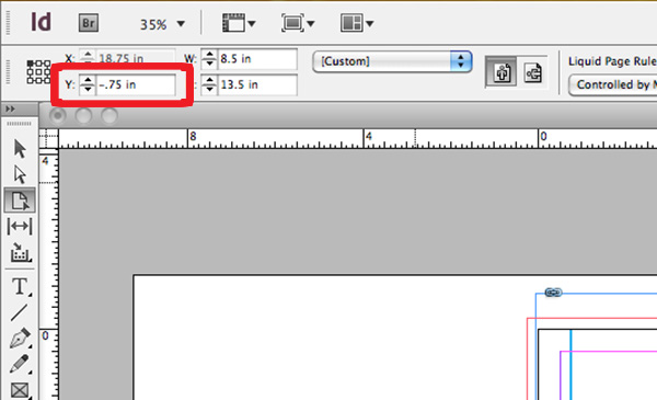
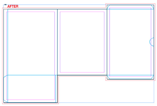
You’ll notice now that while our width is perfect, InDesign automatically put the extra 1.5in in height we needed only at the bottom instead of splitting it so there was .75″ on top and .75″ on the bottom. Grab your Page Tool again, click on the the right most page, and in the top bar where we put in our measurements, you’ll notice a Y axis box. Input –0.75in to move the page up the amount that we’re missing.
Step 14
Here comes the tricky part. We have our InDesign file all ready for the design on the front, but when you open it up, it’ll be empty on the inside, since we don’t have an inside spread to design on yet. Designing for the inside will require the entire dieline to be opposite (reflected). This means we’ll have to take our entire layout that we have for the front and reflect it so when it’s printed, it’s printed two sided and we’ll have a design on the inside, too. If you create a paper dummy of this, it’ll be easy to see.
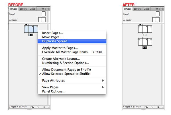
How do we take everything we’ve done so far, duplicate it, and then change the order? First we need to unlock our “dieline” layer since we’ll need a dieline for the inside, too. Then, in your Pages panel, select all of your pages (you can do this by clicking on one, then holding Control). All of your pages should now be highlighted in blue, like below.
Step 15
Next, right-click on top of your pages in your Pages panel, and select Duplicate Spread. You’ll now have an exact copy of your first spread right below it.
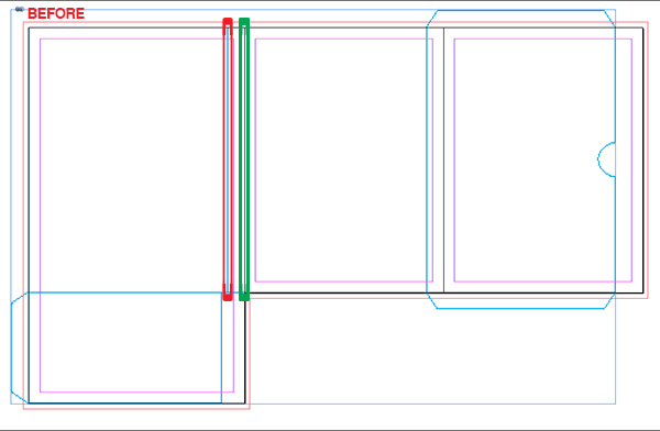
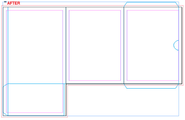
Step 16
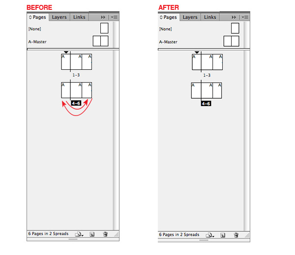
Now we’re only going to be working with pages 4-6. First, we’re going to change the order of our pages. Don’t worry about where your dieline is for pages 4-6 for now. Since there will be no change to “page 5” since it’s in the middle, we need to move “page 6” so it’s where “page 4 is”, and we need to move “page 4” where “page 6” is. All of this can be done in the Pages panel. Simply click on “page 6” first, and move it ahead of “page 4” until you see the open bracket looking icon ( [ ). Release your mouse when you see it. Now we need to take “page 4”, which is now in the middle, and move it all the way right. Click on the middle page and drag it to the right until you see the closed bracket looking icon ( ] ). Release your mouse when you see it.
Step 17
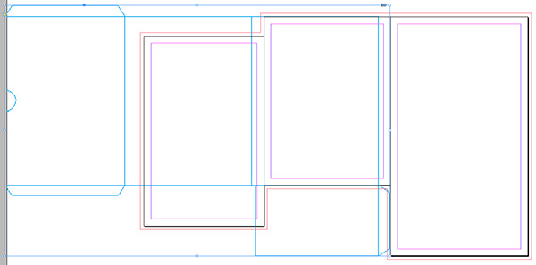
Your spread should now look something like the image below.
Step 18
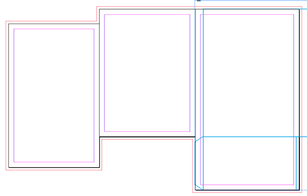
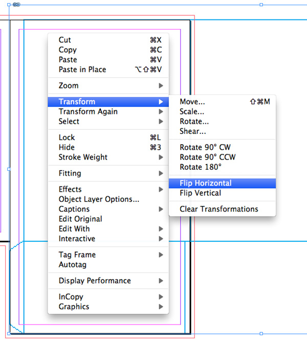
Now we need to take care of our dieline. First, we need to reflect it. Make sure you’re still working in the pages 4-6 spread, and click on your dieline to select it, then right-click and choose Transform > Flip Horizontal.
Step 19
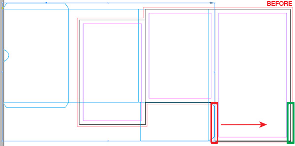
You should now have something that looks similar to the first image below. Next, we’ll need to reposition it. Shift-drag your dieline until the right most blue line of the flap overlaps the right most page line.
Step 20
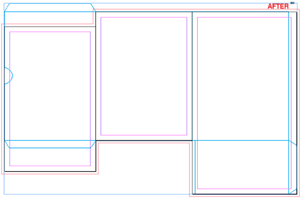
We won’t be moving the dieline again from this point forward, so lock the “dieline” layer in your Layers panel once again. You’ll notice that after you repositioned your dieline, the right page looks perfect, the middle is perfect, but the left page is a little off. We’ll need to move the page up once again -0.75in. Select the Page Tool, then click on the left page (“page 4”), and then input -0.75in in the Y axis box above the document (similar to what we did in step 14).
3. Apply Your Design
Step 1
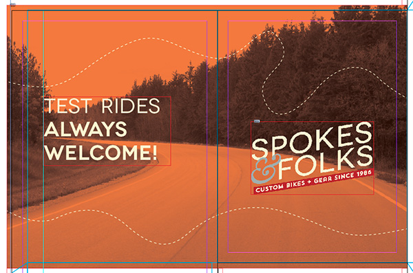
Congrats! We’re now ready to begin the design work! Getting your layout perfect before you apply design will save many potential issues later on. It takes a little time, but saves a lot. Moving forward, our pages 1-3 spread will be the exterior design of the folder, while the pages 4-6 spread will be the interior design of the folder.
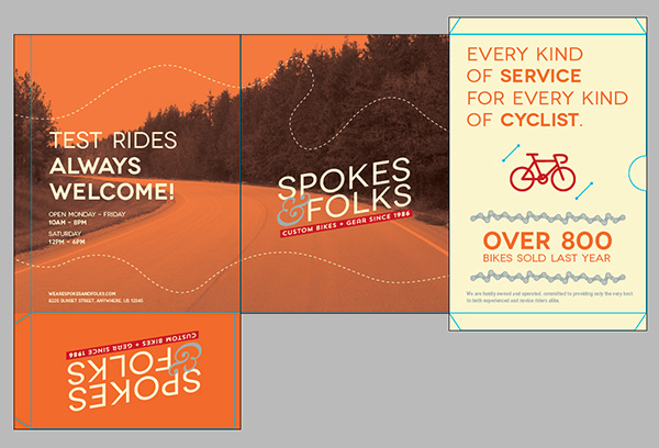
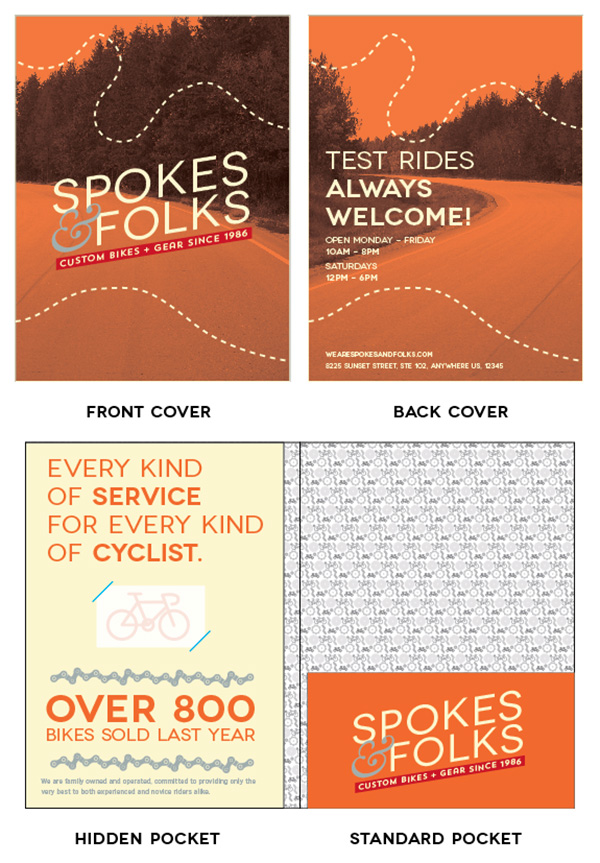
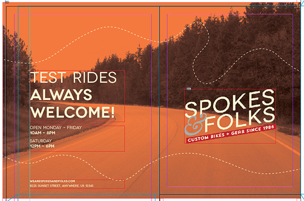
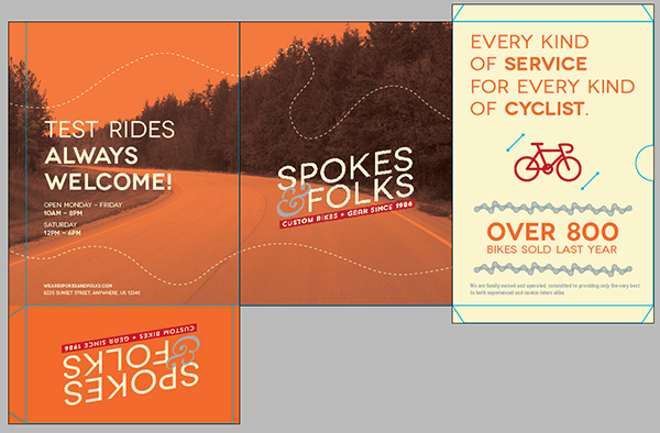
Let’s start with the exterior first, so scroll up to your first spread. I mocked up ahead of time what I wanted all of my pages to look like in Illustrator. You don’t have to do this, but mocking it up in Illustrator, or sketching it out on a piece of paper always creates a good game plan when getting into InDesign. The image below is my mockup that I’ll be replicating in InDesign.
Step 2
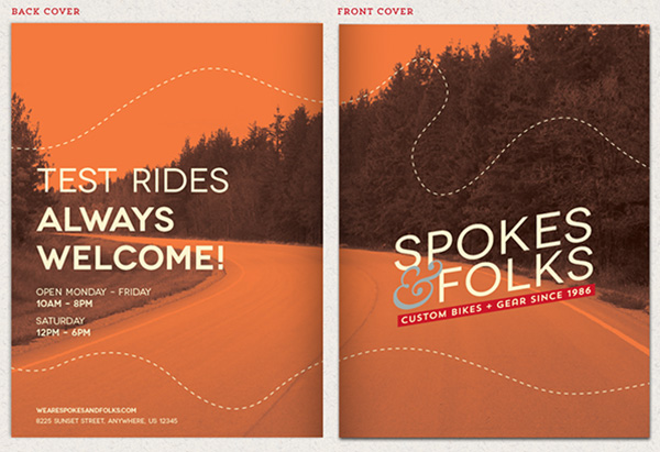
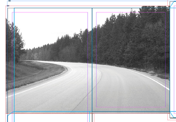
Let’s start with the front and back cover. I’m using the open road image, which you can download here. I brought it into Photoshop first, where I desaturated it and changed the color mode to CMYK, since this folder will be printed.
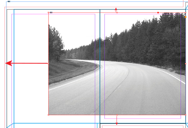
Place your image into your InDesign file by going to File > Place and select your image. Once your image appears on your layout, select your image, then grab the bottom handle and drag its bottom frame down to match your bleed line (the red outline around your layout). Do the same with the top and left side.
Step 3
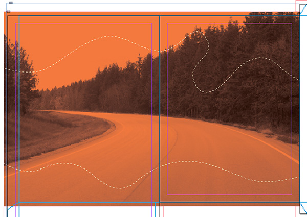
Now we need to fill the frame with our image. Using the Direct Selection Tool (A), click on the image. Since we’re scaling the image, we want to scale it proportionally. Hold down your Shift, then click on the left side node and drag until you fill your frame and get the scale of the image you’re looking for. After you deselect, using your Direct Selection Tool, you can click on the image and move it around in the frame to achieve your desired positioning. You’ll notice our photo bleeds into our standard pocket a little, but don’t worry about it since the pocket will be filled with a solid color in a later step.
Step 4
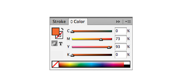
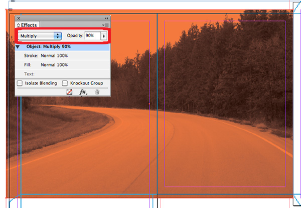
Now we’re going to apply a retro color overlay to the photo. We do this by using our Rectangle Tool (M). After selecting the Rectangle Tool, open up your Color panel (Window > Color) and input the following color build: C=0, M=73, Y=93, K=0. Now click in the top left corner and drag over the entire photo, including bleed area.
Step 5
With your rectangle still selected, open the Effects panel (Window > Effects). Toggle down and select Multiply. Set the Opacity to 90%.
Step 6
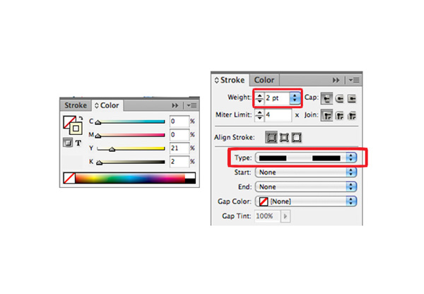
Now we’re going to draw some curved ‘bike path’ lines. We’ll use the Pen Tool (P) for this. Grab your Pen Tool and in your Color panel, remove the fill by clicking the ‘none’ white box with red diagonal line, and click on the stroke behind it. Input the following color build: C=0, M=0, Y=21, K=2. Now, open your Stroke panel (Window > Stroke). Make your Stroke Weight 2pt and under Type, toggle down and select Dashed 4 and 4. Draw two curved lines like the image below.
Step 7
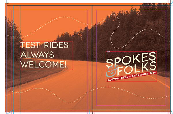
Time to place the logo on the front cover. Go to File > Place and select your logo. Position it using the same methods used for the photo in steps 2 and 3.
Step 8
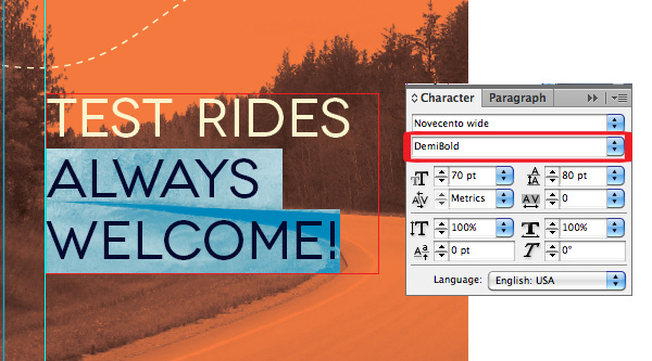
Now it’s time for the back cover information. I’ll be using two fonts for this: “Novecento Wide Normal” and “Novecento Wide DemiBold”. You can download both for free right here. I’ve dragged a guideline out to help keep my text left aligned along the same line. To do this, click in the rulers on the left hand side (Control + R) and drag until it lines up with the 1.5in mark on your top ruler. Now, grab the Type Tool (T) and draw a text box for your text to go in.
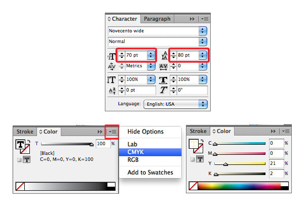
Set your text to “Novecento Wide Normal” in the Character panel (Window > Text > Character), with a Size of 70pt and Leading of 80pt. Go to your Color panel (Window > Color) and you’ll notice the text defaults to black. We want to make it the same color as the bike path lines so we need to click on the fly out menu in the top right corner of the window and select CMYK. Put in the color build of C=0, M=0, Y=21, K=2. In the text box, type “TEST RIDES ALWAYS WELCOME!”.
Step 9
Highlight only the “ALWAYS WELCOME!” with your Text Tool (T), and in the Character panel, set it to “Novecento Wide DemiBold”. Leave all other settings the same.
Step 10
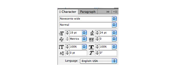
Now we need to put in our hours of operation. Draw another text box using the Type Tool below the one you just created. Use the same color as before, and set the font to “Novecento Wide Normal”, with a point Size of 19pt, and Leading of 24pt. Type: “OPEN MONDAY – FRIDAY 10AM – 8PM, SATURDAY 12PM – 6PM”.
To use an en dash instead of a regular hyphen, use keyboard shortcut Alt + –. You can also get to it by clicking Type > Insert Special Character > Hyphens and Dashes > En Dash.
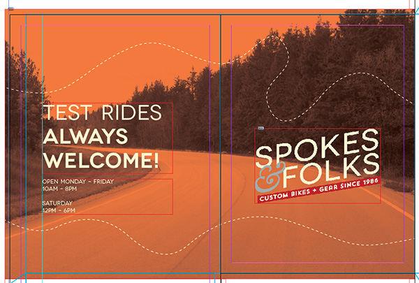
Step 11
We want our hours to stand out a little more, so highlight only your hours and change their font to “Novecento Wide DemiBold”. This looks good, but it looks like there’s just a little too much space between the “10AM – 8PM” line and “SATURDAY”. To bring “SATURDAY” up just a little, highlight only “SATURDAY”, and in your Character panel, set the Leading to 12pt.


Step 12
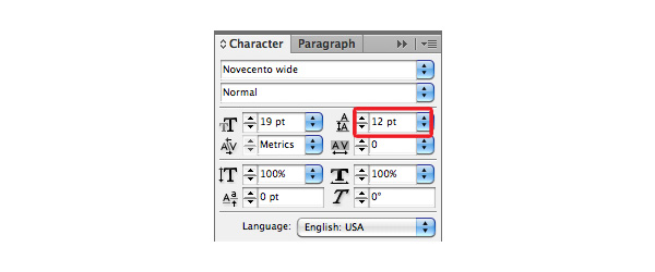
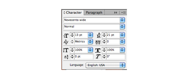
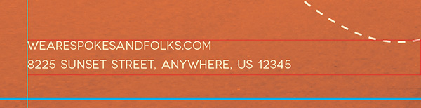
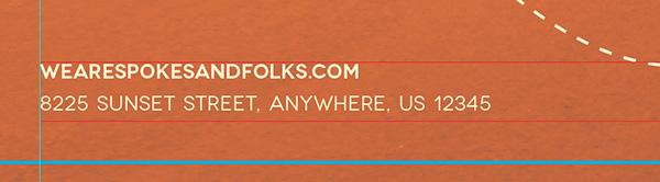
Almost done with the back! We just need to add in the URL and the physical address. Draw one more text box using the Type Tool at the bottom of the back cover, use the same yellow color we’ve been using, set the font to “Novecento Wide Normal” with a point Size of 13pt and Leading set at 21pt. Type out your URL and address. Next, highlight only the URL and change the font to “Novecento Wide DemiBold”, keeping all other settings the same.
Step 13
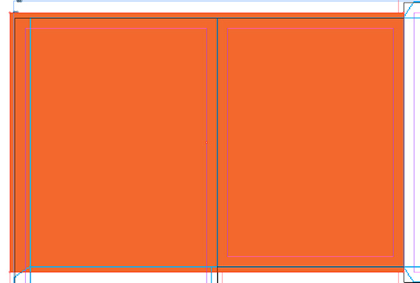
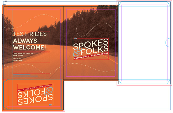
Now let’s take care of the standard pocket. Select your Rectangle Tool (M), then go into your Color panel (Window > Color) and set the color to the orange we’ve been using, C=0, M=73, Y=93, K=0. Next, draw a rectangle that covers the entire tab including the bleed area, and extends over the entire standard flap, going all the way down to the bottom bleed line (the red outline around our entire spread), but stops at the right page line (since our dieline doesn’t extend all the way to the page line).
Step 14
We need to put our logo on the standard pocket, but because it’ll be folding up and appear on the inside of our folder, the logo we place will have to be upside down. Go to File > Place and select your logo. Position your right side up logo where you’d like it on your pocket, then right-click and choose Transform > Rotate 180. Your Logo will now be flipped, and appear correctly once folded.
Step 15
Now it’s time for us to move on to the hidden pocket folder’s design. First, let’s fill the entire pocket with the yellow we’ve been using, C=0, M=0, Y=21, K=2, using our Rectangle Tool (M), like we did for the standard pocket in Step 13. Make sure to extend the color all the way to the bleed lines (the red outline around our spread).
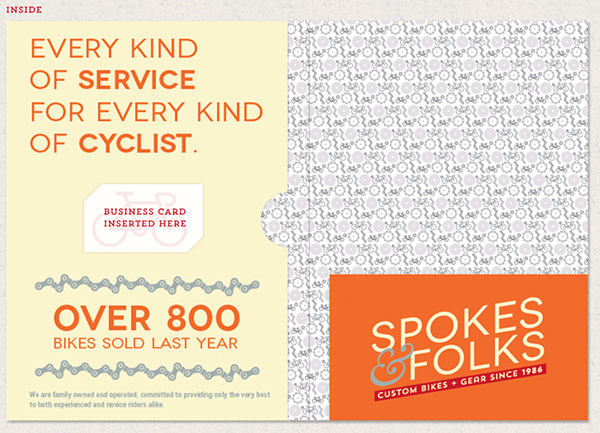
Step 16
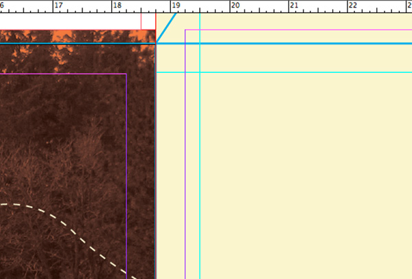
Next, we need to add our headline. Before we do, pull another guideline like we did earlier for the back cover in Step 8, and release when it’s lined up with the 19.5in mark on the top ruler. Now we need to pull a guideline down from the top ruler. Release when it lines up with the 1.25in on the side ruler (this will align exactly with the pink margin line from the front cover).
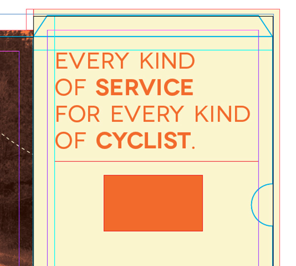
Step 17
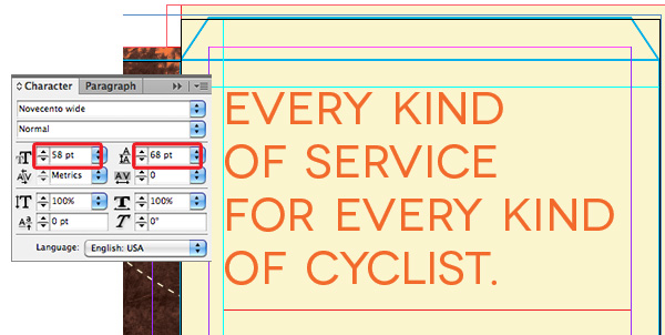
Time for our headline text. Draw a text box using the Type Tool (T), in the Character panel, set your font to “Novecento Wide Normal”, 58pt, with a Leading of 68pt. In the Color panel, set your color to the orange we’ve been using, C=0, M=73, Y=93, K=0. Then Type “EVERY KIND OF SERVICE FOR EVERY KIND OF CYCLIST”. Use an Enter after the first “KIND”, “SERVICE”, and the second “KIND”, so all of our line breaks are where we want them.
Step 18
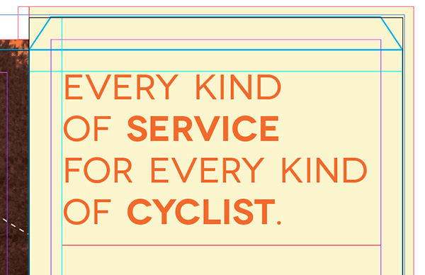
Let’s make the headline a little more interesting by highlighting “SERVICE” with your Type Tool and changing the font to “Novecento Wide DemiBold” in your Character panel. Let’s then do the same to “CYCLIST”.
Step 19
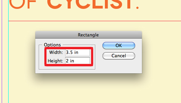
Having a place to put a business card is typical in most pocket folders, so let’s make sure to include one here. The typical size of a business card is 3.5 x 2in. So we can figure out where it would go, let’s make a temporary rectangle to use for placement. Select your Rectangle Tool (M) then double-click on the hidden pocket page (the one we’re working on).
You’ll see a dialog box show up where you can input the size. Input 3.5in for the Width, and 2in for the Height. It doesn’t matter what color it is since we’re only using this temporarily, just make sure it does have a color you can see (I’m using our orange). Position the business card where you’d like the actual one to be placed (I’m keeping mine in the center).
Step 20
When the printer receives this file, he/she needs to know where the business card slits will go that hold the business card in place. Since this will be a cut, it needs to be a part of our dieline. We’ll need to unlock our dieline file one final time to place the marks for the slits. So unlock the “dieline” layer in the Layers panel (Window > Layers), then click on the layer so we’ll be working in that layer.
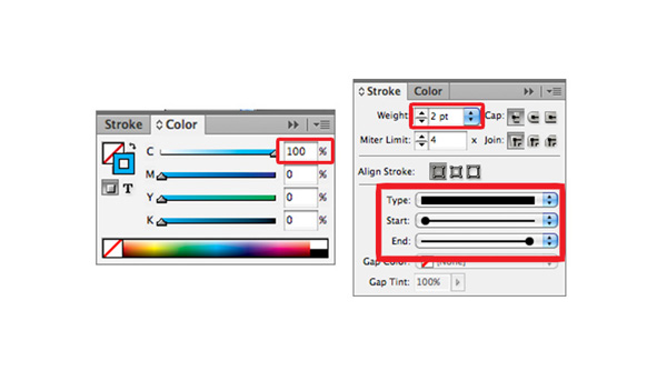
Next, select the Line Tool (\), also found below the Type Tool in your toolbox. We need this line to be the same color and thickness as the color in our dieline. Go into your Color panel (Window > Color), and make the stroke the color of your dieline stroke (mine is C=100, M=0, Y=0, and K=0). Next, go into the Stroke panel (Window > Stroke) and make your stroke thickness the same you used for the dieline (mine is 2pt), make sure it’s a solid line, and in the Start and End menus, toggle down and select Circle Solid.
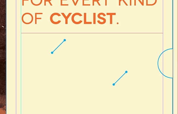
Step 21
Now we’re ready to draw those slits. Go to the upper left corner of your business card, and holding the Shift key (which will make the line a perfect 45 angle), extend the line before and past the corner, like below. Copy and paste that line and align it to the bottom right corner, like below. After you’re happy with the positioning, lock the “dieline” layer in your Layers panel, and click on the “Artwork” layer to continue your design in that layer.


Step 22
Now select and delete your placeholder business card. Our slits are sized and placed perfectly for a standard business card to be held there!
After we delete the card, there will be a pretty obvious gap between our main headline and the information that we’ll be placing towards the bottom. To add a little bit of fun, I’m placing a bike icon where the business card will go, so when a card isn’t there, the design will still look complete, and it’ll be a nice surprise when someone takes the business card out. Go to File > Place choose your icon, and place it between the slits (make sure it won’t go higher or lower than the card so it won’t peek out!).
Step 23
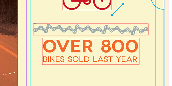
Now we just need to finish up the design of the pocket. Let’s insert a text-box right below the bike icon which will read “OVER 800 BIKES SOLD LAST YEAR”. In your Character panel, use the font “Novecento Wide Normal” set at 33pt with a Leading of 40pt. Use the same color orange we’ve been using in the Color panel. When typing, make sure “OVER 800” is on the top line and “BIKES SOLD LAST YEAR” is on the bottom.
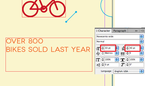
Step 24
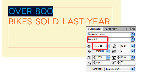
We need to make “OVER 800” stand out much more since it’s an important fact. Let’s highlight only “OVER 800” with our Type Tool, and in the Character panel, change the font to “Novecento Wide DemiBold”, and change the font size to 75pt. Keep the leading the same at 40pt.

Step 25
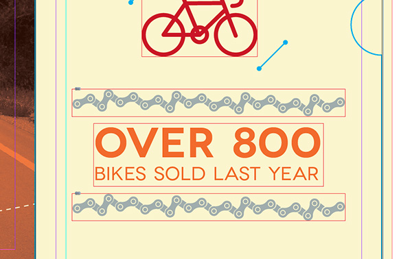
To add a little separation, let’s add in a semi-straight bike chain. Go to File > Place and select the file. Place one above our most recent text-box, and copy and paste another right below it.
Step 26
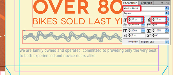
We just need one last text-box for this hidden pocket design to be complete. Below the last bike chain, add a text-box that will begin at the left guide we made when we first started on the hidden pocket page. We’re going to use the font “Mission Gothic Regular” which you can download for free right here. In your Character panel, use a Size of 16pt and Leading of 20pt. We’re going to use the same grey as the bike chain for this text, so in your Color panel, use the build C=10, M=0, Y=6, K=34. Type in: “We are family owned and operated, committed to providing only the very best to both experienced and novice riders alike”.
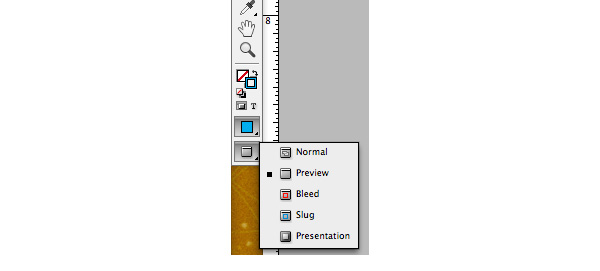
Now let’s take a look at our entire exterior spread! Check it out in preview mode by clicking on the last icon at the bottom of your toolbox and selecting Preview. Click on Normal to return to the mode we were in.
Step 27
Go back to Normal mode and scroll down to your other, reflected spread (pages 4–6). As we discussed earlier, this is where the design for the inside of the folder will go. I’ve chosen to fill the entire inside with a bike pattern I created. I’m simply going to go File > Place and place it over my entire spread.
4. Save Your File
It’s time to save our file! When the printer gets the file, they’ll need all of the http://cdn.tutsplus.com/vector.tutsplus.com/uploads/2013/09/ we used in our design, as well as any fonts so everything will load properly on their computer. We do this by packaging our file. Go to File > Package. Once you do this, you’ll see a dialog box appear showing a summary of your file. This page is important because you’ll see any fixable errors before you hand the file off to the printer.
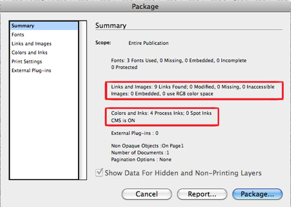
I’ve highlighted where the most common errors occur. The first one is Links and Images. If any of your http://cdn.tutsplus.com/vector.tutsplus.com/uploads/2013/09/ are using RGB mode instead of CMYK (since this is a printed document), you’ll get a warning your colors in your http://cdn.tutsplus.com/vector.tutsplus.com/uploads/2013/09/ won’t come out how you think they will unless you change them and re-save.
The second is Colors and Inks. Remember whenever we were in the Color panel, we were using CMYK color builds instead of RGB. We would get an error here if we didn’t.
Since everything looks error free, click package! You’ll need to choose where you’d like it to save, and once finished, you’ll have your InDesign file, your links, and your http://cdn.tutsplus.com/vector.tutsplus.com/uploads/2013/09/ all together in one folder. When you’re ready to hand it off to the printer, simply compress the file and send.
Get Peddling to the Printers, You’re Done!
I hope you’ve enjoyed my first tutorial here on Tuts+ and are inspired to create your own pocket folder creation.