
In this tutorial I’ll be using Photoshop CS6 to design a simple, clean, landing page for a fictional traveling startup. During this process we’ll look at creating custom grids with guidelines, styling typefaces, using lots of white space and composing our website’s content in a very clean and professional manner. The finished PSD file will be ready to hand over to a developer for coding up.
Tutorial Assets
In order to follow along you will need the following (freely available) assets:
- Bike traveler photo from Unsplash
- PT Serif font from Font Squirrel
- Aller font from Font Squirrel
- Open Sans font from Font Squirrel
- Avatars from User Inter Faces
Get the Document Ready
Step 1
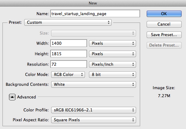
Begin by creating a new document (File > New…) using the settings shown below.
Step 2
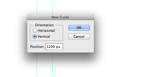
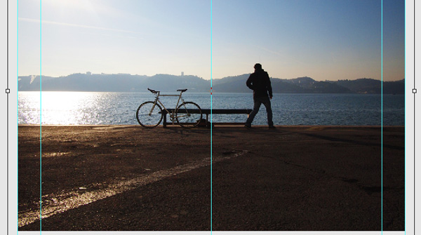
Let’s set some guides so our layout has enough space and looks balanced. I don’t always use a grid, but setting some guidelines will ensure pixel perfection and will help to define our website’s width. Divide the canvas into two halves vertically so you can create a centered composition. Go to View > New Guide… and set some guidelines. I usually choose 1000px as a website width and add some guidelines from the corners so it has space to breathe.
Note: Guidelines used for this tutorial: vertical at 200px, 260px, 700px, 1140px and 1200px.
Tip: You could also use the GuideGuide Photoshop plugin to make this process even quicker.
Step 3
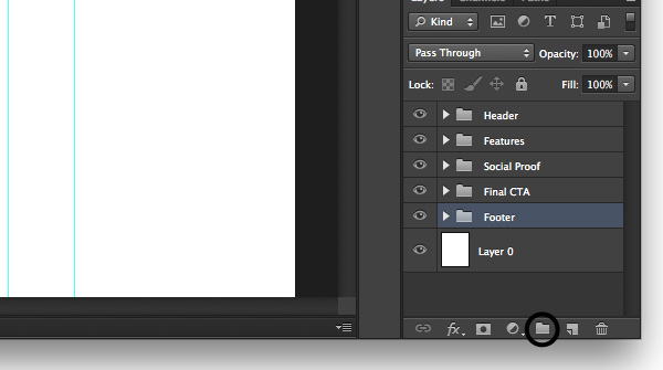
We’re going to keep our document well organized from the very beginning, so let’s create three layer groups named Header, Features, Social Proof, Final CTA and Footer. Sticking to this Photoshop etiquette will keep things organized and easy to navigate or edit. To create groups go to Layer > New > Group… and give each one a title as mentioned. For quick creation of a group just click the icon.
Designing the Header Area
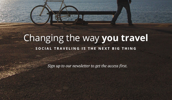
The header is very important for every website as it is the first opportunity to convince a new visitor that it is beneficial to stay on the website. This is where we, designers, need to use striking imagery and a clear message with some actions for visitors to take.
Step 1
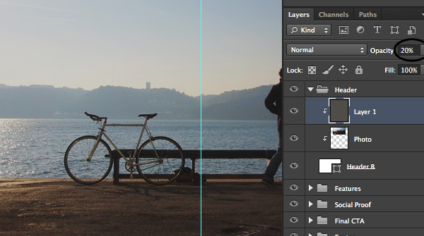
Let’s first change the background color to something very easy for the eye, in my case I used light gray #ebebeb. After that, open up the Header group and using the Rectangle Tool (U) draw a 1000x600px rectangle and place it between the vertical guidelines. Then download Bike traveler photo, drag it to the Photoshop document and place it above the rectangle layer. After that hold down the Alt key and mouse over the photo layer until you see a little arrow pointing down, then release it. You have just created a Clipping Mask.
Now hit CMD+T and resize the photo to fit your needs.
Tip: hold down Shift key to transform proportionally.
Step 2
Now we need to add a layer of transparent color to darken the image so the bright image parts will become darker and white text will be easily readable. Create a new layer above the image and create a Clipping Mask for it too. Then fill that layer with a solid dark color and change the Opacity to around 20% so we can still clearly see the image.
Step 3
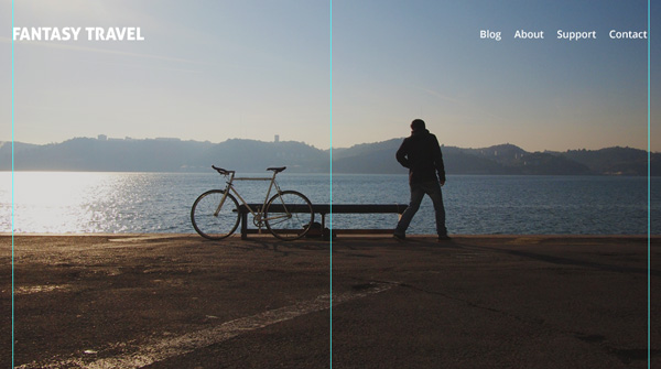
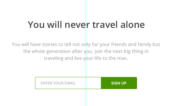
Now let’s put a simple typography-based logo and navigation at the top. Pick a Horizontal Type Tool (T) and write down your startup title on the left hand side. Make sure it is readable and has enough space around it. Our logo is in the top left corner as this is a common web conventions and what many visitors will expect.
I’ve used Aller font for the title and Open Sans for the navigation items.
Step 4
Now let’s play with the main message. You should always limit the strapline to one or two sentences and make sure that it is short and easily readable. In my case I’ve used 32px Open Sans to write the main message, placing emphasis on “you travel” by making it bolder.
The second line is much smaller, therefore forcing it to be perceived of secondary importance, so people will read it after they’re done with the main message. I’ve styled it with bigger spacing between letters, owing to the characters being uppercase.
Notice where I place the messaging, always think about contrast and where it is better to place your copy to be easily read by the reader.
Step 5
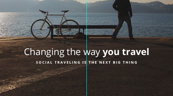
Create a simple call to action informing visitors what they should do. In my case it is a simple message suggesting visitors subscribe to the newsletter. I’ve used 14px size PT Serif (Italic) font.
Step 6
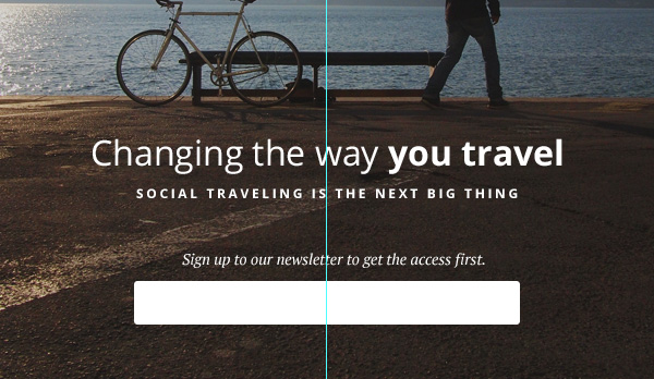
Let’s create a simple email form that allows our visitors to enter their email address and subscribe to the list. Create a new group called Email form. Use the Rounded Rectangle Tool (U) with 3px radius to create a simple white (#FFFFFF) color input.
Step 7
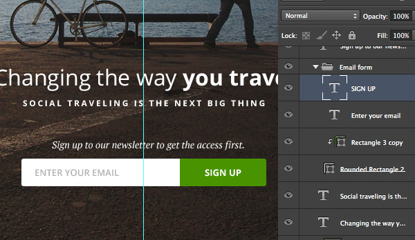
Add hint text for people to understand where to enter their email and create a call to action button. I’ve used 13px Open Sans (Semibold) gray (#bdbdbd) for the input text and 13px Open Sans (Bold) white (#FFFFFF) for the button text. Pick a catchy color for your main call to action so it stands out and encourages action.
In my case I’ve used green (#51a200) for the main call to action. Pick a Rectangle Tool (U) and draw a rectangle shape placed above the white input. Then hold down the Alt key and mouse over the green rectangle until you see an arrow down icon, release the key and you will create a Clipping Mask.
Designing Features Area
This is the main body part right above the fold area. If people are interested in what you have to offer they will scroll down to see what you have in more detail.
Step 1
Collapse the Header group by clicking the small arrow next to the group name. Now we need to create a slightly different background for the body area of our website. I have used the Rounded Rectangle Tool (U) with a radius of 5px and white color #FFFFFF.
Place your newly created shape right above the main background layer.
Step 2
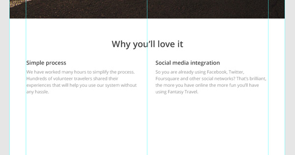
Expand the Features group and start typing your copy. In my case I have added the main message line and two columns of features with a title and a short paragraph.
When creating engaging copy make sure it is legible and not too long. Use different font weights, sizes and colors to create visual hierarchy. Lastly, but very importantly; use plenty of whitespace. In my case I have used Open Sans font variations, dark gray #545454 and light grey #a2a2a2 for my copy.
Designing Social Proof Area
Step 1
Now it’s time to design our second body area that will help website visitors to make up their minds and take action. We’ll design a social proof area showing a couple of testimonials.
First we need to separate the previous area in a subtle way. I have used the Line Tool (U) set to 1px with the color being light gray #e8e8e8.
Step 2
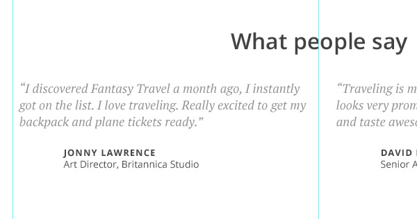
Minimize the Features group and expand the Social Proof group. Once again write down a title keeping the same size you used before. The key to clean design is consistency, so once you have used one color and size before, stick to those.
For the social proof area I have used two fictional testimonials from fictional people. The font used for the quote is PT Serif and the rest is the previously used Open Sans with different size and weight variations.
Step 3
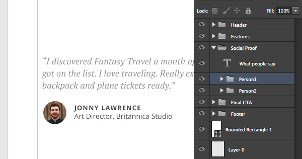
As you can see I have left some space in front of the names. Head over to User Inter Faces to get some avatars. After that pick an Ellipse Tool (U) and holding down Shift key draw a circle. Finally copy and paste your avatar above the circle layer and mouse over the avatar layer holding Alt key so you will create a Clipping Mask.
To make things more organized create two groups inside the Social Proof group and place the testimonial layers in separate groups.
Designing Final Call to Action Area
According to GoodUI you should always repeat your primary call to action so people who didn’t make up their mind in the first place can do so after seeing more of your website.
Step 1
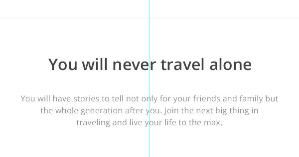
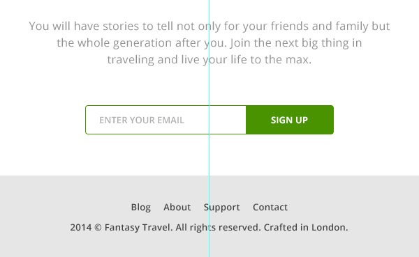
Let’s separate the previous area using the same line. Find the line layer and simply hit CMD+J to duplicate it and then move it below the testimonials leaving plenty of space.
After that, write down the main headline of the section and simple sub-headline giving more information or guidance. As you can see I have used the same style, weight and size fonts as used for previous sections. Stick to one style for all your copy.
Step 2
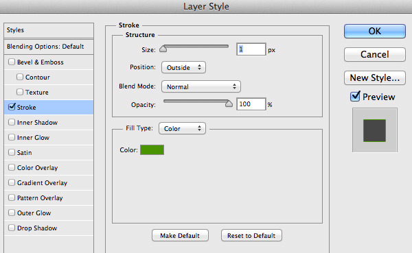
Head over to the Header group and find your form group, after that duplicate (CMD+J) it and move to the Final CTA group. Place it below the messaging and customize it a little bit by adding a green stroke around the input field.
Click the right mouse button on the input layer and select Blending Options… after that apply a Stroke effect as shown below. The color I have used is #51a200.
Designing the Footer
We’re done with the Final CTA group, so minimize it and expand the Footer group. Finally let’s enter some links to the internal pages of your website and put a simple copyright text on a new line. I have used Open Sans (Semibold) font for the links.
Notice how it is placed outside the body background to distinguish it from the main content. Make sure you use consistent spacing above and below the copy so it looks balanced.
Conclusion
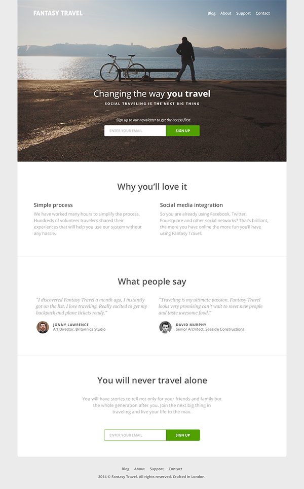
In this tutorial I have walked you through the process of creating a very simple and clean travel website landing page including some key sections which allow you to capture your visitors’ attention, encouraging further action.
The outcome is a balanced and lightweight layout with a strong focus on imagery in the top area and clean typography in the body area. If you have any questions or thoughts, please let us know in the comments area!