
When creating a web app, you often need to present people with friendly help prompts that explain parts of your interface. One of the ways to do it is to have separate pages with help topics that you link to. However, this causes people to lose context of what they are doing and is not very user friendly.
A better way is to show help text right where it is needed. Here is how to do it only with a few CSS rules and a tiny bit of HTML!
The HTML
The first step is to write the markup of the tooltip. Here is what it looks like:
<div class="help-tip"> <p>This is the inline help tip! It can contain all kinds of HTML. Style it as you please.</p> </div>
The <p> element is displayed as the black tooltip, and the .help-tip div is the blue circle with a question mark.
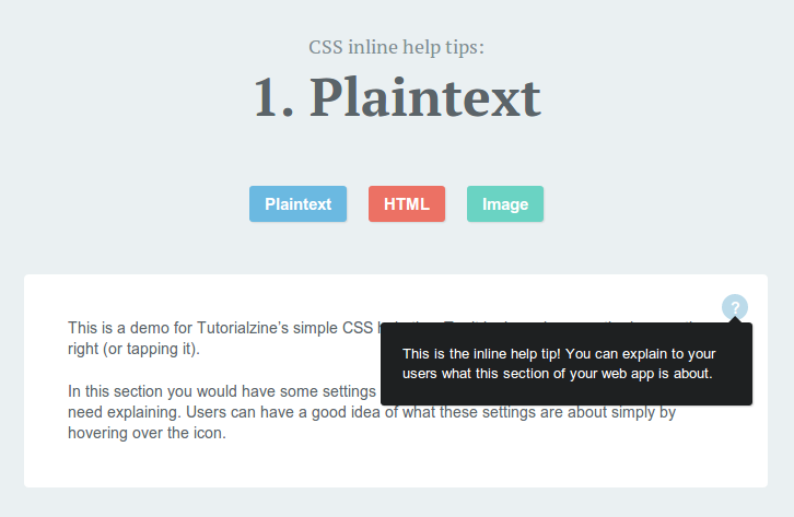
Inline Help Tooltip with CSS
The paragraph is hidden by default and is only revealed on hover. It can contain links, images and other kinds of HTML. It is revealed with a smooth CSS animation, as you can see from the demo.
The CSS
All of this is possible with the help of a bit of CSS (you can find it in style.css in the downloadable zip, linked to from the buttons in the beginning of the article):
.help-tip{
position: absolute;
top: 18px;
right: 18px;
text-align: center;
background-color: #BCDBEA;
border-radius: 50%;
width: 24px;
height: 24px;
font-size: 14px;
line-height: 26px;
cursor: default;
}
.help-tip:before{
content:'?';
font-weight: bold;
color:#fff;
}
.help-tip:hover p{
display:block;
transform-origin: 100% 0%;
-webkit-animation: fadeIn 0.3s ease-in-out;
animation: fadeIn 0.3s ease-in-out;
}
.help-tip p{ /* The tooltip */
display: none;
text-align: left;
background-color: #1E2021;
padding: 20px;
width: 300px;
position: absolute;
border-radius: 3px;
box-shadow: 1px 1px 1px rgba(0, 0, 0, 0.2);
right: -4px;
color: #FFF;
font-size: 13px;
line-height: 1.4;
}
.help-tip p:before{ /* The pointer of the tooltip */
position: absolute;
content: '';
width:0;
height: 0;
border:6px solid transparent;
border-bottom-color:#1E2021;
right:10px;
top:-12px;
}
.help-tip p:after{ /* Prevents the tooltip from being hidden */
width:100%;
height:40px;
content:'';
position: absolute;
top:-40px;
left:0;
}
/* CSS animation */
@-webkit-keyframes fadeIn {
0% {
opacity:0;
transform: scale(0.6);
}
100% {
opacity:100%;
transform: scale(1);
}
}
@keyframes fadeIn {
0% { opacity:0; }
100% { opacity:100%; }
}
Chrome still needs the -webkit prefix for keyframe animations, so we supply both versions. This animation scales the element from the top right corner (thanks to the transform-origin on line 23) and animates the opacity. It is triggered on hover, so while you have your mouse over the tooltip, it will stay on the screen.
It is important to note that the container element that the blue circle with the question mark is displayed in, must be set to position:relative, in order for the circle to appear in the top-right corner.
I hope that you found this quick tip helpful and that you will find a use for it in your web apps!