
In the previous article, I introduced you to grid systems. With any luck, by now, you should have a good understanding of what they are and why they’re a good weapon to have in your design arsenal.
Today, I’m going to explain about choosing a grid system – from creating your own, to working with pre-made CSS frameworks. By the end of this article, you’ll have a good idea of the way you might like to walk your path with grid systems – and hopefully feel confident enough to do so.
Our Choices
Let’s begin by narrowing things down.
Framework or D.I.Y.?
We have two choices before us: do we go with a pre-made framework that somebody else has already built, or do we create our own grid system and work with that? Really, the answer is all down to your personal preference.
I would always recommend that if you’re just starting out with designing for the web, then it may be more beneficial for you to start designing with pre-made frameworks. These designs don’t have to be permanent and can instead be a way of you working with grid systems in a way that eases pressure and allows you to experiment and understand them more.
Pre-made frameworks also allow you to work with prototyping a design – where we can quickly bolt together different elements and modules in a design to see how these play out when they’re actually in a browser (in as realistic a way as they can get, being on a digital form such as the web).
However, I always think that it’s best to create your own grid, if you ever can do so. This way, you’re not only much more in control of the design and structure of your grid, but you can then also be much more in control over the output of your grid and how this plays out in the development stage of your website design. And I don’t know about you (though I imagine many developers will feel the same way I do) but I like to have every bit of control I can have over my code and how it’s presented; creating my own grids allows me to do just that.
Pre-Made Frameworks
Pre-made frameworks are found aplenty in the web design world – what seemingly started out with one or two grid systems (such as 960.gs) soon blew up to us having many dozens, if not hundreds, of grid systems available for us to use.
Grid frameworks are useful as they allow us to easily get a prototype or basic website in place when we’re developing. However, how can we switch that so they’re also useful when we’re designing?
Pre-built frameworks will often come with some sort of PNG or PSD for you to use when you’re designing – and if not, then you’ll need to try and replicate this grid into your design. Simply create a new layer and put this grid overlay in place. Then, you can start designing to the grid that you have.
Popular grid frameworks include
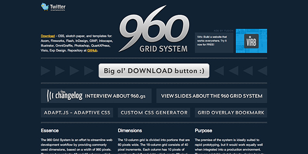
- 960.gs
- 1140 grid (since retired on account of it not being responsive)
- Responsive Grid System
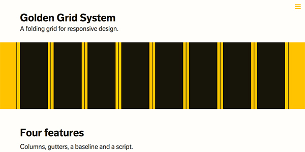
- Golden Grid System
- ..and the list goes on!
D.I.Y. Grids
Just as when I’m working with my code, I like to have control over what I’m designing. If I work with a premade grid framework, then in a way I am committing my work to somebody else’s preferences – whereas if I design my own grids, it means that I have all of the control over how my grid works, how it relates to my design and I know I will have much more control over the final code output as well, as I will have designed it.
Although it can seem quite daunting, as long as you’re armed with some knowledge, creativity and ideas of a layout for your website, then creating your own grids needn’t be as scary as it sounds.
Creating your own grids is hard when you haven’t done it before – but there are so many tools out there to help you. Up until a few of these tools came out I hadn’t even tried creating my own grids myself and I was a big fan of frameworks – but seeing the advantages of being able to create my own grids for every project I do has made me feel much more creative. I feel I can come up with more more innovative and unique design ideas.
First up, when you’re designing your own grids, continually return to your sketchbook, making a few sketches and ideas of layout. Even if you just go back to some of your initial sketches that you made at the beginning of the project, imagining how these sketches can fit into a grid can be useful and give you a head-start.
Creating your own grids is also about a lot of theory – and far too much to include here, for it could be a massive session of articles on its own! But try to master the basics first. Look at your favourite websites online and see if you can pick out a modular or grid-like pattern to their design. See if you can look at the designs you admire and see how different elements align, how the grid might adapt when the design is scaled up or down responsively – all those sorts of little things will help your understanding of using and creating grids much better.
Tools to Create Your Own Grids
As I said before there are many, many tools available to you for creating your own grids to use in your web designs. I’ve picked just three popular solutions, that have helped me the most when rolling with my own grids, but be aware that there are many more just a Google search away.
Gridset
Gridset is a wonderful tool, created by the lovely folk at Mark Boulton Design Studio in South Wales.
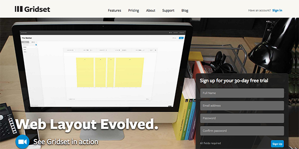
In their own words, Gridset is simply a “tool for making grids” – and they make it so easy to do so. Gridset is perfect for all stages of creating and using your own grids – designing, prototyping and production-stage development.
To create your own grids with Gridset, you simply create a gridset and then create different grids for each of the major breakpoints you think you will use in your design. You can alter the column width, gutter width and even change the ratio of the columns – plus much more.
Gridset provides you with a PNG grid overlay you can use when designing, you can add classes to your HTML to prototype quickly and you can use the measurements that Gridset calculates in your own markup (so you don’t have to use the provided Gridset classes).
With Gridset, you can also use their built in Sass functions – making it even easier to integrate your grid design into your development workflow.
One other great thing about Gridset is the wealth of information they provide about grids. I found I learned so much just through the Gridset blog and deciphering the Gridset Specimens they have on their homepage.
Gridpak
Gridpak is one of the first really interactive responsive grid making tools I found online, created by Erskine Design in Nottingham.
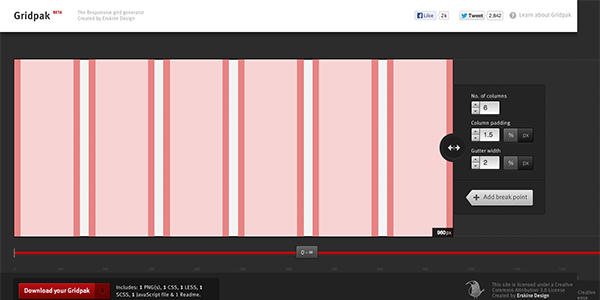
Gridpak works by creating a number of grids (by defining a column size, column padding and gutter widths) for your custom breakpoints.
Once you’ve created all of your grids in Gridpak, you’ll get a download with all the files you’ll need to integrate your grids in your website workflow – a PNG to use as a grid overlay when you’re designing, several files you can use for your Gridpak grid CSS (“vanilla” CSS for your standard classes, as well as both a LESS and Sass version) and you also get a JavaScript overlay file that you can use to overlay your grid on your websites during development.
Gridpak seems really useful to me for prototyping more than anything – it’s really quick to get some visual representations of your grid (at particular responsive breakpoints, too) and integrate these into a quick prototype. From there, we can look at spending more time refining the provided CSS classes into our own markup, ensuring that the quality of our code (which should always be important to a developer!) is top-notch.
CSS Wizardry Fluid Grids
If you don’t want all the bells-and-whistles and instead you’re just after a quick calculator that will help you to create some responsive grids – then I’d receommend a trip to Harry Roberts’ Fluid Grids.
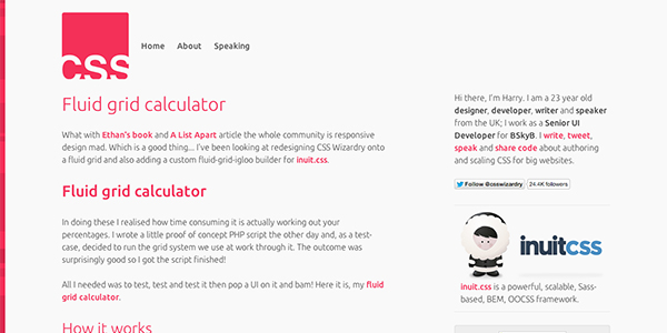
While he can’t host this on his own website anymore (due to the setup he now has), Harry has kindly popped up the original code on to Github. You may have to perform a little manual work to get this working, but it’s well worth the effort if you want a quick and easy system to setting up your grid framework and design.
Assignment
Now you know all about grids and some of the tools you need when creating grids – I want you to try your hand at making some of your own! Using any of the tools mentioned above – or indeed using your own, if you’ve already developed one. Try your hand at creating some of your own grid systems and starting to integrate them with your designs. Let us see the results in the comments!