Build an Advanced Responsive Menu Inspired by Netflix
The other day I visited the Netflix Jobs website from my phone and had a look at its off-canvas menu. I really liked the staggering animations that fired every time you hit it. So I thought it might be a good exercise to take this menu as inspiration and show you how to build a similar responsive menu. Let’s dive in!
What We’re Building
Before getting started, I want you all to have a clear understanding of what we’re going to build:
This embedded pen shows the mobile version of our menu. Be sure to check it on a wider screen to see the desktop version of it as well. Feel free to resize your browser window to see how the layout adapts to various screen sizes.
We’ve a lot of things to cover, so let’s get cracking!
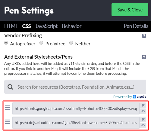
The Assets
For the purposes of this tutorial, I’ve incorporated the following assets into the pen:
The page markup may seem lengthy at first glance, but please don’t feel overwhelmed. In fact, it isn’t as complicated as it looks. Anyhow, I’ll do my best to explain it!
We’ll start with a header which contains a nav (navbar). Within it, we’ll put all the header elements. More specifically:
The hamburger button which will open the off-canvas menu. This will be visible only on small and medium screens (<995px).
The logos. We’ll have two different types of logos. A vertical logo and a horizontal logo. Their visibility will depend on the viewport size.
The .top-menu-wrapper element. This will include two empty .panel elements, the .top-menu list, the search button, and the search form. The .panels will be visible only on small and medium screens (<995px). Inside the .top-menu list, we’ll put the .mob-block element which will wrap some mobile-only elements, the menu links, and the social links. Similar to the .panels, the .mob-block and the social links will appear only on small and medium screens (<995px).
2. Define Some Basic Styles
With the markup ready, we’ll continue with the CSS. Our first step is to set up some CSS variables and common reset styles:
Nothing spectacular here. I just want to discuss two things.
Firstly, notice that we gave font-size: 62.5% to the html. This will set the base font size to 10px ((62.5/100)*16) and override the default browser font size which is 16px (it’s user-configurable though). By doing so, 1rem is equal to 10px and not 16px. That allows us to easily specify rem-based sizes for our elements.
Secondly, pay attention to the no-transition class. Later we’ll use this class to disable all the CSS transitions when the page is being resized.
Note: for simplicity I won’t walk through all the CSS rules in the tutorial. There are almost 400 lines of CSS here. Make sure to check them all by clicking at the CSS tab of the demo project.
3. Style the Mobile Menu
To style the navbar, we’ll follow a mobile-first approach. That said, first we’ll walk through its layout on small and medium screens (<995px), then on larger screens.
With that in mind when the viewport size is under 995px, the navbar will look like this:
At this point as you can see, only the hamburger button, the vertical logo, and the search button (without its text) will appear.
The navbar will behave as a flex container. We’ll give it justify-content: space-between and align-items: center to position its visible children across the main axis and the cross axis accordingly.
Each time we click on the hamburger menu, the .top-menu-wrapper element will receive the show-offcanvas class. In such a case, the off-canvas menu will appear:
This will come into view with a transition effect. The .panel and .top-menu elements will become visible sequentially with a slide-in effect according to their source order. First the .panel1 will appear, then after 200ms the .panel2, and finally after 400ms the .top-menu. At the same time we’ll animate the background color of the ::before pseudo-element of the .top-menu-wrapper. This pseudo-element will serve as an overlay which sits underneath the off-canvas menu.
At this point it’s important to write down a few key things regarding the off-canvas layout:
Both the .panels and the .top-menu will be fixed positioned elements and cover the entire viewport height. They’ll also sit on top of all the other elements.
Their width will depend on the viewport size. For example, on screens up to 549px their width will cover the entire viewport width. On the other hand, on larger screens they’ll all have a fixed width (around 60% of the window width).
The order of their appearance will depend on the value of their transition-delay property.
We’ll use flexbox to layout the contents of the .top-menu and .mob-block elements.
Here’s a part of the styles needed for the off-canvas menu:
Each time we click on the ✕ button, the .top-menu-wrapper will lose its show-offcanvas class.
Right at this time, the .panel and .top-menu elements will disappear with a slide-out effect in a reverse sequential order. First the .top-menu will disappear, then after 100ms the .panel2, and finally after 300ms the .panel1.
Here are the transition-related styles which determine the speed of the target elements:
As long as we click on the search button, the form’s visibility state will change. That means if it’s hidden, it will appear (it will receive the is-visible class). But if it already has this class, it willl disappear.
The JavaScript code which handles the form visibility:
When the viewport width is at least 995px, the navbar layout will be completely different:
In such a case, a typical navigation menu will replace the temporary off-canvas menu.
So, let’s highlight the important differences that will occur on the desktop layout compared to the mobile one:
The horizontal logo will appear.
On the other hand, the following elements will disappear: the ::before pseudo-element of the .top-menu-wrapper, the hamburger toggle button, the vertical logo, the .panels, the .mob-block, and the social links.
In addition the .top-menu won’t behave as a fixed positioned element anymore, but instead it’ll position according to its normal document flow (position: static). Plus, its dropdowns will be hidden by default and appear only when we hover over their corresponding parent list item.
Here’s a part of the most crucial styles for the desktop layout:
When the viewport width is at least 1200px, we’ll do a few small changes. Most importantly, we’ll show the text (Search Resources) of the search button:
We’ve almost finished the creation of our menu. But there’s one last thing that we’ve to fix. To be more specific, each time we resize the browser window, we should clear all the CSS transitions. Otherwise in our case, as we resize the window, the off-canvas menu will appear for a moment before moving back to its default off-screen position.
While it’s not something very important, it would be really nice if we could find a way to solve this issue.
So what we can do is to listen for the resize event, and each time that fires, we’ll add the no-transition class (hopefully you remember it!) to all the .page-header descendants.
But then, when the resize is finished, we’ll wait 500ms (feel free to change that value) before removing this class from all the .page-header descendants.
Here’s the little JavaScript code that achieves this functionality:
I’m not sure if that’s the smartest approach for solving this issue, but I think that at least it works fine and cancels the undesired transitions on window resize.
Obviously, we could enhance this code to run only for the very few elements that are transitioned and not for all the header’s descendants.
Conclusion
That’s it folks! We took the header menu of the Netflix Jobs website as inspiration and learned to create our own advanced responsive menu. Indeed it was a long journey, but I hope that it helped you enhance your front-end skills and learn some new things.
Let’s look again at what we built:
Before closing I’d like to say one more thing: the best way to understand how this demo works is to inspect the CSS styles.
If you plan to build anything similar to this, I’d love to know your ideas! As always, thanks a lot for reading!