The history of Aol branding is a story of bold decisions and risky moves. It shows how much can be achieved when you have the audacity to push the boundaries of design. It also shows that extraordinary problems require extraordinary solutions.
How loss of clients creates necessity for bold actions
The online environment has changed and so came a time for radical changes in Aol. The management has hired an agency, which created its reputation out of avant-garde creations of its designers.
A new Aol logo has lost its brand colors and gained a dot in its name (along with a lot of hate for the new design). If what they say is true – that “all publicity is good publicity”, then the rebranding that Aol has undergone by the end of 2009 has to be considered a good move.

This, original at that time, approach was hard to imitate. It caused a lot of discussion and allowed the company to get a lot of traction, even outside of the US market. The logo proved to be profitable in the short run. But what would be the final verdict?
The new brand identity was created to communicate: innovation, open-mindedness and the promise of high-quality standard of service.
All of this was aimed at supporting the refreshed Aol on its way to regaining its condition from 90’s, when it was considered a leader in its niche.
The logo was undoubtedly innovative – the London studio Wolff Olins (currently a part of Omnicom) has gained a lot of publicity for its bold approach to branding. This time the studio has put forward a brand image, which was shocking to most people in 2009. If you had entered the Aol.com website back at the time, you’d see that the logo remained only partially unchanged. White letters were put against a different background each time. It was (and still is) a very rare apporach, juxtaposed against traditional school of designing logotypes.
How did new Aol logo look in practice?
What was particularly interesting about this branding, was the diversity of the designs. Instead of one color scheme, style or overarching theme, Aol was presenting its visitors with hundreds of greatly varied propositions: from abstract, colorful clouds to gold fishes to cassettes or images of crazy musicians. One thing that was definitely not included, was the pompousness characteristic of such big companies.
Aol had only one way of escaping their demise – running forward
The ever-changing images were not random. After taking a good look at them as a whole, one can distinguish a fresh, cohesive collection that often puts across the idea of flight or space. The effect of surprise cannot be neglected as well – a brand built in that way cannot become boring at any point.
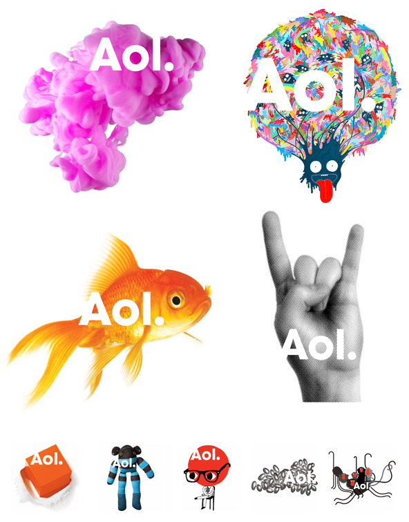
Smaller font and the dot at the end of Aol, was a reminder of its pedigree related to the begginings of the Internet. The dot was supposed to add the feeling of emphasis and self-confidence. One of the letters was always connected to the white background, making it a part of the logotype.
Why Aol chose not to change its name
Before all the previously mentioned changes have been made, Aol was thinking about quitting its name altogether. For a lot of people Aol meant “the Internet of your parents”. It was a hard business case to be solved. After a market research conducted by Leo Burnett agency, the ambitious vision of renaming the whole company was put back on the shelf. The recognition of the brand, although covered with a thick layer of dust, was still a great asset for the company, which was not to be wasted.
What is the big lesson behind all of this?
New branding of Aol was bold – but it had to be bold. When the image of a brand starts to become negative, hiding your head under the sand is not going to help.
Aol has been a rather old Internet company, and most of the companies that started along with it are long gone and forgotten. Aol has started in 1985 – which is considered prehistory in the world of e-business. Most of the companies from that time which are still alive have been utterly rebranded. In 2009, Aol was one of the few which were left behind. From the perspective of today, the rebranding can be considered a very good move. In the short term it brought a lot of profit to the company, but the destiny of the whole company was a part of a much more complex picture.
Why Aol was not saved
Financial directors understand that the past is a great predictor of the future. And Aol had a bad hand when it comes to the past. Bebo, which Aol bought for almost $1 billion, could not find a buyer. ICQ, which was bought for $400 million, had to be sold for $200 million. Similar instances happened many times. Losses, losses, losses…
Aol is still trying to fight for its new position with a more conservative, weather-based branding, but its fame is slowly starting to vanish. We are secretly hoping to witness a new revolution, which will be a tremendously interesting spectacle for all the designers to watch.