
In this tutorial, I’ll be going over all the steps the auto-placement algorithm of the CSS Grid Layout module follows when positioning elements. These steps are controlled by the grid-auto-flow property.
In Introducing the CSS Grid Layout and Seven Ways You Can Place Elements Using CSS Grid Layout, I gave an overview of the CSS Grid spec and explained all the different ways Grid lets you arrange elements on the web. However, in my previous articles I explicitly specified the position of just one element in the grid. As for the rest of the items, they got placed properly based on an algorithm.
Here, I am going to show you how this algorithm works. This way, the next time an element ends up in an unexpected location, you are not left scratching your head wondering what just happened.
Basic Concepts for a Better Grasp of the Auto-placement Algorithm
Let’s go over some fundamental concepts before diving into the workings of the algorithm.
- Anonymous grid items – If you place some text directly inside a grid container without wrapping it in any tag, it will form its own anonymous grid item. You can’t style an anonymous grid item because there is no element for you to style, but it still inherits style rules from its parent container. On the other hand, note that white space inside the grid container will not create its own anonymous grid item
- Value of grid spans – Unlike grid positions, the algorithm has no special rules to resolve the value of grid spans. If not explicitly specified, their value is set to 1 (the item only occupies its own cell)
- Implicit grid – The grid built on the basis of the value of properties like
grid-template-rows,grid-template-columnsandgrid-template-areasis called explicit grid. Now, if you specify the position of a grid item in such a way that it lies outside the bounds of the explicit grid, the browser will generate additional grid lines to accommodate the item. These lines, along with the explicit grid, form the implicit grid. You can read more about it in Where Things Are at in the CSS Grid Layout Working Draft. The auto-placement algorithm can also result in the creation of additional rows or columns in the implicit grid.
Finally, I’d like to make the following preliminary point. The default value of the grid-auto-flow property, which is the property controlling the algorithm, is row. This is also the value I am going to assume in the following explanation of the auto-placement algorithm. On the other hand, if you explicitly set the above property to column, remember to replace instances of the term row with the term column in my explanation of the algorithm. For example, the step “Placement of Elements With a Set Row Position but No Set Column Position” will become “Placement of Elements With a Set Column Position but No Set Row Position”.
Now, enable the experimental features flag in your favorite modern browser to follow along and let’s go over the details of all the steps the algorithm follows to build the layout.
Step #1: Generation of Anonymous Grid Items
The first thing that happens when the algorithm is trying to place all the items inside a grid is the creation of anonymous grid items. As I mentioned earlier, you cannot style these elements because there is no item to apply the style to.
The markup below generates an anonymous grid item from the inter-element text:
<div class="container">
  <span class="nonan">1</span>
    Anonymous Item
  <div class="nonan floating">2</div>
  <div class="nonan">3</div>
  <div class="nonan floating">4</div>
  <div class="nonan">5</div>
</div>
Besides the generation of an anonymous item, one more thing to notice in the demo below is that the grid placement algorithm ignores the CSS floats applied to div 2 and div 4 .
See the Pen Anonymous Grid Items by SitePoint (@SitePoint) on CodePen.
Step #2: Placement of Elements with an Explicitly Specified Position
For this and the next few steps, I will be using a grid of nine different items to show how they are going to be placed.
Here’s the relevant markup:
<div class="container">
  <div class="item a">A</div>
  <div class="item b">B</div>
  <div class="item c">C</div>
  <div class="item d">D</div>
  <div class="item e">E</div>
  <div class="item f">F</div>
  <div class="item f">G</div>
  <div class="item f">H</div>
  <div class="item f">I</div>
</div>
The first items to be placed in the grid are those with an explicitly set position, which in the example below are items A and B. Just ignore all other items in the grid for now. Here is the CSS that explicitly sets the position of A and B:
.a {
  grid-area: 1 / 2 / 2 / 3;
}

.b {
  grid-area: 2 / 1 / 4 / 3;
}
The algorithm positions items A and B according to the values of their respective grid-area property. In particular, the algorithm:
- Sets the position of the top left corner of both A and B using the first and second value of the
grid-areaproperty - Sets the position of the bottom right corner of both A and B using the third and fourth value of the
grid-areaproperty.
The demo below illustrates the final placement of A and B after this step:
See the Pen Placing Elements with Explicit Positions by SitePoint (@SitePoint) on CodePen.
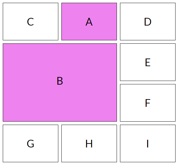
Step #3: Placement of Elements With a Set Row Position but No Set Column Position
Next, the algorithm places the elements whose row position has been set explicitly by using the grid-row-start and grid-row-end properties.
For this example, I will be setting only the grid-row values of item C and item D to give them a definite row position. Here is the CSS for placing both of them:
.c {
  grid-row-start: 1;
  grid-row-end: 3;
}

.d {
  grid-row-start: 1;
  grid-row-end: 2;
}
To determine the column position, which is not explicitly set, the algorithm behaves in one of two ways, according to the packing mode:
- sparse packing (default)
- dense packing
Sparse Packing in Step #3
This is the default behavior. The column-start line of our item will be set to the smallest possible line index which ensures that there won’t be any overlap between the item’s own grid area and the cells already occupied by other items. The column-start line also needs to be past any other item already placed in this row by this step. Please note that I wrote by this step and not until this step.
To clarify this point further, item D in the demo below did not move to the left of item A, even though it could fit in there without any overlap. This is due to the fact that the algorithm does not allow any item with an explicitly set row position but not set column position to be placed before any other similarly positioned item in that specific row (item C in this case). In fact, if you remove the grid-row rules applied to item C, then item D will move to the left of item A.
In short, item D, which has a definite row position but no explicitly set column position, can end up being placed before item A, but only if C does not interfere (interference takes place in this case because C, like D, has a definite row position but no set column position and is in the same row as D).
See the Pen Placing Elements with Definite Grid Positions by SitePoint (@SitePoint) on CodePen.
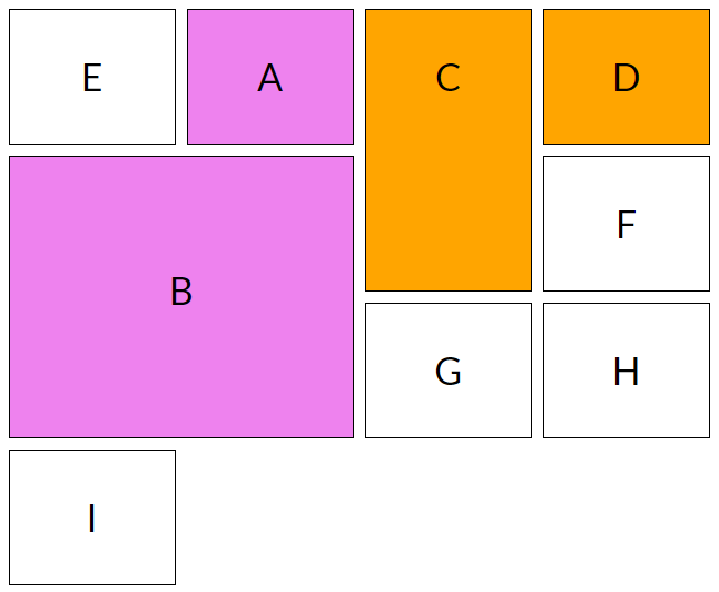
Dense Packing in Step #3
If you want to fill that empty space before item A with item D, you will have to set the value of the grid-auto-flow property to row dense.
.container {
  grid-auto-flow: row dense;
}
In this case too, the column-start line is placed at the smallest index which does not cause any overlap with other grid items. The only difference is that this time, if there is some empty space in a row where our element can fit without any overlap, it will be placed in that position, without considering the previous item in the same row with the same position rules (in this case item C).
See the Pen Elements with Definite Grid Positions – Dense by SitePoint (@SitePoint) on CodePen.
Step #4: Determining the Number of Columns in the Implicit Grid
Next, the algorithm tries to determine the number of columns in the implicit grid. This is done by following a series of steps:
- The algorithm starts with the number of columns in the explicit grid.
- Then it goes through all the grid items with a definite column position and adds columns to the beginning and end of the implicit grid to accommodate all these items.
- Finally, it goes through all the grid items without a definite column position. If the biggest column span among these items is greater than the width of the implicit grid, it adds columns at the end of the grid to accommodate that column span.
Step #5: Placement of Remaining Items
At this point, the algorithm has placed all the items whose position has been explicitly specified as well as items whose row positions are known. Now, it will position all other remaining items in the grid.
Before we go into more detail, you should know about the term auto-placement cursor. It defines the current insertion point in the grid, specified as a pair of row and column grid lines. To start off, the auto-placement cursor is placed at the start-most row and column in the implicit grid.
Once more, the packing mode, determined by the value of the grid-auto-flow property, controls how these items are positioned.
Sparse Packing in Step #5
By default, the remaining items are placed sparsely. Here is the process the algorithm follows to place them.
If the item has no definite position in either axis:
- The algorithm increments the cursor’s column position until:
a) either there is no overlap between already placed items and the current item
b) or the cursor’s column position plus the item’s column span overflow the number of columns in the implicit grid. - If such a non-overlapping position is found, the algorithm sets the item’s
row-startandcolumn-startvalues to the cursor’s current position. Otherwise, it increases the row-position by 1, setscolumn-startto the start-most line in the implicit grid and repeats the previous step.
If the item has a definite column position:
- The column position of the auto placement cursor is set to the item’s
column-startline. If the value of this new position is less than the cursor’s previous column position, the row position is increased by one. - Next, the row position is increased by one until the algorithm reaches a value where the grid item does not overlap with any of the occupied grid cells. If needed, extra rows can be added to the implicit grid. Now the item’s row start line is set to the cursor’s row position and the item’s row end line is set according to its span.
Let’s clarify the steps listed above with what’s happening in the following demo.
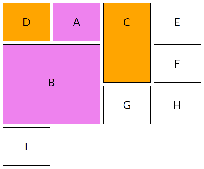
Placement of Items E and F without Definite Position in Either Axis
When the algorithm deals with item E, which has no explicitly set column or row position, the auto-placement cursor is set to row 1 and column 1. Item E occupies just one cell and it can fit in the top left corner without any overlap. Therefore, the algorithm simply places item E at position row 1 / column 1.
The next item without an explicitly set column or row position is F. At this point, the column position for the auto-placement cursor is increased to 2. However, the position row 1 / column 2 is already occupied by item A. This means that the algorithm will have to keep increasing the column position. This goes on until the auto-placement cursor reaches column 4. Since there are no more columns, the row position for the auto-placement cursor is increased by 1 and the column position is set to 1. Now the row position is 2 and the column position is 1. The algorithm again starts increasing the column position by 1 until it reaches column 4. The space at row 2 and column 4 is currently empty and can be occupied by item F. The algorithm places item F there and moves on to the next item.
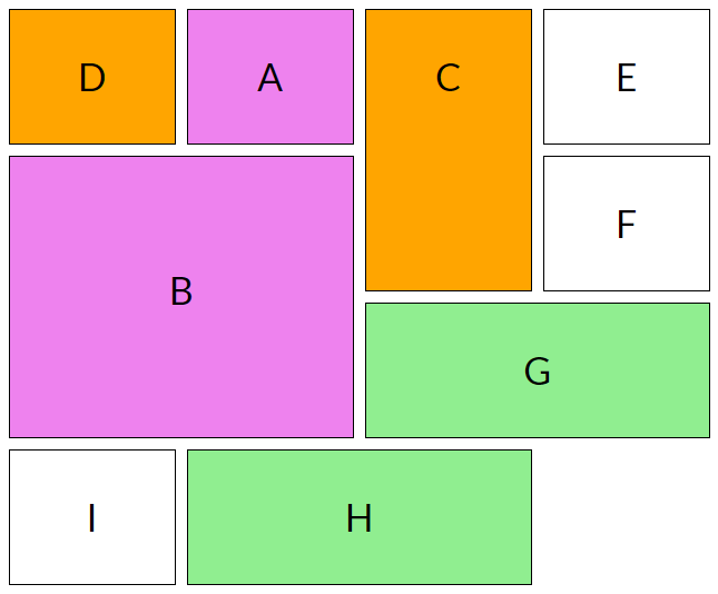
Placement of Items G and H with a Definite Column Position
The remaining items with a definite column position in our demo are G and H. Let’s examine G. The column position of the auto-placement cursor is set to be equal to the value of the grid-column-start property for item G, which is 3. Since this new value is less than the previous column value (which was 4), the row position is increased by one. The current row and column positions are now 3 and 3 respectively. The space at row 3 and column 3 is currently empty and item G can be placed there without any overlap. Therefore, the algorithm places item G there. The same steps are then repeated for the placement of item H.
See the Pen Positioning Remaining Items by SitePoint (@SitePoint) on CodePen.
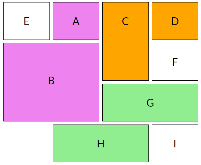
Dense Packing in Step #5
Things are handled a bit differently when the grid-auto-flow property is set to row dense. When placing a grid item with no definite position, the cursor’s current position is set to the start-most row and column line in the implicit grid before the item’s position is determined.
Unlike the previous example, item I is placed to the left of item H because the cursor position gets reset to the start-most row and column line in the implicit grid instead of starting from the last item placed. At this point, while looking for a suitable position to place item I without any overlap, the cursor finds the spot to the left of item H and places it there.
See the Pen Positioning Remaining Items – Dense by SitePoint (@SitePoint) on CodePen.
More from this author
Conclusion
In this article, I went over all the steps followed by the auto-placement algorithm of the CSS Grid Layout module, controlled by the grid-auto-flow property.
Have a go at figuring out the final position of different items in a few other layouts of your own to get a better understanding of the algorithm.
If you have any questions related to this article, let me know in the comments.