This article explores 27 typefaces that will serve as a solid foundation for your typeface library. Take what you will from my suggestions. More importantly, learn from them and use that knowledge to build a typeface library that works for you!
Typeface Categories
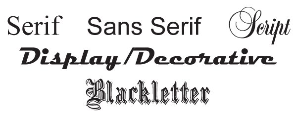
Most typefaces fall into one of five categories: serif, sans serif, script, display/decorative, and blackletter. Within these main categories are a dizzying number of sub-categories such as modern, transitional, humanist, glyphic, calligraphic, digital, grunge, handwritten, geometric, slab, and old style, to name a few. It can get incredibly confusing in a hurry!
A well-stocked font folder should include a few typefaces from each of the above categories. Think of them as pantry staples… items like flour, baking powder, olive oil, chicken stock, sugar, tomato paste, crackers, fun size candy bars, potato chips, and Merlot. Oops, it seems I’ve wandered out of the pantry! Not to worry. Even though some of those items aren’t staples, they are nice to have on hand in case of an emergency. The same is true for your typeface library. Build a solid set of tried and true typefaces and throw in a few fun typefaces simply because you like them!

Serif vs. Sans Serif
The difference between a serif typeface and a sans serif typeface is that serif typefaces have serifs (little “feet”, or short lines, on the ends of their characters) and sans serif typefaces do not. Makes sense, huh?! It is believed that these little appendages/serifs help the eye flow from character to character and increase readability. Many books, magazines, newspapers, and other publications with large blocks of text are set in a serif typeface.
Conversely, sans serif text is thought to be easier to read at low screen resolutions and is the more common choice for the web. People have been debating and studying the validity of these assertions for ages. I believe it’s a matter of personal taste. More and more, I have been using sans serif fonts for body copy. Why? Because I like the way it looks.

Serif Typefaces
Serif typefaces typically fall into one of four subcategories: Old Style, Transitional, Modern, and Slab.
Old Style Serif Typefaces
Let’s start with the original serif typeface, Old Style. Also known as Humanist, Old Style serif typefaces have thick and thin strokes with slight variations in weight. The thinnest part of each character is at an angle, giving it elegance, a sense of movement and oodles of fancy pantsy-ness. If you drew a straight line from the thinnest part of an old style character to the thinnest part of the stroke on the opposite side, the result would be an angled line.
Typefaces such as Caslon, Bembo and Goudy are excellent classic options when a touch of dignity and formality is in order.

Transitional Serif Typefaces
Transitional, or Baroque, serif typefaces differ from Old Style serif typefaces in that they are less calligraphic and more upright. The thin strokes of each character are at the top and the bottom rather than at an angle. There is also a significant contrast between the thick and thin strokes.
Baskerville, Century and Bookman are good examples of transitional serif typefaces. These typefaces are appropriate in formal settings yet aren’t as pretentious as their old style relatives.

Modern Serif Typefaces
Modern serif typefaces, also known as Didone or Neoclassical, have thin serifs and heavy vertical strokes, making them less suitable for large bodies of text. Modern serif typefaces are best used in headlines and other short lines of text.
Bodoni and Didot are two Modern serif typefaces that are right at home in a heading or subheading.

Slab Serif Typefaces
Slab serif typefaces also go by the name Egyptian. They are more rectangular and have fairly equal line weights throughout. They have thick blocky serifs with no tapering. Think of a slab serif as a hybrid typeface. If a serif and a sans serif had a little tryst that produced a child, the baby would be a slab serif.
Rockwell and ITC Lubalin are popular slab serifs. Both are perfect when you need to make a bold statement. They also look great when used with a lighter typeface. Try it!

Sans Serif Typefaces
Like serif typefaces, sans serif typefaces fall into categories, Humanist, Grotesque and Geometric being the most common. A well rounded typeface collection should include at least one face in each of these categories.
Humanist Sans Serif Typefaces
The stroke contrast of a Humanist sans serif typeface gives it a more organic, calligraphic look than other sans serif faces. If you want to use a sans serif typeface for body copy, a Humanist sans serif will do the job. Myriad Pro has been my go to sans serif typeface for quite some time.

Grotesque Sans Serif Typefaces
The Grotesque style typeface was the first sans serif face designed. Prior to its arrival, you could choose between a serif and serif! A fairly new arrival, Helvetica (debuting in 1957), is its shining star. Everyone needs Helvetica, right? If you’re looking for something old school, Akzidenz-Grotesk (designed in 1896) is an excellent option.

Sans Serif Geometric Typefaces
Geometric typefaces are, well… geometric. They can be circular, rectangular, elliptical, or triangular. Depending on the subcategory they fall under, geometric typefaces can be used for everything from body copy to headlines.
Century Gothic is a good example of a typeface inspired by circles. In contrast, Eurostile is a popular square typeface. Need something with more of an oval look? Try Copperplate Gothic. If circles, squares and ovals aren’t doing the trick, the triangular typeface Black Boton with its Pac-Man-esque “C” is an interesting typeface to consider.

Sensational Script Typefaces
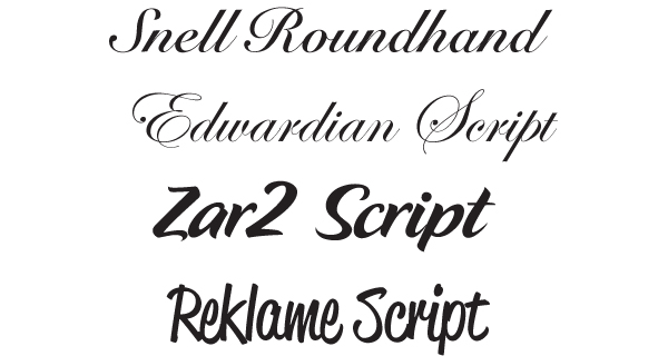
Script typefaces come in two styles – formal and casual.
Formal script typefaces such as Snell Roundhand and Edwardian Script are most often used in announcements and invitations.
Casual script typefaces such as Zar2 Script and Reklame Script have a more handwritten, irregular appearance. These typefaces are the perfect choice for a project that requires a little fun and personality.

Display and Decorative Typefaces
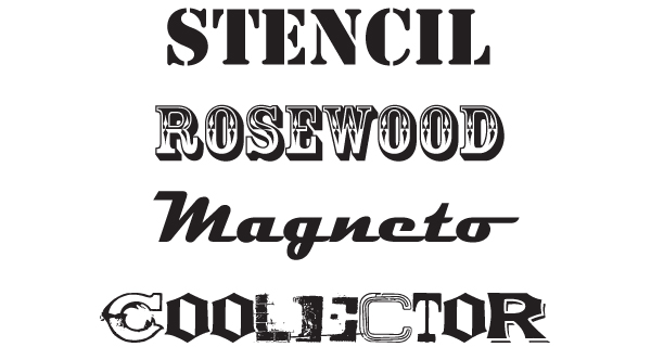
Now we’ve come to the quirkiest category of all, display and decorative typefaces. These typefaces are meant to pack a punch and are best used sparingly. There’s a display/decorative typeface for any mood or tone you desire to achieve. This category is highly personal, but here a few typefaces I find myself using on a regular basis: Stencil, Rosewood, Magneto, and Coolector.
Explore this category to find typefaces that will work for you and the type of work you design.

Blackletter Typefaces
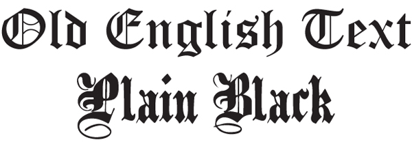
The calligraphic, formal nature of blackletter typefaces brings to mind diplomas, religious texts, knights, and the Hogwarts School of Witchcraft and Wizardry.
Old English Text and Plain Black are respectable choices when a ceremonial or medieval feel is desired.

Conclusion
While these suggestions are a good start, I strongly encourage you to build a typeface library that suits you and the type of work you create. It truly is a personal thing. Your typeface library will evolve as time passes and trends come and go, as it should. Stay on top of it and keep it fresh!*
As sharing is caring, what font do you think all graphic designers should have? What is that one typeface you could not live without?
