 Every month we roundup the best portfolios launched by agencies, freelance designers, and other creative professionals, into one easy-to-digest collection.
And now we come to September. The kids are off to school (the poor dears), the teachers are off to school (the poor dears), and you’re free to spend some time thinking about the most important holiday of the year. You’ve got to get ready for it emotionally, spiritually, and financially.
That’s right, I’m talking about Halloween.
But before you get the pumpkin spice out of the cupboard, why not have a look at these fancy new portfolios? Enjoy.
Note: I’m judging these sites by how good they look to me. If they’re creative and original, or classic but really well-done, it’s all good to me. Sometimes, UX and accessibility suffer. For example, many of these sites depend on JavaScript to display their content at all; this is a Bad Idea , kids. If you find an idea you like and want to adapt to your own site, remember to implement it responsibly.
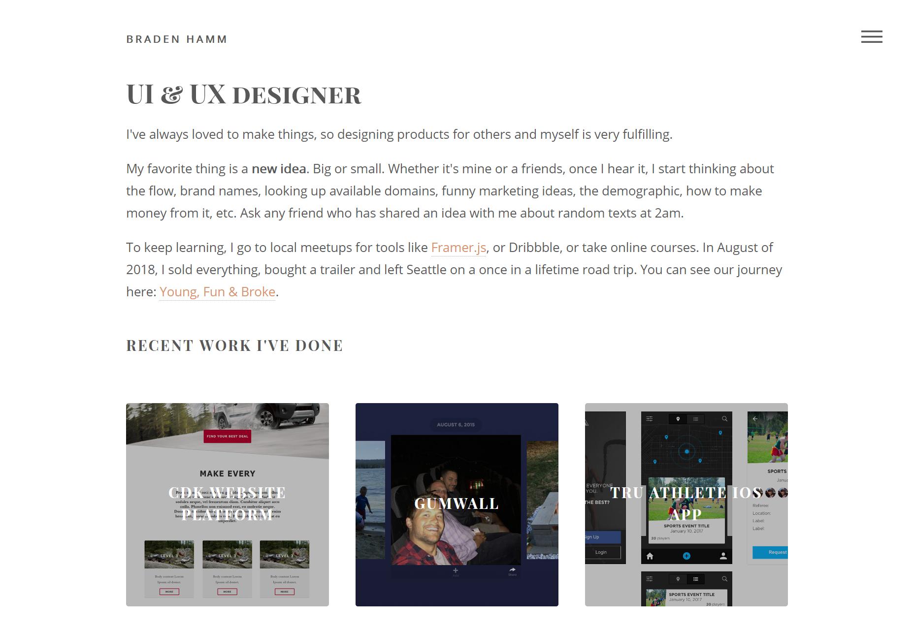
Braden Hamm
Braden Hamm’s portfolio is a wonderful reminder that typography is everything, layout hardly matters, and what are we even doing with our lives? Well, I’m mostly kidding, but the type design in this particular portfolio is generally fantastic. I’d also like to mention the general use of white space, it’s great.
Platform: Static Site
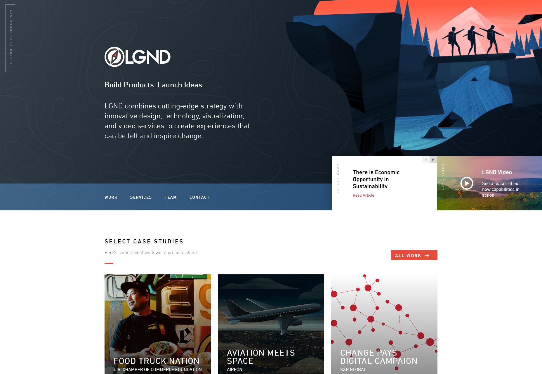
LGND
LGND uses simple, yet stylish type, calm colors, and excellent contrast to make a corporate-friendly design that isn’t boring at all. It even feels a little “futuristic” without going full sci-fi, and that’s impressive on its own. I don’t know whether it’s because corporate design is legitimately better, or just that I’ve turned 30, but this sort of design is growing on me.
Platform: WordPress
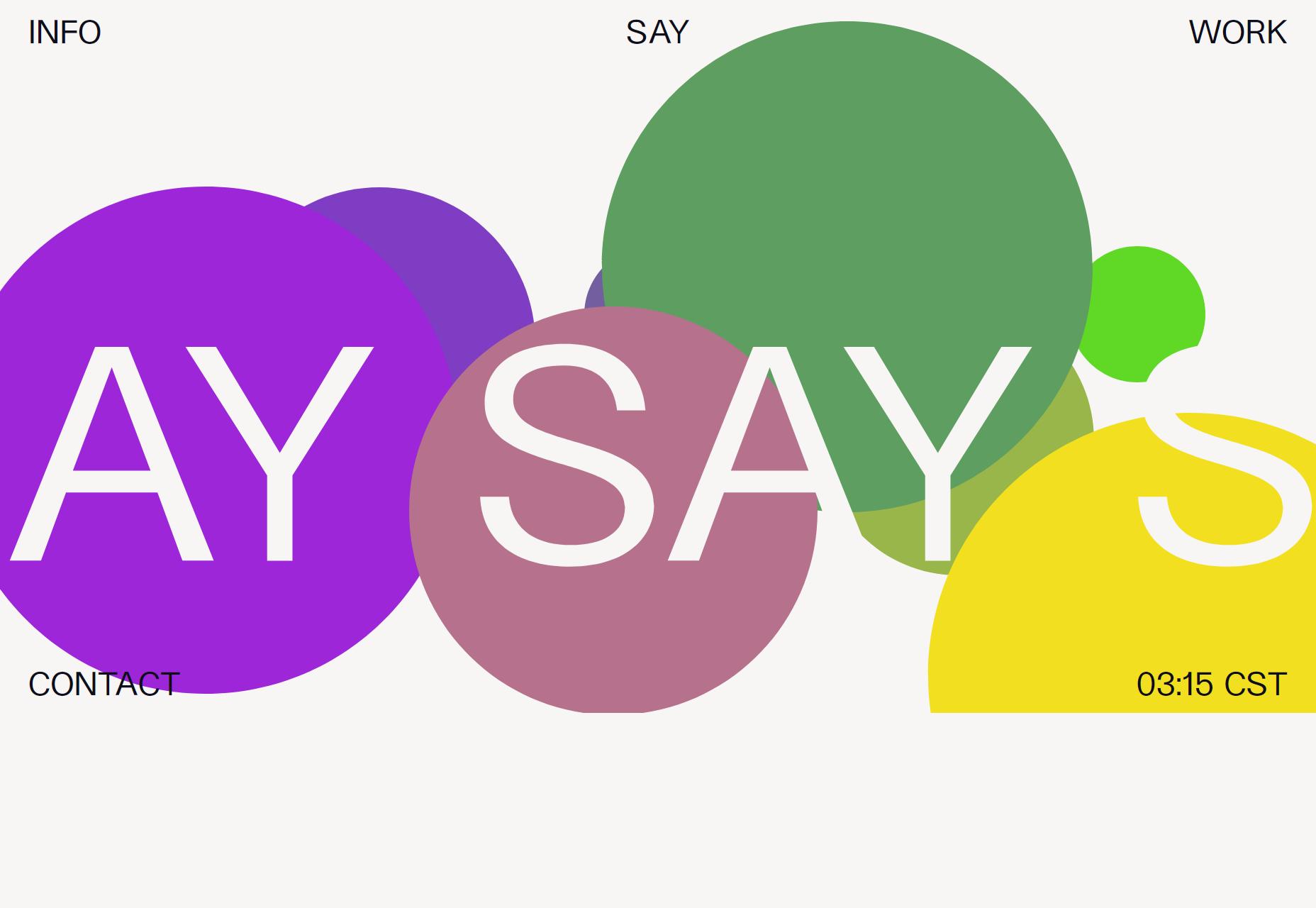
Say
Say’s agency site keeps it simple, going for that sort of artsy, sans-serif minimalism, and I just like it. I like the minimalism, the understated way they use color, and I even like the way you can sort of “paint” on the home page.
I don’t like the custom cursors nearly as much (especially when it’s hard to tell which part of your cursor does the actual clicking), but otherwise it’s a pleasant site to browse.
Platform: Craft CMS
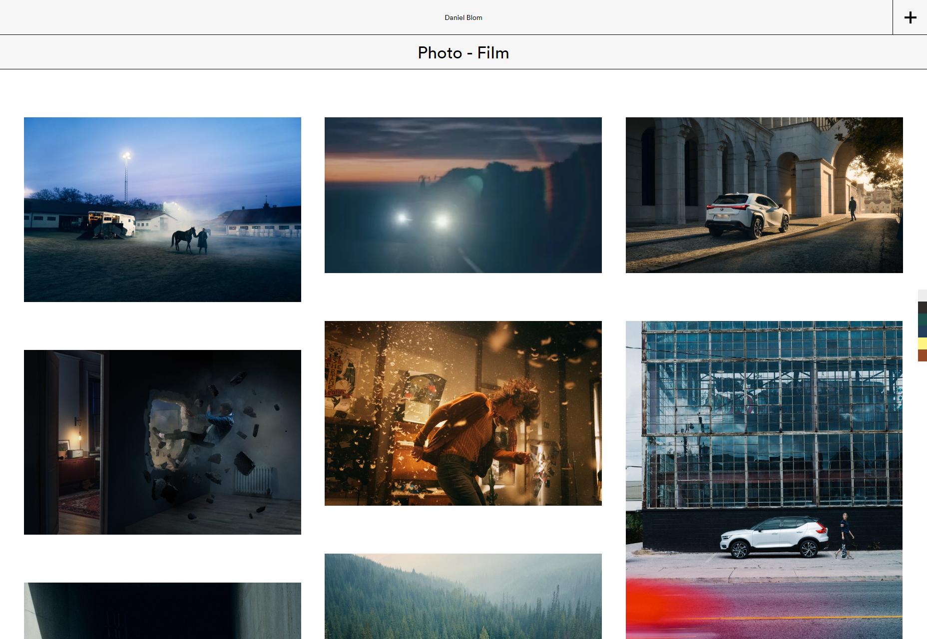
Daniel Blom
Daniel Blom’s portfolio has everything a photography / filmography site needs! Pictures flying all around (only when you first load the site), a masonry layout, and more superminimalism (a word I just made up)!
No but really, after a few concessions to the Flash designer in all of us, it’s a simple and straightforward experience for the most part. I do like that you can change the backgound color of the site while you browse, though.
Platform: WordPress
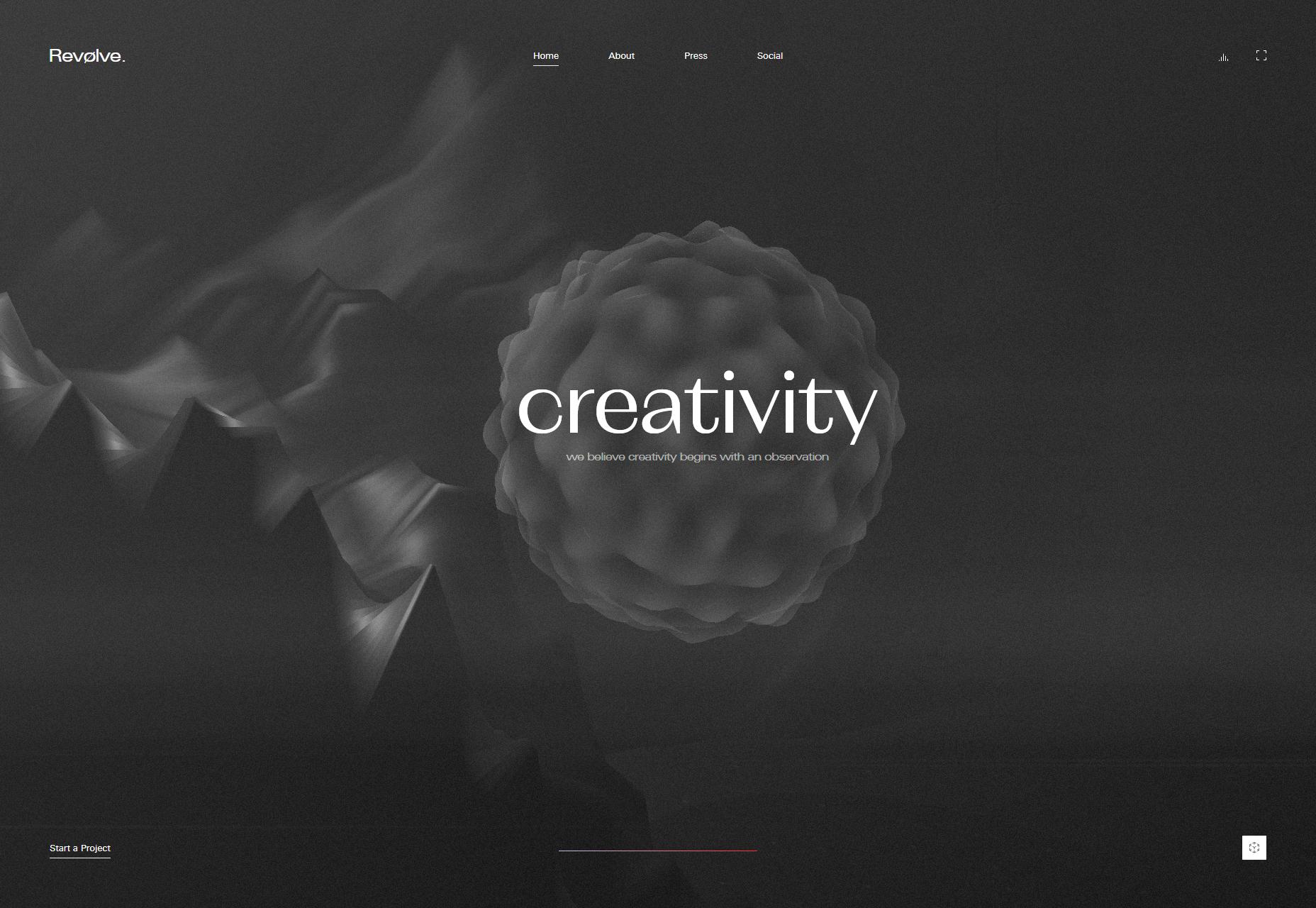
Revolve Studio
Revolve Studio’s site stands out because it was written in ASP.NET. You hardly expect to see that outside of a corporate site.
It’s also a highly presentation-like site, with even a lot of the content being laid out as it might be in a PowerPoint. It also… doesn’t show any work. The site itself more or less is the portfolio piece, with loads of animation, careful attention to type, and even an example of what they can do with augmented reality design. There’s even audio, but only if you turn it on.
And yet, it doesn’t feel crowded. That’s an achievement.
Platform: Custom CMS (I think)
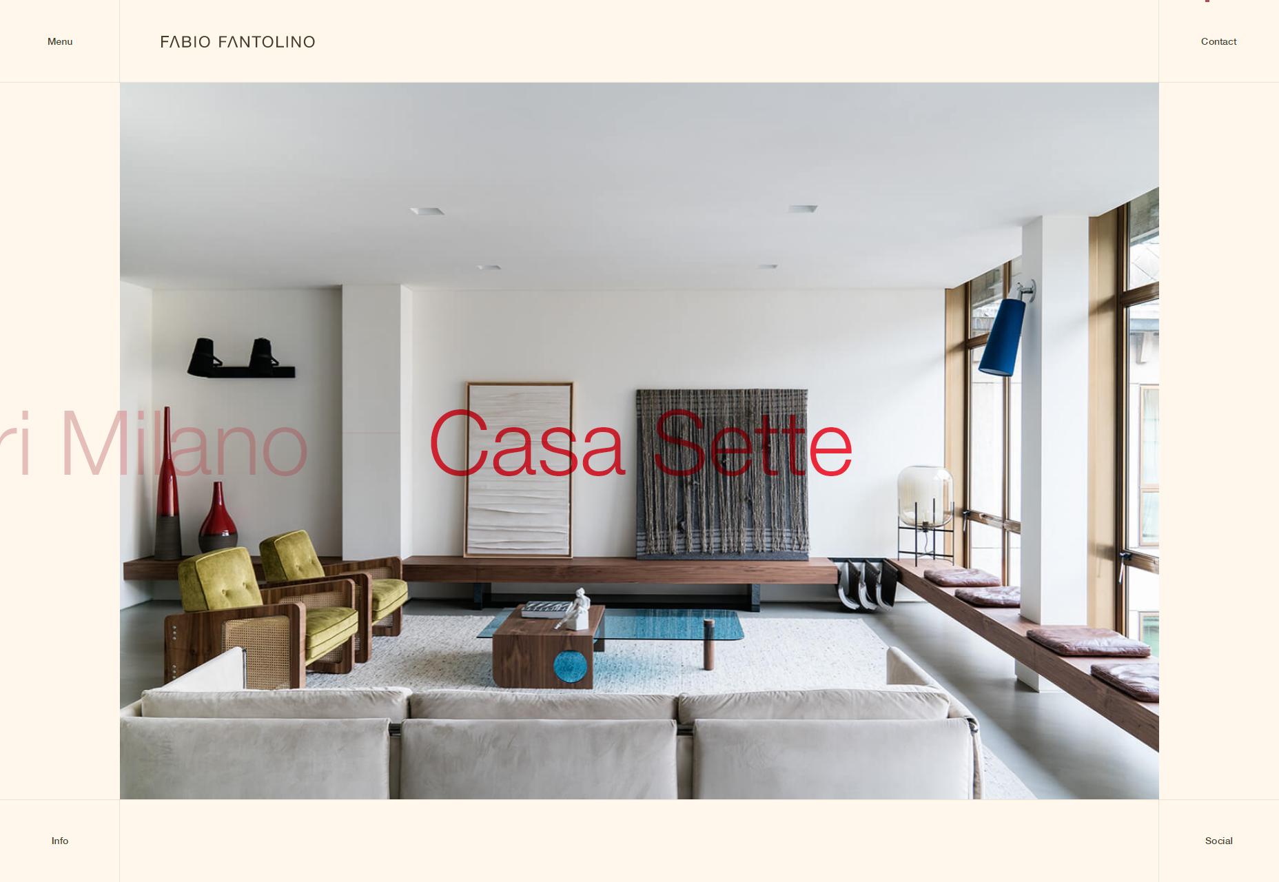
Fabio Fantolino
Fabio Fantolino’s portfolio might literally be what happens when a grid-obsessed animator gets too into PowerPoint. But really, it’s a gorgeous site in its own way, smoothly animated, and I love that color scheme, simple as it is.
Platform: Static Site
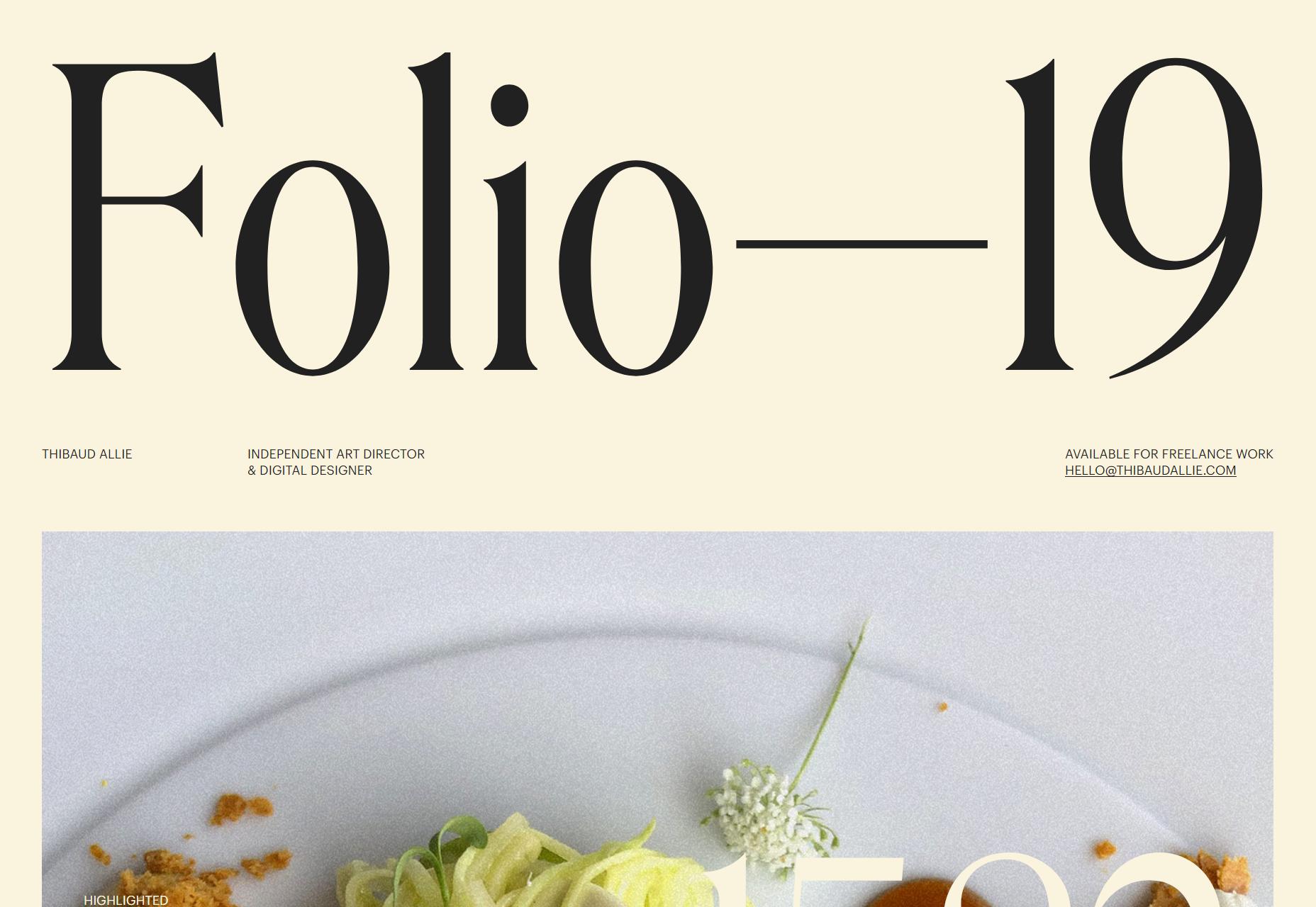
Thibaud Allie
Thibaud Allies’ portfolio is one part print design, and 99 parts definitely designed by an art director. Everything from the giant text to the placement of the images is artsy as heck, but still fairly usable.
Platform: Static Site
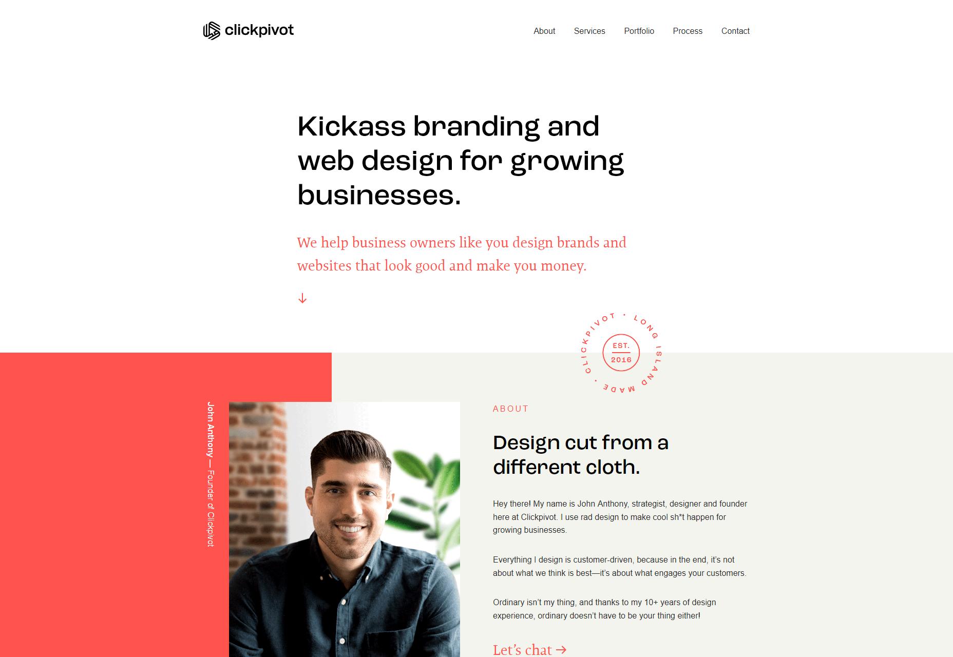
Clickpivot
Clickpivot a one-page website with what is basically a buzzword for a name, and that works, I think. I mean, look at that layout, that type. This is the one-page website that every corporate website aspires to be.
All hyperbole aside, it truly is a pretty site.
Platform: Static Site
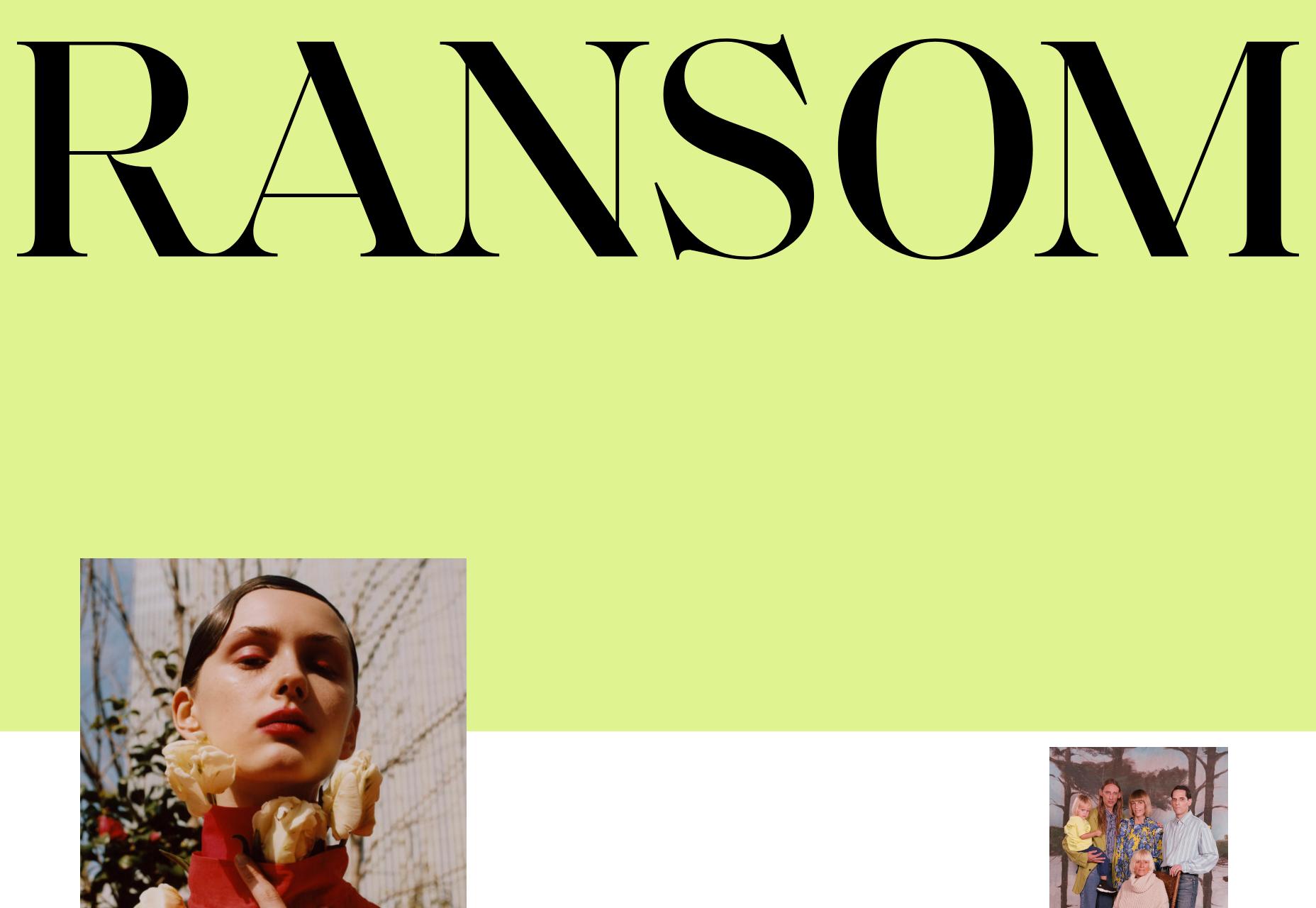
Ransom
Ransom is artsy, asymmetrical, and almost post-minimalist in its aesthetic. It’s an approach we’ve seen before, but it wouldn’t be on this list unless it was laid out with love, and you can see the attention to detail in this design.
Platform: WordPress
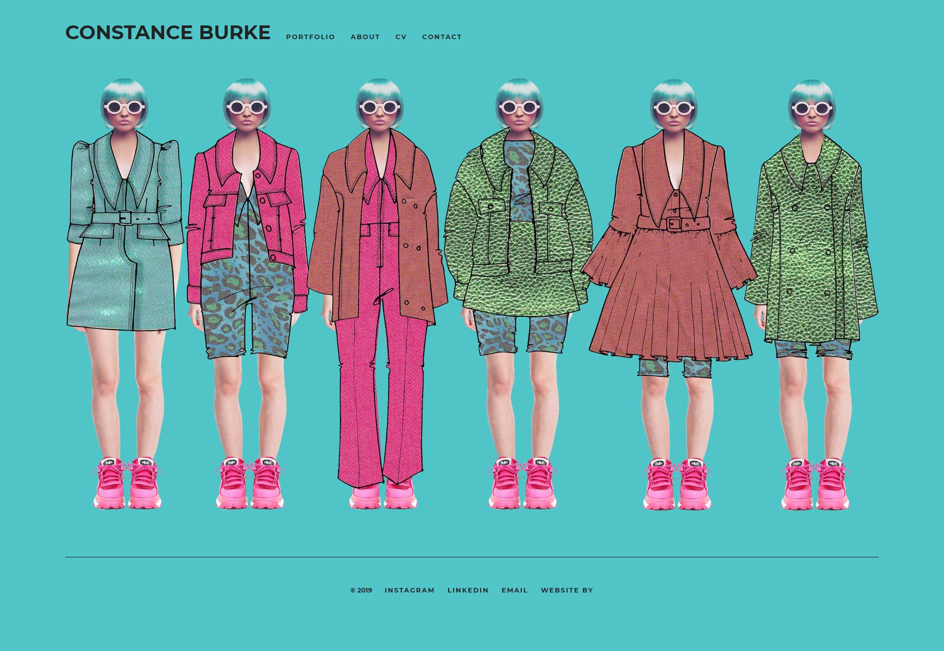
Constance Burke
Constance Burke is a fashion designer, and her illustrations and sketches make up a large part of her site’s overall look and feel. Besides that, there’s a bit of a paper-dress-up-doll aesthetic going on, which both fits the industry she works in, and provides a unique feel to the site. Dress all of that up (pun intended) in a site layout and aesthetic that is well-designed, but intentionally understated, and you get a snazzy portfolio.
Platform: Static Site
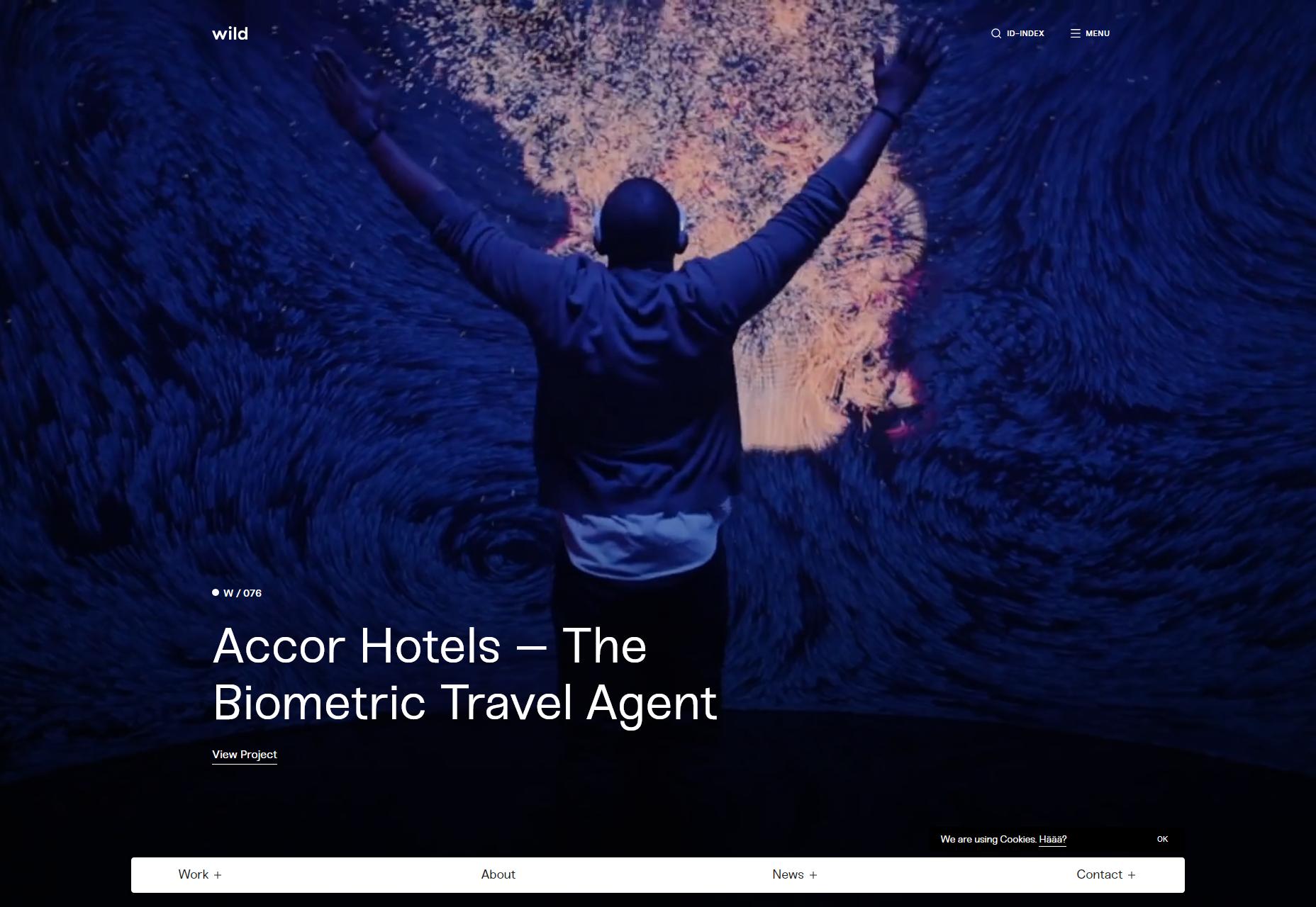
Wild
Wild makes use of grid-focused design, some rather slick animation, and a touch of background video here and there to spice things up. The overall result is sleek, professional, and a pleasure to browse.
Platform: Custom CMS
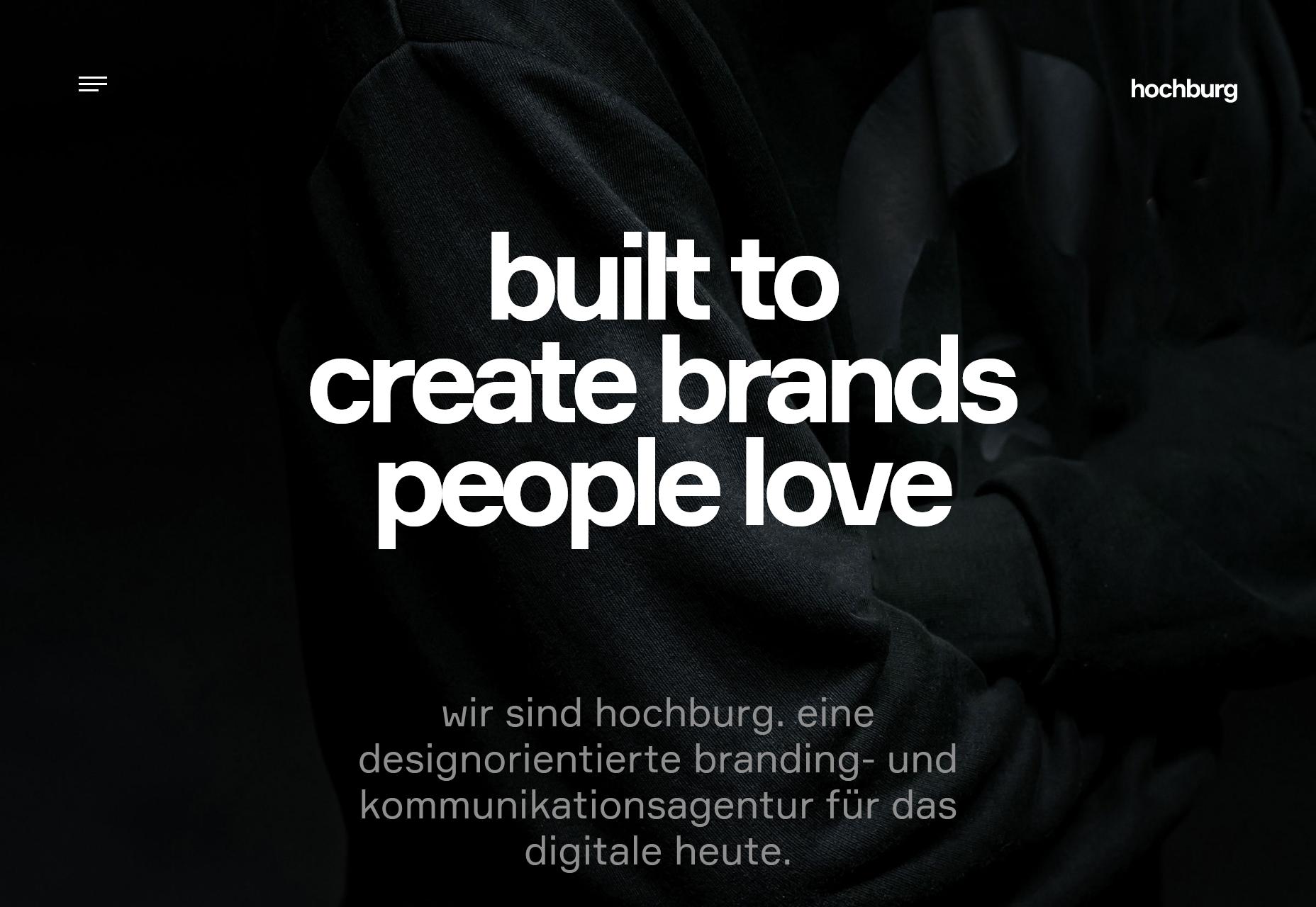
Hochburg
Hochburg’s portfolio mostly sticks to a dark, type-focused aesthetic for most of its normal pages, and switches off to a bright and image-heavy design for the actual portfolio pieces. Light or dark, though, it looks good. Also, they have their own merch shop, which is kind of a power move for any design studio.
Platform: Contao CMS
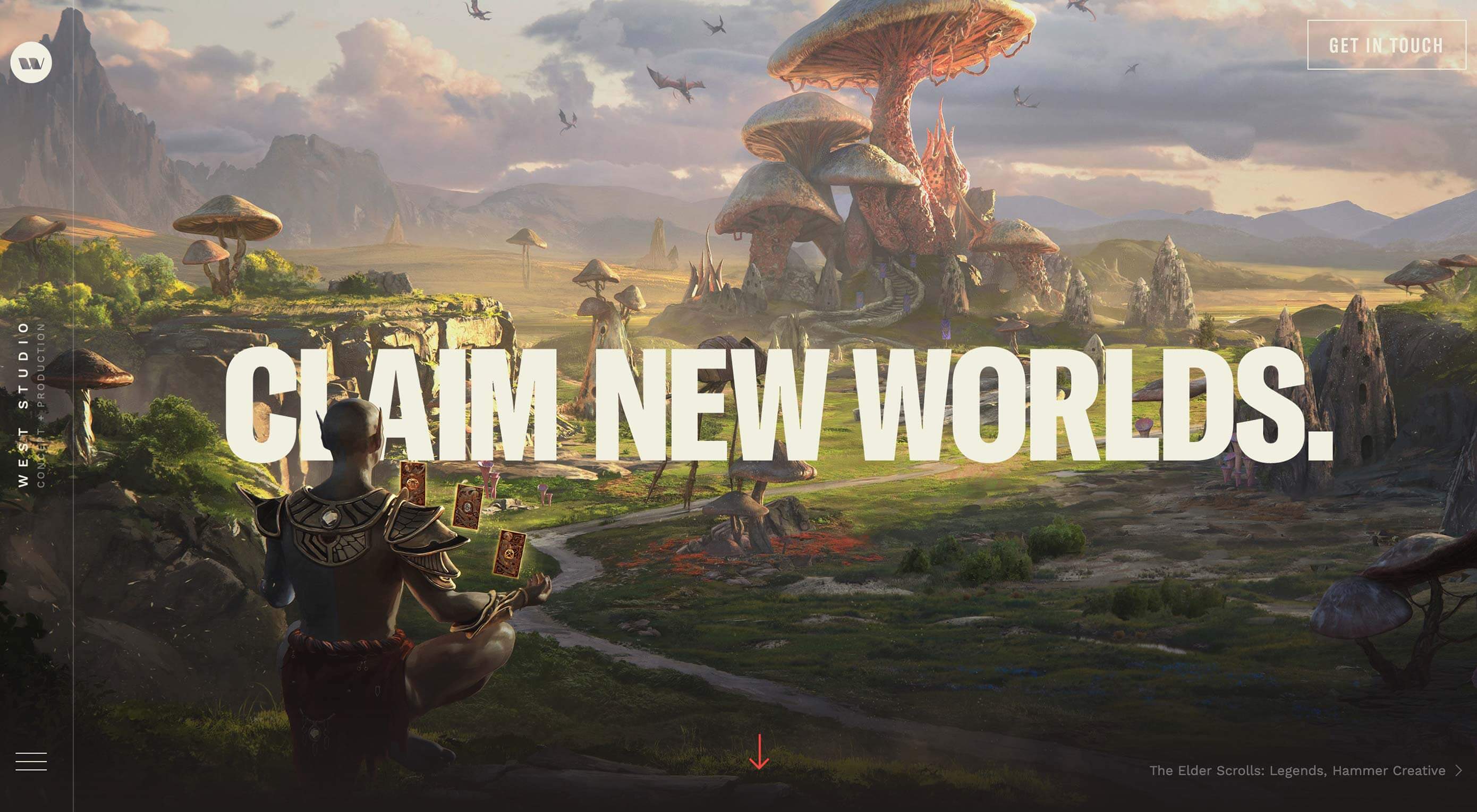
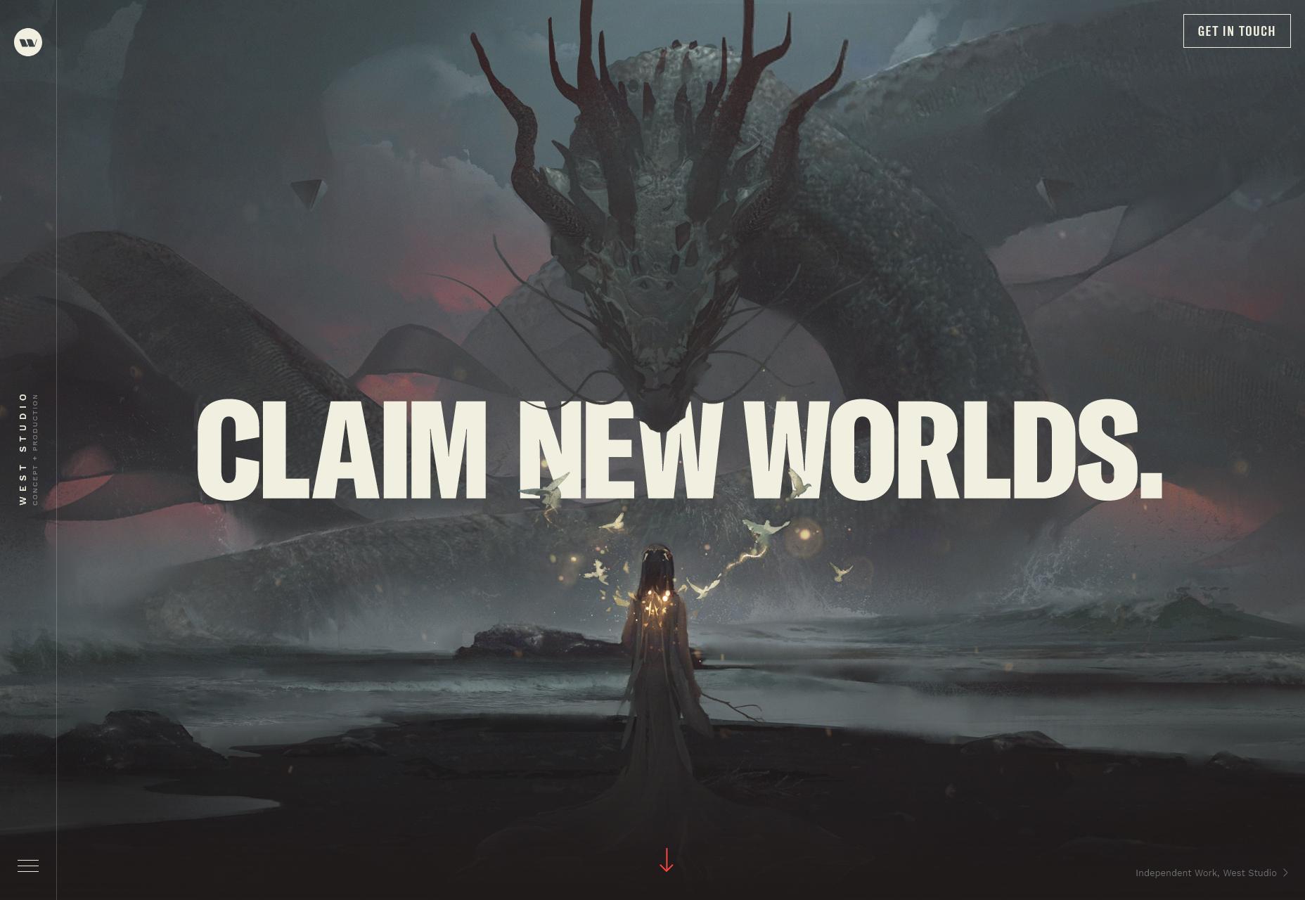
West Studio
West Studio’s portfolio site is all about the imagery, and can you blame them? Their concept art isn’t just their product, it’s astoundingly beautiful. If their work wasn’t great, no amount of smooth, dark layouts and bold typefaces would make much difference… though they have that too.
The way they integrated their art into the design takes the site to a whole new level, though.
Platform: Custom CMS
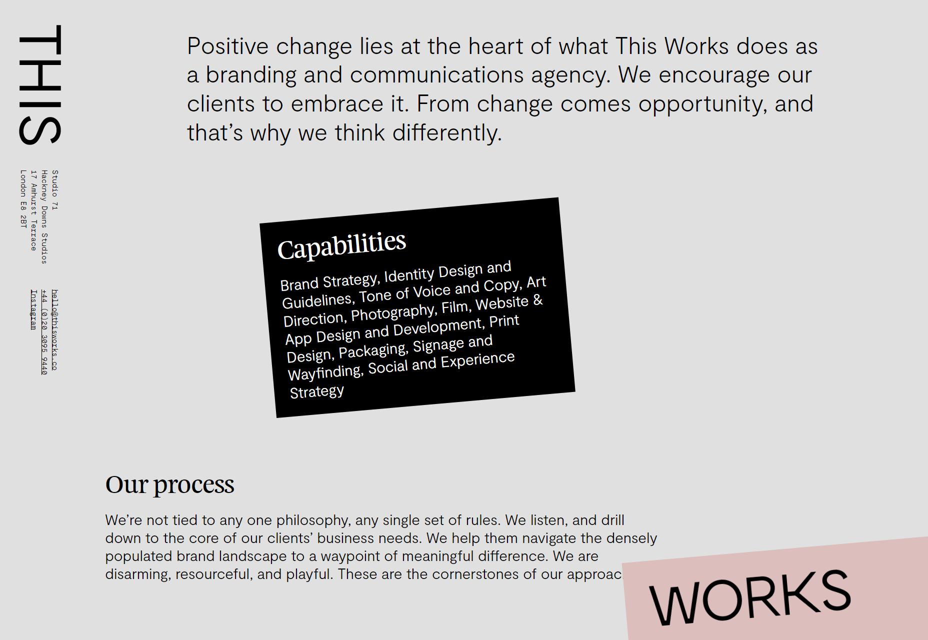
This Works
This Works uses skewed elements and splashes of high contrast to spruce up a design that would otherwise be borderline brutalist. And hey, anyone who can make monospaced body text work is fine by me.
Platform: Static Site
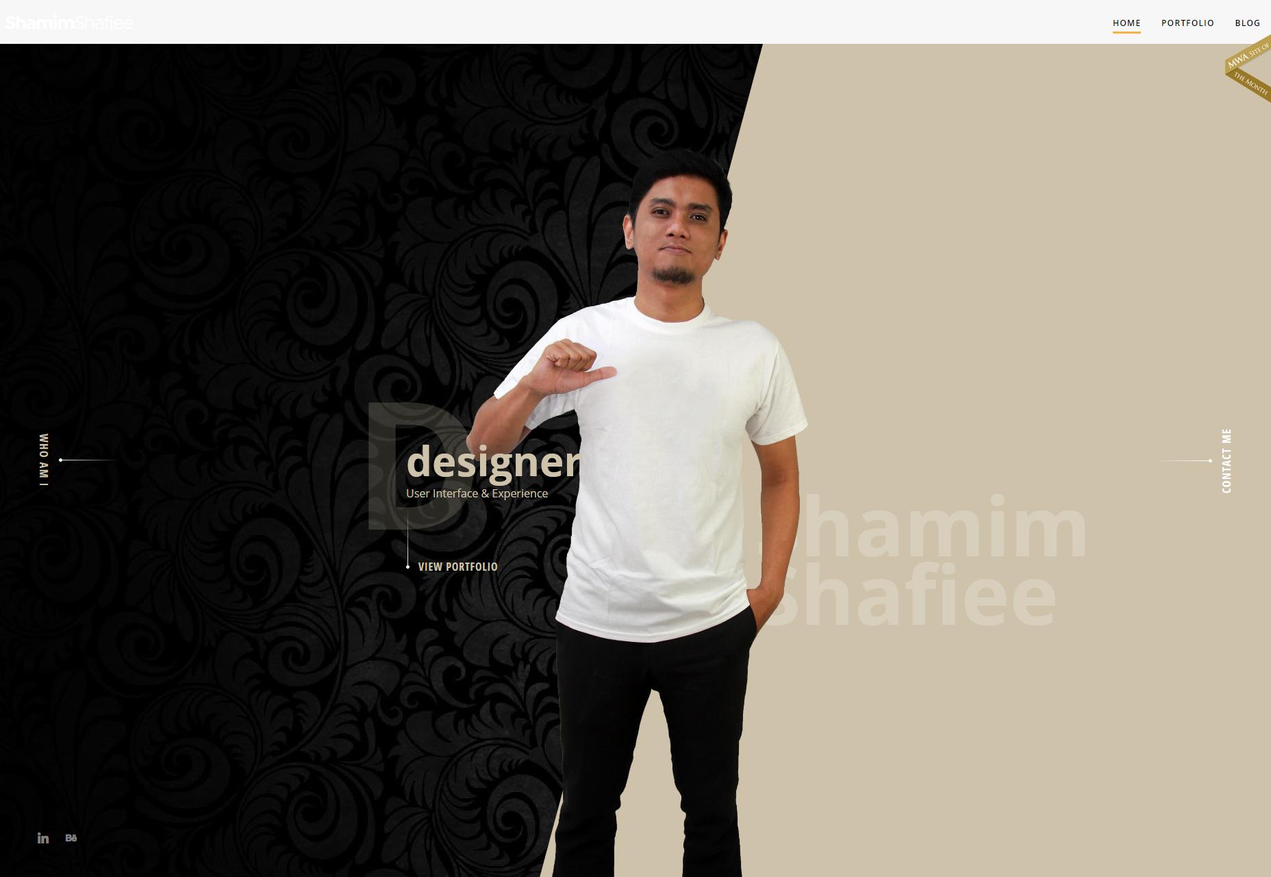
Shamim Shafiee
I love almost everything about Shamim Shafiee’s portfolio: the colors, the layout, the type, it’s all good. But what truly makes this whole thing stand out, is that cut-out picture of the man himself, standing proud and tall on the home page (and the “Who Am I?” screen, incidentally).
I mean, he just looks so determined, so confident. He’s the designer for you, and he’s just waiting for you to figure that out, I’ve been a designer for over a decade, and I wouldn’t dare put myself on my site like that.
This sort of thing might normally looks cheesy and sooo ‘90s, it’s working here. It’s all about the attitude.
Platform: WordPress
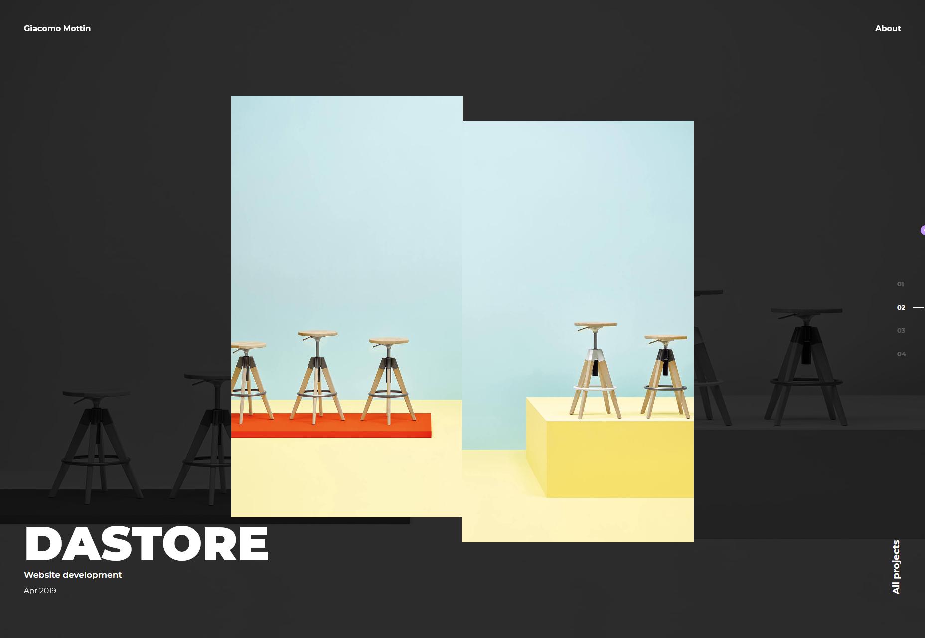
Giacomo Mottin
Giacomo Mottin’s portfolio kind of mixes some presentation-style design at the outset, with some classic fancy minimalism. It’s dark, it’s sleek, and it looks as fashionable as you’d expect from, well… Italy.
Platform: Static Site
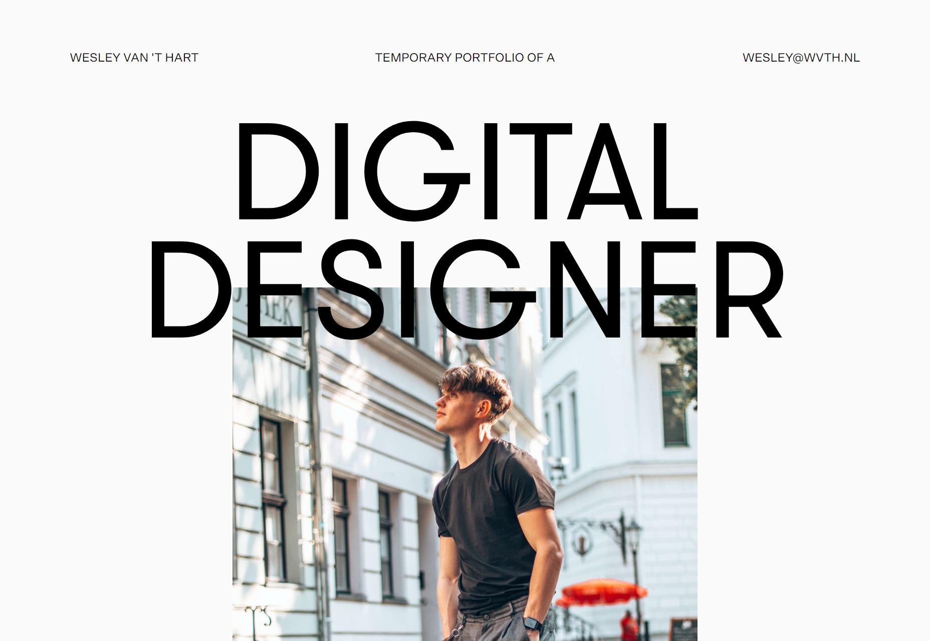
Wesley Van ‘T Hart
And somehow this portfolio looks even more minimalist than the other sites that I’ve already called “superminimalist”. Oh well. In any case, the type is gorgeous, and the almost excessive use of empty space gives the whole design a feeling of elegance.
Platform: Static Site
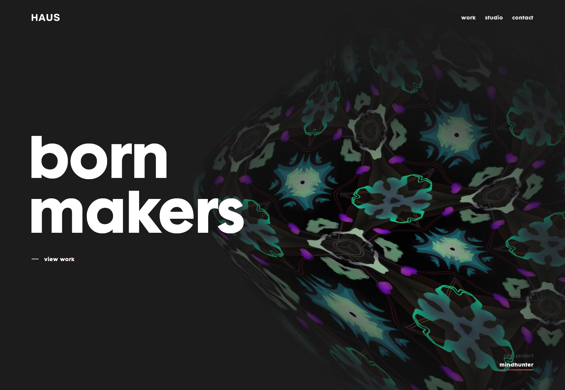
Haus
Haus is all about them graphics. It’s not often I go on about how much I love a site’s graphics—and the rest of the site is pretty solid, I’m going to shout-out their typography in particular—but Haus is doing things I’ve never seen before.
Take the home page, to start with: it looks like they have a constantly shifting amorphous 3D object floating around, and it’s textured with a constantly-shifting set of kaleidoscope patterns. It’s downright hypnotic, which may not be great for usability, but I can’t take my eyes off it.
Platform: Custom CMS
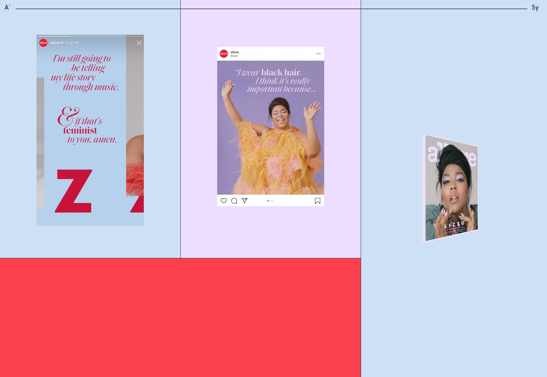
Aimee Sy
Aimee Sy’s portfolio embraces pastels, a print-inspired layout, and… iframes with zoomed-out websites in them? I can’t recall if it’s the first time I’ve ever seen that approach, but it’s certainly striking either way. The sites are semi-usable and browseable (another word I just made up according to my spellcheck).
Overall, while this portfolio is mostly built from familiar elements, the final product feels quite distinct.
Platform: Cargo, Backdrop
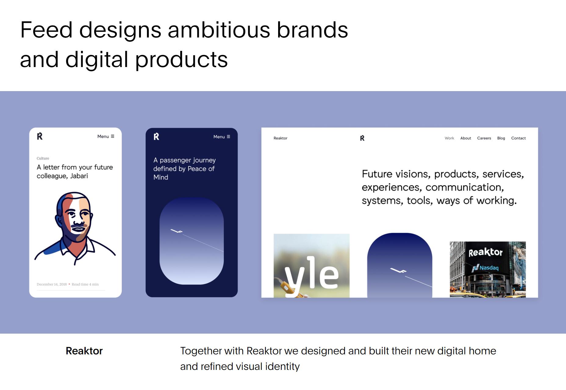
Feed
Feed delivers another simple, minimalist site that does what it says on the tin. As their name suggests, they do seem to prefer a style of layout that looks a bit like a “feed”, and they make liberal use of lazy-loading to create an effect that looks like infinite scrolling (but actually isn’t). It’s a great way to sort of lead people further in to the design and available content.
Platform: Craft CMS
p img {display:inline-block; margin-right:10px;}
.alignleft {float:left;}
p.showcase {clear:both;}
body#browserfriendly p, body#podcast p, div#emailbody p{margin:0;}
![]()