
The typeface you choose for your next layout or logo design could either make it or break it. No pressure! With so many choices, where does one begin?! There is no right or wrong answer to the question, “Which typeface should I use?” However, there are a few guidelines that will help you make an informed decision.
1. Create a Mood
Type triggers emotions. I’m not implying that a typeface has the power to bring you to tears or make you laugh until your belly hurts. That’s just silly. I’m talking about matching the mood of the typeface to the project. Is it fun? Casual? Serious? Fresh? Old-fashioned? Choose a typeface that captures that feeling.
Let’s say you’re working on a logo for a financial company. Chances are you will want to select a typeface that creates a sense of security and protection. Right? In other words, this is no time to break out “Hobo”! If you don’t believe me, see the example below. A formal, traditional typeface such as “Garamond” is a better choice.
2. Choose an Appropriate Typeface
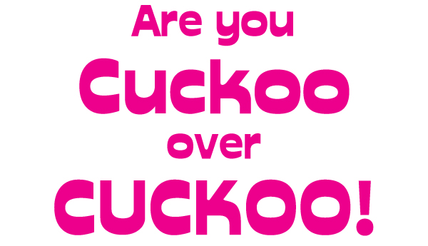
I’m not asking you to ban fun typefaces. Occasionally, something quirky is the perfect fit! In most cases, however, your best bet is to stick with tried and true typefaces. They are versatile because they come in a wide variety of weights and styles and don’t distract the reader.
3. Use Caution When Using Unusual Typefaces
Display and decorative typefaces should be used sparingly. A little “Taco Modern” goes a long way. It works on this menu in the logo and category headings. Now, imagine an entire menu set in “Taco Modern”. Makes you feel like you’ve had one too many Margaritas doesn’t it? Unless you aren’t concerned about readability, these typefaces aren’t a suitable choice for large blocks of text. They are designed for use in headlines or short lines of text and are used for emphasis. Again, a little goes a long way when it comes to display type and decorative typefaces. The same is true for Margaritas.

4. Combine Typefaces Effectively.
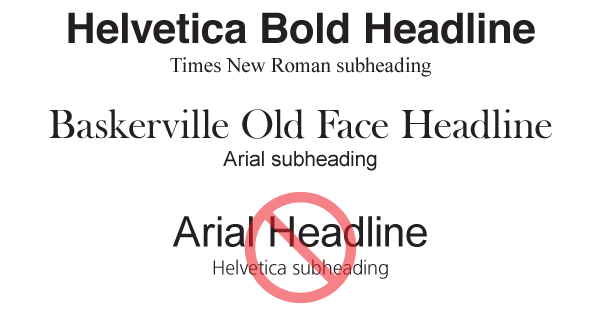
Combining two or more typefaces can be tricky. The general rule of thumb is to use a neutral serif and san serif combination. It’s safe, easy and it works. Set the headline in “Helvetica” and the body copy in “Times New Roman” and you’re good to go!
If that’s too boring for you, try combining an old typeface with a modern typeface. How about a script with a san serif? If you do this, it’s important to pay attention to the contrast between the typefaces you choose. Be sure the contrast between them is great enough to separate them. If the typefaces are too similar, they will look awkward and out of place. Combining “Helvetica” and “Arial”, for example, will look more like a careless mistake than a conscious design choice.
Here are a few more ideas. Use two typefaces with significantly different weights, combine a display typeface with a san serif, or use different weights/styles within the same typeface (“Arial Narrow” with “Arial Black”, for example). The possibilities are endless!
Check out this great post from Webdesigntuts+ on A Beginner’s Guide to Pairing Fonts for more help on this.
5. Limit the Number of Typefaces You Use in a Project
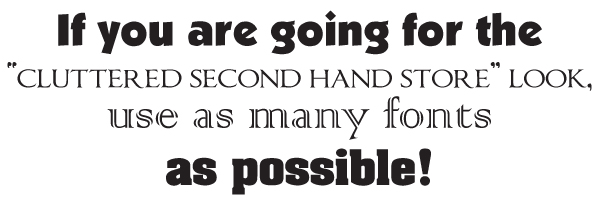
Don’t be obnoxious! More is not necessarily better when it comes to typefaces. Typically, I use only use one or two typefaces in my designs, sometimes three, though that is rare. Any more than three will make your design look like a cluttered second hand store. Then again, if you have a project that requires a jumbled, chaotic look, perhaps using multiple typefaces is the perfect solution.
6. Choose a Typeface That Has the Characters You Need
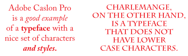
Some typefaces are uppercase only. Others don’t include numbers, multiple weights or italics. If you are setting type for a magazine article, chances are you will need a typeface that includes all of these things. There are instances where these “extras” are not needed, like in a headline, for example.
7. Remember It Has to Be Readable!
Some typefaces are easier to read in certain situations than others. For instance, a billboard or other outdoor signage set in script will be nearly impossible, not to mention irritating to read while driving. In this instance, a bold, clean typeface would greatly enhance readability. If you are designing a book, readability is a must! Fortunately, there are typefaces designed specifically for books. The most popular of these are “Garamond”, “Minion”, “Caslon”, “Janson”, and “Bembo”. Other typefaces, such as “Times New Roman”, were designed for newspapers. That doesn’t mean you can’t use these typefaces for other projects, of course.

8. Stick With Safe Typefaces for Web Use
Are you working on a web project? Be sure that the fonts you use on your computer are available for use on the web too. Unless you’re using web fonts (font files hosted on a web server, implemented using the CSS @font-face rule) a user’s browser may display a different font from the one you intend.
If you’re not using web fonts, you’ll need to rely on system fonts (ie: fonts which are available by default on a computer). Common system fonts include:
- Arial
- Courier
- Garamond
- Georgia
- …and more
For a more comprehensive list of system fonts, take a look at Common fonts to all versions of Windows & Mac equivalents.

9. Use Caution When Placing Text Against a Dark Background
Since most typefaces were designed to be printed with white ink on a light background, you need to be careful when choosing a typeface reversed out of a dark background. Thin characters or those with thin serifs will get lost against a dark background. If the design is to be printed on newsprint or other absorbent stock, chances are the dark area will bleed into the lighter text and decrease readability further. Choose a typeface that is bolder and larger to ensure clarity, the less decorative the better.

10. Throw Out ALL the Rules!
That’s right. Throw them out and follow your gut! Why? There are exceptions to every guideline I mentioned. That’s just one of the things that make graphic design interesting. Typography is something you learn over time and requires endless trial and error. Eventually, it becomes an easy, natural process. In the meantime, have fun!