
A common trait among most successful web designers – they’re very passionate about their work. If they don’t like something, they won’t spend another second on that train of thought. To keep their creative juices alive and afresh, they seek inspiration from various things, random things – a calendar picture, a random collage of colours, the froth on a cup of coffee – anything that sparks the creative fire. To stay ahead of the game the best designers are up-to-date to the latest web design trends. This not only helps in securing higher conversions, but also paves the way to creating the ‘next big thing’.
Apple has always been the connoisseur in shaping the design trends for the world to embrace. The iOS 7 makeover is one of the cornerstones of flat, minimalistic web design. Soon after its release, companies began to adopt the ‘flat design’ trend. Dropbox got a fresh new look, and so did The New York Times. In this article we’re going to take a look into the major design trends of 2013, and recommend some for 2014. I’d like to point out one thing before we get started.
1. Responsive and mobile ready themes
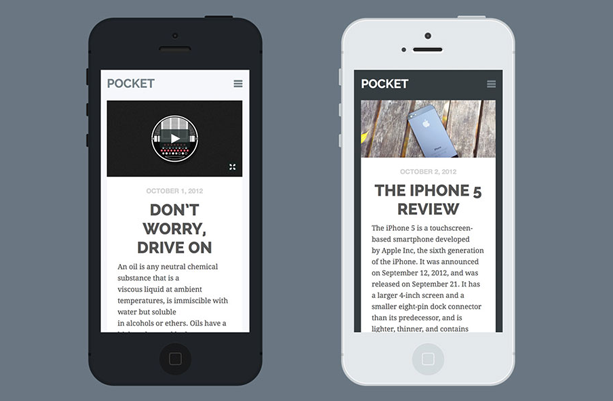
Almost all themes released in the marketplace since early 2013 have been mobile responsive. It’s almost a given factor not to mention an absolute necessity. Just like no one uses the marquee tag, when you’re buying a new theme, you expect it to be mobile, tablet and desktop responsive.
Since 2012, the world has seen a staggering growth in mobile and tablet usage – and this growth is expected to continue and rise in the years to come, unless of course holographic technology is introduced to the masses. After all, who’d want to turn on their desktop/laptop to surf the web when they’re not home – given the fact that their phone is perfectly capable of rendering HTML5 websites?
One of the risks of not having a responsive site is poor end-user experience, and in worse cases, decreasing conversions. It might just happen that a customer was about to buy your product – only if he could find the “Buy Now” button! If your site isn’t mobile responsive, check out this article I wrote on how to make your WordPress site mobile responsive.
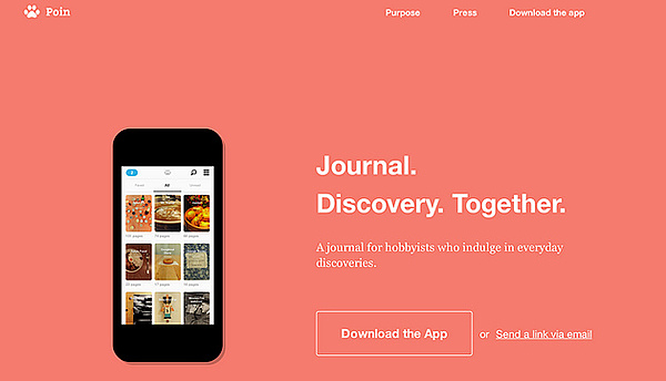
2. Single-page themes
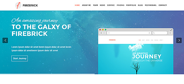
Originally intended for sales pages, one-page WordPress themes have gained considerable popularity over traditional themes. They’re mainly based on AJAX and/or jQuery to enable those smooth scrolling effects. One-page themes contain all the data in a single HTML page with the navigation menu present on the top. They improve the end-user experience by minimizing the page load and navigation time and are used mainly in building portfolio websites. Firebrick, Akin and Fencer are a few examples.
3. Grid based or Pinterest styles themes
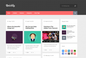
The Grid based layout, sometimes referred to as the ‘masonry style’ or ‘tiled layout’ presents the user with number of boxes – sometimes called ‘cards’ – with each card containing one post. In most cases, this layout is achieved using the jQuery Masonry script. It essentially rearranges the ‘cards’ or posts depending on the browser’s width.
One of the advantages of the grid based a layout is that it enables the viewer to have a larger number of articles visible on their screen, as compared to the traditional scroll-down layout. When you’re viewing a website using the grid based layout, the landscape view will contain a higher number of posts compared to the portrait view.
It’s hard to pinpoint the origin of such a trend, but one can safely say that Pinterest had a lot to do with it. SitePoint and UXMag are some of the popular sites that use the grid based layout apart from news websites. Check out this article featuring some of the best Pinterest style WordPress themes.
4. Full Screen Themes
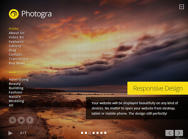
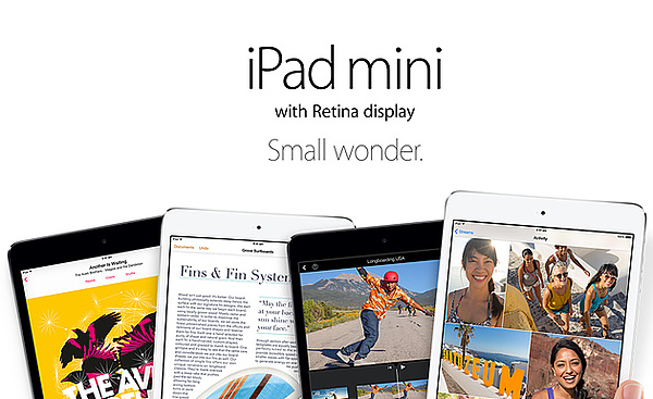
One of the most important conversion factors is the appropriate use of images – rather images of people involved in various activities. An image of a happy woman on the sales page of a vacuum cleaner could increase the conversion factor by 20%. This doesn’t mean you have to place such an image on the sales page of a mountain bike, but a relevant image such as the one below would certainly increase the conversion rate.

Full screen themes are a way to improve this image factor. It immerses the user into the webpage – attracts his/her undivided attention (maybe for a few seconds) and makes the pitch. Video backgrounds are also a great idea – provided that it loads in time to grab the viewer’s attention. Any.DO and Google Now use a video background. Apart from sales pages, full screen WordPress themes are perfect for photography websites and photoblogs. WPLift has its own collection of some awesome full screen WordPress themes.
5. Flat design aka metro styled themes
Even since Microsoft’s logo makeover people have taken a keen interest to flat webdesign sometimes called the metro layout. Originally employed as the Windows 8 Start Menu, the metro styled flat designed WordPress themes have gained acceptance in the community. Check out some of the popular free and premium flat design WordPress themes.
6. Retina-display ready WordPress themes
Ever since high resolution displays became popular (thank you Apple) the need for retina ready themes has seen a steady rise. Let me clarify that the term ‘retina display’ is a sales term coined by Apple. It stands for a high resolution display on a not so big screen which makes the pixel density quite high. This means, any laptop with 1080p or 2560×1444 resolution and a sub 14” screen has a high pixel density – and hence falls under the category of ‘retina displays’. Phones and tables with a PPI (pixels per inch) of higher than 300 fall under retina displays. We have a guide explaining how to convert your theme into a retina ready site, you might want to follow that, although it’s not absolutely necessary. Craft, Impreza and Shadow are some examples of retina ready WordPress themes.
7. Use of font icons
In my opinion, the advent of font icons is the next best thing to happen to the design industry after mobile responsive web design. Using font icons dramatically reduces the use of images in a webpage. This means less time building and modifying images and more time coding the design. All social media icons and other everyday icons like an information bulb or a download box can be replaced with font icons. We have a guide explaining how to use font icons in WordPress – it’s quite easy to implement.
The great thing about font icons is that they’re infinitely scalable – since they’re vectored images. This makes them suited for ‘retina displays’ or anything higher than that. Font icons also allow modification – you can repaint, scale, add background colours to font icons – literally anything that CSS3 has to offer. It’s a new and exciting field which allows designers to break the traditional boundaries.
8. Minimalistic and readability based themes
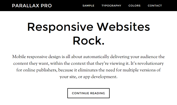
With the rise of minimalistic web design, readability based themes gained a lot of hype. Frankly, this was God answering my prayers. Ever since I pondered on WordPress about a year ago, I always found that the text used in many high profile sites were crumbled. A lot of information was cramped into the viewport, which made reading difficult. With the advent of typography based themes focusing on readability, things took a change. Reading an article was “comfortable”.
With Apple’s iOS 7 redesign, minimalistic WordPress themes are here to say. The Genesis Framework and most of the themes offered by StudioPress are minimal in nature, focussing on readability. Examples include Sixteen-Nine, Parallax Pro, Centric Pro and the default theme that comes with the framework.
Conclusion
It is not easy task to predict whether one from of design will work for the upcoming years. To remain competitive, one has to say up-to-date with the latest web design trends in the industry by following the renowned web design blogs and communities. It is essential to build experience in order to become successful in any field. One of the ways to gain experience is by accepting challenging projects, making yourself learn new things and ultimately, facing failure. After all, it’s survival of the fittest.