 For once, I’m not starting off my article with a joke. When I say “Web 2.0”, I genuinely mean that style of design that we all (temporarily) embraced. Many a corner in Pandora’s new logo is curved, and they have brought back the bright and shiny gradient.
Okay, so it’s a bit muted compared to the shiny gradients of the past, but that’s to be expected. Where once we tried to ride Apple’s chrome style to glory, this new branding effort is tempered (yes… tempered) by the MTV-meets-Bauhaus style of graphics that accompany it.
But we need an example of what I mean. Here’s the Pandora logo all on its lonesome:
![]()
They are not messing around when it comes to their rounded corners.
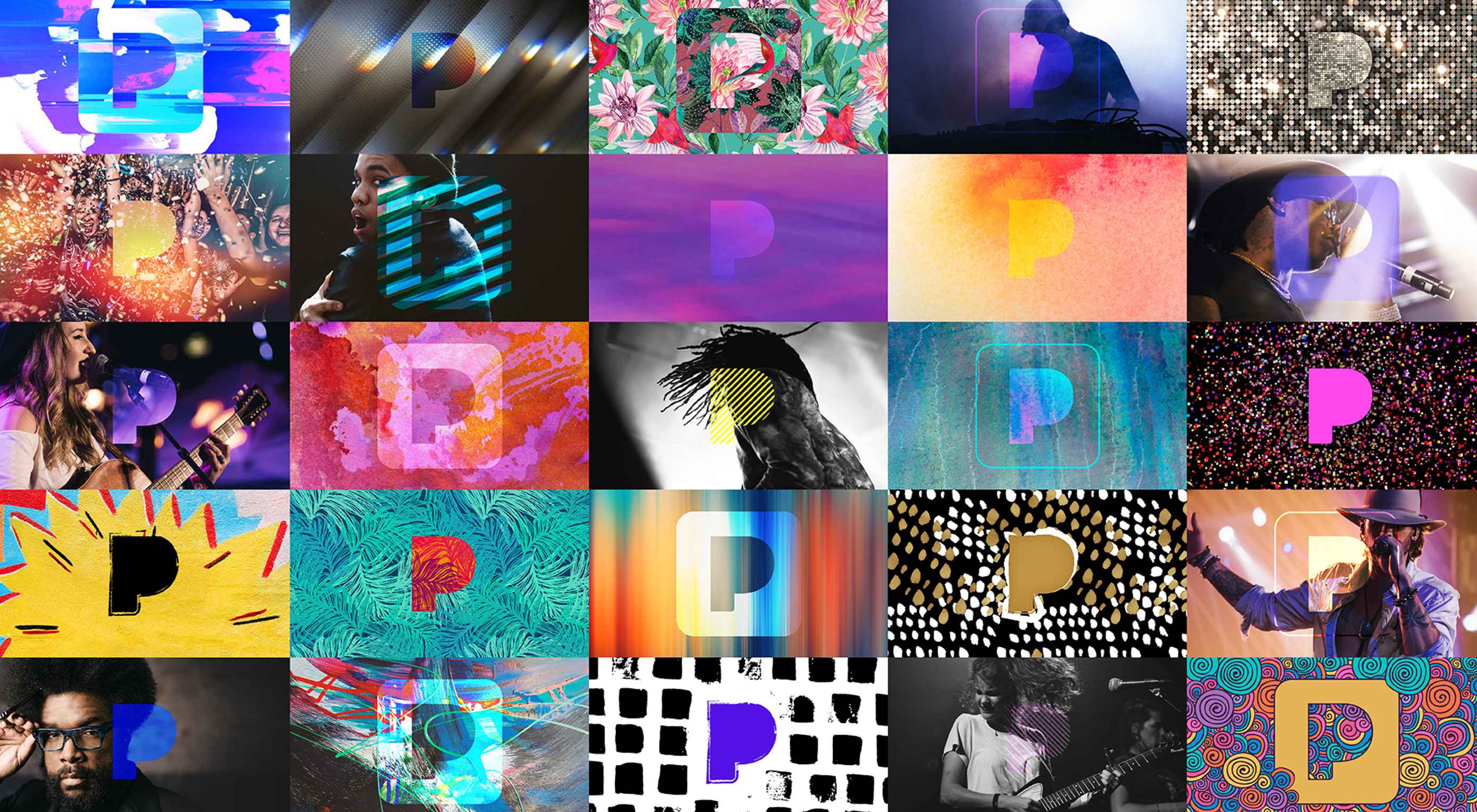
Now here’s what the logo looks like in a more advertising-friendly/artsy context:

Like many big brands nowadays, there seem to be few strict guidelines for how the logo must or must not be used. They want the best of both worlds. They want their brand to be associated with a forward-thinking technology-based service, and art.
I think they’ve largely managed this. By drastically simplifying the letter form in their logomark, they have opened up its potential for use in more artistic contexts, while the regular version works perfectly well as an app icon, a letterhead, or what-have-you.
So congrats, Pandora. It works.
| Woodford Bourne PRO Family of 18 Vintage Grotesque-Style Fonts – only $15! |
|
p img {display:inline-block; margin-right:10px;}
.alignleft {float:left;}
p.showcase {clear:both;}
body#browserfriendly p, body#podcast p, div#emailbody p{margin:0;}
![]()