
Whether you design on paper, in graphics software, or in a web browser, typography is something that you’ll have to consider. No website or poster would be complete without some bits of text on the page. But text alone is not good enough – the symmetrical design and structure of text on a page is what gives readers their initial opinions. And boy those opinions can get real judgemental.
This post delves into the topic of composition related to typography, specifically for websites and web design. I want to share a few points related to balancing your website text in an elegant fashion. There aren’t many hard-and-fast rules because each website is different and requires a distinctive touch. But if you learn how to create readable digital text you’ll be well on your way to designing balanced layouts with ease.
Vertical Distance
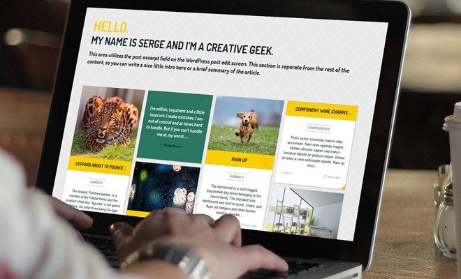
A big part of composing balance requires an understanding of whitespace. In the spectrum of digital text it is crucial to measure the vertical distance between other text. This includes different elements like headers and paragraphs, but also the individual lines in a paragraph.
Typically most websites will use different CSS styles for headers and paragraphs. So while you may not need a whole lot of vertical space the text would still be distinguishable. Also consider the vertical space between 2 different paragraphs. If they’re too close then the paragraphs may look like one large block of text. If they’re too far apart then readers are forced to scroll much further than needed.
On a separate note, the vertical distance between individual lines in a paragraph is called the line height. This can be setup directly using the related CSS property and might even be different for page headers. For paragraph blocks I try to use a fairly wide bottom margin to allow for extra space between text.
Content Hierarchy
Along with the concept of vertical distance is hierarchy in your page content. Paragraphs are often a low-tier element compared to page headings or pull quotes. Without worrying about the content try to design and organize these elements based on hierarchy.
An h1 tag should be more visible than an h2 or h3 heading. This isn’t always the case but for best design practices you want to follow a pyramid structure of HTML text elements. In paragraphs you might create unique effects for highlighted text(yellow background), bolded text, or even specialized hyperlinks.
Consider how you should design any specific element to make it stand out or blend in with the surrounding content.
Defined Page Sections
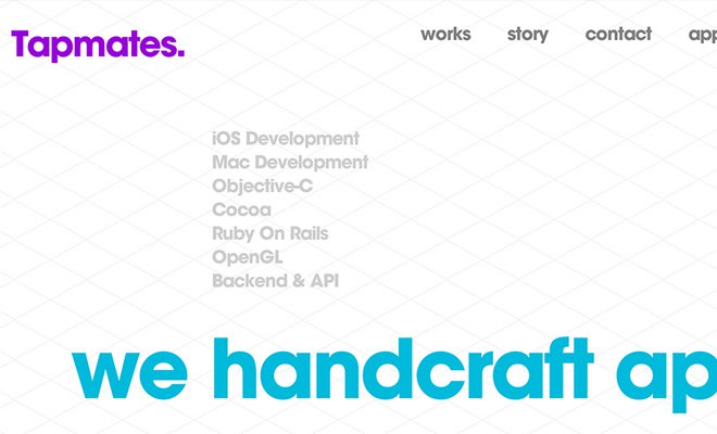
Throughout an entire page layout you should try to incorporate just a small handful of fonts. But over the different page sections you might change a few properties like font size, font weight, capitalization, or kerning. These slight differences give off an illusion that the content has changed or that some words deserve more importance than others.
Although you don’t actually need to use updated text properties to distinguish between a page section break. Using proper whitespace and visual cues it should be easy to distinguish between a header, navigation, content section, and footer. In fact most page content is also broken up into sections using different colors but similar font styles.
Free web fonts: 21 Awesome @font-face Typefaces
So what’s the purpose of this sharp definition? You want to give the visitor’s eyes a break on major page sections. Spacing typography is a big part of this. You also want to rearrange colors so that they work flawlessly and intuitively. Although color theory is a much different topic, it does apply to both print and web typography(and most artistic work).
Sizing with Relative Units
When it comes to font sizes most designers would recommend using a relative font unit. This means either percentages or ems, both of which can be very fluid. I prefer ems because they scale naturally based on the user’s DPI and screen resolution. It’s generally based on point size of defaults fonts set by the browser.
These adaptable fonts will also resize naturally to fit mobile screens. Percentages and ems are the best choice when building a responsive layout. But even fixed-width layouts can benefit a lot from the fluidity of these sizing units.

Pixels should really be reserved for fonts that need to be displayed at a certain size, or fonts that need to fit into a small container. For example think of a pricing table which expands to a maximum width of 600px. If the font size would continue increasing on large monitors then eventually the font could break out of the container. An obvious solution might be to allow the table to be responsive and grow larger with the monitor – but it’s not always an option.
For most general layouts I would try to avoid using pixels for fonts. They’re definitely the original web font unit and most designers are familiar with pixels from Photoshop and other tools. But with a veritable cornucopia of modern screen sizes you should really consider more responsive and flexible alternatives.
Contrasting & Matching Colors
Fonts are not created in a vacuum – but if they were I’d still hope to see each letter with a contrasted color in relation to the background. Every piece of art & design will find itself on a canvas. Even transparent canvases will usually end up having some color. The dynamics of contrast play a big role between the background color and the font choice.
25 Resources for Color Theory
So how can you test and evaluate your colors? Well that’s a great question you curious little monkey! I particularly like this color contrast checker which is hosted for free on Github.
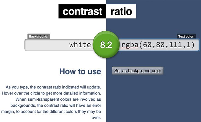
Basically you enter a color value using either keywords(black, white, grey) or HEX/RGBa for the background and text. Believe it or not you can even use the CSS url() value to embed a repeating background. The colors should render dynamically and you’ll immediately see the text contrasted both on the page and in the website’s favicon.
If you’re not a color theory expert this tool can save you loads of time messing with CSS. The best rule of contrast is to find colors of differing values that may still be in the same color range. Matching colors is tough by itself – but you can still find excellent contrast by pairing together a light & dark shade of any hue.
Like most concepts in the design field you’ll pick up typography quicker with practice and repetition. You’ve got to be courageous and fail a few times before you’ll get pretty good. Now that you know about these ideas check out some popular websites and pay attention to the different typographic design qualities. It’s surprising how much you can learn by just studying what others have created.