Whenever you are trying to design a new website, at some point, it comes the moment when you have to choose the right color. The right color selection is a very important matter and the choice should be made by taking into consideration some facts. The top aspect that should be kept in mind is related to aesthetics.
Thanks to the evolution of technology, current displays are not only able to show 32bit of color but they are also able to accurately recreate an image with such a high precision that you can almost believe it’s real thanks to the large spectrum of colors that can be rendered by them. You don’t have to be a specialist in order to make a good choice when it comes to colors, you can find help in psychological guidelines or tried-and-true color theories.
Color psychology is a field of study that analyzes the effects produced by colors and colors combination in matters of emotions and behaviors. Business owners are looking for the perfect color matching their different marketing plans on that field, the color psychology being a big business itself. For example a home decorator is looking after a color that will make a living room a lovely place to spend time or a bright color that will make a home office a more productive place.
People’s response to your color choices might not be uniform and most of the time it might be different, depending on individual experience.
The interpretation and associations of colors is also different in many cultures. Keeping that in mind, let’s check out some psychological associations made by most of the people in Western cultures in response to some specific colors.
Red
The red color is well known for stimulating adrenaline and blood pressure and also increasing human metabolism, being a dramatic, rich and exciting color.
Red is also a color of love and passion, maroon or burgundy, the darker shades of red are perfectly matching a design for the wine industry and the brownish shades or red can be inspiring for an autumn related design.
Orange
Orange is a very active, vivid and energetic color, inspiring happiness, enthusiasm, creativity.Orange is a very catchy color which easily comes in people’s attention and for this rea on it is often used for road cones or life jackets. This color is also well known for stimulating appetite, being the designer’s first choice in food and cooking industry. Orange inspires a less corporate-feeling and a more informal one but it definitely doesn’t bring out the passion you can find in red.
Yellow
Yellow is the most active color, and its overuse can sometimes be overpowering. Yellow is most of the time used for taxicabs and caution signs, being highly visible. Yellow also inspires energy and happiness being the color of the well known smileys.
Green
Green is first of all the color of nature, freshness and growth, that being the reason for its often use in environmental protection. Green is also a color for hope although is less dynamic than red or orange. This color can also inspire wealth, stability, and education and it can also be suitable color for a website especially if used on a black background.
Blue
Blue is the color of faith, openness and intelligence, and because of its calming effects it is often taken into consideration by the home decorators. Due to the fact that blue is very rarely found in real food, it is well known to reduce appetite, therefore it is definitely a bad choice in food industry. Sometimes bad luck is attributed to this color and it also has a powerful emotional effect notable in blues music and in the paintings of Picasso’s depression-induced “blue period.”
This color is also famous for its association with the sea and the sky, therefore being often used in websites for airlines, pools or cruises.
Purple
The purple color is most of the time associated with wealth and extravagance and in the past it was connected with royalty. Purple is the color of balance finding itself between the stimulation of red and the calming of blue. This color is also the least-used colors in web design so If you’re trying to create a less common website design, you can use some shades of purple.
White
White is the color of clean power and its perceptions is different in each culture. For example in Western cultures white is always the color of perfection, light, and purity while in Chinese culture, this is a color traditionally associated with death and mourning.
White is not often found in designer’s choices, due to its simplicity, but such color on a dark background could become a very visible and eye catching way of promoting your website.
Black
Most of the time, negative connotations are attributed to black such as death and evil, but black it can also be a color of power, elegance and strength. In order to create a good idea about how your audience is perceiving the chosen color, you should establish three word associations for each (the first three words that come into your mind when you think of that color).
Color psychology plays an important role in the way the public will perceive your website but you should keep in mind there is no wrong color to use. The psychological guidelines presented above may help to start your palette, but the harmony and the matching of the chosen colors is the key of success. In order to reach success you should also take into consideration a few other attributes of color.
The color temperature is one of the most important attributes and it exists across the entire spectrum.
Warm colors are the colors from red to yellow, including orange, pink, brown, and burgundy. These colors are associated with the sun and fire, and they represent heat and motion. A warm color will always dominate a cool color if they are put together.
Cool colors are the colors from green to blue, including some shades of violet. Violet is the intermediary between red and blue, so a cooler violet will always be closer to blue, while a reddish violet will always be warm.
When it comes to design, cool colors are often used in backgrounds and larger elements on a page, due to the fact that they won’t overpower the content and they have a calming effect.
So, let’s see these colors in action.
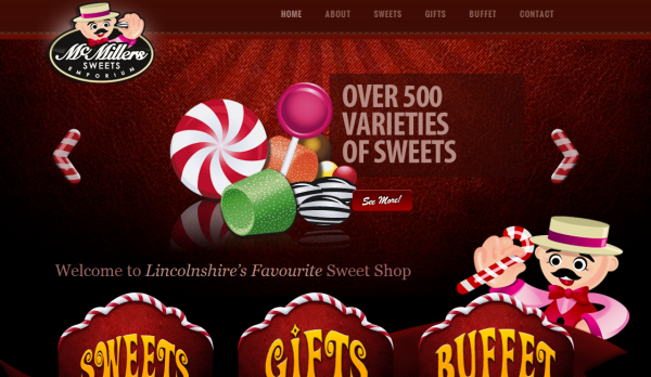
McMillers Sweets Emporium
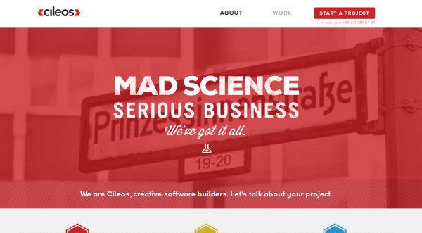
Cileos
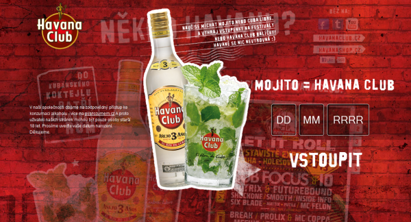
Havana Club
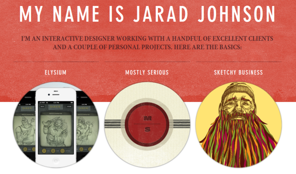
Jarad Johnson
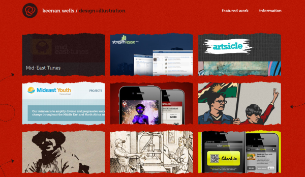
Keenan Wells
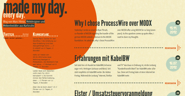
WebDesign Karlsruhe
The Hemsley
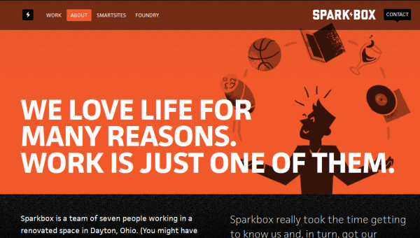
Sparkbox
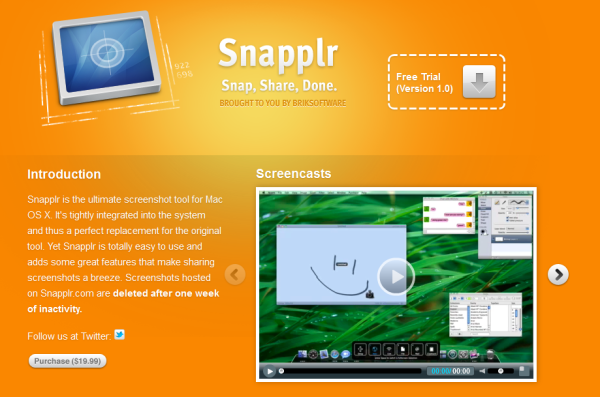
Snapplr
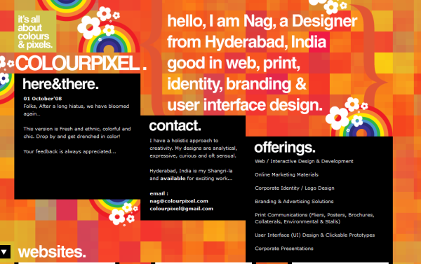
Colourpixel
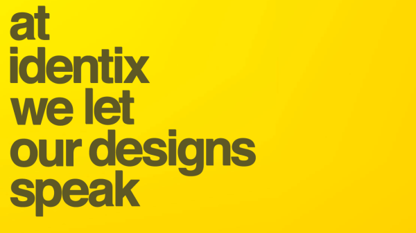
Identix Design
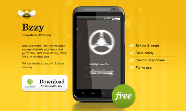
Bzzy App
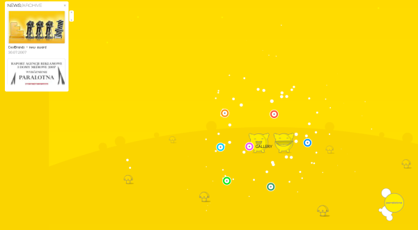
Paralotna
Gareth Dickey

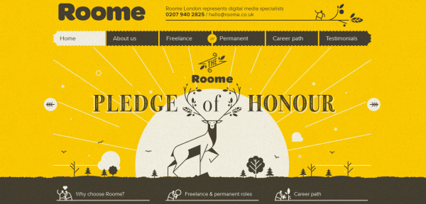
Roome Consulting
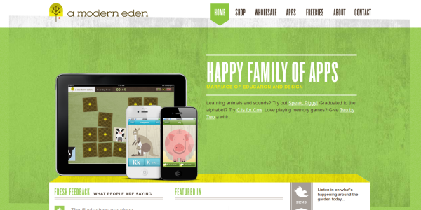
A modern eden
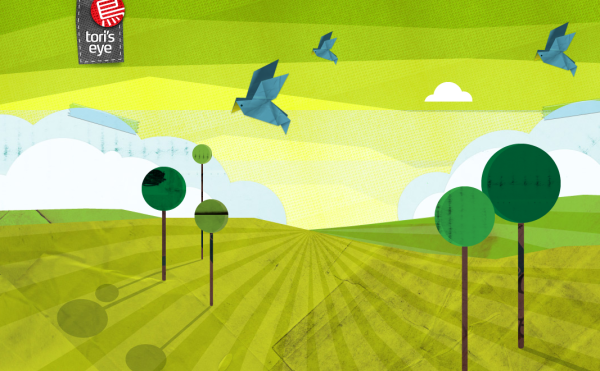
Tori’s eye
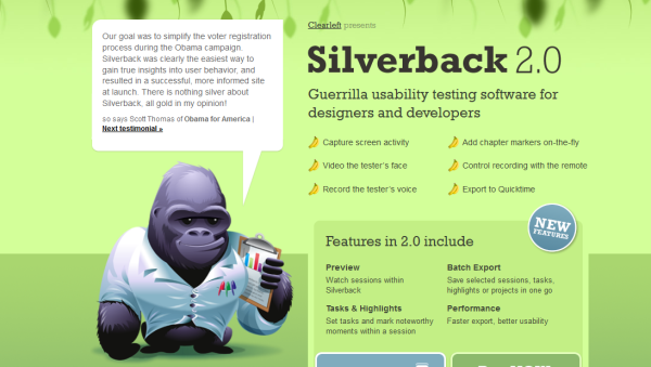
Silverback app
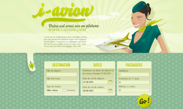
i-avion
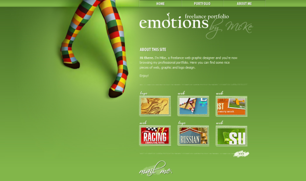
Emotions by Mike
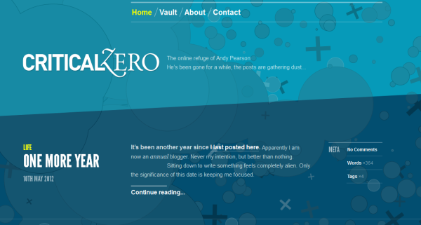
Critical Zero
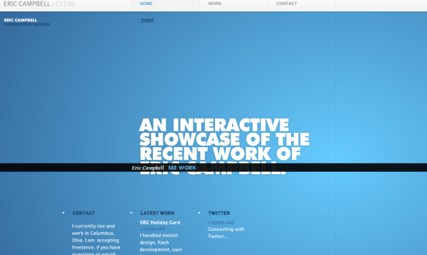
Eric Campbell
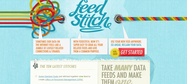
FeedStitch
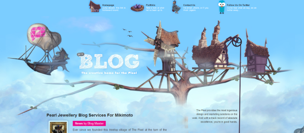
thepixel.com
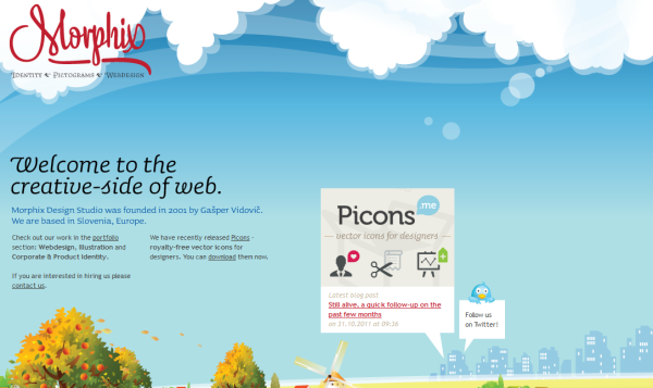
Morphix
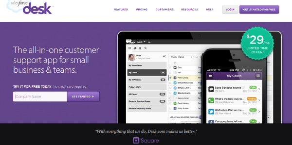
Assistly
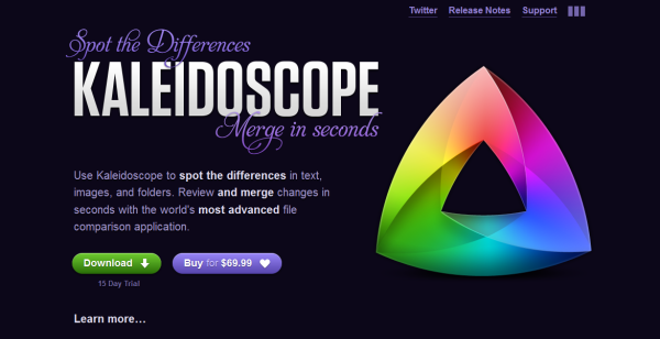
Kaleidoscope
CodeMyConcept

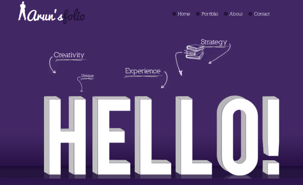
Arun’s Folio
Woman to Woman

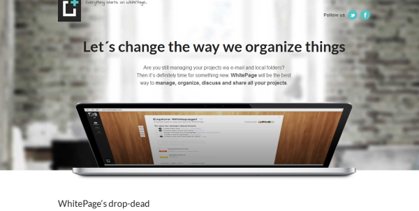
WhitePage
Listing Scout

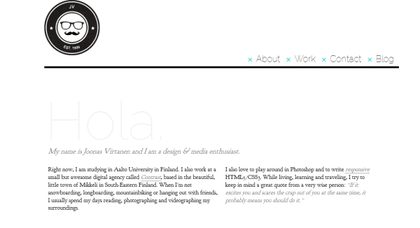
Joonas Virtanen
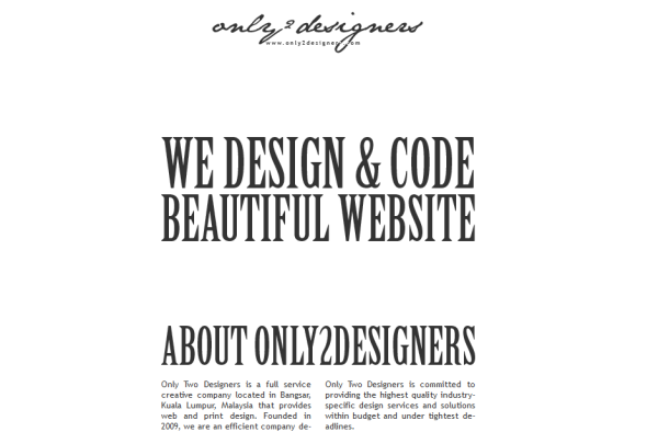
Only Two Designers
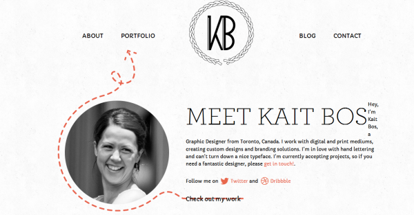
Kait Bos
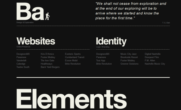
Blake Allen Design
Leah Haggar

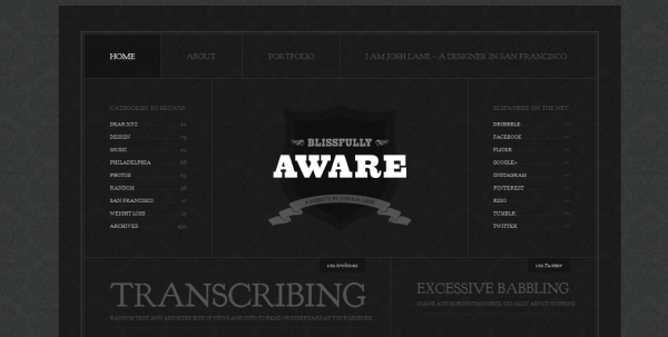
BlissfullyAware
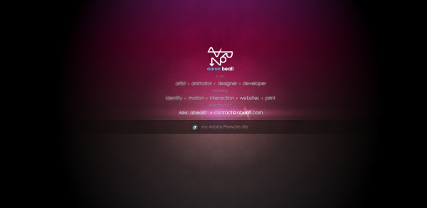
Aaron Beall
Gritti Rollo