
Software: WordPress
Difficulty: Beginner
Completion Time: 1 hour
Final Product What You’ll Be Creating

Last year I did a small (and admittedly very un-scientific) survey among other WordPress developers.
What I wanted to know was this: When they built their first WordPress theme, how did they do it? Did they hack an existing theme or did they start with their own static HTML and turn it into a theme?
The majority of people I spoke to used the second approach – they were all experienced frontend developers who had built sites using HTML and CSS, and found it easiest to take their existing HTML files and convert them to a theme. Two of the people I spoke to were lecturers or teachers, and told me that this is the approach they use with students.
So in this series I’m going to show you how to do just that.
You’ll start with a single HTML file (with a separate stylesheet) and turn that into a WordPress theme with multiple template files and with a variety of hooks, functions, and template tags included to make use of loops, menus, widgets and more.
In this first tutorial, I’ll show you how to prepare your HTML before converting it to PHP to create a theme, which is what we’ll be covering later in the series.
What You’ll Need
For this tutorial, all you’ll need is the basic tools for editing HTML:
- A code editor of your choice
- A browser to see the results of your work
1. Why Prepare Your HTML?
In theory, you could take any valid HTML, add the correct template tags and a loop and turn it into a theme, but I’d recommend being a bit more thorough than that.
The reason for this is that WordPress will add HTML elements and classes when you start to add features such as menus and widgets, so it makes sense to be working with those elements and classes in the first place. I outlined the classes and IDs which WordPress generates in a previous tutorial, so you might want to familiarize yourself with those before continuing.
Another reason is to ensure that your markup is standards-compliant and written in HTML5. If you’re converting an old static site to WordPress, you may be working with old code which is in an earlier version of HTML and which, quite frankly, needs some tidying up.
I can’t tell you how you should tidy up your markup but I can give you advice on using HTML5 with WordPress and structuring your document.
2. HTML5 and WordPress – Structuring Your Markup
There are a number of HTML5 elements such as <article> and <aside> which have obvious places they should go in a WordPress theme – I’ve blogged about this, but the thinking on how each of these should be used is constantly developing, so use your judgement.
In the HTML file I’m going to be working with for this tutorial, however, the structure is as follows:
<header>
    <div>
    </div>
    <aside>
    </aside>
</header>
<nav>
</nav>
<div class="main">
    <div id="content">
        <article>
            <section class="entry-meta">
            </section><!-- .entry-meta -->
            <section class="entry-content">
            </section><!-- .entry-content -->
            <section class="entry-meta">
            </section><!-- .entry-meta -->
        </article>
    </div><!-- #content-->
    <aside class="sidebar">
    </aside>
</div><!-- .main -->
<footer>
    <div class="fatfooter">
    </div><!-- #fatfooter -->
</footer>
As you can see this uses a number of HTML5 elements as well as a few which predate HTML5. In the next part of this tutorial, I’ll show you how to split this structure into template files, but for now just keep it all in one file called index.html.
If your markup isn’t already structured in a similar way and isn’t written in HTML5, take some time to make the relevant changes. The important thing is to have the following areas of the page clearly defined:
- the header – in <header>
- the content – in this case, I’m using <div id=”content”>
<div id="content">. I’m deliberately using an ID here instead of a class so that I can use this as an anchor for screen readers to skip the menu. - the sidebar (if you have one) – here I’m using <aside>. I’ve also added additional classes for styling – these are all object-oriented so can be used throughout the theme and the pages I add later in WordPress.
- the footer – in <footer>. I tend to put another element inside my footer which encloses the widget areas – I call this <div>. This means I can apply a full-width background colour to the
footerelement while keeping the.fatfooterelement centered in the page.
3. Adding Classes and IDs Generated by WordPress
The next step is to work through your markup and add some classes and IDs which will be output by your finished theme.
This stage doesn’t actually affect your final theme, as the classes and IDs will be added automatically via the PHP functions you’ll be adding later. However, if you add the right classes and IDs now, you’ll be using them in your stylesheet and so your styling will continue to work once you’ve converted your HTML to a WordPress theme.
Work through each part of the markup in order.
The Header
WordPress doesn’t automatically add classes and IDs to the site name and description but it makes sense to use ones which are consistent with WordPress terminology. The left hand side of the header contains andiv element with the site name and description in it as follows:
<div class="site-name half left"><!-- site name and description --></div>

<div class="site-name half left">
    <h1 class="one-half-left" id="site-title"><a title="Creating a WordPress theme from static html - home" rel="home">WordPress Theme Building</a></h1>
    <h2 id="site-description">Creating a WordPress theme from static html</h2>
</div>
On the right hand side of my design is a space for the address or phone number or maybe a search box. You can give users of your theme complete flexibility over what’s shown here by setting it up as a widget area. I’ll show you how to create widget areas later in the series but for now just add the relevant classes:
<!-- an aside in the header - this will be populated via a widget area later -->
<aside class="header widget-area half right" role="complementary">
    <div class="widget-container">This will be a widget area in the header - address details (or anything else you like) goes here</div><!-- .widget-container -->
</aside><!-- .half right -->
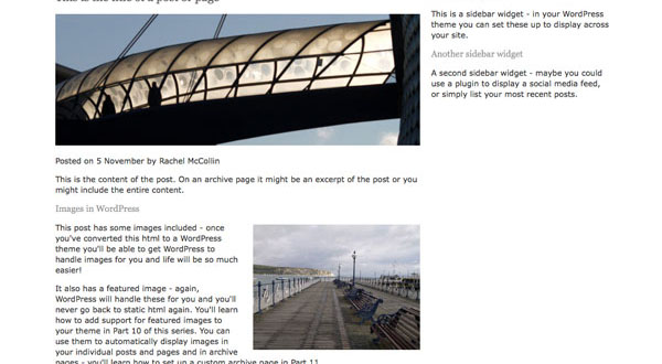
Images
The most important thing to add to your content is classes for images. WordPress generates classes for images based on how you add them to the Media Manager so you need to ensure those are all included in your theme.
In the markup for my dummy page there are two images – one is large and the other is medium and floated right.
For the first I add:
<img class="size-large" alt="" src="images/featured-image.jpg" />
And for the second, I add:
<img class="alignright" alt="" src="images/another-image.jpg" />
Note that in your final theme you’ll remove the code for these images as they’ll automatically be added by WordPress, but it helps to include them so that you can set up the styling correctly.
Having added the classes to your markup, you need to ensure that you’ve catered for image classes in your stylesheet, so add the following:
/* Images */

img {
    max-width: 100%;
}
#content img {
    margin: 0;
    height: auto;
    width: auto;
}
#content .alignleft,
#content img.alignleft {
    float: left;
    margin: 4px 4% 4px 0;
}
#content .alignright,
#content img.alignright {
    float: right;
    margin: 4px 0 4px 4%;
}
#content .aligncenter,
#content img.aligncenter {
    clear: both;
    display: block;
    margin-left: auto;
    margin-right: auto;
}
#content img.alignleft,
#content img.alignright,
#content img.aligncenter {
    margin-bottom: 12px;
}
If you look at my example page you’ll see that the first image is at 100% of the width of the content, and the second image is floated to the right with margins:
Sidebar and Footer
The sidebar and footer will also be containing widget areas so you need to add the relevant classes to your markup and style using those in your stylesheet.
The sidebar markup is as follows:
<!-- the sidebar - in WordPress this will be populated with widgets -->
<aside class="sidebar widget-area one-third right" role="complementary">
    <div class="widget-container">
        <h3 class="widget-title">A sidebar widget</h3>
        <p>This is a sidebar widget - in your WordPress theme you can set these up to display across your site.</p>
    </div><!-- .widget-container -->
    <div class="widget-container">
        <h3 class="widget-title">Another sidebar widget</h3>
        <p>A second sidebar widget - maybe you could use a plugin to display a social media feed, or simply list your most recent posts.</p>
    </div><!-- .widget-container -->
</aside>
The markup for the footer contains four widget areas, each of which can hold more than one widget. As you can see below, I add a class to each which tells the browser which one it is, so I can target each of them for styling later on.
<footer>
    <!-- the .fatfooter aside - I use this to enable a screen-wide background on the footer while still keeping the footer contents in line with the layout -->
    <div class="fatfooter" role="complementary">
        <div class="first quarter left widget-area">
            <div class="widget-container">
                <h3 class="widget-title">First footer widget area</h3>
                <p>A widget area in the footer - use plugins and widgets to populate this.</p>
            </div><!-- .widget-container -->
        </div><!-- .first .widget-area -->
        <div class="second quarter widget-area">
            <div class="widget-container">
                <h3 class="widget-title">Second footer widget area</h3>
                <p>A widget area in the footer - use plugins and widgets to populate this.</p>
            </div><!-- .widget-container -->
        </div><!-- .second .widget-area -->
        <div class="third quarter widget-area">
            <div class="widget-container">
                <h3 class="widget-title">Third footer widget area</h3>
                <p>A widget area in the footer - use plugins and widgets to populate this.</p>
            </div><!-- .widget-container -->
        </div><!-- .third .widget-area -->
        <div class="fourth quarter right widget-area">
            <div class="widget-container">
                <h3 class="widget-title">Fourth footer widget area</h3>
                <p>A widget area in the footer - use plugins and widgets to populate this.</p>
            </div><!-- .widget-container -->
        </div><!-- .fourth .widget-area -->
    </div><!-- #fatfooter -->
</footer>
Summary
Your HTML file is now prepared and ready to be converted into a set of theme files. In the next tutorial I’ll show you how to split it up and add some basic PHP.
Resources
- Working with Classes and IDs generated by WordPress (tutorial)
- Theme Development (from the WordPress Codex)
- WordPress and HTML5 – how they fit together (from my blog)
- HTML5 spec (from the W3C)
- WordPress Theme Development Beginners’s Guide by Tessa Blakeley Silver and Rachel McCollin (yes, me!)